CSS Layouts – Oh, the Humanity… ! by Steve Guttman
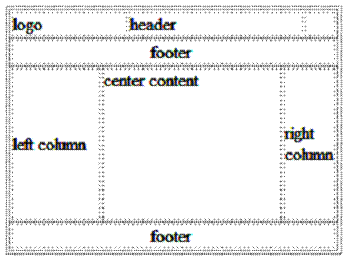
Back in the earlier days of the web—like 5 years ago—the standard fashion for laying-out pages was to wrap your page in a table and to use “colspan” and “rowspan” properties to combine table cells into merged entities, and to embed additional tables into those merged cells (when necessary) to hold and position subsidiary pieces of content. A pretty standard 3-column layout w/header and footer, using tables is shown below.
This strategy worked “OK,” although the use of tables generally meant that graphics falling at the intersection of rows and columns needed to be sliced up and inserted into individual cells. The complete graphic was reconstituted when the table laid itself out. Also, in many cases, HTML authors had to resort to the evil “single pixel transparent GIF” trick to position elements accurately within these layouts. This lead to HTML code that “worked,” but was bulky, difficult to read and maintain, and was generally not very elegant.
With the advent of CSS-P, the positioning of content moved from tables to DIVs—with the position of content regions (within DIVs) being specified in the CSS classes applied to each DIV. This has lead to a host of new problems—some of which I’ll talk about here, and some of which really require CSS 3 to address.
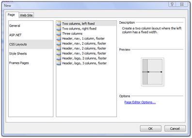
The key to doing CSS layouts is mastering “float” and “clear” CSS properties. I’m going to use a variant of the CSS, 3-column layout included with Expression Web 2. The CSS layouts in Expression Web are found by going to FILE>NEW>PAGE and choose “CSS Layouts” from the left list box. These are good starting points for most page layouts. But, I’m going to create a CSS layout from scratch. If you want to follow along, create a blank HTML page.
The nice thing about CSS layouts is that the page layout—or arrangement of content on the page—is mostly independent of the content itself. This means that we can start by creating the HTML page structure, first, and then apply CSS classes to get the content into the right positions. The basic structure of the HTML within our body tag is:
<body>
<div id=’container’>
<div id=’header’>
Here is my header content
</div>
<div id=’contentcontainer’>
<div id=’leftcol’>
Here is my left column content
</div>
<div id=’rightcol’>
Here is my right column content
</div>
<div id=’centercol’>
Here is my center column content
</div>
</div>
<div id=’footer’>
Here is my footer content
</div>
</div>
</body>
There are a few things to note here:
1. It’s good practice to always wrap your page in a “container” div. This lets you apply page specific styles (if needed) inside the body tag
2. I give IDs to all the div’s that I’m going to position using CSS. I think this makes it easier to understand your page.
3. The right and left content columns fall before the main/center content column. This seems a little bizarre. But, it is a necessary part of this particular 3-column layout technique.
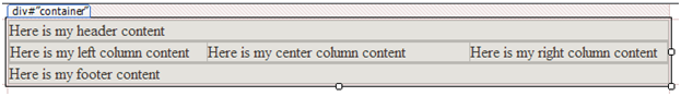
Without any styling at all—this is what my page looks like:
![clip_image002[5]](https://msdntnarchive.blob.core.windows.net/media/TNBlogsFS/BlogFileStorage/blogs_msdn/xweb/WindowsLiveWriter/CSSLayoutsOhtheHumanitybySteveGuttman_9A70/clip_image002%5B5%5D.gif)
So, let’s apply some styling to this structure.
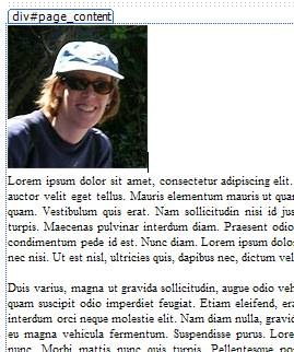
The strategy for 2 and 3-column layouts is pretty straightforward. Divs—by their nature—have a display style of “block,” which means that they will break a line. If you want to line 3 columns up next to eachother—our center, right and left columns—you need to use the float property. As its name implies, float lets you make specific content layout within the flow of whatever else is happening within a page. This is ideal for things like images, which you may want to display within a text block. If, for example, I insert a photo before a text block, it’s going to display like the screenshot below:
If I tag that photo with style=”float:left”, we get the following:
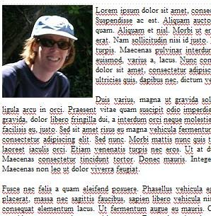
Nice, eh? The text flows nicely around the picture. What you need to remember about floats is that the page content following the floated element will flow around it. Any content preceding the floated element will be unaffected.
So, our trick for creating 3 side-by-side columns follows a similar vein. We apply float:right to the right column and float:left to the left column, we’ll move everything to the correct position. Here’s the HTML layout and markup below:
#leftcol{
width: 200px;
float: left;
}
#rightcol{
width: 200px;
float: right;
}
<body>
<div id=”container”>
<div id=”header”>
Here is my header content
</div>
<div id='contentcontainer'>
<div id='leftcol'>
Here is my left column content
</div>
<div id='rightcol'>
Here is my right column content
</div>
<div id='centercol'>
Here is my center column content
</div>
</div>
<div id=”footer”>
Here is my footer content
</div>
</div>
</body>
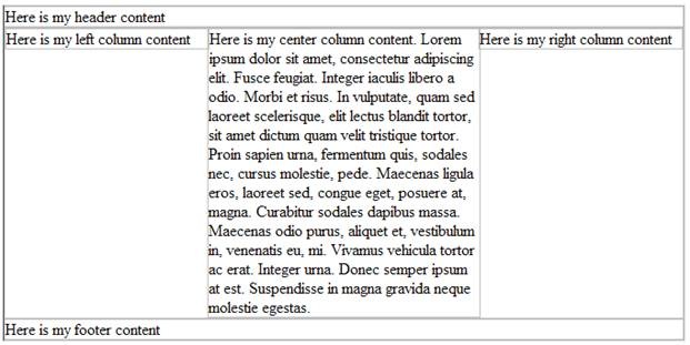
However, there are a few problems, here. If we add additional content into the center column, we see we have a bit of an overflow problem.
![clip_image002[5]](https://msdntnarchive.blob.core.windows.net/media/TNBlogsFS/BlogFileStorage/blogs_msdn/xweb/WindowsLiveWriter/CSSLayoutsOhtheHumanitybySteveGuttman_9A70/clip_image002%5B5%5D.jpg)
To fix this, we set the right and left margins of the center container to the width of the right and left columns, respectively. This will constraint the text to the area between the left and right columns.
There will be another issue if the text in the right or left columns happens to run longer than the text in the center column. The footer will run next to the column instead of under it.
![clip_image004[5]](https://msdntnarchive.blob.core.windows.net/media/TNBlogsFS/BlogFileStorage/blogs_msdn/xweb/WindowsLiveWriter/CSSLayoutsOhtheHumanitybySteveGuttman_9A70/clip_image004%5B5%5D.jpg)
To eliminate this condition, we add the clear:both property to the footer div. Clear moves the element such that it is below any content, either to the right, left or both sides (depending on the value of the property you apply). Our final markup looks like:
#leftcol{
width: 200px;
float: left;
}
#rightcol{
width: 200px;
float: right;
}
#centercol{
margin-right: 200px;
margin-left: 200px;
}
footer {
clear:both;
}
<body>
<div id=”container”>
<div id=”header”>
Here is my header content
</div>
<div id='contentcontainer'>
<div id='leftcol'>
Here is my left column content
</div>
<div id='rightcol'>
Here is my right column content
</div>
<div id='centercol'>
Here is my center column content.
Lorem ipsum…
</div>
</div>
<div id=”footer”>
Here is my footer content
</div>
</div>
</body>
You can do some really powerful layout tricks with floats and clears. Expression Web 2 has some pretty nice starting markup for columnar layouts. Check them out! There’s an excellent tutorial on floats and clears, here: https://css.maxdesign.com.au/floatutorial/index.htm