Accessibility Gotchas 2: High Contrast
The next accessibility gotcha that we see regularly is poor support for high contrast modes. The high level concepts are the same for Xaml and for HTML, but the specific methods to solve them and some of the low level issues are different.
High contrast mode makes it easier for some low-vision users to read the screen. It can also provide environmental help: I regularly switch my phone into high contrast mode during summer time to help read the screen in the sun (this isn’t an issue for me in Seattle during the winter).
You can switch your system into High Contrast mode by hitting left-shift+left-alt+Print Screen (or right click on the desktop and choose “Personalize” then select one of the High Contrast themes). Give this a try to get a hint of what it feels like. Most likely you’ll see green text on black backgrounds, but the details will differ on based on the specific theme you chose.
When we switch to High Contrast we expect several things to change:
1) The contrast between foreground and background text should increase. The Web Content Accessibility Guidelines (WCAG) expect the contrast ratio to be at least 7:1 (up from 4.5:1 for normal contrast) for normal text.
2) Non-essentially busy images should go away: remove background gradients, images, etc. where they might distract from the meaningful information.
You likely have some apps installed which get this wrong
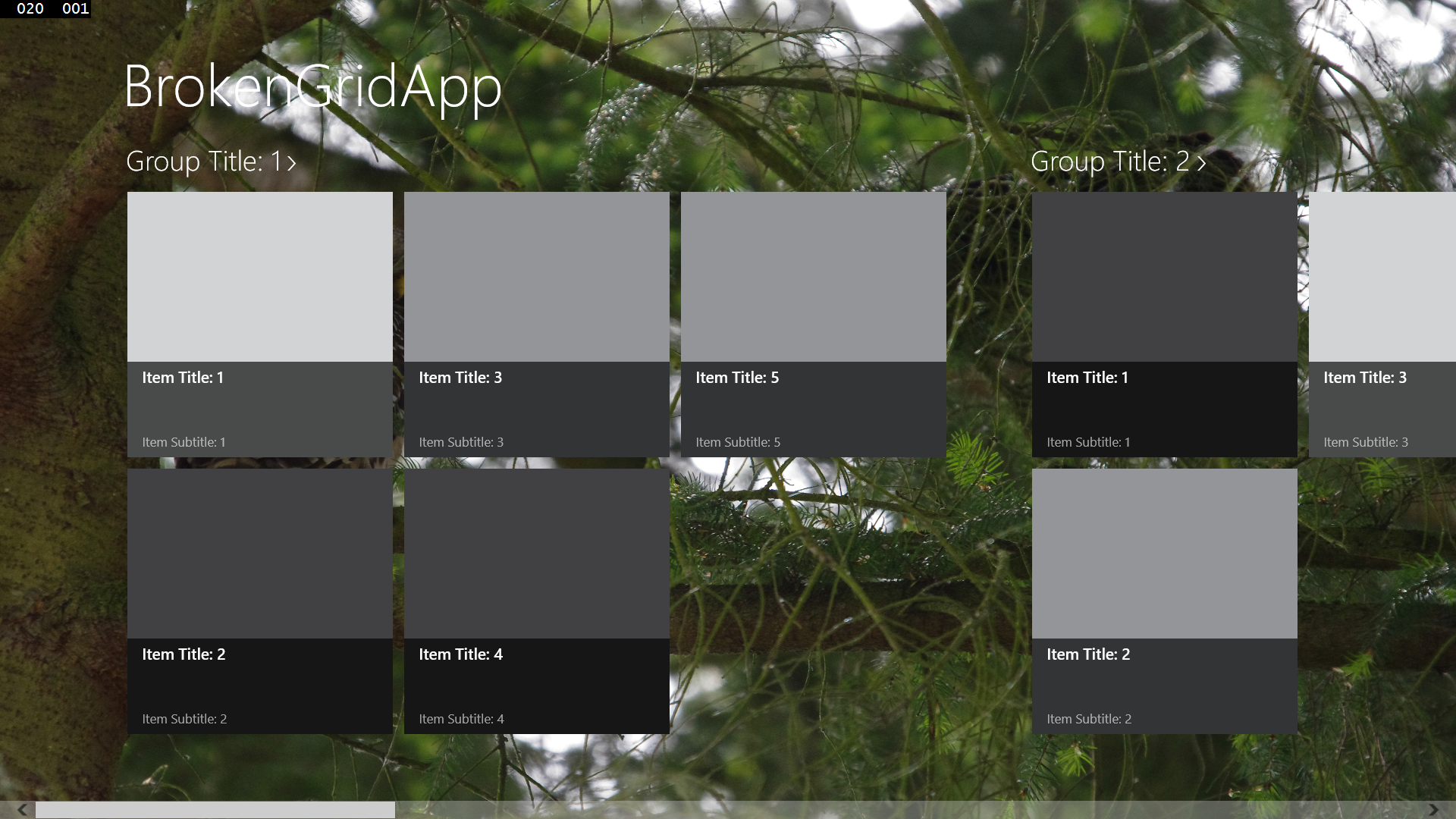
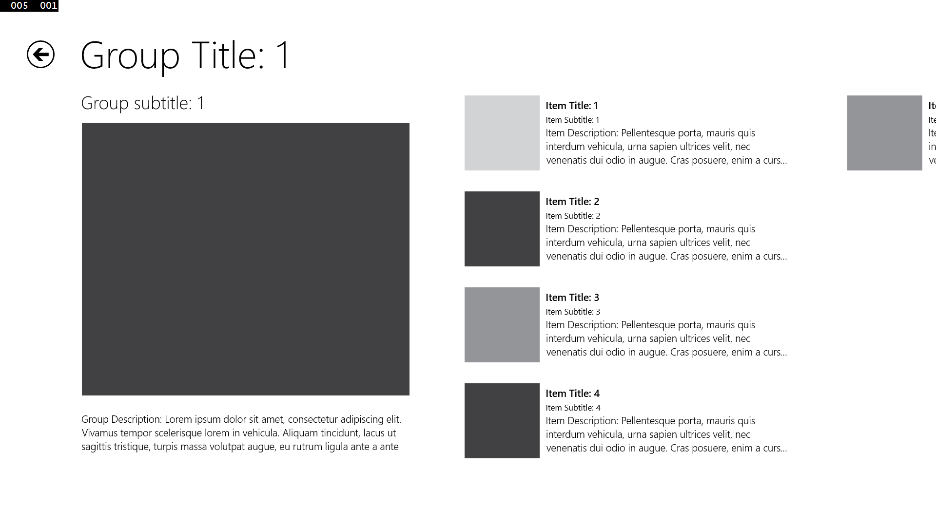
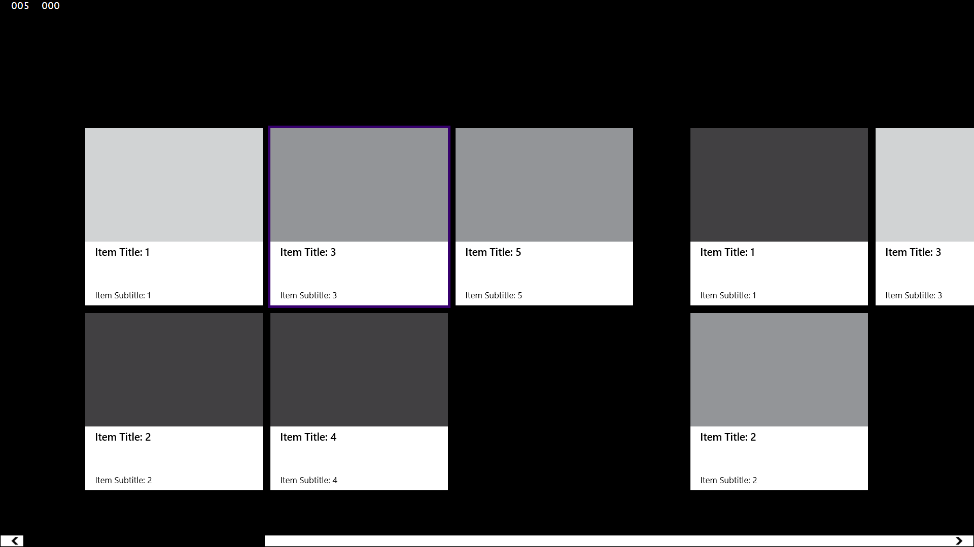
To see switch to High Contrast mode (LShift+LAlt+PrtScn) and bring up the Start Screen. Most of the tiles will now appear white on black (or black on white), with a few (including desktop apps) showing their logo in color on the black background. Photo-oriented live tiles will still show photos, but you may find some other tiles which look essentially the same in high contrast mode as they did before. The icon names will now be on a black (or white) rectangle to separate them from any background images.
If you have an app whose icon didn’t change try opening it and look at its splash screen. It should appear with a white (or black) icon on a full screen black background, but it may appear as a colored rectangle in the middle of the screen.
Once the app starts is the real test: does it appear with your high contrast colors? Does it retain its normal look completely or partially (the nameless blog authoring tool I’m using has custom menus and toolbars which didn’t change, although the writing canvas itself is in my High Contrast colors)? Does its text ironically become low contrast or invisible?
These are the three major symptoms apps run into in High Contrast mode, and they all come from the same root and have the same solution.
Heavily branded app doesn’t change at all:
Touch or mouse over to see the text disappear in High Contrast White modes with a hard coded black background and dark theme
Dark theme GridView in normal contrast Hardcoded black background in High Contrast White

Touch or mouse over to see the text become unreadable in High Contrast Black mode with a hard coded white background and light theme
Light theme GridView in normal contrast Hardcoded white background in High Contrast Black
Touch or mouse over to see essential information in the background graphic and graphic buttons disappear in High Contrast modes
Turbo Copter graphical menu Turbo Copter graphical menu without graphics in High Contrast White

Don't Hard Code colors!
In all of these cases the problem is hard coded colors. In my introductory CS classes the teachers always forbade hard coding numbers in our code. If they saw a number other than 0 or 1 that wasn’t referred to by a constant there was trouble! The same thing applies to colors: consider hard coded colors forbidden; always store colors in a resource (for Xaml) or in CSS (for HTML)
The differences in the behaviors involve which colors are hard coded.
Areas of the app which look completely the same hard code everything: if both the foreground and background are explicitly set they won’t change at all. If only one of the foreground and background is hard coded then the results are unpredictable. Depending on how the other color shifts the results can turn out fine, low contrast, or completely blank.
How do High Contrast modes work?
Xaml and HTML each deal with this slightly differently, but in both cases the system provided colors will switch to the High Contrast palette.
HTML apps deal with High Contrast through CSS: in High Contrast mode all of the foreground and background styles are replaced by the system colors. If you set your colors in CSS rather than hard coding it in HTML then everything will work by default. If needed, this automated handling can be overridden with media queries for –ms-high-contrast.
Xaml apps deal with this through ThemeResources (new for Windows 8.1. Windows 8 apps can use StaticResources) and ThemeDictionaries: in High Contrast mode all of the system brushes will switch automatically to High Contrast brushes, and ThemeResources will choose from the High Contrast ThemeDictionary. Unlike StaticResources, ThemeResources will change the colors immediately when the theme changes. StaticResources will pick from the ThemeDictionary when they are first evaluated but won’t respond to theme changes after that.
If we naively set a color directly in the Xaml then we’ll have problems in High Contrast mode, but we can add our own colors as ThemeResources. By leveraging the ThemeDictionaries we can provide an explicit color for default mode while falling back to system colors for High Contrast modes.
The following hardcoded background color will override the HighContrastWhite theme’s background and make the default text color black on black (cool and edgy, but tough to read).
<!—Bad XAML. Do not do this! -->
<Grid
DataContext="{Binding Group}"
d:DataContext="{Binding Groups[0], Source={d:DesignData Source=/DataModel/SampleData.json, Type=data:SampleDataSource}}"
Background="Black">
<!—Bad XAML. Do not do this! -->
Instead draw the background from a resource:
<Grid
DataContext="{Binding Group}"
d:DataContext="{Binding Groups[0], Source={d:DesignData Source=/DataModel/SampleData.json, Type=data:SampleDataSource}}"
Background="{ThemeResource PageBackground}">
And provide both default and high contrast versions. In this sample we use a background image instead of the solid black background, but default to the system SystemColorWindowColor for HighContrast. In general it's best to use an existing system color in HighContrast mode rather than hardcoding a specific color. If you need to hardcode a color then do so for HighContrast and HighContrastWhite and test with both black and white HighContrast modes.
<Page.Resources>
<!-- Collection of items displayed by this page -->
< ResourceDictionary>
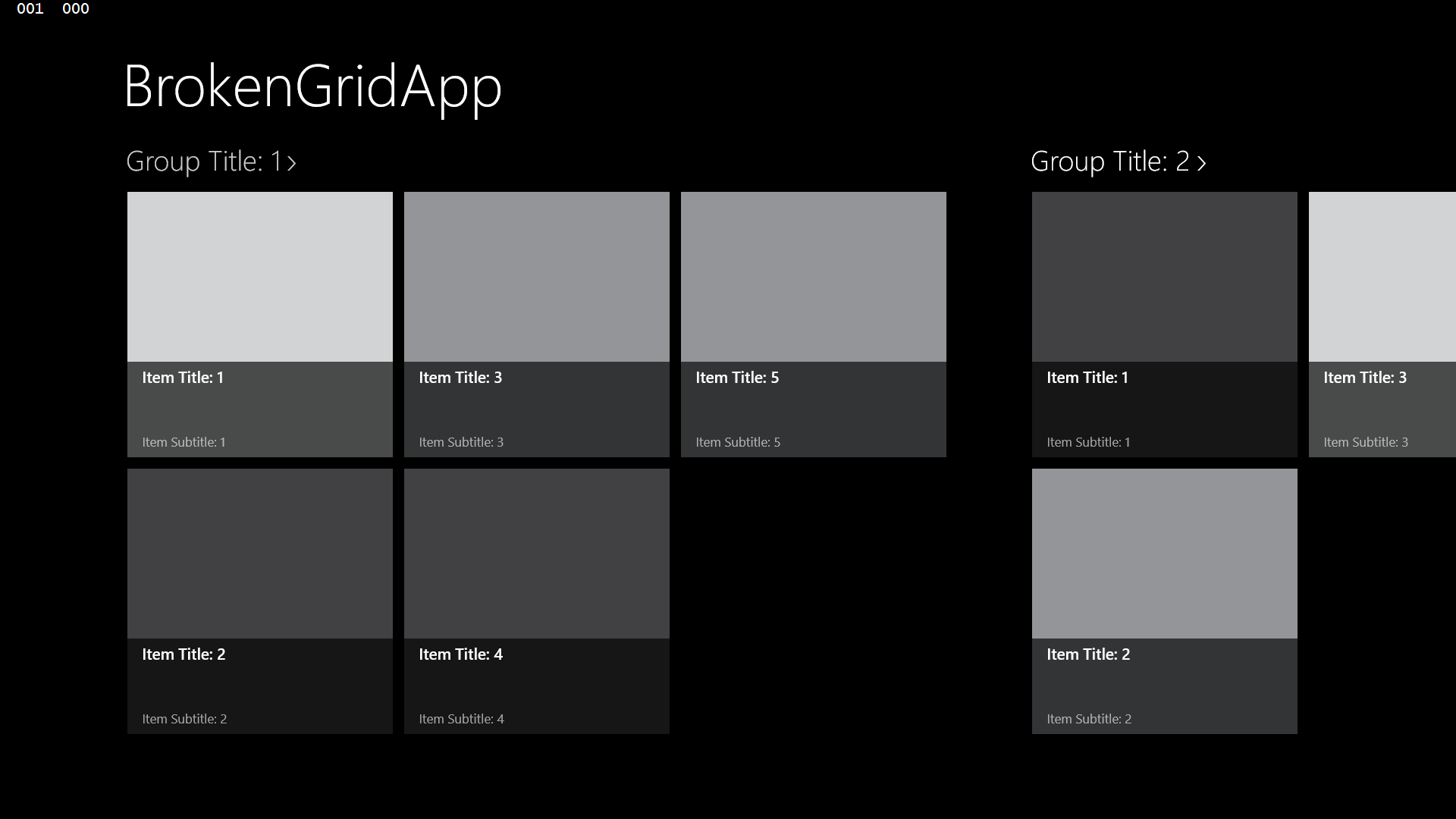
<x:String x:Key="AppName">BrokenGridApp</x:String>
< CollectionViewSource
x:Name="itemsViewSource"
Source="{Binding Items}"
d:Source="{Binding Groups[0].Items, Source={d:DesignData Source=/DataModel/SampleData.json, Type=data:SampleDataSource}}"/>
<ResourceDictionary.ThemeDictionaries>
< ResourceDictionary x:Key="Default">
< ImageBrush x:Key="PageBackground" Stretch="Fill" ImageSource="Assets/owlvcrow.jpg"/>
</ResourceDictionary>
< ResourceDictionary x:Key="HighContrast">
< SolidColorBrush x:Key="PageBackground" Color="{ThemeResource SystemColorWindowColor}" />
</ResourceDictionary>
</ResourceDictionary.ThemeDictionaries>
</ResourceDictionary>
</Page.Resources>
The designer can help set this up. You can set the background brush in the properties and then convert it to a resource:

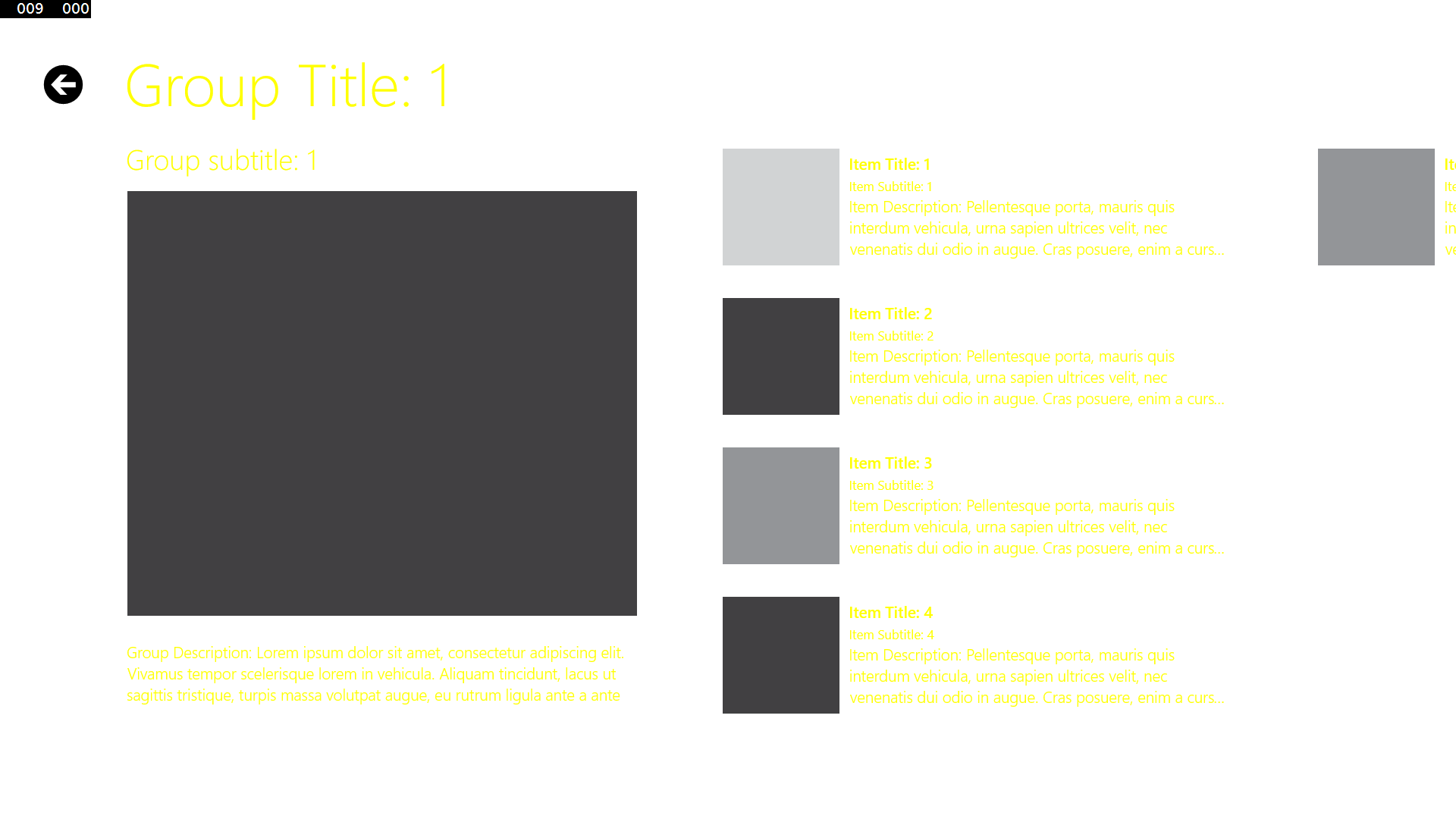
W can also make more complicated changes. For example, a color picker may fill the background of its tile with the color to choose. Rather than setting its name in a rectangle (like the Start Screen does) we might want to move the tile color to only part of the tile. Since data templates are good candidates for resources in any case we can put completely different data templates in the default and High Contrast dictionaries.
Touch or mouse over to see the template shift in High Contrast mode
Color swatch with colored background Color swatch with colored border in High Contrast
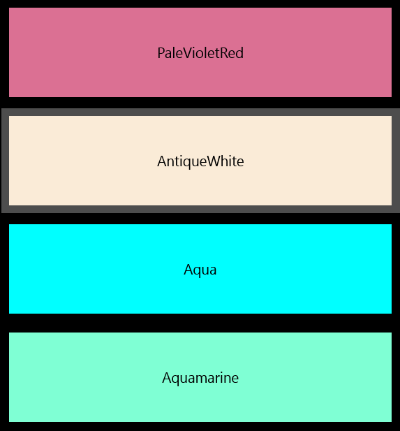
In Default contrast mode we use a DataTemplate which fills the background of the tile's border with the picked color. The Text's Foreground color is calculated from the background color so it can show dark on light colors and light on dark colors. For HighContrast mode we move the color swatch to the border's BorderBrush and leave the rest as default values.
<ResourceDictionary>
< ResourceDictionary.ThemeDictionaries>
< ResourceDictionary x:Key="Default">
< DataTemplate x:Key="ColorListTemplate">
<Grid>
<Border BorderThickness="4" Height="100" Width="400" HorizontalAlignment="Center" VerticalAlignment="Center" >
<Border.Background>
< SolidColorBrush Color="{Binding Color}"/>
</Border.Background>
<TextBlock
Text="{Binding Name}" VerticalAlignment="Center" HorizontalAlignment="Center" Foreground="{Binding Color, Converter={StaticResource ContrastConverter}}"/>
</Border>
</Grid>
</DataTemplate>
</ResourceDictionary>
< ResourceDictionary x:Key="HighContrast">
<DataTemplate x:Key="ColorListTemplate">
<Grid>
<Border BorderThickness="4" Height="100" Width="400" HorizontalAlignment="Center" VerticalAlignment="Center" >
<Border.BorderBrush>
<SolidColorBrush Color="{Binding Color}"/>
</Border.BorderBrush>
<TextBlock Text="{Binding Name}" VerticalAlignment="Center" HorizontalAlignment="Center"/>
</Border>
</Grid>
</DataTemplate>
</ResourceDictionary>
</ResourceDictionary.ThemeDictionaries>
How about background images?
The other modification we want to make in High Contrast modes is to remove complicated background images. HTML will do this for us: background images set in CSS will automatically be removed. As noted in the previous example, Xaml handles the image the same way as it does colors: if we fill the background with an ImageBrush we can put the ImageBrush in a resource the same as any custom color. This can fall back to the HighContrast ThemeDictionary just as colors do.
We do want to be careful that we only remove the complexity of the background image and don’t remove any important information. If we do have information encoded in the bitmap such as the logo and button text in the Turbo Chopper app then we need to do two more things.
Touch or mouse over to see how the logo and graphic buttons disappear in high contrast mode (again)
Turbo Copter graphical menu Turbo Copter graphical menu without graphics in High Contrast White
First, for HTML apps we need to override the removal of the bitmap. We can do that by setting the –ms-high-contrast-adjust style to “none” on the images we need to keep. In this case, where we want to keep everything we can set it on the page’s <body> tag and let the buttons inherit it:
<body style='-ms-high-contrast-adjust: none;'>
<button id="easyButton" ></button>
<button id="hardButton"></button>
<button id="insaneButton"></button>
<button id="scoresButton"></button>
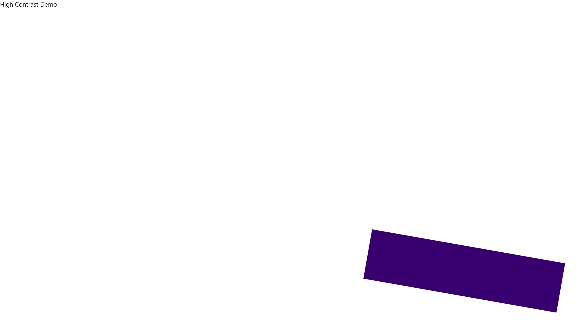
High Contrast Demo
< /body>
That will prevent the bitmaps from being removed, but leaves them busy and low-contrast. To fix that Windows Store apps can use name qualifiers to supply different image resources for different scenarios and the appropriate one will be used. This system supports a wide range of specific resources (for scaling, localization, DX feature level, etc.) as well as for contrast: by adding contrast-standard, contrast-high, contrast-black, or contrast-white to the image name the appropriate version will be used automatically.
Just adding high contrast assets to the app’s content fixes that for both high contrast black and white themes:
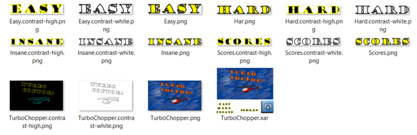
Touch or mouse over to see the updated images in High Contrast Black
Turbo Copter graphical menu Turbo Copter graphical menu with high contrast graphics in High Contrast Black

Touch or mouse over to see the updated images in High Contrast White

Turbo Copter graphical menu Turbo Copter graphical menu with high contrast graphics in High Contrast White
We can use the same naming scheme for the app’s icons and splash screen.
Need more customization?
These settings should cover most high contrast scenarios for HTML and Xaml. If you write your own UI in DirectX or otherwise need more customization then the app can query the AccessibilitySettings class to see if the user is in HighContrast mode and if so what HighContrastScheme is currently running.
Summary
The most important thing to remember about high contrast modes is not to hard code colors. Do make your app interesting and branded, but pull the colors from resources (Xaml) or styles (Html) and fall back to system colors in high contrast modes.
Remove cluttered or busy backgrounds and provide high contrast assets for the icons, splash screen, and any non-cosmetic images.
Test your app out to make sure it works sanely in high contrast modes: check both high contrast black and high contrast white themes and watch for areas which don’t change or which disappear.
Links
Supporting high contrast themes (Html)
Supporting high-contrast themes (Xaml)
How to name resources using qualifiers
Previous entries in this series:
Accessibility Gotchas: Introduction
Accessibility Gotchas 1: Xaml ListView speaks in tongues
--Rob