Experiments with WindowChrome
In July, the Microsoft Ribbon for WPF was released. Hopefully you saw the announcements from the WPF Team and on Pete Brown’s blog, and have already downloaded the Ribbon. A little bonus that you get with the Ribbon is the WPF Shell Integration Library and documentation for it on MSDN. This library includes the WindowChrome class, which the RibbonWindow uses to draw things like the QuickAccessToolbar and contextual tab headers in the non-client area of the window. You can use the shell integration features without using the Ribbon, or you can download and use it on its own from MSDN Code Gallery.
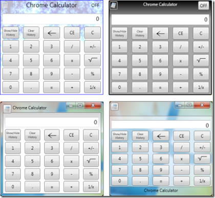
Since the WindowChrome documentation only shows an example of creating a standard looking window, I wanted to share some other experiments that look a little more interesting. I built a simple calculator application, and gave it some different looks using WindowChrome. Double-clicking the system button switches to the next style. In these screen shots, only the window style is changing; the calculator control is the same.
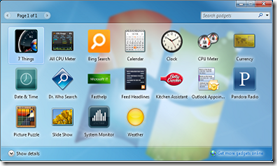
In this post, I’ll quickly walk through creating the last style shown, which is modeled after the Gadgets window in Windows 7.
Using the WindowChrome class
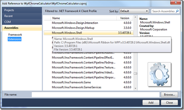
The first thing to do to use the WindowChrome class is to add a reference to the Microsoft.Windows.Shell assembly. If you have the WPF Ribbon installed, you’ll find it listed under Assemblies > Extensions > Microsoft.Windows.Shell. If you are using the stand-alone library from Code Gallery, you’ll need to browse to where you put the .dll file.
Next, we’ll do some basic set up of the project and application window.
Add an Images folder to the project for icons and backgrounds.
Add XML namespace references for the Shell library and the local application.
Set the name, title, size, and icon properties.
(You’ll also need to add the icon to the project. Calculator.ico is from the Visual Studio Image Library (> Objects >ico_format > WinVista). The other images in this example were created using Paint.NET.)
When you're done, the XAML will look like this:
 <Window x:Class="WpfChromeCalculator.MainWindow"
  xmlns="https://schemas.microsoft.com/winfx/2006/xaml/presentation"
  xmlns:x="https://schemas.microsoft.com/winfx/2006/xaml"
  xmlns:shell="clr-namespace:Microsoft.Windows.Shell;assembly=Microsoft.Windows.Shell"
  xmlns:local="clr-namespace:WpfChromeCalculator"
  Title="Chrome Calculator" Height="260" Width="300"
  Icon="Images/calculator.ico" x:Name="CalcWindow">
     <Grid>

    </Grid>
</Window>
Now we can use WindowChrome to add some styles to the application. The WindowChrome documentation gives an overview of how to style the window using WindowChrome, so I won't cover everything in detail here. Check out the overview, and then we’ll get to customizing a style...
Styling WindowChrome
First, we’ll add a style to our window resources with a target type of local:MainWindow. We attach the WindowChrome object to the MainWindow using the WindowChrome attached property.
To get the transparent look of the gadget window, we’ll set the WindowChrome.GlassFrameThickness property to -1. This makes the glass effect cover the entire window. We’ll also set the ResizeBorderThickness and CaptionHeight properties. These areas are not visible, but respond to the mouse to provide window resizing and dragging.
 <Window.Resources>
  <Style x:Key="GadgetStyle" TargetType="{x:Type local:MainWindow}">
    <Setter Property="shell:WindowChrome.WindowChrome">
      <Setter.Value>
        <shell:WindowChrome GlassFrameThickness="-1"
                            ResizeBorderThickness="4"
                            CaptionHeight="36"/>
      </Setter.Value>
    </Setter> …
Next, we’ll add a control template that specifies the elements of the application window. The first thing to do here is to provide a ContentPresenter that displays the contents of the window. To make the content fit within the window border, we’ll put it inside an invisible Border and set the margins to match the widths of the window border (0 on the sides, 25 on the bottom, and 40 (RisizeBorderThickness + CaptionHeight) on the top).
Finally, we can specify any controls or other content that will appear in the border. This is the main point of using WindowChrome - the ability to put your own interactive WPF content in the window border. For the sake of this demonstration, the content will be a simple button to represent the System button, and a TextBlock to display the window title.
 … <Setter Property="Template">
    <Setter.Value>
      <ControlTemplate TargetType="{x:Type local:MainWindow}">
        <Grid>
          <!-- This is the ContentPresenter that displays the window content. -->
          <Border Margin="0,40,0,25" >
            <ContentPresenter Content="{TemplateBinding Content}"/>
          </Border>
<!--This is the transparent white rectangle that goes behind the window content.-->
          <Border Margin="1,40,1,25" BorderBrush="Gray" BorderThickness="0,1,0,1"
                  Grid.ZIndex="-1">
            <Rectangle Fill="White" Opacity="0.5" />
          </Border>
          <!-- Window Border Content -->
            <!-- System Button -->
            <Button VerticalAlignment="Top" HorizontalAlignment="Left" Padding="1"
                    Margin="{Binding RelativeSource={RelativeSource TemplatedParent},
                    Path=(shell:WindowChrome.WindowChrome).ResizeBorderThickness}"
                    shell:WindowChrome.IsHitTestVisibleInChrome="True"
                    Command="{x:Static shell:SystemCommands.ShowSystemMenuCommand}"
                    CommandParameter="{Binding ElementName=CalcWindow}">
               <Image Source="{Binding RelativeSource=
                                      {RelativeSource TemplatedParent}, Path=Icon}"
                      Width="16" Height="16"
                      shell:WindowChrome.IsHitTestVisibleInChrome="True"/>
            </Button>
            <!-- Window Title -->
            <TextBlock VerticalAlignment="Bottom" TextAlignment="Center"
                       Padding="0,0,0,8"
                       Text="{Binding RelativeSource=
                                     {RelativeSource TemplatedParent}, Path=Title}" />
          </Grid>
        </ControlTemplate>
      </Setter.Value>
    </Setter>
  </Style>
</Window.Resources>
There are a few interesting things to note in this XAML.
- The button margin is bound to the ResizeBorderThickness property. This keeps the button from covering the resize border, so you can resize the window from the upper left corner.
- The button command is set to SystemCommands.ShowSystemMenuCommand. This shows the system menu when the button is clicked, just like the real system button. Download the project to see the full implementation.
- On both the button and the image, we set the IsHitTestVisibleInChrome attached property to true. This allows the button to receive mouse input. By default, elements that are placed in the window border are not interactive.
- The image that is in the button is bound to the Window.Icon property, so the replacement “system” button displays the application icon. Similarly, the TextBlock is bound to the Window.Title property.
Applying the Style to the Window
Now that the window style is defined, we need to apply it to the window. To do this, we’ll handle the Window.Loaded event and set the Window.Style property. Since this style uses Aero glass effects, it won’t render correctly on systems that aren’t using Aero glass (Windows XP, or Vista/ Window 7 with Aero disabled). Before we apply the style, we’ll want to check if glass effects are enabled, and only apply the style if they are. Fortunately, the Microsoft.Windows.Shell namespace also includes the SystemParameters2 class, which provides an easy way to access system settings that are useful with WindowChrome. We can simply check the IsGlassEnabled property before setting the style.
         public MainWindow()
        {
            InitializeComponent();
            Loaded += new RoutedEventHandler(MainWindow_Loaded);
        }

        void MainWindow_Loaded(object sender, RoutedEventArgs e)
        {
            Style _style = null;
            if (Microsoft.Windows.Shell.SystemParameters2.Current.IsGlassEnabled == true)
            {
                _style = (Style)Resources["GadgetStyle"];
            }
            this.Style = _style;
        }
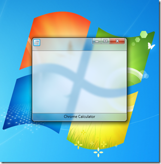
With just this XAML and code, we’ve got a window that resembles the Windows 7 gadget window. Now we just need to add some content.
You can download the complete sample from MSDN Code Gallery.


