SystemColors Reference
WPF exposes a swatch of colors that comprise the current Windows system theme. These are available in the SystemColors class as Colors, Brushes, and corresponding ResourceKeys (for binding with dynamic notification of changes to these colors, e.g. if the user switches Windows themes). This blog post contains a WPF tool to visually describe what Windows system colors are exposed through WPF and how these SystemColors members change as the Windows theme changes. Screenshots from the tool are contained in the blog post.
- SystemColors Swatch
- Reference Tables - SystemColors tables for different Windows themes
- What are the Windows system colors?
- SystemColors in WPF
- Overriding SystemColors using ResourceKeys to skin WPF controls
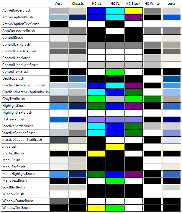
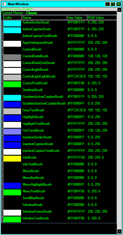
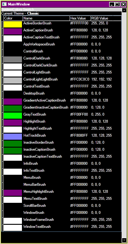
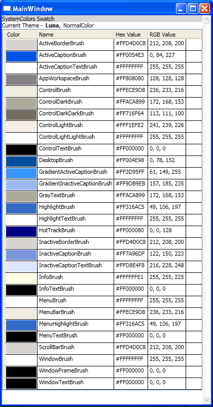
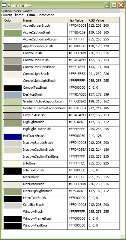
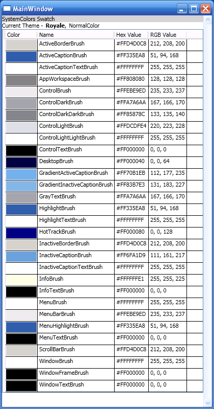
1. SystemColors Swatch
This graph is intended as a quick reference for control authors. While creating the default Style and template for a control, pick colors from this table that give the desired look across different OS themes. Here's a direct link you can bookmark and use as a quick reference. (Note: Luna is deprecated and is only available on XP)

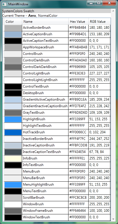
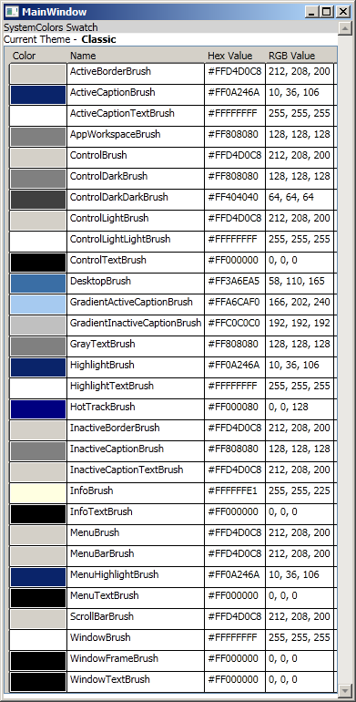
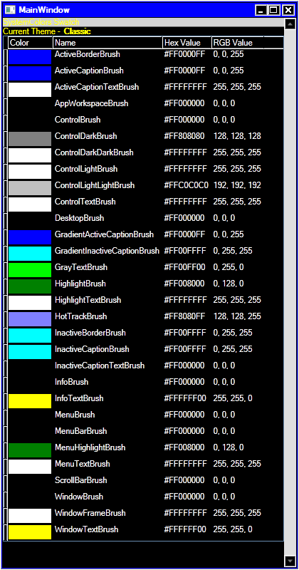
2. Reference Tables - SystemColors tables for different Windows themes
Here's the source for the tool I used to create these tables, and it is also attached to the blog post. Check it out!
3. What are the Windows system colors?
Windows uses a set of colors to draw UI elements like highlight borders, text, shadows, control chrome, window frames, etc. These colors can be retrieved and set using Windows APIs like GetSysColor. WPF applications expose these colors through managed wrappers as we’ll see in the SystemColors class.
Each Windows theme specifies the system colors differently. You can tweak the system colors yourself to create your own Windows theme, and WPF is able to pick up the colors the user has set in their theme so that WPF controls render to match the current theme.
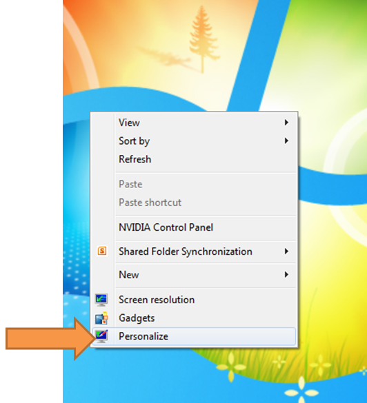
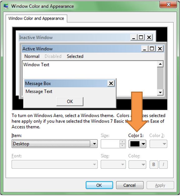
To personalize your system colors on Win7, bring up the Appearance and Personalization config either through Desktop or Control Panel:
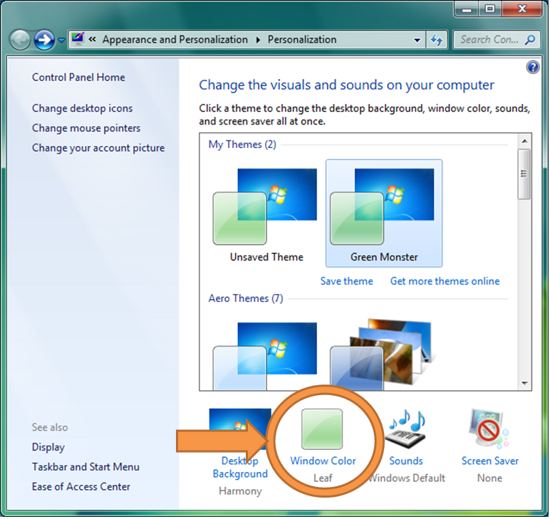
Click on “Window Color” to customize the window glass color and other system colors:
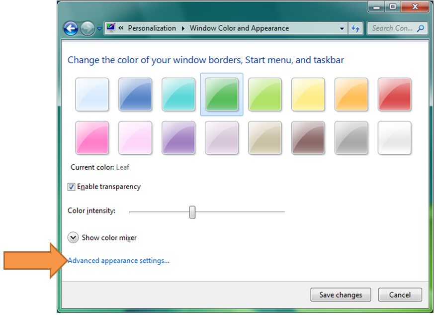
Choose “Advanced appearance settings…”:
Here you can configure the different system colors for Windows to use. The combo box allows you to select a UI element, and the color picker enables you to assign colors and other properties for it:
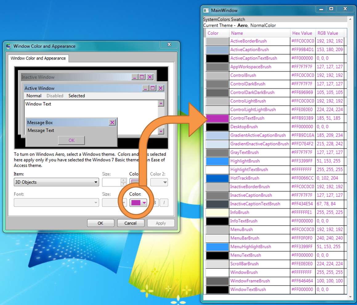
If you play around with these settings, you’ll see native Windows applications and WPF applications transform by picking up on the color settings. For example, if we change the black color for “3D Objects” to purple, then the foreground of certain UI elements picks this up:
In general, don’t worry about specifics here, like which settings affect which controls. Just be aware that WPF controls bind to many of the colors and other parameters specified here. (Note: While WPF apps dynamically assume the new system colors when the Windows theme changes, the same cannot be said for tweaking individual system colors. If you are using a WPF app to calibrate changes to the Windows system colors, you should recycle the app between sets of changes.)
4. SystemColors in WPF
WPF exposes Windows system colors through the SystemColors class as static Color, Brush, and ResourceKey properties. That is, for each unique system color exposed by WPF, there is a corresponding Color, ResourceKey for the Color, SolidColorBrush, and ResourceKey for the SolidColorBrush. If you don’t care about dynamic change notification, then in your XAML you can bind to the Brush directly:
<Button Background="{x:Static SystemColors.DesktopBrush}" .../>
However, control authors using SystemColors will likely want to bind to the resource keys instead so that they receive dynamic change notification. For example, if you are retemplating Button but wanted to basically match the look of a Windows button, you could bind a template element’s Background to SystemColors.ControlBrushKey using a DynamicResource reference:
<ControlTemplate TargetType="Button">
<Grid ...>
<Border Background="{DynamicResource {x:Static SystemColors.ControlBrushKey}}" ...>
<ContentPresenter />
</Border>
</Grid>
</ControlTemplate>
By using the correct SystemColor (use the chart at the beginning of this blog post) in a control’s template, the control will appear more natural under the different Windows themes (and even under many custom themes). That way, instead of having to craft different templates for the different Windows themes to pick up theme-specific color settings, you achieve a theme-specific look automatically.
5. Overriding SystemColors using ResourceKeys to skin WPF controls
We’ve mentioned that stock WPF controls bind to certain SystemColors in their templates to achieve a look that matches up nicely with the current Windows theme. In some cases you may want to change the way these stock controls look without having to retemplate them. Styles can get you pretty far and allow you to set properties like Background, BorderBrush, BorderThickness, Margin, Padding, Foreground, etc. Beyond that, you can use Triggers in Styles to set these properties differently for different control states. However, some developers have gone the route of overriding SystemColors to achieve the desired look for these elements.
To override the system-supplied ControlDark color, for example, create a SolidColorBrush whose key is SystemColors.ControlDarkKey and place it in the target control’s ResourceDictionary (or a ResourceDictionary walked by that control during resource resolution).
Here we should state that a control requiring you to go down this road is poorly designed (including parts of the WPF stock controls). Styles should be sufficient for basic reskinning and colorization. We don’t advise using this practice, and we are studying this problem so that we may provide a better mechanism.
Further reading on this from Szymon Kobalczyk's blog:
https://geekswithblogs.net/kobush/archive/2007/03/25/109753.aspx
The sample code for this tool is attached. Happy skinning!