Does your feature present inaccessible error icons?
This post describes some of the accessibility-related issues with a common method of providing helpful information to a customer filling in a form.
While tooltips can be an invaluable source of help to your customers, that help must be efficiently accessible to all your customers, regardless of how they interact with their device.
Introduction
When a customer is filling in an editable form field, it's relatively common practice for an icon to appear near the field if the data entered into the field is not as the form requires. For example, say the form asks me to supply my favourite Unicode value, in hex, and I type a 'g'. An icon appears next to the field, and when I hover the mouse cursor over the icon, a tooltip appears. The tooltip content lets me know that 'g' is not a valid input, as shown in the screenshot below.
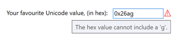
Figure 1: A tooltip reporting that a character in a form field is not acceptable.
Periodically we encounter shipping UI like this, and this generally means that the UI designer, program manager, and developer who worked on this UI are all able to see the visuals shown on the screen, and are all able to use a mouse. They can all access the helpful content in the tooltip, so things seem fine. The issue with this type of UI is that often the helpful tooltip content is not accessible to a customer using the keyboard, for both customers who use screen readers, and for sighted customers.
Note that for this post, I created the above demo UI with the following XAML in a WPF app.
<StackPanel Orientation="Horizontal">
<!-- Todo: Localize all this. -->
<TextBlock
Name="NameTextBlock"
Text="Your favourite Unicode value, (in hex):"
Margin="0 0 10 0" />
<TextBox
Name="NameTextBox"
Width="100"
Height="20"
VerticalAlignment="Top"
AutomationProperties.LabeledBy="{Binding ElementName=NameTextBlock}" />
<TextBlock
x:Name="NameErrorIcon"
Text="⚠"
Foreground="Red"
ToolTip="The hex value cannot include a 'g'."
Visibility="{Binding Text, ElementName=NameTextBox,
Converter={StaticResource ToolTipVisibilityConverter}}" />
</StackPanel>
But perhaps the tooltip content isn't really that important?
When tooltip content is not accessible to customers who only use a keyboard, (and so do not use a mouse,) sometimes a question arises around how important the tooltip really is. In some cases, a tooltip is extremely important, and without it, it's not practical for your customer to complete their task. In other cases you might feel that the tooltip is somewhat helpful, but its absence wouldn't significantly impact the customer experience. By default, I assume a tooltip is important, and must be accessible to all your customers. If it doesn't seem that important, why not remove it, and avoid the issue of it only being accessible to some of your customers?
Typically the notion of removing a tooltip is quite unattractive, which suggests that the tooltip really is helpful, and so must be accessible to all your customers.
Making the helpful content accessible
Often when we encounter accessibility issues in UI like that shown in Figure 1 above, we first focus on the programmatic accessibility of the UI. Given that tooltip content applies only to the specific form field, perhaps a UI Automation (UIA) property could be set on the field, and that property would be the text shown in the tooltip. By doing that, a screen reader which uses UIA could learn about the helpful error information directly from the form field itself.
For example, the screenshot below shows the Inspect SDK tool reporting that the UIA HelpText property of the form field matches the tooltip content shown earlier.
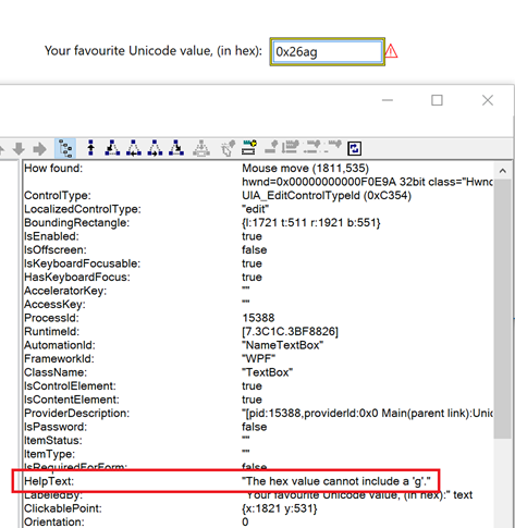
Figure 2: The Inspect SDK tool reporting that the HelpText property of the form field is "The hex value cannot include a 'g'.".
This means that a screen reader which uses UIA can access all the information that your customer needs directly from the form field, and it doesn't have to access the error-related icon or the icon's tooltip at all.
For this demonstration, I've achieved the above results by adding the following TextChanged handler to the WPF TextBox. (As far as I know, it's not possible in WPF to bind the TextBox's AutomationProperty.HelpText in XAML to the TextBox text property, such that the HelpText property gets updated as the text in the TextBox changes.)
private void NameTextBox_TextChanged(object sender, TextChangedEventArgs e)
{
AutomationProperties.SetHelpText(
sender as TextBox,
NameErrorIcon.Visibility == Visibility.Visible ? (string)NameErrorIcon.ToolTip : "");
}
With the above change, the helpful error-related information is accessible to a sighted customer who uses a mouse, and a customer who uses both a screen reader and the keyboard. (That's assuming the screen reader conveys the UIA HelpText property to the customer.) And sometimes, we can find that's as far as the consideration around accessibility goes. But what about the sighted customer who only uses the keyboard? How can they access that helpful information that makes it clear to them as to what the issue is with the text they've entered into the field?
Typically, due to the way this sort of UI is implemented, the error-related icon is not keyboard focusable. This means the customer can't tab to it and have the tooltip triggered through the icon getting keyboard focus. And often, it's appropriate that the icon cannot gain keyboard focus. If it can get keyboard focus, the customer might wonder why they've been taken to it as they tabbed through the UI. Traditionally if your customer can tab to a UI element, then there's some action they can initiate at that element. So your customer may wonder, can they invoke it, expand it, select it, toggle it, etc? They may press Space or Enter having tabbed to the element, in the expectation of triggering some action. But when they do that, nothing will happen, and this would be a confusing experience. So by default I'd leave the icon out of the tab order.
Perhaps another way of conveying the information would be through context-sensitive help. The icon appears, your customer wonders what it means, presses F1, and up pops a window with comprehensive details around how to use the fields on the form. Technically that may be accessible, but it seems a pretty tedious way of accessing the required information. Accessibility means being able to fully access all the functionality of the app, in an efficient way. Being taken out of the form in order to be able to make progress doesn't sound very efficient.
So how about making it really obvious to the sighted customer as to what the problem is, by providing the helpful information right next to where the problem is?
If the helpful text is displayed by the form field, then it's really efficient for a sighted customer to become aware of the issue, regardless of how they provide input at the device. The following screenshot shows the helpful error text being shown below the form field.
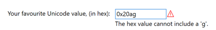
Figure 3: The helpful text "The hex value cannot include a 'g'." visually appearing directly beneath the form field to which it applies.
That demo UI was created with the following XAML in a WPF app.
<Grid.RowDefinitions>
<RowDefinition Height="Auto" />
<RowDefinition Height="Auto" />
<RowDefinition Height="*" />
</Grid.RowDefinitions>
<Grid.ColumnDefinitions>
<ColumnDefinition Width="Auto" />
<ColumnDefinition Width="Auto" />
</Grid.ColumnDefinitions>
<!-- Todo: Localize all this. -->
<TextBlock
Name="NameTextBlock"
Text="Your favourite Unicode value, (in hex):"
Margin="0 0 10 0" />
<StackPanel Grid.Column="1" Orientation="Horizontal">
<TextBox
Name="NameTextBox"
Width="100"
Height="20"
VerticalAlignment="Top"
HorizontalAlignment="Left"
AutomationProperties.LabeledBy="{Binding ElementName=NameTextBlock}" />
<TextBlock
x:Name="NameErrorIcon"
Text="⚠"
Foreground="Red"
ToolTip="The hex value cannot include a 'g'."
Visibility="{Binding Text, ElementName=NameTextBox,
Converter={StaticResource ToolTipVisibilityConverter}}" />
</StackPanel>
<TextBlock Grid.Row="1" Grid.Column="1"
Text="{Binding ToolTip, ElementName=NameErrorIcon}"
Visibility="{Binding Text, ElementName=NameTextBox,
Converter={StaticResource ToolTipVisibilityConverter}}" />
If the helpful text appears close to the form field to which it applies, that reduces the time it takes your sighted customer to digest what's shown on the screen, and to quickly make the connection between the various related elements. It's also worth pointing out that having the label shown visually close to the form field increases the likelihood that it's going to be useful when a magnifier is running. If a magnifier has zoomed the view such that the form field occupies most of the view, then to have the helpful text shown at some distant point in the form, could result in it not appearing in the view.
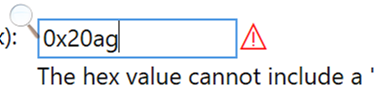
Figure 4: The Windows Magnifier zoomed in on the form field, with the associated helpful text mostly still visible in the view.
A note on the error icon
It might be said that now the helpful text string is displayed directly by the form field, the error icon isn't serving much purpose, and can be removed. But you may feel that for your sighted customers, it does provide some additional means to get their attention, in addition to the helpful error-related text which is now accessible to all your customers. So you may decide to leave the error icon in the visual design. (You may decide that its tooltip is no longer required though.)
The main outstanding questions about the error icon relate to its use of colors. The above screenshots show the error icon appearing in red. That's fine by default, so long as there's no way for the use of color to be a source of frustration for your customers who have some level of color blindness. For example, say red is used when there's an error detected in the form field which prevents progress through the current task. But maybe you have other helpful informational strings too, which are also associated with the same form field, but which are considered to be warnings rather than errors. For example, say the value your customer entered in the "Your favourite Unicode value" field is the same as the value they already entered in a nearby "Your least favourite Unicode value" field. That might be an error, but you can't be sure, because maybe they only know one Unicode value. (Ok, this is becoming a rather hypothetical example now.) Regardless, you decide to show a warning icon, which looks just like the error icon, but it's green.

Figure 5: A green warning icon, which is identical to the red error icon, except that it's green.
The screenshot below shows the red error icon and the green warning icon, having been processed by a color blindness simulator, in this case simulating protanopia. Many of your customers will have some level of color vision deficiency, so never convey important information through use of color alone.

Figure 6: The red icon and green icon having been processed by a red-green protanopia color blindness simulator, and the processed colors of the two icons are now almost identical.
Another important note on use of colors, is that the colors shown must respect your customer's choice of colors when a high contrast theme is active. And "customer's choice" is a critical point here. Many customers who use high contrast themes will customize the colors in order to make the colors as effective as they can be. So if you hard code colors to be (say) white, yellow or black when a high contrast theme is active, you may be contradicting your customer's wishes. So instead of always showing the error icon in red, when a high contrast theme is active, use a foreground color from the active theme. The screenshot below shows the high contrast theme's color for window text being used.
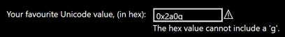
Figure 7: The error icon being shown using colors which respect the active high contrast theme.
For this demonstration WPF UI, the following XAML was used:
<TextBlock
x:Name="NameErrorIcon"
Text="⚠"
ToolTip="The hex value cannot include a 'g'."
Visibility="{Binding Text, ElementName=NameTextBox,
Converter={StaticResource ToolTipVisibilityConverter}}">
<TextBlock.Style>
<Style TargetType="{x:Type TextBlock}">
<Setter Property="Foreground" Value="Red" />
<Style.Triggers>
<DataTrigger Binding="{Binding Path=(SystemParameters.HighContrast)}" Value="True">
<Setter Property="Foreground"
Value="{DynamicResource {x:Static SystemColors.WindowTextBrushKey}}" />
</DataTrigger>
</Style.Triggers>
</Style>
</TextBlock.Style>
</TextBlock>
While the implementation is different, the principles are the same
Throughout this post, I've used code for a demo WPF app I just built. If I'd built the UI using a different UI framework, the implementation details would be different. But an important point here is that the principles of accessible UI are the same regardless of how you build your UI. Whether the UI is Win32, WinForms, WPF, UWP XAML or HTML, all your customers need to be able to efficiently access all your app's functionality.
In some cases, one platform might make it practical to achieve some result which isn't practical in another UI framework. Where that's the case, it's always worth considering how the accessibility of your UI can be enhanced such that it's as efficient and pleasant to use as possible, given the capabilities of the UI framework that you're using . For example, above we have the helpful text information programmatically accessible directly from the form field. As such, it might serve no purpose for your customer using a screen reader to encounter the error icon, given that the error icon only exists to expose the same helpful text. If the UI is UWP XAML, then it's straightforward to remove the icon from the Control view of the UIA tree, and as such, indicate to screen readers that it's not interesting to the customer. This isn't so practical to achieve in WPF, and so the customer can encounter the icon if they navigate through the UI in certain ways. As such, it would be helpful to give the icon a useful accessible name, through the AutomationProperties.Name property, such that your customer knows what its purpose is.
The screenshot below shows the Inspect SDK tool reporting that the error icon now has a UIA Name property of "Error icon", and that it's being exposed through the Control view of the UIA tree.
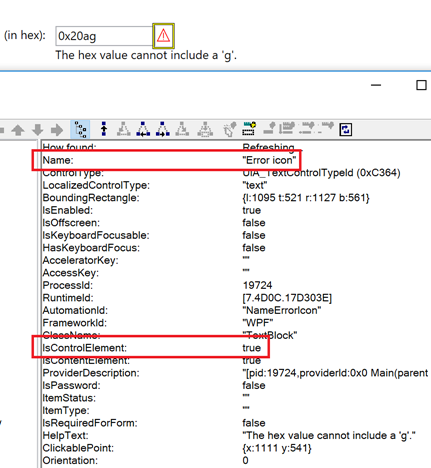
Figure 8: The Inspect SDK tool reporting that the error icon has a UIA Name property of "Error icon", and its IsControlElement property is True.
In general, if the framework makes it practical to remove purely decorative images and icons from the Control view of the UIA tree, then that action should be taken, in order to provide the most efficient experience as possible for your customers. If it is not practical to remove them from the Control view of the UIA tree, then give them helpful accessible names in order to convey their meaning to your customers. You may feel in some cases that it's not worth setting an accessible name on an image because the image isn't important to your customer, but how does your customer know that? If they encounter a nameless image, they can't know whether the image matters to them or not.
Important: While the code snippets in this post don't include the localization of strings, any UIA Name or HelpText property string must be localized just as any string presented visually is.
Summary
Validation of data supplied at a form is standard practice, and it's common for an icon to appear by a field when data entered at the field is not as expected. Sometimes a form field might always present some instructional text, with a description of exactly what "valid" input means at the field. But often the only way for a customer to learn what's valid, is through interaction with the helpful information that gets presented following the input of invalid data.
If your UI follows that model, consider how your customers can efficiently leverage that helpful information regardless of the following:
- The mechanism used for inputting at the device, including touch, mouse, or keyboard.
- The mechanism used for consuming information presented by the app, including visuals, or screen reader audio.
- Your customer has some level of color blindness, or uses a magnifier or high contrast theme when consuming the screen visuals.
Your customers might use some form of input or output mechanism that I've not explicitly called out in this post. For example, speech input or eye gaze input, and use of a braille device. But in general, if you've built UI which is fully accessible to customers using touch, mouse, or a keyboard, and for customers who are sighted or who use a screen reader, then your UI will also be accessible to customers who use other forms of input and output.
So next time you encounter a form field which shows an error icon with a tooltip, consider who's blocked from accessing that tooltip's helpful information.
And thanks for making sure that all your helpful information is efficiently accessible to all your customers!
Guy