Common approaches for enhancing the programmatic accessibility of your Win32, WinForms and WPF apps: Part 4 – WPF
This post describes some of the steps you can take to enhance the programmatic accessibility of your WPF app.
Introduction
By default, use standard WPF controls in your app, and leverage the work that the WPF UI framework can do to provide the foundation for an accessible experience.
While the accessibility of Win32 and WinForms UI is based on Microsoft Active Accessibility (MSAA) data, which UIA's MSAAProxy converts into UIA data, WPF is a native UIA provider. So the WPF Framework implements the UIA provider interfaces on your behalf, enabling UIA client apps like Narrator to interact with your UI.
Many standard WPF controls are accessible by default, with all the appropriate UIA properties, patterns, and events being supported by the WPF framework. For example, a WPF CheckBox control has a UIA Name property set from the text associated with the CheckBox, and it supports the UIA Toggle pattern, and raises UIA ToggleToggleStatePropertyChanged events when the toggle state changes.
The screenshot below shows the Inspect SDK tool reporting the UIA properties of a WPF CheckBox.
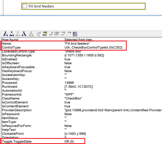
Figure 1: The Inspect SDK tool reporting the UIA properties of a WPF CheckBox.
Enhancing the default accessible experience
Because WPF is a native UIA provider, it was designed such that when you enhance the accessibility of your app, you work with WPF concepts that have a close mapping with UIA concepts. For example, if you want to customize the UIA ItemStatus property of an element, you would work with the WPF AutomationProperties.ItemStatus property.
Below are some of the ways that you can enhance the programmatic accessibility of your WPF app.
Enhancing the UIA properties of an element
Typically the WPF AutomationProperties class is used to customize specific UIA properties. Properties available through the WPF AutomationProperties class are as follows:
- AcceleratorKey
- AccessKey
- AutomationId
- HelpText
- IsColumnHeader
- IsOffscreenBehavior
- IsRequiredForForm
- IsRowHeader
- ItemStatus
- ItemType
- LabeledBy
- Name
Some of these AutomationProperties properties are really handy. A classic use is to customize the Name property of a button that shows a glyph rather than a text string. In addition, being able to add helpful supplemental information to an element through the HelpText property, or a current status through the ItemStatus property, can in some situations be a great way to enhance the accessibility of the UI.
Important: Strings exposed through such properties as Name and HelpText are localized in exactly the same way that strings shown visually are.
The AutomationId property can be used to help assistive technologies (AT) apps like screen readers, and also automation tests, easily find specific elements without having to search through the UI using localized strings such as Names.
Another property that can be particularly helpful in some scenarios is the LabeledBy property. This might be used with a control which has no directly associated label, (for example, a TextBox or ComboBox,) to have its UIA Name property set from another nearby element.
For example, the XAML below shows a TextBox having its accessible Name set from a nearby TextBlock.
<StackPanel Orientation="Horizontal">
<!-- Todo: Localize this label. -->
<TextBlock Name="BirdLabel">Bird:</TextBlock>
<TextBox Width="100" Height="20" AutomationProperties.LabeledBy="{Binding ElementName=BirdLabel}">Towhee</TextBox>
</StackPanel>
The screenshot below shows the Inspect SDK tool reporting the expected UIA Name property. If the AutomationProperties.LabeledBy attribute had not been set, then the TextBox would have no accessible name at all, and the customer using Narrator would not be informed of the purpose of the TextBox when they tabbed into it.
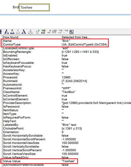
Figure 2: The Inspect SDK tool reporting that a WPF TextBox's UIA Name property is the same as the visual label associated with the TextBox.
By repurposing the existing visual label string to be the accessible name of the TextBox, we avoid the need to maintain two strings, and the related localized costs.
I've not seen the other AutomationProperties properties used as much as the ones I've called out above. (And it's worth noting that setting the AccessKey property doesn't result in the full access key support being added, as it would do with a UWP XAML app in the Windows 10 Creators Edition.)
Further enhancement of an element's UIA properties and patterns
While the AutomationProperties class is one of the first things we'd consider when customizing the accessibility of a WPF app, sometimes it isn't sufficient to achieve the desired results. For some customization of UIA properties or UIA pattern support, we need to turn to WPF AutomationPeers.
A standard control in WPF is accessible through its associated AutomationPeer. For example, a Button control is accessible because it has a ButtonAutomationPeer. By creating your own custom AutomationPeer for a control, you can enhance that control's accessibility.
Typically your custom AutomationPeer would derive from a standard control's AutomationPeer, because you'd want to leverage as much support for accessibility as possible from WPF itself. The code below is how all my custom AutomationPeers start.
public class MyControl : <Some standard control>
{
protected override AutomationPeer OnCreateAutomationPeer()
{
return new MyControlAutomationPeer(this);
}
}
public class MyControlAutomationPeer : <The standard control's AutomationPeer>
{
public MyControlAutomationPeer (MyControl owner) : base(owner)
{
}
}
For example, say you have a "Font Color" button, which visually shows a color indicating what the current font color is. You implemented the Font Color button using a standard WPF Button control, and by doing so, the button's keyboard accessible by default. Given that due to the way that this particular button's defined, it has no accessible name by default, so you used AutomationProperties.LabeledBy to have the accessible name of the button set from the TextBlock shown within the button.
So you ended up with the following XAML:
<Button Width="100" Height="20" AutomationProperties.LabeledBy="{Binding ElementName=FontColorButtonLabel}">
<Button.Content>
<StackPanel Orientation="Horizontal">
<!-- Todo: Localized this label. -->
<TextBlock Name="FontColorButtonLabel" Text="Font Color" />
<Rectangle Width="16" Height="16">
<Rectangle.Fill>
<SolidColorBrush Color="Green" />
</Rectangle.Fill>
</Rectangle>
</StackPanel>
</Button.Content>
</Button>
The screenshot below shows the Inspect SDK tool reporting the accessible name of the button.
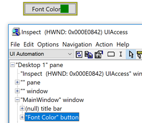
Figure 3: The Inspect SDK tool reporting the UIA Name property of a WPF Button.
While the button is accessible in many ways, there's a big gap in its accessibility; the current font color shown visually on the button, is not conveyed programmatically through UIA. One option here would be to consider the current color as being a current Value property of the button. To expose a value through UIA, we need to update the button to support the UIA Value pattern.
There are three parts to adding support for a UIA pattern to a custom AutomationPeer:
- Inherit from the related provider interface.
- Override GetPattern() and return an object that implements the pattern.
- Implement the pattern.
The code below shows partial support or the UIA Value pattern being added to a WPF Button control. Notice that the custom AutomationPeer derives from a ButtonAutomationPeer, and so gets lots of accessibility for free.
public class MyValueButtonAutomationPeer : ButtonAutomationPeer, IValueProvider
{
private MyValueButton _owner;
public MyValueButtonAutomationPeer(MyValueButton owner) : base(owner)
{
_owner = owner;
}
public override object GetPattern(PatternInterface patternInterface)
{
if (patternInterface == PatternInterface.Value)
{
return this;
}
return base.GetPattern(patternInterface);
}
// Implement the UIA Value pattern.
// Todo: Connect up the visual representation and the programmatic representation.
public string Value
{
get
{
return _owner.Value;
}
}
public bool IsReadOnly
{
get
{
return false;
}
}
public void SetValue(string value)
{
string oldValue = _owner.Value;
_owner.Value = value;
// Raise a UIA property changed event whenever the Value changes.
this.RaisePropertyChangedEvent(ValuePattern.ValueProperty, oldValue, value);
}
}
I said this adds "partial" support, because in most UI's the customer can set the current value by interacting with the control's visuals. The snippet above has no connection between the visual and programmatic representation, and in most cases, that would need to be added.
The screenshot below shows the Inspect SDK tool reporting the current value of the Font Color button.
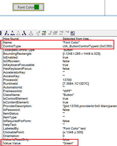
Figure 4: The Inspect SDK tool reporting a custom UIA Value property being exposed by a WPF Button control.
Support for other UIA patterns can be added in a similar way to that shown above for the Value pattern.
In some cases, you might want to use a custom AutomationPeer to customize certain UIA properties which are not accessible through the AutomationProperties class.
To demonstrate this, I've just created a useless custom control with the following XAML and code-behind:
<!-- Todo: Localize the accessible name. -->
<local:MyCustomControl AutomationProperties.Name="Sunflower seed"/>
public class MyCustomControl : Control
{
protected override AutomationPeer OnCreateAutomationPeer()
{
return new MyCustomControlAutomationPeer(this);
}
}
public class MyCustomControlAutomationPeer : FrameworkElementAutomationPeer
{
private MyCustomControl _owner;
public MyCustomControlAutomationPeer(MyCustomControl owner) : base(owner)
{
_owner = owner;
}
}
Let's assume that when you build your own custom control, it has accessible visuals and it's keyboard accessible, and it actually does something useful.
If I point the Inspect SDK tool at my useless control, then I'm told that the control has a name of "Sunflower seed", but the UIA LocalizedControlType is "custom". The string "custom" is the default English string provided by UIA when it encounters an element whose UIA ControlType is UIA_CustomControlTypeId. A LocalizedControlType string of "custom" really isn't very helpful to my customer, but UIA can't know the true meaning of the control. Unfortunately a number of apps have shipped with this experience over the years.
So this is where we can provide a much more informative string to the customer, through a custom AutomationPeer. By overriding the AutomationPeer's GetLocalizedControlTypeCore(), the customer can know when they've encountered, (in this example,) a bird feeder control.
protected override string GetLocalizedControlTypeCore()
{
// Todo: Localize this!
return "Bird feeder";
}
The screenshot below shows the Inspect SDK tool reporting the custom LocalizedControlType set through the AutomationPeer.
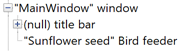
Figure 5: The Inspect SDK tool reporting a LocalizedControlType of "Bird feeder".
There's quite a variety of UIA properties which can be set through the AutomationPeer, and it can be interesting to consider what sort of enhancements might help your customers. For example, say I have a control which by default is being exposed through the Control view of the UIA tree. Because it's in the Control view, a customer using Narrator can encounter it. In some cases, the control itself might be a custom control which only exists as a container for other controls of more interest to my customers, and I don't want the custom control itself to be exposed to my customers using Narrator. Rather I just want its content to be exposed.
In that case, I might want my control to only be exposed through the Raw view of the UIA tree. By adding the code below to my AutomationPeer, I'm removing the control from the Control view and the Content view of the UIA tree, and so effectively removing it from the Narrator experience.
protected override bool IsControlElementCore()
{
return false;
}
protected override bool IsContentElementCore()
{
return false;
}
A note on ListViews, GridViews and DataGrids
While many not-customized standard controls will be programmatically accessible by default, the more intricate list- and grid-related controls warrant especially close scrutiny. You'll want to point the Inspect SDK tool at the related items in your UI, to verify that the UIA representation of the elements is as your customers need it to be.
The accessible name of a ListViewItem
Depending on how a ListView is generated, sometimes action is needed to set appropriate accessible names on the items in the ListView. (And sometimes it can be tempting to bind the items' AutomationProperties.Name in an ItemContainerStyle property setter, but that isn't supported in WPF.) Often the most straightforward approach to set the accessible name is to override the ToString() of the item's view model. (The same is true for GridViews.)
Making sure your sortable columns are accessible
With some controls, it's straightforward to make the contained columns sortable. However, sometimes this is only accessible to a customer using touch or a mouse by default, and a customer using a keyboard cannot change the sort order. Sometimes this can be remedied by using a ColumnHeaderStyle property setter to make the header focusable. Once the header is focusable, your customer can tab into a column header, and press the Enter or Space key to change the sort order.
The code below shows how to do this with a DataGrid.
<DataGrid ColumnHeaderStyle="{StaticResource KeyboardFocusableHeaderStyle}" … >
…
</DataGrid>
<Application.Resources>
<Style x:Key="KeyboardFocusableHeaderStyle" TargetType="DataGridColumnHeader">
<Setter Property="Focusable" Value="True" />
</Style>
</Application.Resources>
However, even when a customer using a keyboard can change the current sort order, that sort order might not be conveyed programmatically. So your customer using Narrator isn't informed on which column is sorted, and whether it's sorted ascending or descending.
One approach which can help here is to have the current sort order conveyed through a UIA property of the header element. The code below shows how the AutomationProperties.ItemStatus property is used to convey the sort order when the sort order in a GridView changes, and also how to raise a related UIA event to notify UIA client apps like Narrator.
// Get the current UIA ItemStatus from the header element.
string oldStatus = AutomationProperties.GetItemStatus(header);
// Set some sample new ItemStatus here...
string newStatus = "Descending sort"; // <- Todo: Localize this!
// Now set the new UIA ItemStatus on the header element.
AutomationProperties.SetItemStatus(header, newStatus);
// Having just set the new ItemStatus, raise a UIA property changed event. Note that the peer may
// be null here unless a UIA client app such as Narrator or the AccEvent SDK tool are running.
GridViewColumnHeaderAutomationPeer peer = FrameAutomationPeer.FromElement(header) as GridViewColumnHeaderAutomationPeer;
if (peer != null)
{
peer.RaisePropertyChangedEvent(AutomationElementIdentifiers.ItemStatusProperty, oldStatus, newStatus);
}
Using the above code, I can tab to a header, hear details about that header, and then move to another header and press the Spacebar to change the sort order. Sample Narrator announcements while I do this are as follows:
Tab
Table Customers, First Name, header item,
Right Arrow
Last Name, header item,
Space
Last Name Descending sort
Exposing a custom accessible name for a grid cell
For cells showing visual text, that text will get exposed by WPF as some UIA property. For cells that have been customized to show only an image, then there may be no text available for WPF to leverage. This can leave the accessible name of the cell empty, and that could render the grid unusable.
One option here is to consider using a style setter to set the AutomationProperties.Name property. (A similar approach could be taken for other properties such as HelpText.)
The code below shows how to set the accessible name of the cells in the first column in a grid.
<DataGrid Name="DG1" ItemsSource="{Binding}" AutoGenerateColumns="False" SelectionUnit="Cell">
<DataGrid.Columns>
<DataGridTextColumn Header="Status" Binding="{Binding IsLoading}" CellStyle="{StaticResource MyCellStyle}" />
<DataGridTextColumn Header="First Name" Binding="{Binding FirstName}"/>
<DataGridTextColumn Header="Last Name" Binding="{Binding LastName}" />
</DataGrid.Columns>
</DataGrid>
<Style x:Key="MyCellStyle" TargetType="DataGridCell">
<Setter Property="AutomationProperties.Name" Value="{Binding IsLoading, Converter={StaticResource MyIsLoadingToAccessibleNameConverter}}"/>
</Style>
<local:MyIsLoadingToAccessibleNameConverter x:Key="MyIsLoadingToAccessibleNameConverter"/>
public class MyIsLoadingToAccessibleNameConverter : IValueConverter
{
public object Convert(object value, Type targetType, object parameter, System.Globalization.CultureInfo culture)
{
bool isLoading = (bool)value;
// Todo: Localize this.
return isLoading ? "Loading" : "Not loading";
}
public object ConvertBack(object value, Type targetType, object parameter, System.Globalization.CultureInfo culture)
{
return new NotImplementedException();
}
}
The code below shows how to set the accessible name for the header in the first column.
<DataGrid ...>
<DataGrid.Columns>
<DataGridTextColumn ...>
<DataGridTextColumn.HeaderStyle>
<Style TargetType="{x:Type DataGridColumnHeader}">
<Setter Property="AutomationProperties.Name" Value="Localized header accessible name" />
</Style>
</DataGridTextColumn.HeaderStyle>
</DataGridTextColumn>
<DataGridTextColumn ... />
<DataGridTextColumn ... />
</DataGrid.Columns>
</DataGrid>
Making a ListViewItem programmatically invokable
Say you want to add support for the UIA Invoke pattern to ListViewItems. This follows a similar approach to that shown earlier for adding pattern support to AutomationPeers, but in the case of ListViews, CreateItemAutomationPeer() would be overridden.
The following code shows how to add support for the Invoke pattern to items in a WPF ListView.
public class MyInvokableListView : ListView
{
protected override AutomationPeer OnCreateAutomationPeer()
{
return new MyInvokableListViewAutomationPeer(this);
}
}
public class MyInvokableListViewAutomationPeer : ListBoxAutomationPeer
{
public MyInvokableListViewAutomationPeer(MyInvokableListView owner) : base(owner)
{
}
protected override ItemAutomationPeer CreateItemAutomationPeer(object item)
{
return new MyInvokableListViewItemAutomationPeer(item, this);
}
}
public class MyInvokableListViewItemAutomationPeer : ListBoxItemAutomationPeer, IInvokeProvider
{
public MyInvokableListViewItemAutomationPeer(object owner, SelectorAutomationPeer selectorAutomationPeer) :
base(owner, selectorAutomationPeer)
{
}
public override object GetPattern(PatternInterface patternInterface)
{
if (patternInterface == PatternInterface.Invoke)
{
return this;
}
return base.GetPattern(patternInterface);
}
public void Invoke()
{
// TODO: Take action in response to the item being invoked.
}
}
The resulting ListViewItems support the UIA Invoke pattern in addition to the UIA SelectionItem pattern that they already supported.
Raising a UIA event which is not natively supported by WPF
I think it's very unusual for you to want to do what I'm about to say, but in case you find it could help your customers, I'll say it anyway.
WPF provides a way for AutomationPeers to raise UIA events. For example, you may have a custom control which simulates keyboard focus moving between elements contained within it. So as keyboard focus appears to move, you call RaiseAutomationEvent() off your element's AutomationPeer, passing in AutomationFocusChanged to let screen readers know of focus-related changes occurring in the UI. (And you could call RaisePropertyChangedEvent() if a UIA property has changed on the element.)
But say you want to raise a UIA event which WPF doesn't support. Like I said, I think it's unlikely that you will want to do this, but let's say you have a very valid reason. In that case, you could consider using interop to raise the event.
The following example has a WPF app raise a SystemAlert event, despite WPF not supporting that event. (A SystemAlert event would not really get raised by an app, but rather by some system UI.)
public class AlertTextBlock : TextBlock
{
AlertTextBlockAutomationPeer peer;
protected override AutomationPeer OnCreateAutomationPeer()
{
this.peer = new AlertTextBlockAutomationPeer(this);
return this.peer;
}
public void RaiseSystemAlert()
{
if (this.peer != null)
{
// Have the AutomationPeer for this element raise the UIA event.
peer.RaiseSystemAlertEvent();
}
}
}
public class AlertTextBlockAutomationPeer : TextBlockAutomationPeer
{
AlertTextBlock AlertTextBlock;
IRawElementProviderSimple reps;
public AlertTextBlockAutomationPeer(AlertTextBlock owner) : base(owner)
{
this.AlertTextBlock = owner;
}
public void RaiseSystemAlertEvent()
{
// Get the IRawElementProviderSimple for this AutomationPeer.
if (this.reps == null)
{
AutomationPeer peer = FrameworkElementAutomationPeer.FromElement(this.AlertTextBlock);
if (peer != null)
{
reps = ProviderFromPeer(peer);
}
}
if (this.reps != null)
{
// Call the native UiaRaiseAutomationEvent to raise the event.
NativeMethods.UiaRaiseAutomationEvent(this.reps, 20023 /*UIA_SystemAlertEventId*/);
}
}
}
public class NativeMethods
{
[DllImport("UIAutomationCore.dll", EntryPoint = "UiaRaiseAutomationEvent")]
public static extern int UiaRaiseAutomationEvent(IRawElementProviderSimple element, int eventId);
}
I can then add the custom AlertTextBlock to my XAML:
<local:AlertTextBlock x:Name="StatusTextBlock" />
And whenever I set the text on the TextBlock, I raise the event.
// Todo: localize this.
StatusTextBlock.Text = "Internet connection vanished during transaction.";
StatusTextBlock.RaiseSystemAlert();
It might seem tempting to use the above approach to have a LiveRegionChanged event raise when some status string is updated in the app. But that's not useful unless the UIA LiveSetting property is also supported, and it's a lot of work to add support for that to a WPF app.
Summary
Say you have WPF UI, and you want to enhance its accessibility. Consider the following options:
- Replace custom UI with a standard WPF control which is accessible by default. Perhaps the custom UI isn't really essential.
- Consider whether the AutomationProperties class can provide essential information like a UIA Name for a button which shows no text visually, or provide supplemental information like UIA HelpText or ItemStatus.
- Consider whether a custom AutomationPeer can be used to add support for specific UIA patterns to your UI, or to set useful UIA properties not accessible through the AutomationProperties class.
- Examine the UIA representation of your list- and grid-related UI, and consider if style property setters might help make that UI more accessible.
- If you need to raise an event to make a screen reader aware of a change in your UI, call RaiseAutomationEvent() or RaisePropertyChangedEvent().
Thanks for helping everyone benefit from all the great features of your WPF app!
Guy
Posts in this series: