The accessibility of Sight Sign – an eye-gaze controlled app for writing a signature with a robot
This post describes accessibility-related considerations for a simple app which was built to allow eye-gaze input to trigger control of a robot. Particular attention was paid to any customization made to the app visuals, such that all customers, regardless of how they interact with their device, can fully and efficiently interact with the app.
Introduction
Many years ago, my mum had MND/ALS. I remember visiting my mum and dad and watched them have to deal with a letter from some organization, which asked my mum to sign a letter. My mum was paralyzed, and so physically signing a letter wasn’t an option. And as my dad tried to explain the situation to the organization, it boiled down to my mum and dad having to try to figure out what to do. This was one more thing for them to have to deal with.
So it was of great interest to me last year to be told that Microsoft Research (MSR) was working on a project with Team Gleason, related to writing a signature. The goal would be that Steve Gleason would use eye-gaze technology to interact with an app on his Surface device, and that app would control a robot which would sign an NFL jersey. MSR has great expertize in eye-gaze and robot technology, and it was a privilege for me to have an opportunity to contribute to the building of the app running on the Surface.
The app is shown in the following two videos: Steve signing a Gleason jersey, Steve Gleason autographs a jersey with his eyes.
While a number of different interaction models were considered, the final app had two buttons which could be used to have the robot write the signature. One button was labeled “Stamp” which when invoked would have a dot shown at the start of the signature, and when that dot was invoked, the entire signature was sent to the robot. The second button was labeled “Write”. When that button was invoked, the dot would wait to be invoked at the start and end of each ink stroke.
The app is now open source, and can be downloaded through the link at Sight Sign: a Windows app.
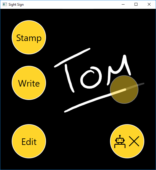
Figure 1: The Sight Sign app showing a signature saying “Tom” and is underlined. A translucent dot is tracing out the signature.
Having built the app, we wanted to review the steps that we took relating to the accessibility of the app itself. Any app should be efficiently usable by all people, regardless of how they interact with their device. For example, can the app be used by someone using Windows Speech Recognition and who’s also blind?
So the question is: Is the Sight Sign app accessible?
What accessibility did we get for free?
One of the most important aspects of building an accessible app is making sure we leverage what the Windows platform can do for us around making our UI accessible with no specific work on our part. So by default, I always use standard controls that come with the UI framework that I’m using to build the app. For example, if I add a button to the app, I use the Button control that comes with the framework. This means the button will be keyboard accessible and programmatically accessible, and will respect high contrast themes.
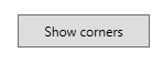
Figure 2: A button in the app’s Settings page is fully accessible by default.
Often it’s only when we start customizing the UI, that the question of accessibility becomes an issue. So rather than list the ways in which the app is accessible, it’s probably more interesting to consider how the app was not accessible by default due to specific customizations we made.
Some notes on the accessibility of the app, which were made as the project wrapped up last year, are at The Accessibility of the Sight Sign app.
Where did the app need specific attention regarding accessibility?
While Windows provided the app with a lot of accessibility by default, some explicit action was taken on our part to enhance the accessibility of the app. Sometimes where this work is required, devs might feel that the work should not be necessary. That is, any app should be accessible by default. Full stop.
But technology just hasn’t reached that point yet. Sometimes some specific step is required due to a constraint in the platform, (such as that described in the “Keyboard accessibility” section below,) and the dev’s feeling that some explicit action on their part shouldn’t be necessary, is fair enough. In other cases the action on the dev’s part might be required because the platform can’t really be expected to be able to guess the best experience for the customer, and you as the dev are best suited to tune the experience to be as helpful as it can be.
The sections below spotlight some of the most interesting aspects of the accessibility of the app.
Input method
Standard Button controls were used in the app, as they could be controlled by the eye-gaze technology used by Microsoft Research. So by default, those buttons could also be invoked through a range of different input methods. These included keyboard, mouse, touch and Windows Speech Recognition (WSR).
So overall, this was exactly what I wanted to have happen. We didn’t want to have to use controls that only responded to eye-gaze input.
In my experiments with WSR control of the app, I did hit one behavior that I’d not expected. First I’d say “Click Stamp” to have the Stamp button invoked, and then I’d say “Click dot” to click the dot at the start of an ink stroke, and have it animate to the end of the stroke. Up to this point, everything had behaved as I expected. But if I then said “Click dot” again to click the dot at its new location, WSR would try to interact with it at its earlier location, and my attempt to click it at its new location didn’t work. In order to account for this, I would say “Refresh speech commands”. In response to that, WSR would refresh whatever cached data it had about the dot button, and I could then successfully invoke it with “Click dot”.
By the way, it’s worth pointing out how the app had not been designed to have ink strokes written directly through eye-gaze input. Instead ink could either be loaded from an XML file containing point data, or laid down directly in the app with a pen. In either case eye-gaze input would then be used to have the ink point data sent to the robot such that the robot would write the signature.
Keyboard accessibility
The app was not designed to be able to lay down ink with the keyboard. But it was designed such that all other aspects of the app should be fully keyboard accessible. In fact, it was assumed that by using standard Button controls in the app, it would be fully keyboard accessible by default, and no action would be required relating to keyboard accessibility.
As it happened, the app wasn’t quite keyboard accessible by default.
Because standard Button controls were used, I could use the tab key to move keyboard focus through all the buttons in the app, and could invoke them with the keyboard. The animating dot in the app was also just a Button control, so again, I could tab to the dot and invoke it when I needed too.
Important: This is a classic example of how a styled Button control made things so easy for me as a developer. I didn’t build a custom control which was presented visually as a dot, and then work to make it keyboard accessible and programmatically accessible. Instead I used a standard Button control which was already keyboard accessible and programmatically accessible, and I then styled it to appear visually however I needed it to appear.
But there was one keyboard-related issue that I wasn’t expecting. For a button to be keyboard accessible, not only must it be able to gain keyboard focus, I as a sighted user must be able to tell that it has keyboard focus. If I can’t tell when the button has keyboard focus, then I can’t know when I can invoke it with the keyboard. It turned out with the UI framework that the app was built with, (WPF,) the default keyboard focus feedback did not show up against the black background shown in the app. So in order to account for the black background, I took steps to define my own keyboard focus feedback that did show up against the background. I know the keyboard focus feedback could really do with being improved further, as it’s still not as conspicuous as I’d like it to be.
Note that this constraint with the keyboard focus feedback on the black background, does not apply to UWP XAML apps.
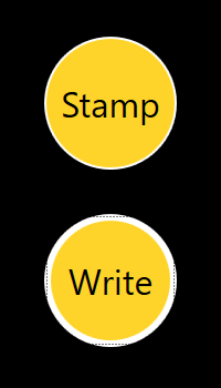
Figure 3: The Sight Sign app’s custom keyboard focus feedback when a button has keyboard focus.
High Contrast
As with other aspects of accessibility, Windows does a lot of work to have your app support high contrast by default. For example, when your customer makes a high contrast theme active, your standard buttons will change such that the colors used for the button text and button background are taken from the high contrast theme.
And importantly, this includes themes where your customer has specifically chosen whatever colors work best for them. Whenever we think of colors shown on buttons when a high contrast theme is active, we never think of colors such as black or white, but rather we think of the “button text color” and “button background color”. We don’t care what the RGB values of those colors happen to be.
So if we’d done nothing to customize the colors in the app, we wouldn’t need to take any specific steps around high contrast support. However, we had very deliberately taken steps to customize the colors shown in the Sight Sign app, and as such, we needed to account for that when a high contrast theme was active.
In this WPF app, it was really pretty straightforward to account for high contrast. Wherever we took action to show a custom color, (for example, on the app background or on some buttons,) we’d check whether a high contrast theme is active. If a high contrast theme is active, we’d show appropriate colors from the high contrast theme.
For example, when setting up the color to be used for the text shown on buttons, we’d take the action shown below. First the XAML for the button binds to a new “ButtonTextColor” property, and that color takes into account whether a high contrast theme is active.
<Button x:Name="StampButton"
Style="{StaticResource SimpleButton}"
Foreground="{Binding ButtonTextColor,
Converter={StaticResource ColorToSolidBrushConverter}}"
Content="Stamp" Click="StampButton_Click" Margin="0 0 0 40" />
public Color ButtonTextColor
{
get
{
return SystemParameters.HighContrast ?
SystemColors.ControlTextColor : _buttonTextColor;
}
set
{
_buttonTextColor = value;
}
}
By the way, having made a high contrast theme active, I got an interesting surprise relating to the ink shown. Firstly, the color of the ink automatically changed to be shown using the high contrast theme’s color for static text. For example, if I selected the “High Contrast #1” theme, the ink became yellow. That should really increase the likelihood that the ink is discernable against its background.
The second automatic change was that the translucent ink became 100% opaque. This was really interesting to me, as historically opacity has been the source of a number of bugs in high contrast. That is, devs are increasingly aware of the need to present visuals in appropriate colors when a high contrast theme is active, but if an element is shown with an opacity of less than 100%, it won’t be as high contrast as the customer needs it to be. So having the app’s translucent ink automatically change to be 100% opaque, was a helpful step for the platform to take.
Note that the translucency of the animated dot shown in the app did have to be accounted for in code, such that the dot was 100% opaque when a high contrast theme is active.
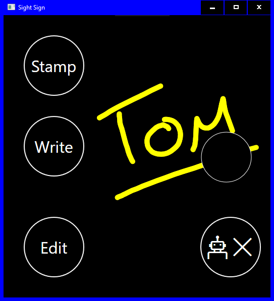
Figure 4: Buttons and ink respecting colors from the current high contrast theme, and the ink is automatically 100% opaque.
To illustrate how the Windows platform is always evolving and enhancing its support for accessibility, I was pointed recently to new ink functionality in the Windows 10 Creators Update. The app dev now has more explicit control over how their ink should appear when a high contrast theme is active. For example, perhaps it’d be most helpful to use the theme colors, or to use the app-supplied colors, or to use the theme colors only when there’s insufficient contrast with the app-supplied colors. I’ve yet to try that out myself, but I’m looking forward to giving it a whirl. It sounds pretty interesting stuff. More details are at InkHighContrastAdjustment.
Programmatic accessibility
The topic of the programmatic accessibility of the app was again important to me for personal reasons. A few years ago I spent a while working with someone who wanted to get familiar with steps for accessing his e-mail and with browsing the web. He had ALS, and was also blind. He would use a keyboard to control his screen reader, but I was conscious of how his physical abilities might change such that his ability to interact with his keyboard might be impacted.
On a side note, this was when I explored the idea of building an app which could help browse the web, where a screen reader would be controlled only through keys on a number pad. More details on that exploration are at How UI Automation helped me build a tool for a user who’s blind and who has MND/ALS.
And so this was an important reminder for me. We don’t built apps such that the app can be used either by someone who has a severe mobility impairment, or by someone else who is blind. We build apps such that the apps can be used by everyone, regardless of how they interact with their device. We build apps that someone who has severe mobility impairments and who’s blind, can use.
And to follow on from the theme running through this post, if the app uses standard button controls, those buttons will be programmatically accessible by default. For example, the Sight Sign app shows a button showing the text “Stamp”, and another button showing “Write”. When my customer moves the Narrator screen reader to these buttons, they’ll hear “Stamp, button” and “Write, button”. These buttons are accessible by default. Goodo.
However, there is a button which doesn’t show text, and instead shows a glyph representing a robot. The customer whose sighted doesn’t know the purpose of the button, but might assume it has something to do with the robot. If the button’s invoked, then the Settings window appears. So the button is indeed the “Settings” button, and one might say that the robot glyph should more clearly reflect that. Maybe that’s the case, but the programmatic experience can certainly make that clear.
The WPF framework, (along with UWP XAML, HTML, WinForms, and Win32,) provides a way for you to supply a helpful name to a button, and that’s what we did for the Settings button. We know exactly what the purpose of the button is, so we gave it the helpful, concise, unambiguous name of “Settings”. (If this was a shipping app, we’d be sure to localize it too.)
Now there’s another very important aspect of this button. It shows dynamic state information. Any important information conveyed visually on any element must also be conveyed programmatically to the customer. The button shows ‘X’ visually when the app’s not currently connected to the robot, and so Narrator must be able to convey that state to the customer. I do not want to overload the accessible name of the button to incorporate state information. The name of the button is “Settings” regardless of the app’s current state. So I do not want to set the name to be (say) “Settings, robot disconnected”.
Instead I’ll choose another UIA property to expose the state information on the button. For this app, I chose the UIA HelpText property. In retrospect, I probably would have preferred to use the UIA ItemStatus property, because the robot connection state is a status after all. Maybe I’ll update the app at some point to use the ItemStatus. Either way, Narrator can announce whatever text I supply through the HelpText or ItemStatus properties.
The code to set the Name and HelpText properties is shown below. The Name is set directly in the XAML, (which wouldn’t be done in a shipping app due to the need for the Name to be localized). The HelpText property is bound to a property exposed by the robot arm class, and the converter shown below returns text appropriate to the current connection state. (And again, a shipping app would use a localized string in the converter.)
<Button Grid.Row="1"
x:Name="SettingsButton"
AutomationProperties.Name="Settings"
AutomationProperties.HelpText="{Binding Arm.Connected,
Converter={StaticResource ArmConnectedToHelpTextConverter}}"
Style="{StaticResource SimpleButton}"
Foreground="{Binding ButtonTextColor,
Converter={StaticResource ColorToSolidBrushConverter}}"
Content="{Binding Arm.Connected,
Converter={StaticResource ArmConnectedToContentConverter}}"
FontFamily="Segoe MDL2 Assets"
FontSize="48"
Click="SettingsButton_Click" />
public class ArmConnectedToHelpTextConverter : IValueConverter
{
public object Convert(
object value,
Type targetType,
object parameter,
CultureInfo culture)
{
var armConnected = (bool)value;
return "Robot " + (armConnected ? "connected" : "disconnected");
}
public object ConvertBack(
object value,
Type targetType,
object parameter,
CultureInfo culture)
{
throw new NotImplementedException();
}
}
More information on the UIA Name and HelpText properties can be found at WPF AutomationProperties Class, and UWP XAML AutomationProperties Class.
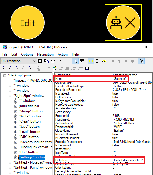
Figure 5: The Inspect SDK tool showing the UIA Name and HelpText properties exposed by the Settings button. The Name is “Settings” and the HelpText is “Robot is disconnected”, and both are highlighted in the screenshot.
Why the above changes alone leave the app woefully inaccessible
Ok, I can point the Inspect SDK tool to the buttons in the app, including the Settings button, and verify that the programmatic representation of the UI is as I expect. I can also move Narrator through the buttons, and verify that the announcements made are also as I expect. This is as far as we got when we uploaded the app as open source to github last year.
However, there was a serious omission in the accessibility of the app.
As a developer, there’s something I never want my customer to say when they’re using a screen reader and they invoke a button in my app. And that is: “Did anything just happen?”. If my customer triggers some action in the app, and the app doesn’t let them know what’s going on, then I’ve failed as a dev in my attempt to build an accessible app.
But with the changes described so far, the experience is as follows:
1. My customer tabs to the Write button, and Narrator announces the button.
2. They invoke the button. Narrator says nothing.
3. They tab around, find the dot, and Narrator announces the dot button.
4. They invoke the dot button. Narrator says nothing.
5. The dot animates to the end of the ink stroke, and stops, waiting to be invoked again. Narrator says nothing.
How often during that experience will my customer ask “Did anything just happen?”, and how likely is it that that customer will want to remain my customer?
So, before I can say that the app’s accessible, I need to have announcements made which tell my customer what’s going on.
One practical approach is to have a helpful UIA ItemStatus set for the button which my customer is currently interacting with. Narrator will announce an element’s ItemStatus when it moves to the element, and also will announce a change in the ItemStatus on the element that it’s currently interacting with. Details on the ItemStatus property can be found at ItemStatus for WPF, or ItemStatus for UWP XAML. And Narrator announcing an item’s status also mentions how the ItemStatus property can be used in a Win32 app.
For example, say my customer moves Narrator to the Write button. Narrator will announce “Write, button”. My customer then invokes the button, and in response the app shows the dot waiting at the start of the first ink stroke. If the app changes the ItemStatus of the Write button at that point to be “Dot waiting”, then Narrator will notice the change in the Write button’s ItemStatus, and say “Write Dot waiting”.
What’s more, the app can also set the ItemStatus property of the dot button, such that at any time the property reflects what the dot’s currently doing. This leads to the updated experience described below.
1. My customer tabs to the Write button, and Narrator announces the button.
2. They invoke the button. Narrator announces “Write dot waiting”.
3. They tab around, find the dot at the start of the first ink stroke. Narrator announces “Dot button <pause> dot waiting.”
4. They invoke the dot button. Narrator announces “Dot button, writing now”.
5. Shortly after that, the dot reaches the end of the ink stroke, and Narrator announces “Dot not writing”. My customer knows the app is now waiting for input, and so continues interacting with the app until the full signature has been sent to the robot.
So with the addition of the announcements, it becomes practical for my customer using Narrator to fully complete the action to have the app control the robot as required. The code below shows how the status property was changed on the dot button.
// Change the UIA ItemStatus property on the button.
AutomationProperties.SetItemStatus(dotButton, newStatus);
// Raise a UIA property changed event to let UIA client apps know of the change in status.
ButtonAutomationPeer peer =
(ButtonAutomationPeer)FrameAutomationPeer.FromElement(dotButton);
if (peer != null)
{
// Todo: Include the previous ItemStatus when raising this event.
peer.RaisePropertyChangedEvent(
AutomationElementIdentifiers.ItemStatusProperty, "", newStatus);
}
Note: I’ve experimented with the changes described above relating to the ItemStatus announcements, and verified that things seem to work as expected, but I’ve yet to update the Sight Sign app at github with these changes. I’ll do that as soon as I get the chance.
Conclusion
The Sight Sign app demonstrates three important points around building an accessible app:
1. Windows can provide your app with considerable accessibility by default, if you take advantage of the standard controls that come with the UI framework that you’re using.
2. Where you choose to customize the visuals of the standard controls used in your app, it can often be straightforward to account for that customization in such a way that your app is still fully accessible. For example, to always show theme colors when a high contrast theme is active, and to set accessible names and states on buttons which show no text strings visually.
3. If there are critically important changes in state that occur in the app, you can set state information on related element properties to make sure screen readers will make your customers aware of those changes.
The Sight Sign app was originally built for a specific scenario, and its feature set was very deliberate for a variety of reasons. You might feel that the app could be of interest to someone you know, but who might prefer to interact with the app in some other way. For example, perhaps the animating dot would continue along the ink stroke only while the mouse cursor is over the dot, or maybe you’d like ink to be dropped into the app in direct response to some particular form of input. The Sight Sign code is open source, and is waiting for you to experiment.
A key point in all this is that the goal is not simply to generate a signature. After all, it might already be practical for the customer to have a “Print” button invoked in (say) Word, and out comes a signature from the printer. The aim here is to help provide as much involvement in the signing process as practical for the person using the app. The person may prefer to invoke a Stamp button to have the entire signature sent to the robot, or to keep the cursor over the dot as it’s tracing the signature, or to drop ink directly. The point is that the customer is in control.
So if someone near you finds it a challenge to write their signature, please do consider whether a system based on Sight Sign has potential to help. To enable a family member to actively participate in signing a birthday card, is a powerful thing.
Guy