Ask Learn
Preview
Ask Learn is an AI assistant that can answer questions, clarify concepts, and define terms using trusted Microsoft documentation.
Please sign in to use Ask Learn.
Sign inThis browser is no longer supported.
Upgrade to Microsoft Edge to take advantage of the latest features, security updates, and technical support.
Note
Access to this page requires authorization. You can try signing in or changing directories.
Access to this page requires authorization. You can try changing directories.
This post describes a demo app that I recently built for a presentation on building accessible Windows apps. The post is followed by four follow-up posts related to questions arising during the presentation.
By the way, whenever you see a code snippet in the posts that contains something that looks like a chess piece, the original code didn’t contain the single Unicode character with that chess piece glyph. Rather, the code contained a string like “& #x265A;” (containing no spaces) and that gets shown has the Unicode later when uploaded in the post.
A couple of weeks ago I had the opportunity to chat with devs on the topic of building accessible UI. A key theme throughout the discussion was that by using standard controls that come with the UI framework, it may be significantly less work for you to deliver an accessible UI, relative to the work involved with making your own custom controls accessible.
For example, if you add a Button control, (be it XAML, HTML or Win32,) then in some cases you may have to take no specific steps for the button to be keyboard accessible and programmatically accessible, and for it to respect high contrast themes.
Having said that, one of the highest severity and common accessibility bugs you may find when examining an app under development, is the bug where a button has no accessible name. So your customer who’s using a screen reader will be made aware that there’s a button in the app, but won’t be told what the button does. I wouldn’t ship buttons that visually give no clue as to what the button does, and so I won’t do that for my customers who consume the UI through a programmatic interface.

Figure 1: An example of the importance of conveying the purpose of buttons.
So for this recent discussion, I built a demo app which presented four buttons. Each button presented a single Unicode character, and the glyph for that character looked like a particular chess piece. By default, many UI frameworks will repurpose any text that’s set on a button to be the button’s accessible name. That works great when the text is (say) “Save” or “Cancel”, but not so great when the text is a single Unicode character from some font with lots of cool glyphs in it. In that case the Narrator screen reader will pass the character to a Text-To-Speech (TTS) engine, and that TTS engine might say nothing.
As such, this is a case where I’ll want to add an accurate, efficient and localized accessible name to the buttons myself. So I updated the demo app to give two of the buttons useful accessible names.

Figure 2: The Inspect SDK tool reporting the accessible names of the buttons shown in the demo app.
In order to demonstrate the ways that I’d add an accessible name based on which UI framework I was using, I built five versions of the app. So the Visual Studio solution had a project for each of UWP XAML, UWP HTML, Win32, WinForms and WPF.
The sections below show the steps I took for each UI framework.
I added a unique x:Uid and an associated localized string for each button. This is a similar approach to the steps I would take for adding a localized string that would be shown visually on the button.
For example, in the page’s XAML:
<Button x:Uid="BlackKingButton" Content="♚" FontSize="100" Margin="10" />
And in the Resource.resw file:
<data name="BlackKingButton.AutomationProperties.Name" xml:space="preserve">
<value>Black King</value>
</data>
This version of the demo app broke a very fundamental rule of not hard-coding an English string in the UI. A shipping app would need to support localized accessible names using whatever mechanism that it uses for supporting localized visual strings.
<button id="BlackKingButton"
aria-label="Black King"
class="chessPieceButton">♚</button>
The demo app set the accessible name using the aria-label property. However, in general, guidance is that use of ARIA properties should be avoided if the same results can be achieved using HTML 5 without ARIA properties. I have achieved similar results in the past by using HTML such as:
<label for="BlackKingButton" hidden="hidden">Black King</label>
<button id="BlackKingButton" class="chessPieceButton">♚</button>
I used the handy SetHwndPropStr() for this. That function and SetHwndProp() can be used to set other properties too. For example, in order to have a UI change announced by making some Win32 UI an assertive LiveRegion, as described at How to have important changes in your Win32 UI announced by Narrator.
Near the top of the file:
#include <initguid.h>
#include "objbase.h"
#include "uiautomation.h"
IAccPropServices* _pAccPropServices = NULL;
When the UI’s created:
HRESULT hr = CoCreateInstance(
CLSID_AccPropServices,
nullptr,
CLSCTX_INPROC,
IID_PPV_ARGS(&_pAccPropServices));
if (SUCCEEDED(hr))
{
// Assume the strings are always available...
WCHAR szButtonBlackKing[MAX_LOADSTRING];
LoadString(
hInst,
IDS_BLACKKING,
szButtonBlackKing,
ARRAYSIZE(szButtonBlackKing));
WCHAR szButtonWhiteQueen[MAX_LOADSTRING];
LoadString(
hInst,
IDS_WHITEQUEEN,
szButtonWhiteQueen,
ARRAYSIZE(szButtonWhiteQueen));
hr = _pAccPropServices->SetHwndPropStr(
GetDlgItem(hDlg, IDC_CHESSPIECE_BLACKKING2),
OBJID_CLIENT,
CHILDID_SELF,
Name_Property_GUID,
szButtonBlackKing);
if (SUCCEEDED(hr))
{
hr = _pAccPropServices->SetHwndPropStr(
GetDlgItem(hDlg, IDC_CHESSPIECE_WHITEQUEEN2),
OBJID_CLIENT,
CHILDID_SELF,
Name_Property_GUID,
szButtonWhiteQueen);
}
}
When the UI is being cleaned up:
if (_pAccPropServices != nullptr)
{
// We only added the one property to the hwnds.
MSAAPROPID props[] = {Name_Property_GUID};
_pAccPropServices->ClearHwndProps(
GetDlgItem(hDlg, IDC_CHESSPIECE_BLACKKING2),
OBJID_CLIENT,
CHILDID_SELF,
props,
ARRAYSIZE(props));
_pAccPropServices->ClearHwndProps(
GetDlgItem(hDlg, IDC_CHESSPIECE_WHITEQUEEN2),
OBJID_CLIENT,
CHILDID_SELF,
props,
ARRAYSIZE(props));
}
Setting the accessible name of the buttons in the WinForms app was done simply through the Properties window in Visual Studio. Localization of the accessible names follows the same approach as localization of strings shown visually in the app.
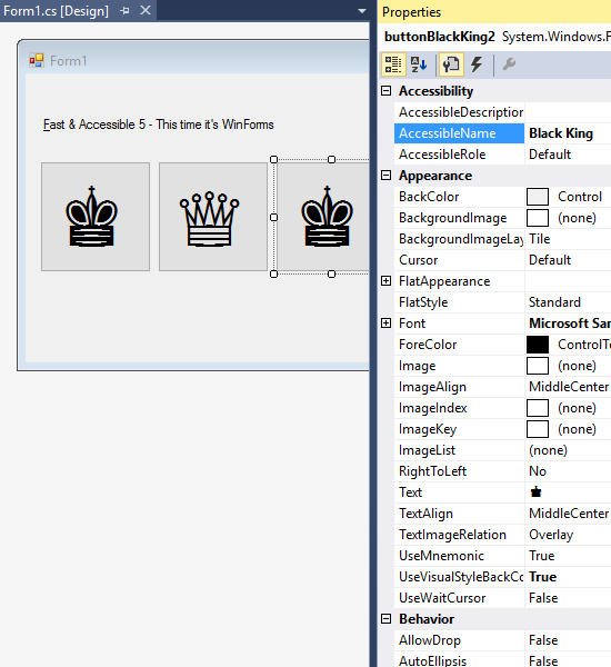
Figure 3: Adding a localized accessible name for a WinForms button via the Properties window in Visual Studio.
The demo app set the accessible names on the buttons in code, as shown here:
using System.Windows.Automation;
AutomationProperties.SetName(
BlackKingButton,
Properties.Resources.BlackKingButtonAccessibleName);
And in the localized resource file:
<data name="BlackKingButtonAccessibleName" xml:space="preserve">
<value>Black King</value>
</data>
Now, while the overarching message in all this is that standard controls are often a lot more accessible by default than custom controls, in some situations you may feel that it’s appropriate for you to build and present some custom control in your app. So in order to demo some of what the platform provides to help you make your custom UI accessible, I included a custom control in the demo app.
By adding the XAML and C# below, my app showed a chess piece that reacted to me prodding it.
<local:MyControl x:Name="CrimsonKing">
<TextBlock Text="♚" FontSize="100" Margin="10" Foreground="Crimson" />
</local:MyControl>
public class MyControl : UserControl
{
protected override void OnPointerPressed(PointerRoutedEventArgs e)
{
// Do something...
e.Handled = true;
}
}

Figure 4: A custom control shown in the demo app.
Of course, all I’d done is build UI which I as an individual can use, and that won’t do at all. While the crimson chess piece is visible enough for me, and I can physically touch the screen at that point, what about all my customers who use different methods of input or output at their device? My goal is to have all my customers efficiently leverage all the functionality in my app, regardless of how they interact with their device.
The custom control I’d built is woefully inaccessible. It can’t be used with a keyboard. It can’t be used with a screen reader. It won’t respect my customer’s choice of colors when a high contrast theme is active. There’s no way I’d ship this to my customers.
So if this was a shipping app, I’d take a step back and consider whether I should just ditch the custom control, and replace it with a styled button which has a Click event handler. By default a button’s Click event handler will get called when my customer invokes the button via touch, mouse, keyboard or programmatic access, and also when using access keys in the Windows 10 Anniversary Update. But in the interests of the demo, I decided to stick with the custom control, and take steps to improve its accessibility.
With the changes shown below I made my custom control as accessible as the other buttons in the app.
<local:MyAccessibleControl x:Name="CrimsonKing"
x:Uid="CrimsonKingButton"
IsTabStop="True"
UseSystemFocusVisuals="True">
<TextBlock Text="♚" FontSize="100" Margin="10"
Foreground="{ThemeResource CrimsonKingForeground}"
AutomationProperties.AccessibilityView="Raw"/>
</local:MyAccessibleControl>
<ResourceDictionary>
<ResourceDictionary.ThemeDictionaries>
<ResourceDictionary x:Key="Light">
<SolidColorBrush x:Key="CrimsonKingForeground"
Color="Crimson" />
</ResourceDictionary>
<ResourceDictionary x:Key="Dark">
<SolidColorBrush x:Key="CrimsonKingForeground"
Color="Crimson" />
</ResourceDictionary>
<ResourceDictionary x:Key="HighContrast">
<SolidColorBrush x:Key="CrimsonKingForeground"
Color="{ThemeResource SystemColorButtonTextColor}" />
</ResourceDictionary>
</ResourceDictionary.ThemeDictionaries>
</ResourceDictionary>
public class MyAccessibleControl : MyControl
{
protected override void OnPointerPressed(PointerRoutedEventArgs e)
{
// Do something...
e.Handled = true;
}
protected override void OnKeyUp(KeyRoutedEventArgs e)
{
if (e.Key == VirtualKey.Enter)
{
// Do something...
e.Handled = true;
}
}
protected override AutomationPeer OnCreateAutomationPeer()
{
return new MyAccessibleControlAutomationPeer(this);
}
}
public class MyAccessibleControlAutomationPeer :
FrameworkElementAutomationPeer,
IInvokeProvider
{
MyControl myControl;
public MyAccessibleControlAutomationPeer(MyControl owner) :
base(owner)
{
this.myControl = owner;
}
protected override object GetPatternCore(PatternInterface patternInterface)
{
if (patternInterface == PatternInterface.Invoke)
{
return this;
}
return null;
}
public void Invoke()
{
// Do something...
}
}
With the above changes, I could tab to the control and see visual feedback appear to let me know when the control had keyboard focus. And I could then press and release the Enter key to invoke the control.

Figure 5: Keyboard focus feedback showing on the custom control.
I could also point the Inspect SDK tool to the control, and see that it has a name and localized control type of “Crimson King” and “Chess piece” respectively, and then use Inspect to programmatically invoke the control.

Figure 6: Using the Inspect SDK tool to programmatically invoke the UWP XAML custom control.
Demo’ing the support that I’d added for high contrast themes became a lot more interesting than I expected when someone pointed out a gross accessibility bug in what I was showing. I demo’d how through the straightforward use of the “HighContrast” ResourceDictionary, my custom control would change to use whatever the system color is for button text when a high contrast theme is active. And indeed, it changed exactly as I expected.

Figure 7: The custom control using the system color for button text when a high contrast theme is active.
But what I’d missed when building the app, was that this meant that when this high contrast theme is active, a button showing a black king chess piece will look identical to a button showing a white king chess piece. That means the UI is completely broken when this theme is active. So for a shipping app, I must have some other way to differentiate the meaning of each button.
Having added support for the UIA Invoke pattern to my control’s custom AutomationPeer, I thought it might be handy to show how support for other patterns might also be added. So the code below shows some of what’s required to add support for other common UIA patterns.
// The custom AutomationPeer below supports the following patterns:
//
// Invoke
// ExpandCollapse
// Value
// Toggle
//
// An example of how to add support for the UIA Scroll pattern is at:
// https://blogs.msdn.microsoft.com/winuiautomation/2014/06/15/updating-the-explorable-map-to-add-support-for-scrolling-with-a-screen-reader/
public class MyAccessibleControlAutomationPeer :
FrameworkElementAutomationPeer,
IInvokeProvider,
IExpandCollapseProvider,
IValueProvider,
IToggleProvider
{
MyControl myControl;
public MyAccessibleControlAutomationPeer(MyControl owner) :
base(owner)
{
this.myControl = owner;
}
protected override object GetPatternCore(PatternInterface patternInterface)
{
if ((patternInterface == PatternInterface.Invoke) ||
(patternInterface == PatternInterface.ExpandCollapse) ||
(patternInterface == PatternInterface.Value) ||
(patternInterface == PatternInterface.Toggle))
{
return this;
}
return null;
}
// Invoke pattern.
public void Invoke()
{
myControl.DoSomething();
}
// ExpandCollapse pattern.
private bool _expanded = true;
public void Expand()
{
_expanded = true;
}
public void Collapse()
{
_expanded = false;
}
public ExpandCollapseState ExpandCollapseState
{
get
{
return _expanded ?
ExpandCollapseState.Expanded : ExpandCollapseState.Collapsed;
}
}
// Value pattern.
private string _value = "0";
public bool IsReadOnly
{
get
{
return false;
}
}
public string Value
{
get
{
return _value;
}
}
public void SetValue(string newValue)
{
_value = newValue;
}
// Toggle pattern.
private ToggleState _toggleState = ToggleState.On;
public ToggleState ToggleState
{
get
{
return _toggleState;
}
}
public void Toggle()
{
_toggleState = (_toggleState == ToggleState.On ?
ToggleState.Off : ToggleState.On);
}
}
The demo app also highlighted similar accessibility issues with a UWP HTML app. This time, rather than going out of my way to create my own custom control, all I had to do was add a div with a pointer event handler.
<div id="CrimsonKing" class="crimsonKing">♚</div>
var crimsonKing = document.getElementById("CrimsonKing");
crimsonKing.addEventListener(
"mousedown",
crimsonKingMouseDownHandler,
false);
Again the UI showed some visuals and would react to being prodded, but it was still unshippable due to the severity of its inaccessibility. This is a classic accessibility problem where a partially interactable div is being used instead of a button element. While by default I would consider replacing my use of div with that of button, for the demo app, I instead improved the UI’s accessibility with the changes shown below. (While this demo app does not use a localized string for the accessible name, a shipping app would certainly use a localized name.)
<div id="CrimsonKing"
class="crimsonKing"
aria-label="Crimson King"
role="button"
tabindex="0">♚</div>
var crimsonKing = document.getElementById("CrimsonKing");
crimsonKing.addEventListener(
"mousedown",
crimsonKingMouseDownHandler,
false);
crimsonKing.addEventListener(
"keyup",
crimsonKingKeyUpHandler,
false);
@media screen and (-ms-high-contrast)
{
.crimsonKing {
color: ButtonText;
border: solid;
border-width: 1px;
}
}
Sure enough, with those changes, I could tab to the UI and use the keyboard to invoke it, and the UI was shown using system colors when a high contrast theme was active, and I could use the Inspect SDK tool to programmatically invoke the UI.
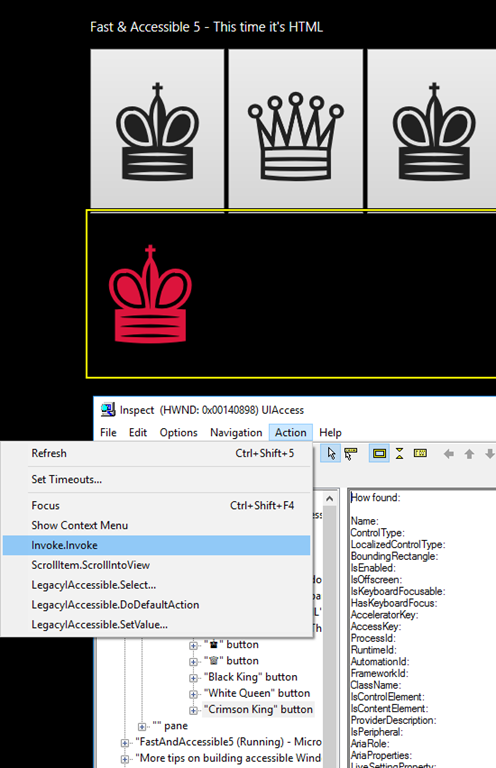
Figure 8: Using the Inspect SDK tool to programmatically invoke the UWP HTML app UI.
If at all practical, go with standard controls in the UI framework you’re using and benefit from whatever accessibility the related framework provides by default. Then, as required, enhance that default accessibility in whatever way you feel would help your customers. For example, add an accessible name for a control that visually shows only a single Unicode character, or provide high contrast visuals for a control which you’ve styled to use a collection of super-cool custom colors by default.
If you do decide to build your own custom controls, consider during the planning phase what work will be required by you to make those custom controls accessible. You’ll want to budget time for that work along with all the other work on your plate.
The remaining posts in this series relate to questions asked during the session which involved some investigation on my part afterwards in order to learn where things stand today. I found some of the outcomes of these investigations to be really exciting. Particularly the points about support for access keys and the default keyboard focus feedback in the Windows 10 Anniversary Update.
Guy
Posts in this series:
Follow-up #2: How do I have access keys shown on buttons in my UWP XAML app?
Ask Learn is an AI assistant that can answer questions, clarify concepts, and define terms using trusted Microsoft documentation.
Please sign in to use Ask Learn.
Sign in