Building accessible Windows Universal apps: Programmatic accessibility
This series of posts describes how to avoid some common accessibility bugs when building Windows Universal apps. This post focuses on bugs which affect customers who use screen readers and other assistive technology products.
How well do you really know your app’s UI?
Devs work hard to deliver an app that looks exciting and professional. There’ll be no misaligned buttons, no unexpected variation in font size or colors, everything looking balanced. That’s exactly as it should be, and it’s great for your sighted customers.
Your app’s also exposing a programmatic interface which will be consumed by your customers who use assistive technology products like the Narrator screen reader. This interface is channeled from your app to Narrator through the UI Automation (UIA) API, and the XAML and WinJS frameworks do lots of work to allow your app’s UI to be represented through UIA.
Exactly what’s in your app’s UIA representation is controlled by two things:
1. The default representation enabled by the UI framework.
2. Enhancements that you enable by providing additional data in your UI.
To give an example, say you have two buttons in your UI. One has the text “Learn more” set on it, and the other contains a FontIcon referencing some glyph that looks like an arrow pointing left. The image below shows how these buttons represent themselves visually.

Figure 1: Two buttons in an app. One button shows text, and the other shows a glyph.
I can point the Inspect tool that comes with the Windows SDK at that UI, and learn how the UI is being represented through the UIA programmatic interface.

Figure 2: The Inspect SDK tool reporting the programmatic interface for my UI.
Looking at the data reported by Inspect, I can see two elements in my UI which have a control type of “button”. This is good, as it matches my visual interface. In fact, Inspect also shows me there are two text elements between the buttons. I didn’t have to do anything to generate this programmatic interface, rather the XAML framework did all the work for me.
For one of the buttons, I can see that it has an accessible name of “Learn more”. This means when the Narrator screen reader encounters that button, it will say “Learn more, button”. My customer will know they’ve encountered a button, and the function of that button. And again, I didn’t have to do anything to enable that.
Things become more interesting when Narrator encounters the other button – the one showing the glyph. The framework only knows there’s a FontIcon containing some glyph, and doesn’t have a friendly text string to use for the name of the button. As such the accessible name is empty, and my customer will only hear “button” when Narrator encounters it.
To consider the impact of this, you’d ask yourself whether you’d ship buttons that are visually empty for your sighted customers. And of course that would be unthinkable. So this is a case where a little action is required on your part to fill in the blank. With two tiny tweaks in your code which will be described later, the button can be given a helpful accessible name.

Figure 3: The Inspect tool reporting that a button now has a helpful accessible name of “Back”.
By making adjustments like this, you can have a huge impact on the effectiveness of your app’s programmatic interface.
MSDN has a ton of stuff about UIA. Which of it relates to me?
UI Automation is a powerful thing. Say instead of building a XAML or WinJS app, you were using some graphics engine to render all sorts of shapes and images to the screen, (for example using DirectX.) Using UIA, you could programmatically define a hierarchical tree of elements which exposes all those shapes and images in a way that makes perfect sense to your customers who consume that programmatic interface. And if you were doing that, you could learn all sorts of helpful things at UI Automation Provider Programmer's Guide.
But when you’re building a XAML or WinJS app, you don’t need to do all that work. Instead the UI framework will build up the programmatic interface based on how you define your UI. The framework will take your XAML or HTML, and create the programmatic UIA interface for you. You can then enhance that interface as necessary by modifying your code. You might do that in your XAML app by using the AutomationProperties or AutomationPeer classes, and you might do it in your WinJS app by adding aria markup to your HTML.
So neither your XAML nor WinJS apps access the UIA provider API directly, (even though the very handy XAML AutomationPeer class was designed with the UIA interfaces in mind.) Some information around how XAML and WinJS app UI relates to their programmatic interfaces can be found at the following links.
Exposing basic information about UI elements (XAML)
Exposing basic information about UI elements (HTML)
The figure below shows how your XAML and WinJS apps are not implementing the UIA provider interface directly, but rather how the UI framework does that work for you. And it’s important to note that the arrows between the circles in the figure are double-headed. This is because not only does UIA allow your UI data to be exposed to your customer, but also allows your customer to indirectly control your UI programmatically.

Figure 4: Chart showing two-way communication between your app, the UI framework used by your app, UIA, the UIA client app such as a screen reader, and your customer.
And one more note on UIA – UIA cannot make an inaccessible app accessible. UIA channels the programmatic interface exposed by the UI framework, over to the UIA client app to present that interface in whatever way the client app feels is best for your customers. So your customers need a great programmatic interface by the time it’s sent down the UIA pipe by the UI framework.
The demo app
The Programmatic Access page of the app demonstrates four problems that I’ve seen repeatedly with apps under development. Three of those problems I consider serious, and the fourth is about raising the quality of an app from being “technically accessible” to being efficient to use.
The problems demonstrated by the app are as follows:
1. Buttons and other elements with no accessible names.
2. Buttons and other interactable controls that can’t be programmatically invoked.
3. Important information being hidden from the customer.
4. Redundant information being presented to the customer.

Figure 5: The Programmatic Accessibility page of the demo app.
Buttons and other elements with no accessible names
So you want your UI to be helpful and efficient, regardless of whether your customer consumes the UI through your visual or programmatic interface. Your UI exposes information about the properties of your UI through (the appropriately named) UIA “Properties”. Properties include such things as a UI element’s name, control type and bounding rectangle on the screen.
To help us consider the impact of what we expose through the programmatic interface, the image below shows four versions of visual buttons related to saving data to disk. The text shown visually for each of the buttons is:
1. The first button shows no text.
2. “Save”.
3. “Save button”.
4. “Save your current data to a file”.

Figure 6: Four buttons with different visual text content.
If you were to add a save-related button to your app, which version would you add? I doubt you’d add the one with the text “Save button”, as your sighted customers can already tell it’s a button. You probably wouldn’t add the one with “Save your current data to a file”, because most of your customers will find all that information redundant, and it clutters your UI. So that leaves the tough choice between the empty button and the one with “Save” in it.
You might feel I’m being frivolous here, as it’s obvious which button you’d add to your app. The reason why I raise the question is that many apps ship with all these versions of buttons in their programmatic interface. For example, a dev might feel a helpful name for a Save button is “Save button”, because after all, it is a Save button. But the programmatic interface also exposes a Control Type property, which in this case is a button control. So when a screen reader announces a button whose name is “Save button” to the customer, by speaking both the name and control type, the customer will hear “Save button button”. So the accessible name should not include the control type.
The customer will also not want to hear a long explanation about the purpose of the button every time they reach it. To hear “Save your current data to a file” every time is just going to get irritating. So keep the accessible name efficient, (usually matching the visuals shown on the button,) and provide other ways for the user to learn more about the functionality of the button. For example, through the UIA HelpText property also exposed by the Button through the programmatic interface, or through the app’s accessible documentation.
But the most severe and most common bug here is that apps ship with buttons that have no accessible name at all. This sort of inaccessible interface can render the app unusable to your customers.
It’s worth noting that we’re not just talking about buttons here. Anything that’s conveying important information to your customer, (which is almost everything in your UI,) will need to have an accessible name. For example, images, lists, list items and hyperlinks.
This is where I find the Inspect SDK tool absolutely essential. I can point it to my app’s UI, and learn where elements have been given accessible names just fine by the UI framework, and where I’m going to have to tweak things to make that happen.
The image below shows the Inspect tool being pointed to the first four buttons on the demo app’s Programmatic Access page.
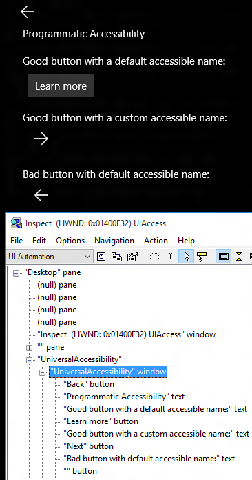
Figure 7: The Inspect tool reporting data exposed by the first four buttons on the page.
Only one of the buttons shows text visually, and the XAML framework has automatically exposed that text as the accessible name of the button. But the other three buttons show glyphs. The demo app sets accessible names on two of those buttons with two straightforward steps. Those steps are:
1. Add an x:Uid to the button.
2. Add a localized accessible name which can be referenced through that x:Uid.
For example for the “Next” button shown above:
XAML
<Button x:Uid="NextButton" …
Resource file:
NextButton.[using:Windows.UI.Xaml.Automation]AutomationProperties.Name “Next”
In many cases in your UI, these two steps are all you need to give your elements an accessible name. Sometimes other steps are required, and most of these are listed at this series of posts, Giving your XAML element an accessible name.
The last of the four buttons shown above has deliberately not had an accessible name set on it. When Inspect shows this in its view of the hierarchical tree of elements, it shows a pair of double quotes followed by the control type.
A note on localized properties
Accessible names must be localized. (Not all of your customers are as fluent in Welsh as you are.) If you’ve built your app from an SDK sample, you might find some accessible names that are hard-coded in English have been pulled in from the sample. Instances of that hard-coding should be replaced with localized strings before you ship your app all over the world.
The fact that accessible names are localized can impact your automated tests, as your test system might not have access to the localized resources. So another UIA property that can be exposed by your UI elements is the AutomationId. The AutomationId string is expected to be unique amongst all your UI shown at any given moment, and so is often what gets accessed by automated tests.
If your XAML element has an x:Name, then that value will be exposed by default through UIA as the AutomationId property of the element. That AutomationId value taken from the x:Name would be overridden if the XAML element also has an explicit AutomationProperties.AutomationId property set. If your element doesn’t have an AutomationId exposed through UIA and you want to add one, you’d add a AutomationProperties.AutomationId rather than an x:Name. There’s some overhead to adding an x:Name to an element, so you’d not add that just to get an AutomationId exposed through UIA.
Six things to know about the Inspect SDK tool
I couldn’t do my job without the Inspect SDK tool, but the tool does take some getting used to. Here are some things I’ve learned about it.
1. The Inspect tool does not run on the phone and cannot connect to UI running in the phone emulator. So use Inspect on the desktop to verify that all is well with your UI. The programmatic interface that you build on the desktop, will be the same on the tablet and phone.
2. Make sure you know what view of the UIA tree is being reported by Inspect. Some details on the “view” of the UIA tree can be found at I’ll say this only once - Your customers need an efficient experience. While I never look at the “Content” view, I do switch between the “Control” view and the “Raw” view. I must know which of the Control view and Raw view I’m looking at when using Inspect.
3. The tree hierarchy pane might be stale. The left pane in Inspect shows a tree hierarchy of UIA elements. If the app’s UI associated with that tree changes, Inspect’s UI does not automatically refresh. This means Inspect can be showing stale data. I use Inspect’s Shift+Ctrl+5 keyboard shortcut to refresh its UI.
4. The nodes in the hierarchy will by default show the “+” symbol to indicate that it can be expanded, regardless of whether it can actually be expanded or not. So if you click the “+”, some descendants might appear, or the “+” will simply vanish if there are no descendants.
5. You may see a number of elements with an accessible name of “.”. If a button visually shows a glyph, that might be implemented as a TextBlock showing some Unicode character with a particular font set. If so, the XAML framework might expose that text as the accessible name of the button in the same way it does for any text shown visually on the button. So if you see a button with an accessible name of “.”, that’s probably the glyph being exposed, and is as much help to the customer as a button with no name. So that button will need a helpful accessible name set on it.
6. Inspect has keyboard shortcuts for navigating through the UIA tree of elements. When dealing with transient flyouts in your app, you can’t go clicking in Inspect, as that’ll lead to your UI closing. I find the shortcuts Shift+Ctrl+F5/F6/F7/F8 really helpful here. That allows me to navigate all over the UIA tree in Inspect, without clicking anywhere.
Buttons and other interactable controls that can’t be programmatically invoked
So far, we’ve discussed how your UI exposes all its great information through your app’s programmatic interface. But because your app is fully programmatically accessible, your UI must also allow itself to be controlled programmatically. This is achieved by having your UI support UIA “Patterns”. A pattern lets UIA client apps like Narrator and Inspect learn about the behaviors that your UI supports, and to trigger those behaviors.
For example, a button will support the UIA “Invoke” pattern, and so the button can be programmatically invoked in the same way it can be invoked through touch, mouse or keyboard. And a scrollable list will support the “Scroll” pattern, and so the list can be programmatically scrolled in the same way it can be scrolled through touch, mouse or keyboard.
Important: The great thing here is that the standard controls provided by the UI framework support the typical patterns for free. If you add a Button control with a Click event handler, then it supports the UIA Invoke pattern. So by default, always use standard controls in your app, and style them however you want. Once you go down the road of using custom controls, you’ll find that a lot of required support for UIA patterns is missing, and you’ll have to add that support yourself.
More information about UIA patterns can be found at Does your XAML UI support the Patterns that your customer needs?
So first I’ll point Inspect to a standard button, and see that it claims to support the Invoke pattern. If the IsInvokePatternAvailable property is false, then I know it can’t be programmatically invoked.

Figure 8: Inspect showing that a standard button claims that it can be programmatically invoked.
So now that I know the button claims it can be programmatically invoked, I can use Inspect to actually try to programmatically invoke it.

Figure 9: Selecting the Invoke.Invoke command from Inspect’s Action menu to programmatically invoke a button.
And sure enough, when I do this, the button reacts in the same way as if I’d invoked it with touch, mouse or keyboard.
What does this mean to a customer who uses a screen reader like Narrator? When Narrator is running on a touch device, all input to your UI is made programmatically. So if your button can be programmatically invoked, then your customer using Narrator on a touch device will be able to invoke it.
Now let’s take a look at the sort of button which ships and cannot be invoked by your customer using Narrator through touch.

Figure 10: A button which cannot be invoked by a customer using Narrator through touch.
This sort of inaccessible button often ships because it was only tested using touch or mouse. It can be invoked fine through touch and mouse because it has a PointerPressed or Tapped event handler on it. But that event handler doesn’t get called when a UIA client app tries to programmatically invoke the button. If I point Inspect at the button, I can see that it’s not a button at all. It’s just some text with a border, and it doesn’t support the UIA Invoke pattern. So when I added this button, the only customers I considered were those who are sighted and can use touch or a mouse. This will not do.

Figure 11: Inspect showing that what looks like a button visually is not really a button at all.
Instead, I should have added a standard Button control, and styled it however I want. That’s good for me, and good for all my customers regardless of how they interact with their device.
Important information being hidden from the customer
So far we’ve seen how your programmatic interface will convey all the important information in your app’s UI, and how it allows your customers to programmatically control the app. The next very important piece in all this is to let your customers know when your UI is changing.
Say you show a “Download” button in your UI. This button is so important, that if the download experience is broken, no-one would use your app. Your customer understands the incredible value that your app brings to them, and with great excitement invokes the Download button. In response, your app shows some progress UI, and your customer gets even more excited. But then your device suddenly loses network connectivity. Your app handles this gracefully and presents the text “Your device has lost network connectivity. Please try the download again when your device has network connectivity”. Your customer is momentarily heartbroken, but soon realizes that this wasn’t your app’s fault. In fact, they really appreciate how your app let them know exactly what the problem is as soon as it happened. They still love your app.
At least your sighted customers do.
How would that sighted customer feel if they invoked the Download button, and nothing happened at all on the screen? They’d first wonder if they invoked the button at all, and probably try invoking it again. And again. Some may then hope a download had begun, and wait for a while. And a while longer. Eventually they’d decide the download never happened, uninstall the app, and look for another app that might actually be some use to them.
Obviously you’ve never ship this experience for your sighted customers, but this is the sort of experience that apps ship for customers who use screen readers. What the apps really want to do is make their current status known to all your customers. As such, the app needs to let screen readers like Narrator know when something important’s going on.
This is done through the use of UIA “Events”. For example, a FocusChanged event allows Narrator to know when keyboard focus has moved from one control to another, and a PropertyChanged event allows Narrator to know when the text shown on the button with keyboard focus has changed. Again the UI framework is doing a lot of work for you here. The framework raises many UIA events automatically to allow the customer who’s using a screen reader to know what’s going on.
But for scenarios like the one described above, it is necessary for you to take specific action to make sure your customer knows about the critical information being shown visually on the screen. This can be done through the use of “Live Regions”. More information about these can be found at Let your customers know what's going on by leveraging the XAML LiveSetting property.
The demo app illustrates this by showing progress UI and then a visual text string, in response to a button being invoked. By default, no UIA events relating to that progress UI or text string are raised in such a way that Narrator will announce that UI to my customer.
If, however, a nearby checkbox is checked in the demo app, then the app raises LiveRegionChanged events when the progress UI appears and later when the text appears. I can use the AccEvent SDK tool to verify that the events are getting raised as expected.
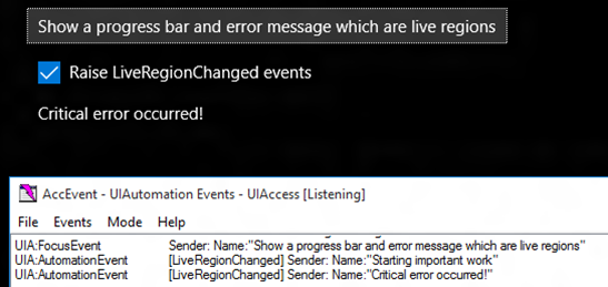
Figure 12: The AccEvent SDK tool showing that the demo app is raising LiveRegionChanged events when important visual changes are occurring in the UI.
And so when I use Narrator to invoke the button, I hear “Starting important work”, and a few seconds later, “Critical error occurred!”
Redundant information being presented to the customer
So far we’ve talked about how your customer must have access to all the important information presented visually in your app. That’s fundamental accessibility. But what happens if the app is exposing duplicate or redundant information? For example, you wouldn’t ship an app which had the text contained within a button repeated visually after the button.

Figure 13: Buttons with their contained text repeated visually after the buttons.
Perhaps someone might say, “What’s the big deal? My customer can still reach the buttons they need to reach”. But you wouldn’t say that, because the visuals are confusing, and degrade the quality of the UI in your app. Yet sometimes it’s easy for the same confusion to ship in your app’s programmatic interface. Depending how custom UI is implemented, redundant information can be exposed by default.
The demo app shows this with a custom button which contains an Image and a TextBlock. A UIA client app can easily encounter these as three related, but separate elements. The image below shows the Inspect SDK tool reporting easily accessed elements associated with the button in the demo app.

Figure 14: A button exposing redundant contained elements.
The demo app has explicitly added a comprehensive and efficient accessible name to the button, and so my customer knows everything they need to know about the button when they encounter it. The customer doesn’t then want to encounter the text inside the button as a separate element. How the UIA client app deals with such an element hierarchy is up to the UIA client app. In the case of the Narrator screen reader, if the customer is exploring the UI by moving to all interactable controls and all static text, they’ll hit both the button and the redundant text element.
But this is where you as the app dev can help elevate your customer’s experience from being “technically accessible”, to being efficient and pleasant.
Often with a very simple change, you can move the redundant elements out of the commonly accessed view of UIA elements. The demo app does this with one of the buttons shown on the page, by adding the following XAML markup to the redundant Image and TextBlock.
AutomationProperties.AccessibilityView="Raw"
That markup has been applied to the contents of another button on the page, and the image below shows the Inspect tool reporting that in the commonly accessed view of UIA elements, that button is represented by a single element.

Figure 15: A button exposing only the information the customer needs in the commonly accessed view of UIA elements.
So the button is more efficient and pleasant to work with, and this is all part of having your app expose a programmatic interface that’s as high quality as your visual interface.
More details on exactly what the above XAML markup is doing, and what I mean by “the commonly accessed view of UIA elements” can be found at I’ll say this only once - Your customers need an efficient experience.
A couple of things you’re not expecting
The UI platform does a lot of work to make your app’s UI accessible by default. An app will programmatically expose a hierarchical tree of elements, with appropriate properties such as control type and bounding rectangle, and in many cases with helpful accessible names, without any specific work on your part. The platform also provides support for you to enhance the accessibility where necessary. For example, to add an accessible name to a button which shows a glyph visually.
There are some situations however, where you’ll need to take action and you weren’t expecting to have to do that. So I’ll mention a couple of those situations below. For one of these, someone very fairly asked whether this was a “bug or a feature” in the platform. My response is at the end of Allowing Narrator to make it clear which group is associated with a grouped item. The gist of my response is that the platform doesn’t do everything we’d like it to do yet. It does a ton of very helpful stuff to make your app accessible, but in some places you do have to take steps to account for the way it works today. I can’t say how and when related changes will be made to the platform in the future, but it’s always being improved.
1. List items’ accessible names. Depending on how your list is implemented, the accessible names of list items might be the name of your view model class associated with the list items. This is obviously meaningless to your customers. A common way to address this in a C# app is for the app to override the view model class’s ToString(), and have the list items’ accessible names returned from that method. This is mentioned in the “Set an accessible name on a list item” section at Giving your XAML element an accessible name: Part 3 – Other interesting ways.
2. CheckBoxes and RadioButtons programmatic control. Say you’ve added some Click event handlers to your CheckBoxes and RadioButtons, and these get called fine when you interact with the controls through touch, mouse and keyboard. The Click event handlers don’t get called when the CheckBox is programmatically toggled through UIA, and when the RadioButton is programmatically selected through UIA. So this means a customer using Narrator with touch can’t interact with the controls. If the CheckBoxes and RadioButtons have Checked and Unchecked event handlers, then these handlers do get called when the controls are programmatically toggled or selected.
A great keyboard experience is a prerequisite for a great screen reader experience
If your app’s keyboard accessibility has issues, then this will impact many of your customers who use screen readers, as a high proportion of those customers will control their screen reader using the keyboard. But if you’ve already built an app which is really efficient to use with the keyboard, then you’ve got a head start on delivering a great screen reader experience too.
Below are a couple of things to remember around the screen reader experience with the keyboard.
1. I’ve heard people ask a few times how a customer using Narrator can point Narrator to a static text label in their app. In fact, they’ve wondered if they should make the static label keyboard focusable, just so that Narrator will speak the label when the customer tabs to it. But to make a static text label keyboard focusable would be confusing for all your customers who interact with your app using the keyboard. They’ll tab to it, and wonder why they’ve been taken to it. Is it somehow interactable? Instead, don’t make the static text label keyboard focusable, and leave it to your customer’s screen reader to provide the support which allows your customer to reach that static text label. In the case of Narrator, your customer can reach all controls and static text labels through the CapsLock+Left/RightArrow key presses, or single-finger left/right swipe gestures on a touch device.
For a full list of Narrator’s keyboard commands and touch gestures, see Hear text read aloud with Narrator.
2. You might set the AutomationProperties.AcceleratorKey or AutomationProperties.AccessKey in your app, to help your customers who use screen readers to know what keyboard shortcuts are available in your app. Setting these properties alone does not enable the shortcuts. You’ll still need to implement the shortcuts with key-related event handlers.
Summary
Your customers need and expect your app to expose a high quality interface, both visually and programmatically. The Inspect and AccEvent SDK tools can help you get a great idea as to exactly how your app’s UI is being exposed programmatically.
With these tools, you can consider the following:
1. The UIA properties exposed by your app, which describe your UI to your customers.
2. The UIA patterns exposed by your app, which allow your customers to programmatically control your UI.
3. The UIA events raised by your app, which allow your customers to know what’s going on in your UI.
References
XAML
AutomationProperties class
AutomationPeer class
Meeting requirements for accessible text (XAML)
Custom automation peers
Giving your XAML element an accessible name: Part 1 - Introduction
Does your XAML UI support the Patterns that your customer needs?
I’ll say this only once - Your customers need an efficient experience
When you work your focus hocus pocus, don’t leave your customers behind
Let your customers know what's going on by leveraging the XAML LiveSetting property
Customizing the accessibility of my XAML and WinJS Windows 8 apps – Part 2: The XAML app
WinJS
Exposing basic information about UI elements (HTML)
Mapping HTML and ARIA properties to UI Automation
An accessibility case study - Reading List. Part 4: Programmatic accessibility
Customizing the accessibility of my XAML and WinJS Windows 8 apps – Part 3: The WinJS app
Posts in this series
Building accessible Windows Universal apps: Introduction
Building accessible Windows Universal apps: Keyboard accessibility
Building accessible Windows Universal apps: Colors and contrast
Building accessible Windows Universal apps: Programmatic accessibility
Building accessible Windows Universal apps: Other important accessibility considerations