Building accessible Windows Universal apps: Introduction
This series of posts describes how to avoid some common accessibility bugs when building Windows Universal apps.
Introduction
In a couple of weeks at a conference in Seattle, I’ll have an opportunity to share some of my experiences around the more common accessibility-related bugs that I’ve encountered during app development. So as part of preparing for that, I’ve just built a simple XAML app that helps demonstrate those bugs.
I did a similar thing a couple of years ago for another conference, and built a demo app described at Customizing the accessibility of my XAML and WinJS Windows 8 apps. But at that time, I’d just built a Windows 8 app which would run on a PC and tablet. This new demo app is much more interesting to me because it’s a Windows Universal app, and that means it’ll run on a PC, tablet and phone.
The most important thing to remember
As I built this demo app, there was one point that came up again and again, and again. It’s much less work for a dev to make an app accessible, if the UI’s based on standard controls provided by the UI framework. If you add, say, a Button control to your page, much of the work’s done for you to make the button accessible to your customers who are blind and use either the keyboard or touch to interact with your app. And you can style that button however you’d like for your sighted customers.
But once you choose to not use standard controls, and present some button-like visuals on the screen, then it can be a lot more work to make the UI accessible. And sometimes in practice, it means that apps ship with accessibility bugs which block customers from leveraging all the app’s cool features.
Make the app accessible once – for all of PC, tablet and phone
One of the most important aspects for me when it comes to building an accessible Windows Universal app, is that the steps I take to make the app accessible to all my customers, are the same regardless of the device that the app’s going to be running on.
For example, if a customer with low vision selects a high contrast theme for Windows on the PC, and my app reacts to present its visuals in a way that’s appropriate to the theme, then my app will react in the same way on the tablet and phone. And if a customer who’s blind uses touch gestures on a tablet or phone to move the Narrator screen reader to a button showing a glyph, then the same accessible name that I’d set on the button will be announced on all devices. When I do the work to support high contrast themes and to set accessible names on buttons showing glyphs, it doesn’t matter whether my customer will be using a PC, tablet or phone. I do the work once, and I’m done.
Remind me – “Accessibility is… high contrast, screen reader support… what else?”
Last year a dev who clearly wanted to support all of his customers, regardless of how they interact with their device, asked me for a list of things that he should think about as part of making an app accessible. He’d been thinking about high contrast and screen reader support, but knew there’s more to accessibility than that.
In this sort of situation, I don’t then reel off a long list of details around what to consider for accessibility. A dev is already considering a variety of additional business critical topics such as security, privacy and geopolitics, (and not forgetting some competitive app-specific features too,) so an unstructured list of topics on accessibility isn’t going to be helpful.
For me, this is how I tend to think of the topics:
1. Audio
2. Keyboard accessibility
3. Colors and contrast
4. Programmatic accessibility
5. Other
I’m not suggesting this grouping works for everyone, but it helps me.
With the above grouping in mind, this is the main page in my demo Universal app running in the phone emulator.
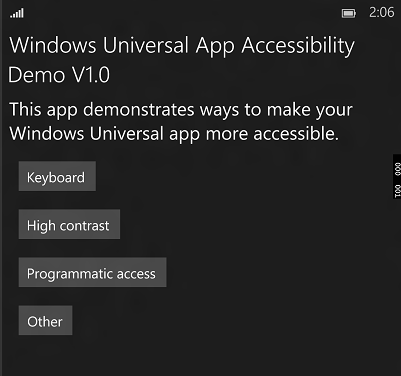
Figure 1: The Main page on the Universal Accessibility demo app.
Note: I’m sorry that all the images throughout this series of posts have no accessible names. That seems pretty ironic given the topic of the posts. I’ve not yet found a practical way of setting names to images at this particular blog site, but I’ll fix that as soon as I can. In the meantime, each image has a descriptive label below it.
So where’s “Audio” on the main page?
Many of your customers will have hearing impairments, so video that you show will need captioning. And if you raise audio alerts, those alerts will need accompanying visuals and depending on the device, a way for accompanying haptic feedback to be generated.
But having said that, this isn’t something I’ve had experience in, and so I’m not familiar with the sorts of common issues that can arise here. My expectation is that by using standard controls, any audio-related accessibility requirements will be met. All being well, I’ll have a chance to learn more about that, and can update this post accordingly.
The “Other” section really does matter
While I’ve bucketed some accessibility-related settings into an “Other” section, those settings are as important as everything else. Some of those settings don’t commonly impact app devs. For example, supporting your customer’s choice of caret width in an edit field. (If you use a standard UI framework control for this, the framework will respect the choice of caret width for you.) But other settings may well need to be accounted for in your app code.
In fact I’m particularly sensitive about one of these settings at the moment. A few weeks ago I spent some time with a family member who can no longer quickly understand what’s shown on a screen in front of him. In response to a press of a button on a TV remote control, an “inputs” list appears on the TV. He then needs to scan the list of around ten items shown on the screen, remember that “HDMI 1” equates to “DVD”, find the obscure down-arrow button on the remote, (amongst the 50 or so other buttons, some of which have more obvious arrow visuals on them,) and start arrowing through the list. The list times-out after 5 seconds. So my family member is blocked from functionality that affects the quality of his life, because the people who built that technology don’t let me customize the timeout for the transient visuals.
The “Other” section in my demo app, shows UI that respects my customer’s choice of timeout for transient visuals. Instead of hard-coding a timeout, with two lines of code, you can really help someone who finds dealing with transient UI a challenge.
var uiSettings = new UISettings();
this.timer.Interval = new TimeSpan(0, 0, (int)uiSettings.MessageDuration);
So if you build your own transient UI, (rather than using some framework UI which respects your customer’s choice of timeout by default,) please remember to respect that setting.
What’s next for the demo app?
Once I’ve tidied up the code a bit and added some comments, (with links to MSDN resources,) I’ll upload the app somewhere so that anyone can try it out and give feedback. The app’s certainly not comprehensive when it comes to highlighting all the sorts of accessibility-related bugs you might encounter when developing an app. My goal with this series of posts has been to discuss the more common bugs that apps hit during development, based on my experiences.
If your app avoids the bugs that the demo app has, you’ll be well on the way to allowing all your customers to leverage the awesome power of your app, regardless of how your customer interacts with their device.
I should also say that the app does not demo how to build a good Windows Universal app UI. On a big screen, the demo app shows a small vertical list of items just like it does on a small phone screen. No-one would ship an app like that. This demo app is all about common accessibility bugs – nothing more.
This series of posts is based on how things are at the time the posts were written. At any given time, the UI platform will do a ton of work to make many parts of your app accessible with little or even no work on your part. But there’ll always be some additional action required by you, as part of building the accessible experience that your customers deserve. Often that action on your part is straightforward, but sometimes it’s not so clear, and may be more work than you feel it should be. The UI platform is constantly improving, and over time does more and more to help you build your accessible app.
Let me know if you’d like me to update the app to demonstrate how to avoid a particular accessibility bug that you’ve encountered while building your app. I can expand the demo app to discuss other bugs, and at some point, I’d like to make a WinJS version of it too.
Thanks for considering how everyone can benefit from all your great work.
Guy
Posts in this series
Building accessible Windows Universal apps: Introduction
Building accessible Windows Universal apps: Keyboard accessibility
Building accessible Windows Universal apps: Colors and contrast
Building accessible Windows Universal apps: Programmatic accessibility
Building accessible Windows Universal apps: Other important accessibility considerations