Building accessible Windows Universal apps: Colors and contrast
This series of posts describes how to avoid some common accessibility bugs when building Windows Universal apps. This post focuses on bugs which affect customers who use visuals shown on the screen.
Think about what you’re getting from Design
Say your UI Designer gives you some really cool-looking visuals to implement in your app. If you’re sighted you may think, “Well, these are really cool-looking visuals”, and set about implementing them. But before you do that, it’s worth asking yourself a couple of things:
1. What will my customers who are color-blind think of these really cool-looking visuals?
Many of your customers are color-blind, and so if any information is conveyed through color alone, that can be a big problem for them. A classic example is when a big symbol in the UI attempts to let your customer know that all is well or all is not well, by changing a green blob to become a red blob. For your customers who find it a challenge differentiating green and red, your UI isn’t helping them.
2. What impact does the contrast used in the visuals have on my goal of making it easy for my customers to consume information presented in my app?
Maybe your visuals present some text in (say) blue, on a background of (say) lighter blue. Maybe that’s cool-looking to you, but is the contrast ratio between the text and its background so low, that many of your customers will find it a challenge to make out what the text says? In fact there are W3C guidelines on minimum contrast between text and its background.
If you don’t ask yourself the above questions when getting your cool-looking visuals from Design, someone else will ask them just as you’re about to ship. You really don’t want to be in that position.
So having asked yourself those questions when you first got the visuals, the next thing you do is ask your Designer if they considered those questions when designing the visuals. Hopefully their response will be something like:
“Yes, I took both these points into consideration. No information is being conveyed through color alone, and all text has a contrast of at least 4.5:1 against its background. Thanks for asking.”
If their response is not something like that, then further discussions are required before you spend time implementing the cool-looking visuals.
Respect your customer’s choice of high contrast theme
Some of your customers will find it easier to use your app if the colors it presents are taken from a high contrast theme. Windows comes with four built-in high contrast themes; three of which shown light-on-dark colors, and the fourth shows dark-on-light. Many customers who use high contrast themes will customize the theme to show whatever colors that they find most helpful.
And this raises a very important point:
You as the dev don’t care about what specific colors are being shown when a high contrast theme is active. For example, when you’re presenting text on a button, you are not specifically showing white text on a black background. Instead, you’re showing text in the system’s “Button Text” color, on the system’s “Button Background” color. And those colors may be white and black, or maybe some other colors that your customer’s specifically chosen.
To illustrate the point, I’ve just created a custom theme in Windows on my desktop. I set “Text” to appear in red, and “Button Text” in Cyan. Here I’d say that the “Text” color generally gets applied to static text, and the “Button Text” color gets applied to text on interactable controls, (other than hyperlinks which have their own customizable color for their text).
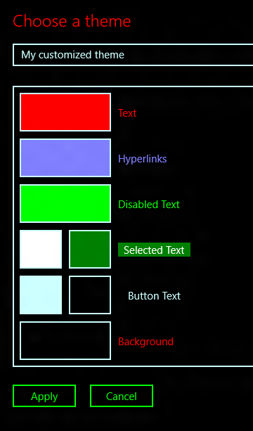
Figure 1: A high contrast theme with customized colors.
A quick note on using high contrast themes on the phone
On the desktop, your customer can select one of four high contrast themes and then customize the colors presented, in order to create their own theme. On the phone, your customer can simply turn high contrast on or off. In that case, whether the active high contrast theme is light-on-dark or dark-on-light depends on whether your phone is currently set to use light or dark colors through the “Colors” settings page.
But while there are some differences between the desktop and phone as to how your customers can specify the theme to be used, the work that you do as a dev to support your customers’ wishes are the same regardless of the device that your Windows Universal app’s running on. So you do the work once to support high contrast, and you’re done.
The demo app
The following two points are spotlighted by my new demo app, specifically because I’ve seen these bugs hit during the development of shipping apps.
1. Fixed colors don’t respect the customer’s wishes, and in a way that might not be obvious to you.
2. A button’s colors are fine, but other properties on the button negatively impact the user experience.
The image below shows the high contrast-related page of the demo app, running in the phone emulator launched from Visual Studio.
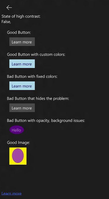
Figure 2: The High Contrast page of the demo app.
So what does the demo app page do right?
Before discussing the problems on the page, it’s worth talking about where the page is doing a good job at respecting my customer’s choice of colors.
The first button on the page is a standard Button control, and as such, will respect my customer’s wishes. If I change the active theme to be a high contrast theme, the button’s visuals change with no work whatsoever on my part.
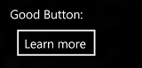
Figure 3: A standard Button respecting colors from the current high contrast theme.
The next button shows its text and background using custom colors. And this is absolutely fine, because the app defines what colors should be shown in the button for the “Light” and “Dark” themes, and also when a high contrast theme is active.

Figure 4: A button showing custom colors for the Light and Dark themes.
The following XAML snippets show the definition of the button, and the ThemeDictionaries defining the colors to be used for each theme.
<Button …
Background="{ThemeResource GoodButtonBackground}"
Foreground="{ThemeResource GoodButtonForeground}"/>
<Application.Resources>
<ResourceDictionary>
<ResourceDictionary.ThemeDictionaries>
<ResourceDictionary x:Key="Default">
<SolidColorBrush x:Key="GoodButtonBackground" Color="LightBlue" />
<SolidColorBrush x:Key="GoodButtonForeground" Color="DarkBlue" />
</ResourceDictionary>
<ResourceDictionary x:Key="Light">
<SolidColorBrush x:Key="GoodButtonBackground" Color="LightBlue" />
<SolidColorBrush x:Key="GoodButtonForeground" Color="Blue" />
</ResourceDictionary>
<ResourceDictionary x:Key="HighContrast">
<SolidColorBrush x:Key="GoodButtonBackground"
Color="{ThemeResource SystemColorButtonFaceColor}" />
<SolidColorBrush x:Key="GoodButtonForeground"
Color="{ThemeResource SystemColorButtonTextColor}" />
</ResourceDictionary>
</ResourceDictionary.ThemeDictionaries>
</ResourceDictionary>
</Application.Resources>
The “HighContrast” ResourceDictionary above does not contain hard-coded colors. Instead it references system colors, and respects my customer’s wishes regardless of whether they’d like the text to be light-on-dark or dark-on-light.
Tip: Watch out for copy/paste bugs here. It’s easy to slap in some inappropriate colors into the HighContrast ResourceDictionary during development. (After all, you’ll get an exception if you make a high contrast theme active and your UI references some brushes that are missing from the ResourceDictionary, so you may put some “temporary” colors in.) I’d strongly recommend periodically doing a search for hard-coded colors in your app. You may well find (i) hard-coded colors being used directly in your controls’ XAML or in the HighContrast ResourceDictionary, or (ii) hard coded use of colors in your code-behind which doesn’t account for a high contrast theme being active. By default, when you find hard-coded colors being used in this way, you should raise a big red flag*.
*That big red flag should not convey the severity of the issue through use of color alone.
The image below shows how the custom colors presented on the button change to respect my customer’s wishes when a high contrast theme is active.
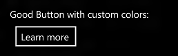
Figure 5: A Button which uses custom colors changes to respect colors from the current High Contrast theme.
In your ResourceDictionary, do try to take note of whether you’re using SystemColorButtonFaceColor, SystemColorWindowTextColor, or some other color for your text. It’s easy to end up showing text in a color that suggest its static text, when it’s actually sitting on a button.
And it’s certainly true that sometimes you may have a variety of elements in custom UI, each with their own particular app-specific purpose, and it’s not obvious as to which system colors would be most appropriate for all the elements. In that case, you really have to pick what you feel is a combination that would be most helpful to your customers.
Don’t trip up like I did…
And talking of copy/paste errors, when I originally added the use of system color brushes to my HighContrast ResourceDictionary in the demo app, I added them as StaticResources. (Presumably I was pasting it all in from somewhere.) This actually seemed to mostly work, but there were some problems with it. (I forget what – maybe the UI wasn’t reacting to changes in the state of high contrast while the app was running.) So I queried this unexpected behavior, and was told to use a ThemeResource instead. This is because the XAML attribute that I want to use changes depending on which theme is active. Seems fair enough really.
What did I mean by “… code-behind which doesn’t account for a high contrast theme being active”?
You may have decided for some reason that your code-behind needs to take some action which impacts the colors shown in your UI. That logic will need to take into account whether a high contrast theme is active, as you might choose to show some light or dark color instead. Your code can know at any given moment whether a high contrast theme is active, what the theme is, and when a high contrast theme becomes active or inactive, through use of AccessibilitySettings. Using this, you can know that a high contrast theme is active, and this means you can decide to not present some important visuals with hard-coded use of (say) Colors.OliveDrab.
The demo app reacts to changes in high contrast, and presents some information about the current state of high contrast using following code-behind.
public sealed partial class HighContrastPage : Page
{
public HighContrastPage()
{
this.InitializeComponent();
var accessibilitySettings = new AccessibilitySettings();
accessibilitySettings.HighContrastChanged += AccessibilitySettings_HighContrastChanged;
RefreshHighContrastStatus(accessibilitySettings);
}
private void AccessibilitySettings_HighContrastChanged(
AccessibilitySettings accessibilitySettings, object args)
{
RefreshHighContrastStatus(accessibilitySettings);
}
private void RefreshHighContrastStatus(
AccessibilitySettings accessibilitySettings)
{
// If high contrast is not on, then HighContrastScheme reports
// the high contrast theme that was most recently active.
Dispatcher.RunAsync(CoreDispatcherPriority.Normal, () =>
{
HighContrastStatus.Text =
accessibilitySettings.HighContrast + ", " +
accessibilitySettings.HighContrastScheme;
});
}
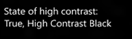
Figure 6: The demo app reporting that high contrast is active, and the current theme is called “High Contrast Black”.
And the last thing that this page in the demo app does right…
At the bottom of the page, there’s a colorful image. I’ve actually added three versions of the image to the set of assets used by the demo app. There’s the spectacular multicolored version, (with yellow and purple,) a light-on-dark equivalent and a dark-on-light equivalent. By following a particular naming convention when adding the assets to the VS project, the most appropriate version of the image will get picked up automatically based on what (if any) high contrast theme is active when the app starts.
So in my page XAML I include an image whose source is:
Source="ms-appx:///Assets/HCTestImage.png"
And then name my three assets:
HCTestImage.png
HCTestImage.contrast-black.png
HCTestImage.contrast-white.png
The image below shows the light-on-dark version of the image being shown in the demo app. The name of this asset is HCTestImage.contrast-black.png. No extra work on my part was required in order to make the theme-based selection happen in the app.
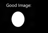
Figure 7: The light-on-dark version of an image automatically being shown.
Note: The asset shown is based on the active theme at the time the app was started. So if the user changes theme while the app’s running, the app may be left showing an inappropriate version of the image. I don’t know if it’s possible to avoid that by taking additional action to set the image source through the ResourceDictionary. In general, I’d just stick to leveraging the handy functionality based on the asset naming convention.
Note: You may often hear people say that your customer who uses a high contrast theme doesn’t change their theme. For many customers this may be true. But some customers may only find some particular UI in your app difficult to make out, so they’ll turn on a high contrast theme temporarily to work at that part of your UI, and then turn high contrast off afterwards. So wherever practical, react to your customer changing the state of high contrast while your app is running.
Ok, so what’s wrong with this page in the demo app?
Well, let’s start off with the button that uses fixed colors for its text and background. The demo app defines the button with the following XAML.
<Button
Background="LightBlue" Foreground="DarkBlue"
Margin="8 10 0 0" Content="Learn more"
Click="HighContrastBadButton_Click" />
In this case the colors are hard-coded with the button, but the same problem would occur if I was referencing some ResourceDictionary brush and hard-coded the colors defining that brush. The image below shows that the only part of the button to respect the customer’s choice of colors is the button’s border.
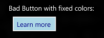
Figure 8: A button not respecting the customer’s choice of colors when a high contrast theme is active.
Now, if all high contrast bugs were like that one, apps would ship with fewer high contrast bugs than they do. A sighted dev could turn on high contrast while building the app, and it might be pretty obvious to them that something’s not right with the button.
But another button on the page looks like this in high contrast:
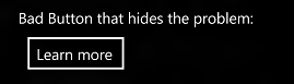
Figure 9: A deceptive button appearing to respect the customer’s choice of colors when a high contrast theme is active.
The image above shows that when high contrast is on, the button has a white border, white text, and a black background. In fact it looks just like another button on the page which I’ve said does respect the customer’s choice of colors. So where’s the problem?
The problem is that the button is defined with the following XAML:
<Button
Foreground="White"
Margin="8 10 0 0" Content="Learn more"
Click="HighContrastBadButton_Click" />
This means that the button text will always be white, regardless of what color the customer wants button text to be. So if I set up my PC or phone to show dark text on a light background when high contrast is turned on, my button text becomes white-on-white, and so invisible.
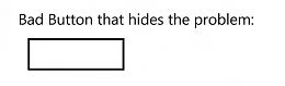
Figure 10: A button showing white text on a white background.
Sometimes the cause of this sort of bug will jump out at you when you start investigating. For example, someone’s hard-coded a color in the button XAML. But other times you may have to dig around following brush references to find exactly where the hard-coded color is.
So it’s really important to not think of high contrast as being about showing specific colors such as white, yellow, purple or black. But rather as being about showing system colors. And with this in mind, test your app while a light-on-dark theme is active, and also when a dark-on-light theme is active.
Tip: When verifying that your app looks great when a high contrast theme is active, make sure you know what should be visible. A while ago I sat with a dev to verify that an app respected high contrast, and we agreed that the visuals were acceptable. The dev then said, “Hold on, shouldn’t there be a button near the top of the app?” Indeed, it turned out that a button was present at the top of the app, but all its visual properties were black. Your attention doesn’t get drawn to a button whose text, border, and background are all black. So keep this in mind when verifying your app in high contrast, it can sometimes be easy to miss a big bug like this.
Anything else lurking?
So say you’ve verified that all appropriate system colors will be shown in your UI when a high contrast theme is active. Does that mean your buttons are going to look hunky-dory when a high contrast theme is active? Not necessarily.
Another source of problems relates to background behind text, and opacity of text.
The demo app shows a button whose background color and text color respects the current high contrast colors. However, the button shows a background image which is present even when high contrast is active, and that will likely interfere with the contrast between the text and the button background. In addition, this button hard-codes an opacity on the text of less than 100%. That might look cool to some customers, but not to others who want really strong contrast between the text and background.
In high contrast, the button shouldn’t be showing a background image, and its text opacity should be 100%.
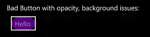
Figure 11: A button inappropriately showing a background image and text translucency while high contrast is turned on.
Summary
The last example above touches on a very important point in all this. Respecting high contrast isn’t only about making sure you’re using appropriate system colors when high contrast is active. Respecting those colors is only part of achieving your goal of making sure your UI is as easy to work with as possible for customers who have low vision. So if you’re sighted, ask yourself as you look at your UI in high contrast, is it as easy to work with as you can make it?
For example, say a button respects high contrast colors just fine, but in high contrast a border becomes visible which touches the text inside the button. That’s an unfriendly UI to present to your customer, and yet it respects high contrast colors.
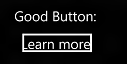
Figure 12: A button whose border touches the text contained inside the button.
So please do the following:
1. Have all your UI respect the most appropriate system colors when a high contrast theme is active.
2. Take a step back and consider what else you can do to make your UI as easy to use as possible when high contrast is turned on. For example, hide background images, make text 100% opaque, and prevent button borders and other UI from bumping up next to text.
References
XAML
Supporting high-contrast themes (XAML)
ResourceDictionary.ThemeDictionaries property
AccessibilitySettings class
XAML high contrast style sample
How to name resources using qualifiers (XAML)
WinJS
Supporting high contrast themes (HTML)
-ms-high-contrast media feature
AccessibilitySettings class
How to name resources using qualifiers (HTML)
An accessibility case study - Reading List. Part 2: Colours and Contrast
Posts in this series
Building accessible Windows Universal apps: Introduction
Building accessible Windows Universal apps: Keyboard accessibility
Building accessible Windows Universal apps: Colors and contrast
Building accessible Windows Universal apps: Programmatic accessibility
Building accessible Windows Universal apps: Other important accessibility considerations