When you work your focus hocus pocus, don’t leave your customers behind
This post describes how your customers may need your custom control to raise a UIA FocusChanged event.
I’d rather be watching grosbeaks
On a lovely sunny day, I’d rather be outside, pointing my binoculars at the tops of trees, and not inside staring at a monitor. So this means when adding some really useful feature to my app, I want to spend as little time as possible doing it.
Given that I want all my customers to leverage the feature, regardless of how they interact with their device, by default I always want to implement my feature using standard controls provided by whatever UI framework I’m using. So if I add, say, a standard button to my XAML Windows Store app, I know that it’ll be useable to everyone, including…
- My sighted customers.
- My customers who have low vision and use a high contrast theme or magnification.
- My customers who are blind and use a screen reader such as Narrator.
- My customers who only use the keyboard as their input device.
So I’ll add a standard control to my app, let the standard control work all its magic for me, and I can head outside and have some fun.
So you want some custom UI? Consider what this means to your customers first!
In your really cool app, perhaps you’ve decided that your buttons should look like something unique. Something that’s really, really going to delight your customers. So, you’re going to implement some custom UI. How you decide to do this can have big consequences to you and your customers.
I’ve seen apps where a decision was made to implement a button which has custom visuals, by starting with the visuals on the screen, and then piece-by-piece turning it into something more like a button. After all, this is easy, right? Just add a custom control with something like a PointerPressed event handler, and you’re done. Right?
Not so fast.
By adding a pointer handler, you may be supporting your customers who interact with the UI with a mouse or through touch, but what about your customers who only use the keyboard? Ok, you say, I’ll add a KeyDown event handler too. By doing that, you’re planning to detect when your customer’s pressed (say) the Enter key or Spacebar to trigger the button’s action. But can your customer even move keyboard focus over to the button in the first place? For a control to be useful to your customers who only use the keyboard…
- There must be a way for keyboard focus to reach the control, (and preferably an efficient way).
- Your customer must be able to quickly know when keyboard focus has reached the control,
(including when using high contrast themes).
- Intuitive key presses must allow your customer to leverage the functionality made available by the control.
For example, invoke it, select it, toggle it.
Ok, ok, I get it, you say. I’ll do what’s necessary to make my custom control fully keyboard accessible. While that’s progress, what about your customers who are blind and interact with your UI using the Narrator screen reader and touch? Those customers depend on all your UI being programmatically accessible through UI Automation (UIA). Not only does this mean that your UI exposes all sorts of essential properties programmatically, (for example, its name, bounding rect, localized control type,) but can also be controlled programmatically, (for example, invoked, selected, toggled).
So if you simply draw some cool visuals on the screen, and then update it to be fully accessible to all of your customers, that can be a lot of work. It’s doable, but really, do you really want to be doing all that on a sunny day like this?
Of course you don’t. That’s why you’re much better off taking some standard control, and styling it to make it look like whatever you want. And to help illustrate this, I just downloaded the styling sample available at XAML control and app styling sample. This sample contains a styled Button:
<Button Style="{StaticResource MyButtonStyle}"
Height="100" Margin="0,0,0,10">This is a custom template for button</Button>
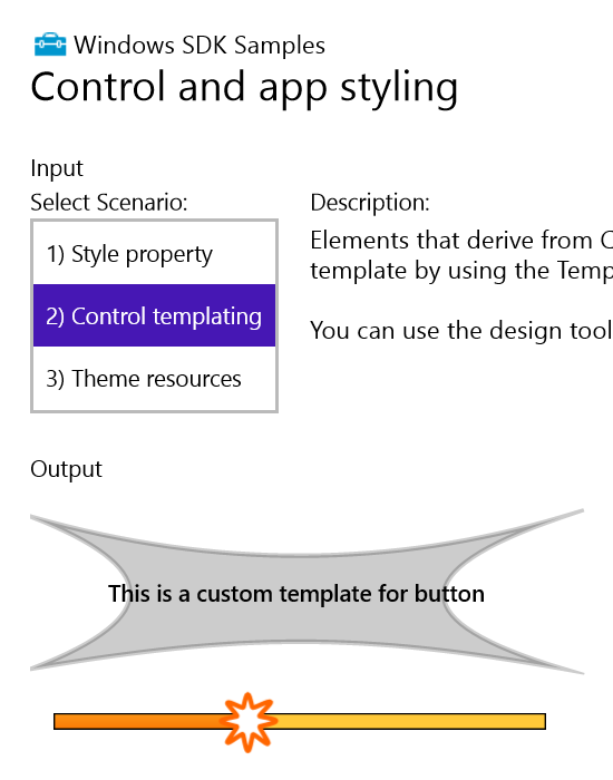
Figure 1: XAML sample app showing a styled Button control.
I pointed the Inspect SDK tool at the Button and saw some very helpful properties. And importantly, I noticed the control supports the UIA Invoke pattern, so your customers using the Narrator screen reader through touch, can programmatically invoke the Button. All super stuff. (For an introduction into UIA patterns, see Does your XAML UI support the Patterns that your customer needs?)
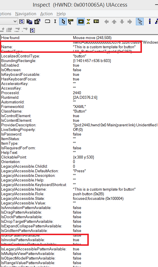
Figure 2: The Inspect SDK tool showing the UIA properties and patterns supported by the styled Button.
Then I tried using only the keyboard to interact with the Button, and what a treat that was! Thinking back to the points I mentioned earlier about keyboard accessibility…
- I could tab to the Button to set keyboard focus to it.
- I was shown that keyboard focus had moved to the Button, including when a high contrast theme was active.
- If I pressed the Enter key or Spacebar when the Button had keyboard focus, its Click handler got called.
I modified the sample to add a Click handler to the Button. This handler got called when I interacted with the Button via mouse, touch, keyboard or Narrator touch.
I then ran the AccEvent SDK tool in order to see UIA FocusChanged events being reported as I tabbed around the app’s UI.
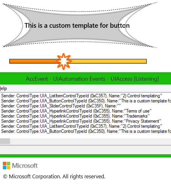
Figure 3: The SDK sample showing keyboard focus feedback on the styled Button, and the AccEvent SDK tool reporting FocusChanged events.
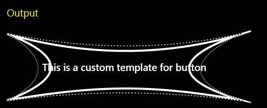
Figure 4: The SDK sample showing keyboard focus feedback at the style Button when a high contrast theme is active.
I should point out that while the sample’s done a really great job on the accessibility of the styled Button, things aren’t looking so good for the slider. The AccEvent SDK tool told me that keyboard focus moved to the slider as I tabbed around, but it also told me that the slider has no accessible name. That means a customer who’s blind and is using a screen reader, won’t be told the purpose of the slider. In your shipping app, your customers will need all your controls to have helpful accessible names.
So the upshot of all this is, please do consider styling standard controls like Buttons for your super-cool UI, rather than starting with an inaccessible control and adding all the accessible functionality that your customers need.
Ok, so you’ve decided not to style a standard control
We’re now getting to the thing that prompted me to post all this. Sometimes devs feel they do have a compelling reason for not styling some standard control like a Button, and move forward with building their own control, and doing all the work themselves to make it accessible. So they’ll probably build a custom AutomationPeer for the control, and do all the work to support UIA patterns like the Invoke pattern for programmatic accessibility. (For an introduction into custom AutomationPeers, see Does your XAML UI support the Patterns that your customer needs?)
And they’ll make the control keyboard accessible. Sometimes setting the IsTabStop property to true in your UI can make a big difference on how keyboard accessible it is. But depending on how you’ve implemented your UI, maybe you have some containing control which really does get keyboard focus, and then you have a bunch of contained elements which are to give the appearance of getting keyboard focus as your customer presses the tab key. So you add a KeyDown handler to your containing control, and when you detect the tab key press, you move some keyboard-focus-feedback-like visuals between your contained elements. And when you detect an Enter key or Spacebar press, you trigger some action appropriate to whichever of the contained elements has “focus”.
This may all seem to work fine, but I’ve seen a couple of apps which have missed one very important step.
When you’re doing the work yourself to move keyboard focus around your custom UI, not only must you let your sighted customers know where focus is, (with default and high contrast visuals), but also support your customers who use assistive technology tools like screen readers and magnifiers.
So try out the following to get a feel for why it’s so important.
- Press Win+Plus to turn on the Windows Magnifier. (Pressing Win+Escape later will turn it off.)
- Go to the Magnifier Options button in its UI and make sure “Follow keyboard focus” is checked.
- Press Win+Plus a few more times to use very high magnification like some of your customers do.
- Press Win+R to show the Run dialog.
- Tab around that dialog, and do Alt+Tab to interact with other apps.
You’ll notice that as you tab around, the control getting keyboard focus is brought into view.
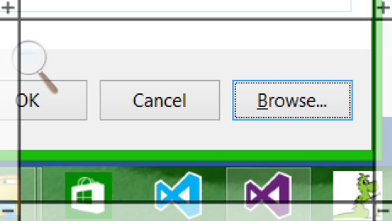
Figure 5: Magnifier on a touch device bringing a Browse button into view when it gains keyboard focus.
If your control doesn’t report that it’s getting keyboard focus, then your customers who use magnification will be left looking at some other UI. They’ll have to spend a while searching for whatever has focus. Similarly your customers who use screen readers won’t be told what’s gained focus. The end result is that these customers won’t be able to leverage whatever cool functionality is being provided by your control.
One way or another, your UI must raise the UIA FocusChanged event as keyboard focus moves from one element to another. The screenshot of the AccEvent SDK tool above, showed that the styled standard controls were raising the event. But if your UI is so custom that no such event is being raised, you’ll need to do it yourself.
If your element derives from FrameworkElement, then you can raise an event to say that it’s gained keyboard focus with the following:
var peer = FrameworkElementAutomationPeer.FromElement(<x:Name of my element>);
if (peer != null)
{
peer.RaiseAutomationEvent(AutomationEvents.AutomationFocusChanged);
}
By doing this, you’re allowing your customers who use magnifiers and screen readers to follow keyboard focus as it moves around your app.
You've announced that your custom element now has keyboard focus, but does it stand questioning?
When a UIA client app like Narrator is notified that some element has gained keyboard focus, the app might go back to the element and ask it to confirm that it still has focus. Keyboard focus can rapidly bounce around new UI that appears, and might take a moment to settle down. Narrator's not going to want to react to a notification that keyboard focus is on some element, when in fact keyboard focus has already moved on. So it's important that your custom element with focus can stand being questioned on whether it actually has focus.
This means the custom AutomationPeer that's associated with the custom element that has focus must set its HasKeyboardFocus property to true, all the while that the element has focus.
Conclusion
Please do make sure all your customers can leverage the great functionality you’ve built, regardless of how they interact with your app. Any app you ship has at least two interfaces. There’s the visual interface that gets tons of attention during development. There’s also the programmatic interface. You are shipping that programmatic interface, and many of your customers are depending on that interface being high quality.
By using standard controls, you can provide an accessible user experience with little work on your part. Where custom styling is being used with standard controls, you can provide super-snazzy visuals, and still get tons of accessibility for free. If you choose to make things more custom and so lose that free accessibility, then there may be a lot of extra work required before all your customers can benefit from your great work.
And in that very custom case, a couple of the things that you may need to do is raise the UIA FocusChanged event when an element in your custom UI gets focus, and set the HasKeyboardFocus property to true while the element has focus. This can make a huge difference to your customers.
For more information on how you can make your app accessible to all your customers who use the keyboard, see Implementing keyboard accessibility.
Anyway – catch you later, I have to head outside now. There’s a grosbeak out there…
Guy
Figure 6: A black-headed grosbeak and squirrel looking at each other.