Does your XAML UI support the Patterns that your customer needs?
This post encourages you to let the XAML Framework do lots of the work required to make your UI accessible to all your customers.
The UI Automation (UIA) API exposes your UI elements through a programmatically accessible hierarchical tree, and assistive technology (AT) tools such as screen readers will present those elements in whatever way they think is most helpful to your customers.
The elements will expose the following:
1. Properties, such as a name and control type. For example a Button with a name of “Install”.
2. Events to let your customer know when something’s changed in the element’s UI.
3. Patterns to describe the behaviors exposed by the element.
Today, we’ll take a closer look at Patterns.
When a UIA client such as the Narrator screen reader examines one of your UI elements, it will want to know what behaviors it supports. For example, can it be invoked? You might say to yourself, if it has a control type of Button, then why not just assume it can be invoked? That’s a fair question, but to tie an element’s Control Type to the behaviors it supports is too limiting for your UI. Say you want to get creative, and your have good reason to show a button which can somehow be expanded and collapsed. We’d not want to have to have a new type of button which is dedicated to supporting that, (an “ExpandableButton” say). Rather we’d have a Button and add support for programmatically expanding and collapsing it. One of the great things about UIA is that you can add additional behaviors to your elements in a way that the behaviors can be programmatically accessed by AT tools.
But first let’s take a step back, and think about what XAML gives us for free.
Say you show a button in your UI, and the button shows the text “Install” on it. When the Narrator screen reader examines the element, your customer will hear “Install, Button”. This means they know they’re dealing with a button, and what the button relates to. In most cases you won’t have done anything specifically related to accessibility to make that happen. Instead XAML did the work for you.
Many XAML UI controls have an “AutomationPeer” associated with it. For example, a Button has a ButtonAutomationPeer. It’s the AutomationPeer that’s providing the accessible functionality for the control. The ButtonAutomationPeer will take the text shown on the button and make it the accessible name for the button. It will also automatically expose appropriate data for such things at the control type and bounding rectangle. And importantly, the ButtonAutomationPeer will also let UIA clients know that the button can be invoked.
I just created a new XAML app, and added a button. I pointed the Inspect SDK tool at the button, and Inspect showed me that the button supports the UIA Invoke pattern, as shown in the screenshot below.
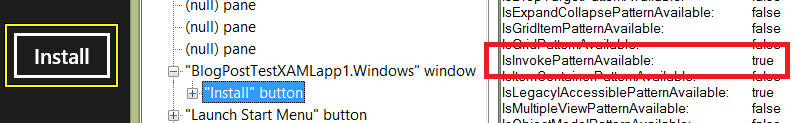
Figure 1: Inspect showing that the Button supports the Invoke pattern.
In fact lots of XAML controls support UIA patterns relevant to the type of control, and this allow your customers who are using Narrator to leverage the behaviors of the control. For example, a Slider supports the RangeValue pattern, as shown below.
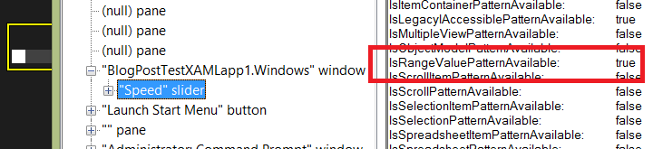
Figure 2: Inspect showing that a Slider supports the RangeValue pattern.
It can be quite interesting to point Inspect to elements all over your UI and learn what UIA patterns they support. You’ll find that you’re checkboxes support the Toggle pattern, and your ListViews support the Scroll pattern. Without this support, your customer will not be able to use the UI.
A very important point here is that XAML itself is doing the work to make the UI programmatically accessible. In many cases you don’t have to do any work to allow your customers who use Narrator to invoke a button, or to scroll a list, or to set the value on a slider, because XAML has added support for the related UIA patterns by default.
Wherever possible, let XAML do the work for you.
But you’re building a “custom” control for your UI
Say you’ve decided to build some custom control, because you feel that the standard XAML controls don’t quite meet some need in your app.
On a side note, it’s very ambiguous of me here to use the word “custom”. Does that mean my control is (say) a button with some of my own styling, or a C# control I’ve written which derives from the Button class and is very similar to a Button, or a C# control which derives from a XAML Control and is unlike anything that anyone’s ever built before? For my purposes here, I’m considering something to be custom if it’s somehow impacting the default accessibility that XAML wants to provide for you. I know that’s an unsatisfying answer for some, but it’s perfect for me here. If it have a regular Button in my UI which is showing some text visually, then it’s going to be programmatically accessible thanks to the work that XAML’s doing for me. But once I’ve done something which means that the Button is no longer accessible, then as far as I’m concerned, it’s now “custom”.
If at all possible, you want XAML to make your control accessible for you. So before launching into building new classes for your control, you’d take a step back and ask yourself whether that’s really necessary. If you have something that behaves exactly like a button, but it doesn’t look like a button, can you use a regular Button control and apply whatever super-imaginative styling you want on it? If you do that, XAML will provide its usual ButtonAutomationPeer to make sure your customers who use Narrator can invoke the button.
By the way, when applying cool styling, do make sure you have visuals which let the user know when the button has keyboard focus, and which looks crystal-clear when a high contrast theme is active.
Ok then, so you’ve decided that while you can just apply styling to many of your buttons and get XAML to support the UIA patterns that your customer needs, you’ve decided that one of your controls really does need a new class which you’re going to write.
public class SuperButton : Control
{
// Do lots of great stuff here...
}
And I reference this in my XAML.
<local:SuperButton>
</local:SuperButton>
If I run the app and take a look with Inspect at what’s being programmatically exposed, I see no reference to my control anywhere in the UIA tree of elements. But if instead my class is derived from a Button, then XAML will use a ButtonAutomationPeer to make the control accessible.
public class SuperButton : Button
The screenshot below shows Inspect reporting that my control can be programmatically invoked.
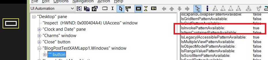
Figure 3: Inspect showing that a custom control derived from a Button supports the Invoke pattern.
So if your control is really very similar to a button, in some cases you’ll derive from a Button, and let a XAML ButtonAutomationPeer do all the accessibility-related work for you.
So what’s this “custom AutomationPeer” that I hear so much about?
Once in a while, you might feel that the above approach of leveraging the default AutomationPeer for your control, does go a long way to achieving what you want, but doesn’t quite provide the best accessible experience that you customer deserves. Perhaps you want to adjust some specific aspect of the element’s accessible experience to reflect exactly what your app does. For example, rather than your customer being told that the element is a “Button”, they should be told it’s a “Super button”. (Hopefully you’ll pick a string that’s a little more helpful…)
To do this, you’d write a custom AutomationPeer which will provide exactly the accessible experience that your customer needs. And again, you want XAML to do as much of the work for you as possible. So to continue the simple case above, your custom AutomationPeer will derive from a ButtonAutomationPeer, and you’ll override just the things you need to override.
The first thing you do is create the custom AutomationPeer and hook it up such that when UIA asks your control for an AutomationPeer, UIA will be supplied with your custom AutomationPeer.
public class SuperButton : Button
{
protected override AutomationPeer OnCreateAutomationPeer()
{
return new SuperButtonAutomationPeer(this);
}
// Do lots of great stuff here...
}
public class SuperButtonAutomationPeer : ButtonAutomationPeer
{
Button button;
public SuperButtonAutomationPeer(Button owner) : base(owner)
{
button = owner;
}
}
Next, you’d override just enough to allow UIA to pick up the custom control type.
In some cases when you’re building custom UI, you might find that one of the pre-defined control types already known to UIA is a good match for what you need. In that case, you can just override GetAutomationControlTypeCore() and return a known control type. But your “Super button” is not a pre-defined control type, so you’d override GetAutomationControlTypeCore() to return AutomationControlType.Custom, and also override GetLocalizedControlTypeCore() to supply a helpful localized string.
protected override AutomationControlType GetAutomationControlTypeCore()
{
return AutomationControlType.Custom;
}
protected override string GetLocalizedControlTypeCore()
{
// Always used localized strings here!
return loader.GetString("SuperButtonControlType");
}
And since I never like to demo any UI that doesn’t have an accessible name, (as accessible names are critically important to your customer,) let’s add a helpful name to the control. This is an easy two-step process for static (but localized) names. First add the name to your resw file, as shown below.
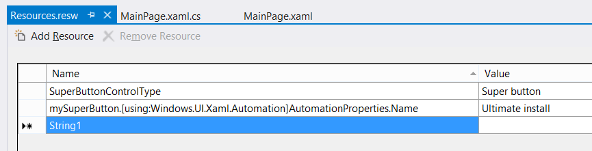
Figure 4: Localized string resources in the test app.
And then add the x:Uid to the XAML, in order for the accessible name to be automatically picked up.
<local:SuperButton x:Uid="mySuperButton">
</local:SuperButton>
When I run the app and point Inspect to it, the accessible name and control type get reported as expected. When I then point Narrator to the element, I hear “Ultimate install, Super button” because Narrator generally speaks a control type after speaking the element’s name.
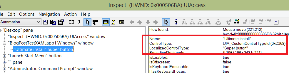
Figure 5: Inspect showing the name and control type of the element with a custom AutomationPeer.
Remember – because the custom AutomationPeer derived from ButtonAutomationPeer, the element supports the Invoke pattern by default. So if you do use a custom AutomationPeer, consider how your control can derive from a regular XAML control in such a way that leads it to getting the appropriate UIA pattern support. This would mean that you get some pattern support for free, and you don’t have to implement it yourself.
Another example of this would be if you’re going to create a super-cool “Sine wave slider” control. It might be pretty much like any other slider, but you’re presenting it such that it follows a sine wave. (Let’s just assume you have a strong business justification for doing that.) You’ll want your Sine wave slider to support the RangeValue pattern like any slider does, as that will allow your customers to programmatically increase or decrease the value of the slider.
So the Sine wave slider would derive from RangeBase, in the same way a regular XAML Slider control does. By doing that, your control automatically gets support for the RangeValue pattern. And again you might override GetLocalizedControlTypeCore() to allow your customer to hear a helpful control type.
public class SuperControl : RangeBase
{
protected override AutomationPeer OnCreateAutomationPeer()
{
return new SuperControlAutomationPeer(this);
}
// Do lots of great stuff here...
}
public class SuperControlAutomationPeer : RangeBaseAutomationPeer {
RangeBase control;
public SuperControlAutomationPeer(RangeBase owner)
: base(owner)
{
control = owner;
}
protected override AutomationControlType GetAutomationControlTypeCore()
{
return AutomationControlType.Custom;
}
ResourceLoader loader = new ResourceLoader();
protected override string GetLocalizedControlTypeCore()
{
// Always used localized strings here!
return loader.GetString("SineWaveSliderControlType");
}
}
The screenshot below shows that the element has a name of "Ulimate slider", a control type of "Sine wave slider", and it supports the RangeValue pattern. Support for that pattern is being provided by XAML.
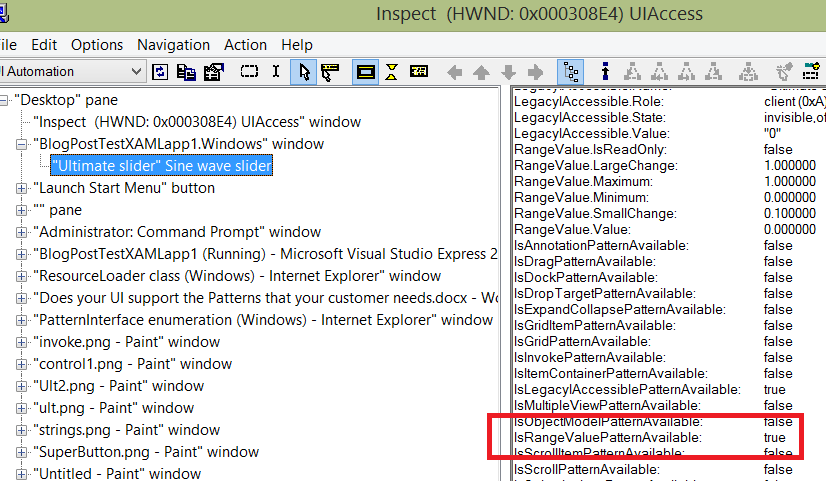
Figure 6: Inspect showing that the Sine wave slider supports the RangeValue pattern.
But my control is unlike any other control
So you’ve thought carefully about whether your control should derive from some regular XAML control such as a Button, but you've decided that your control is actually fairly different from all other regular controls. In this case you decide to derive your class from Control.
public class SuperControl : Control
{
// Do lots of great stuff here...
}
Having done that, the element doesn’t appear at all in the UIA tree. So you add a custom AutomationPeer, and XAML will then expose the element in the UIA tree. In this case the custom AutomationPeer can’t derive from ButtonAutomationPeer, because your in this case SuperControl class isn’t derived from a Button. If you derive your SuperControl from a Control, then your custom AutomationPeer should derive from FrameworkElementAutomationPeer.
public class SuperControlAutomationPeer : FrameworkElementAutomationPeer
{
Control control;
public SuperControlAutomationPeer(Control owner)
: base(owner)
{
control = owner;
}
}
When I pointed Inspect to the app now, I found the element exposed in the UIA tree, and it had a name of “Ultimate install” left over from the earlier change. The control type exposed was “Custom”, which is fair enough, as XAML has no way of knowing what the control will be used for.
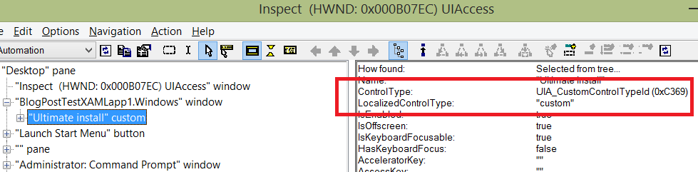
Figure 7: Inspect showing the control type of "Custom" for the control associated with the AutomationPeer derived from FrameworkElementAutomationPeer.
Interestingly, the Bounding Rectangle property for the element is missing, whereas I got that property by default when I made use of a ButtonAutomationPeer. So this is another example of how I'm losing some of the default accessibility that XAML can provide for me.
Also, I notice that I get support for no interesting UIA patterns at all. This means there’s no support for the Invoke pattern, and as such, your customer using Narrator can't programmatically invoke the control. If your control can’t be invoked though any other means either, (such as the keyboard, mouse or touch,) then that’s ok. But if it can be invoked through other means, then it must be programmatically invokable too.
So at this point, you’d take another step back and consider whether the control should just derive from a Button, as by doing that, you’ll get the support for the Invoke pattern for free.
But let’s say that you still feel it’s appropriate to keep deriving from a Control, and you’ll do the work to support the Invoke pattern. There are 3 steps to adding support for a pattern to your custom AutomationPeer.
1. Inherit from the related UIA provider interface.
2. Let UIA know that you support the pattern.
3. Implement support for the pattern.
Supporting the Invoke pattern is about as easy as it gets, because the only thing in that pattern is one method, Invoke(). Other patterns may include multiple methods and properties.
public class SuperControlAutomationPeer : FrameworkElementAutomationPeer, IInvokeProvider
{
Control control;
public SuperControlAutomationPeer(Control owner)
: base(owner)
{
control = owner;
}
protected override object GetPatternCore(PatternInterface patternInterface)
{
if (patternInterface == PatternInterface.Invoke)
{
return this;
}
return null;
}
public void Invoke()
{
// Do something in response to the control being invoked...
}
}
When I point Inspect to the control, I now see it supports the Invoke pattern, and I can tell Inspect to call the Invoke() method I implemented.
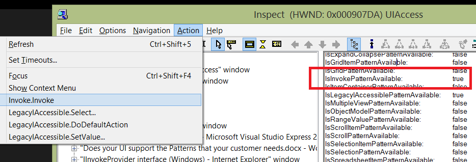
Figure 8: Inspect invoking an element through the Invoke pattern support.
Text is more interesting than it might seem
Now, there are lots of useful patterns which can be supported, and hopefully you’ll get XAML to provide the implementation of the patterns of interest wherever possible. (I should say that sometimes you might not find an exact match between the existing UIA patterns and the custom behaviors of your control, so in general you'd just pick the closest match amongst the list of patterns.)
A particularly interesting pattern is the Text pattern. This allows an element to expose rich properties for the text it presents. For example, the TextPattern can be used to expose information about what text is selected, along with such things as the text color, and whether it’s bold or italic. If you point Inspect to WordPad, you’ll find that the big area where you type in WordPad supports the Text pattern. Any document-related UI will want to support that pattern.
However, many elements that display text only ever want to display a simple string, and they’ll never need to support such things as a selection state or text formatting attributes. For the control to implement the Text pattern would be a lot of work, and often would have no real benefit to your customer.
I expect at this point you’re thinking “Why would I need to implement it anyway? Can’t I derive from a regular XAML control that supports it, and have XAML do the work for me?” Well, yes, that’s a fair point. You could try deriving from TextBlock because that supports the TextPattern, but the TextBlock is a sealed class, and so you can’t derive from it. (If you instead you try deriving from FrameworkElement, given that the TextBlock derives from that, then you don’t get the Text pattern support.) And because you can’t derive from TextBlock, your custom AutomationPeer can’t derive from TextBlockAutomationPeer.
As it happens, you can derive from TextBox and get the Text pattern support for free, but if all you want is to convey a simple label for your control, the deriving from TextBox isn’t an appropriate match for your needs.
So, if all you need is to convey a simple text string, then the UIA Name property of your element will do just fine. You can set that though a number of ways, including:
1. Let the XAML framework set the accessible name property based on the text displayed in the element.
2. Use the element's x:Uid to pick up a localized string.
3. Use the AutomationProperties.LabeledBy property to have the accessible name pulled from the accessible name of another element. (And “Name” works fine in the XAML for referencing the other element. You don’t need the overhead associated with using “x:Name”.)
4. Bind the AutomationProperties.Name to some dynamic string property on one of your view models.
But having set up the accessible name one way or another, the UIA client will present that string in whatever way they feel is best for your customer. You don’t need to use a UIA pattern to expose that simple string.
Narrator deals with so many UI frameworks
So the XAML framework will expose your UI through the UIA API to UIA clients such as Narrator. The UIA tree exposed will be based on what XAML does for you by default, (based on how you defined your UI,) and what you’ve done on top of that to enhance the default accessibility of the UI.
Narrator will then attempt to present the best possible experience to your customers based on the information it has available. An interesting point here is that Narrator does this for all UI frameworks running on Windows. Different UI in different frameworks might expose information in a variety of ways, and Narrator works to present a consistent experience to the user regardless of the framework. As part of presenting the best possible experience based on the information available, Narrator will sometimes customize the experience depending on the combination of the patterns supported and the element’s control type.
Often Narrator will speak the element’s control type after having spoken the element’s name. This is helpful as it informs your customer that they’re at a (say) button, slider or hyperlink. (Narrator will also announce a control type of “Custom” if you’ve taken steps that have led to the element having that control type.) If Narrator encounter an element whose control type is Text, then it goes to great lengths to try to announce this in the most useful way.
If the Text element is a simple text label in your UI, the when your customer reaches it, Narrator will speak the element’s name but not say “Text” afterwards. But if you’ve added support to your element for a pattern that reports that it’s not a read-only element, then Narrator would say “Editable” after reading the element’s name. For example, if you’ve added Value pattern support to the element through a custom AutomationPeer, and the Value pattern’s read-only property is false, then Narrator will reasonably assume that the element can be edited.
When examine the accessibility of your UI, it’s always worth pointing Inspect to it first. This allows you to determine the elements' control types, the localized strings used for announcing the control types, and the list of UIA patterns the UI supports. I really find this essential when building custom UI, as I don’t try to predict how my UI will get represented through UIA. Inspect will show me exactly what properties, patterns and element hierarchy my UI has. Once I’m happy with the UI, I can point Narrator to it, and consider the quality of the experience. If something isn’t exactly how I’d like it to be, I can consider how the UIA representation of my UI might be influencing the Narrator experience.
Summary
When building custom UI, try to let XAML do as much of the work as possible to make the UI accessible to all your customers. This includes allowing XAML to provide the implementation of the various UIA patterns that will lead to all your customers being able to leverage the great features available in your app.
So for "custom" UI, use standard XAML controls and style them as appropriate for your app.
If that’s not possible, create a custom control derived from a standard control. For example, derive from a Button, and let the default ButtonAutomationPeer that’s associated with the Button work its magic.
If that’s not possible, create a custom control derived from a standard control, and create a custom AutomationPeer with a few overrides to enhance the accessible experience.
If that’s not possible, create a custom control derived from a Control, and create a custom AutomationPeer derived from FrameworkElementAutomationPeer. Then add all the UIA pattern implementation that your customers need.
It’s definitely worth considering up front how you can let XAML do most of the heavy lifting for you, so you can get on with other things. But one way or another, your UI needs to support the appropriate patterns. Your customers are depending on you.
Guy