How to use new controls in Windows 8.1 (2)
Before developing an app, you should know which tools can be used to help with design
and layout. In the previous article, we introduced some new features in windows8.1.
Now, let us see more useful new features in this blog.
The Hub Control
Hub control is a new feature introduced in windows 8.1 and can display different categories of content,
each of which maps to the section pages in your app. In windows 8.1,
Hub control provides elements to help you more easily implement the hub design,
which reflects the proper design guidelines and behaviors pattern of your app.
Mission : display data from different sources
For example, in our app, customers want to display different data sources to a page like News
app, one section of page displays sports news and another section displays
music news. In the past, we may add two or more GridView or ListView controls
in a page and set different data sources to different controls. For now, using
each hub section, we can use only one hub control to display data from
different sources. And any XAML content can be used to create a visually rich hub page.
Mission: provide each group with different DataTemplates
If you try to make a hub page by ListView or GridView, you should group the
GridView and make different groups have different DataTemplates. In the past, we
used DataTemplateSelector to achieve this. You should make a ViewModel to get
either some data, or class subtype that differentiates one group from another. And
you should create your own custom DataTemplateSelector that can make the
determination for each group of what type it is.
Below is what we have done:
public sealed class ItemGroupTemplateSelector : DataTemplateSelector
{
public DataTemplate InventoryItemTemplate { get; set; }
public DataTemplate RoomItemTemplate { get; set; }
protected override DataTemplate SelectTemplateCore( object item, DependencyObject container )
{
if( item != null )
{
if( item is ViewModelRoomItem )
{
return this.RoomItemTemplate;
}
else if( item is ViewModelInventoryItem )
{
return this.InventoryItemTemplate;
}
}
return null;
}
}
Make a Hub Page:
As we have discussed above, making a hub page is so complicated and time-consuming
in windows 8. Now with New hub control in windows 8.1, we can easily achieve
it. We only need to create some hub sections in hub control and define each hub
sections with different DataTemplate.
Hub section:
Basically, the Hub control is a collection of HubSections. You do not add content directly
to a hub section; instead, you define the content of your HubSection in a
DataTemplate object. Content can either be defined inline or be bound to a data
source. Any valid XAML can be used in a hub section. And Each HubSection has two important properties:
●Header: used to get or set the section header
●ContentTemplate: used to get or set the section content
What we’ve done:
What we’ve done is only to make different hub section in hub control with different DataTemplates:
XAML :
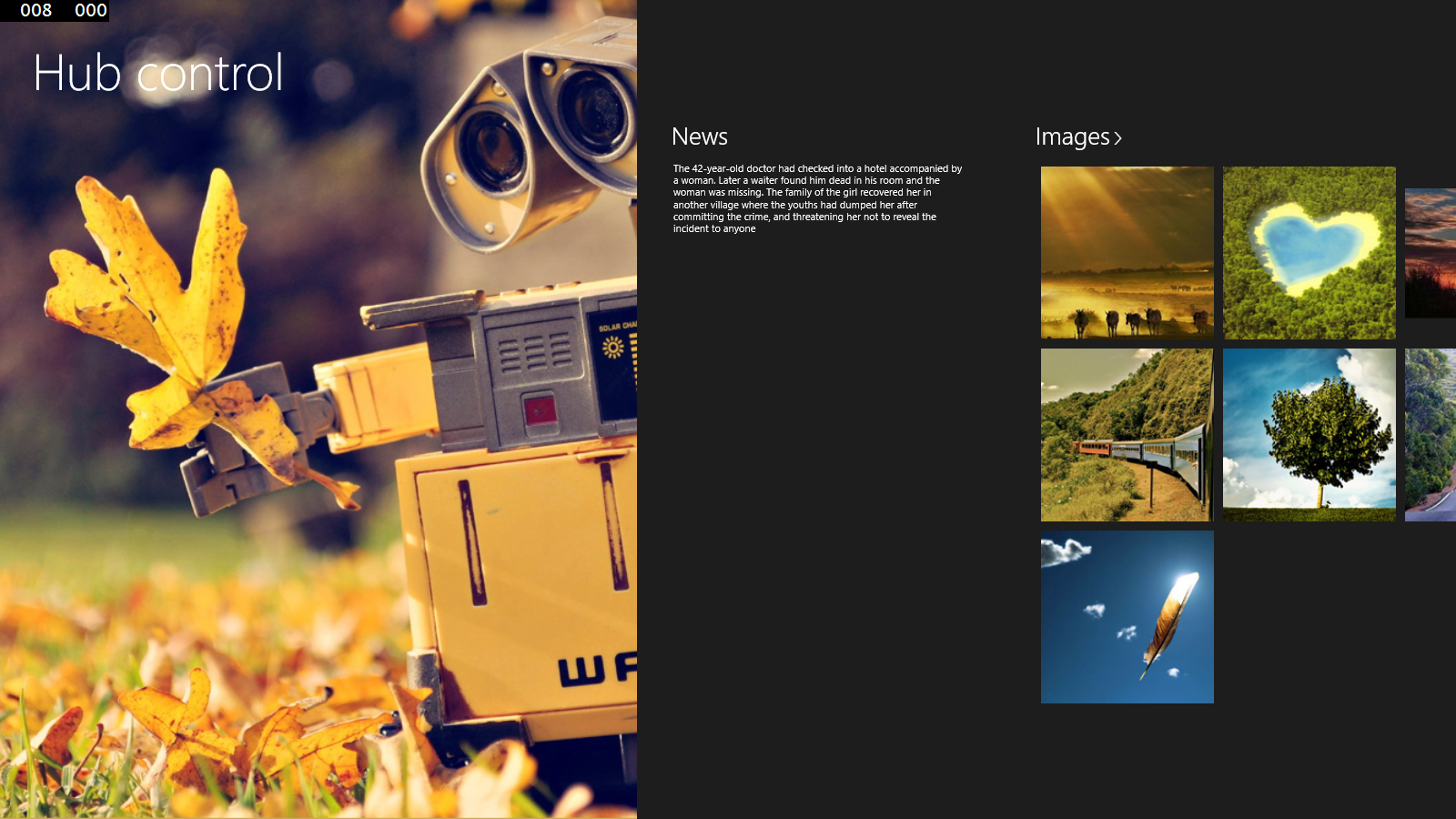
<Hub Header="Hub control" x:Name="Hubsample">
<HubSection Width="700">
<HubSection.Background>
<ImageBrush ImageSource="Assets/windows 8.1.png" Stretch="UniformToFill" />
</HubSection.Background>
</HubSection>
<HubSection Header="News" Width="400" >
<HubSection.ContentTemplate>
<DataTemplate>
<TextBlock Text="{Binding Text}" TextWrapping="Wrap" />
</DataTemplate>
</HubSection.ContentTemplate>
</HubSection>
<HubSection x:Name="ImagesSection" Header="Images" IsHeaderInteractive="True" MinWidth="620">
<HubSection.ContentTemplate>
<DataTemplate>
<GridView ItemsSource="{Binding }">
<GridView.ItemTemplate>
<DataTemplate>
<Image Source="{Binding Image}"/>
</DataTemplate>
</GridView.ItemTemplate>
<GridView.ItemsPanel>
<ItemsPanelTemplate>
<VariableSizedWrapGrid Orientation="Horizontal" ItemHeight="200" ItemWidth="200" MaximumRowsOrColumns="3">
</VariableSizedWrapGrid>
</ItemsPanelTemplate>
</GridView.ItemsPanel>
</GridView>
</DataTemplate>
</HubSection.ContentTemplate>
</HubSection>
</Hub>
Result :
Navigate by headers
If you want to make customers navigate to a specific page of your app when they click
the header in each HubSection. You can implement this by set
IsHeaderInteractive HubSection property to true and hander SectionHeaderClick
event in hub control:
<Hub Header="Hub control" x:Name="Hubsample" SectionHeaderClick="Hubsample_SectionHeaderClick">
<HubSection Width="700" Name="MainSection" IsHeaderInteractive="True">
<HubSection.Background>
<ImageBrush ImageSource="Assets/windows 8.1.png" Stretch="UniformToFill" />
</HubSection.Background>
</HubSection>
<HubSection Header="News" Width="400" IsHeaderInteractive="True" Name="NewsSection">
<HubSection.ContentTemplate>
<DataTemplate>
<TextBlock Text="{Binding Text}" TextWrapping="Wrap" />
</DataTemplate>
</HubSection.ContentTemplate>
</HubSection>
…….
</Hub>
private void Hubsample_SectionHeaderClick(object sender, HubSectionHeaderClickEventArgs e)
{
switch(e.Section.Name)
{
case "NewsSection":
this.Frame.Navigate(NewsPage);
break;
case "MainSection":
this.Frame.Navigate(InforPage);
break;
.......
}
}
Flyout & MenuFlyout
Flyout and MenuFlyout are new controls which introduced in windows 8.1. A Flyout
displays lightweight UI that either is informational or requires user
interaction. You can use it to collect input from the user, show more details
about an item, or ask the user to confirm an action. And a Flyout should show
only in response to a tap or a click, as well as always dismiss when you taps
outside it. Like Flyout, MenuFlyout let the user choose from a contextual list
of simple commands or options.
Creat a Flyout & MenuFlyout
In windows 8, the flyout and Menuflyout are actually accomplished with the popup
control. Unlike the flyout in JavaScript, the XAML popup must be manually
implemented for placement, dismissal, animations, etc. So making a flyout in
windows 8 is not very easy.
What we’ve done
As new feathers in windows 8.1, we can easily implement flyout or menuflyout,what
we’ve done as below:
Flyout:
In windows 8.1, Button control has a new Flyout property that can simplify
attaching and opening a Flyout control. For another control, you can also
attach a Flyout control to it by using the FlyoutBase.AttachedFlyout attached property.
In XAML page we can code like below:
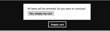
<Button Content="Empty cart">
<Button.Flyout>
<Flyout>
<StackPanel>
<TextBlock Style="{StaticResource BasicTextStyle}">
All items will be removed. Do you want to continue?
</TextBlock>
<Button Click="DeleteConfirmation_Click">Yes, empty my cart</Button>
</StackPanel>
</Flyout>
</Button.Flyout>
</Button>
In code-behind, we also can easily add a Flyout to a control. You can use some
code below to add a flyout to TextBlock control:
TextBlock textOption = new TextBlock();
textOption.Margin = new Thickness(266, 306, 0, 0);
textOption.Text = "My option";
Flyout Myflyout=new Flyout();
TextBlock MytextBlock=new TextBlock();
MytextBlock.Text="You can edit this text by tapping it.";
Myflyout.Content=MytextBlock;
textOption.SetValue(FlyoutBase.AttachedFlyoutProperty, Myflyout);
grid.Children.Add(textOption);
textOption.SetValue(Grid.ColumnProperty, 2);
To open this Flyout, handle the Tapped event and call the FlyoutBase.ShowAttachedFlyout method
private void textOption_Tapped(object sender, TappedRoutedEventArgs e)
{
FrameworkElement element = sender as FrameworkElement;
if (element != null)
{
FlyoutBase.ShowAttachedFlyout(element);
}
}
MeunFlyout:
Similar to Menuflyout, you can define the contents of the menu by adding MenuFlyoutItem, ToggleMenuFlyoutItem, and MenuFlyoutSeparator
objects to the MenuFlyout.These objects are for:
●MenuFlyoutItem—Performing an immediate action.
●ToggleMenuFlyoutItem—Switching an option on or off.
●MenuFlyoutSeparator—Visually separating menu items.
What we’ve done like below:
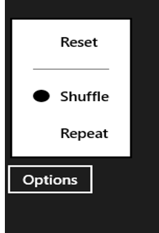
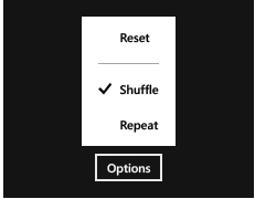
<Button Content="Options">
<Button.Flyout>
<MenuFlyout>
<MenuFlyoutItem Text="Reset" Click="Reset_Click"/>
<MenuFlyoutSeparator/>
<ToggleMenuFlyoutItem Text="Shuffle" IsChecked="{Binding IsShuffleEnabled,
Mode=TwoWay}"/>
<ToggleMenuFlyoutItem Text="Repeat" IsChecked="{Binding IsRepeatEnabled,
Mode=TwoWay}"/>
</MenuFlyout>
</Button.Flyout>
</Button>
For ToggleMenuFlyoutItem, if you wondering to update the icon when it was checked.
You can right click the ToggleMenuFlyoutItem, and select “Edit Template”, “Edit
a Copy”, then you will see a dialog asking for create style resource, click“OK”.
Try to find the following code within the Style:
<Path x:Name="CheckGlyph" Data="F1 M 0,58 L 2,56 L 6,60 L 13,51 L
15,53 L 6,64 z" Fill="{TemplateBinding Foreground}"
FlowDirection="LeftToRight" Height="14"
Margin="0,0,10,0" Opacity="0" Stretch="Fill" Width="16"/>
Replace it with following code:
<Ellipse x:Name="CheckGlyph" Fill="{TemplateBinding Foreground}"
FlowDirection="LeftToRight" Height="14"
Margin="0,0,10,0" Opacity="0" Stretch="Fill" Width="16"/>
When you select a ToggleMenuFlyoutItem,the check icon like below: