Managing distributed, part-time and virtual teams – Part 2 … Portfolio, flights, teams, epics and VSO
Last time instantiated a thread on Normali[s|z]ed estimations and continue with our use of Visual Studio Online (VSO) to manage our portfolio of projects, teams and “flights”.
our context
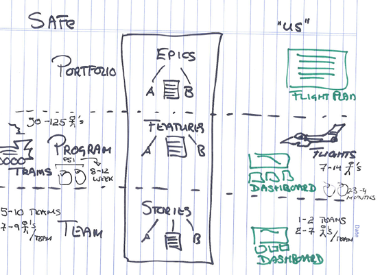
In the following whiteboard illustration we show the hierarchy of epics – features and stories in the middle.
- On the left we scribbled a few notes from the Scaled Agile Framework® (SAFe™), which talks about 5-10 teams, each with 7-9 members, working in a release “train” driven by 50-125 members.
Typically there is a potentially shippable increment (PSI) every 8-12 weeks. The left hand-side summarizes the full-time world, with dedicated teams. - On the right we see “our” world, which can be summarised as geographically distributed, virtual, part-time and volunteer based teams.
We work with smaller feature teams working in a release “flight” to implement an “Idea”, which probably stems from our passion in aviation
- (A)rchitecture and (B)usiness are “types” of the backlog items, dividing the backlog into business features or the supporting architecture.
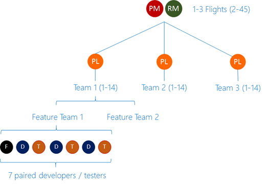
- Each feature team has 5-7 members.
Each “Flight” team has 1-2 feature teams, coordinated by a project lead.
For every 1-3 flights we have a program manager (pm) and a scrum|ruck master (rm).
Our ecosystem may feel management heavy, however, every resource, except for the program manager, are geographically distributed, part-time volunteers. There is a high tax to coordinate the often strategic flights, with “razor sharp focus” and ensure we meet time, feature and quality goals.
? .1 Anyone operating with similar team structures?
our portfolio view of ideas and flights
At the time of writing this blog post, we do not have the option of customizing our process template on Visual Studio Online and therefore neither have support for the portfolio level or the Epic work item type. So, the following view from our TFS on Azure IaaS proof-of-concept environment is what we would like to see if we were to transform the whiteboard above into a backlog:

Instead we use tags to “tag” features as (1) Epics and assign them a (2) business, (3) architecture or (4) process (ruck) type:
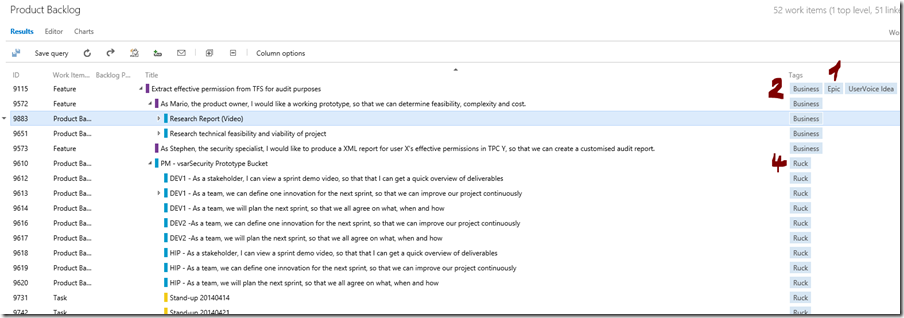
Using a special query we can get a list of our portfolio of “flights”:

So, at a portfolio level we can see the status of all “flights”.
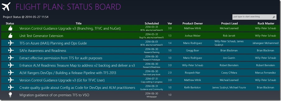
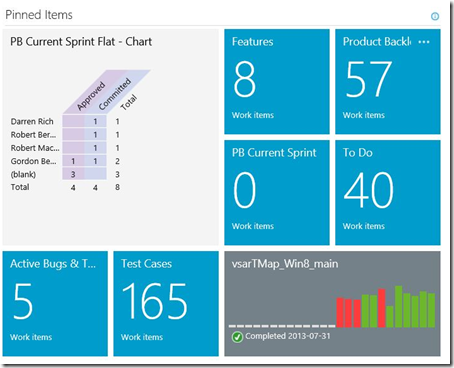
A few years ago, project dashboards were the buzzword and promise for successful project management. Unfortunately the over use and misuse of widgets, gadgets, colors, and information created overwhelming dashboards making it difficult to spot the “eye of the storm” and easy to ignore information until it was too late. In our project ecosystem we use the visualization status of the flights as out main view.It is a visualization that should feel natural to anyone who has traveled by bus, train, ship or plane and tracked their departure, arrival, or connecting journey on the status board. Using the Flight Plan community solution we visualize our recently landed, inflight, and imminent projects on our flight plan status board, pulling this information in real-time from our Visual Studio Online account. The use of a common user experience makes it easy to consume, and the subtle use of colors makes us aware of potential issues.
- Green – Once the product owner signs off on the flight (project), it has landed successfully, and therefore meets expectations.
- Blue – The flight (project) is inflight (under construction) and is on-track.
- Red - The flight (project) is inflight (under construction), but is overdue and requires attention.
- Grey – The flight (project) is one of the next ideas to prepare for take-off.
The flight plan status board intentionally does not overwhelm the team with detail, which can be explored by selecting (clicking on) flights.
What is missing is the metrics of work done, work pending and investment themes. More on those at a later stage, as we are typically not tracking them “actively” for part-time projects.
? .2 What do you think of these high-level visualizations?
? .3 What do you think of the use of tags as an interim work-around until we can customize the process templates and add Epic as a first-class citizen on VSO?
our flight view at team level
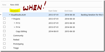
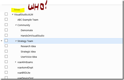
Using iteration and area paths we define the “when” and “who”, allowing us to fine tune each query and associated dashboard.
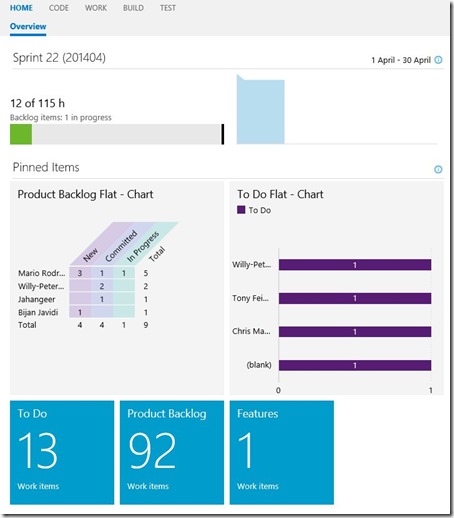
Each of our teams has its own dashboard and ability to decide which information is important to the team on their home page.
These dashboards are typically less overwhelming and customized to give the team a predictive (crystal ball) and reflective (are we in trouble) state of their nation. For example, the following team uses this simple dashboard to visualize their burn down, product backlog, and list of things to do. We should all frown when looking at the “burn down” chart, which is not ideal at a glance. If we look at the details, for example 12h of work remaining with 115h bandwidth, we realize that it should trigger a “ping” to the task owners, but is not (yet) a state that requires immediate corrective action.
Another example shows a team that is tracking their gated build, which has a few issues and has returned to a green (A-OK) state. What should appear unusual is the lack of information shown for capacity and burn-down of tasks in the two top graphs.
A key point is that visualization can share the most important status and trends-over-time information “at a glance”. They should not be an after-thought, but rather instilled in the team culture before launching a new project.
? .4 Are you using these VSO dashboards in a similar way?
reference information
More information n program managers, flight board and our VSO dog-fooding can be found in this section.
- Program Manager (PM)
- Flight Board
- VSO
- This series
- Part 1 - Normali[s|z]ed estimations
? .5 What’s missing?
what’s next?
Prioritization that typically goes hand in hand with estimations.
