Treasure Map under the bonnet (hood) #3 … Windows 8 Layout Controls (Update)
Lesson learnt: When you ask a developer or dev lead which view class is stable and ready to be used as an example, think twice before you start documenting. Change is imminent, change is guaranteed … but, we are agile and tenacious :)
This post is an update for the Treasure Map under the bonnet (hood) #1 … Windows 8 Layout Controls post and explains what has changed and why.
Making sure things have changed
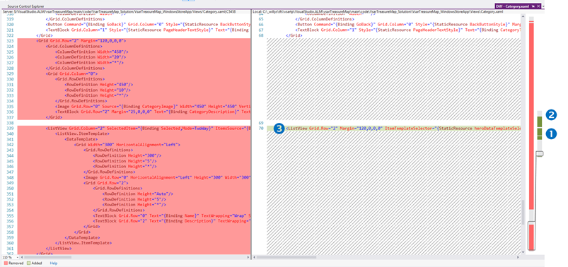
Using the Visual Studio Compare feature, gave me a high-altitude view of the seemingly massive changes when looking at the navigation bar on the right:
 |
|
| Styling information has been moved out of the category.xaml file, which account for most of the red (deleted) navigation bar and changes. | |
| The ListView control now refers to style="{StaticResource heroDataTemplateSelector}" and in-line styling has been removed. | |
Robert MacLean, our dev lead, refer to the heroDataTemplateSelector as a "very smart piece of XAML". Each time the items control (in our case a ListView) is ready to render an item it calls the selector to get advice on which template too use for rendering. If you peruse the codebase and look for the HeroDataTemplateSelector.SelectTemplateCore method you will find the fairly simple code that overrides the SelectTemplate() method and make a very powerful decision which template should be used to render the item. In our case, we have a selector that checks if the item has a name or not - if not, we use the HeroTemplate, otherwise we use the StandardTemplate. |
Dev Lead question time …
 |
Why are we defining the TemplateSelector and ListView style in the view file and not in the TreasureMap.xaml ResourceDictionary? |
|
Robert MacLean, our dev lead, replies … The template selector is defined in the view as it is very much specific to the view - it is not something we would reuse elsewhere in exactly the same way. |
 |
Delving into the ListView and associated Template
heroDataTemplateSelector
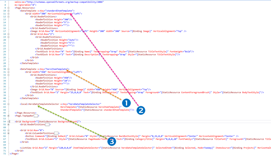
The HeroDataTemplateSelector defines two templates, namely HeroTemplate and StandardTemplate, both of which are defined on the Category page within the <Page.Resources/> tag.
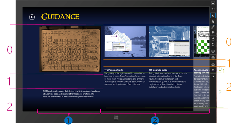
 The standardItemTemplate defines a grid with three rows, the third of which has a grid with three rows, an Image and two TextBlocks. Remember that we use this template when an item has a name, in other words when it refers to a category item such as the TFS Planning Guide, within the Guidance category.
 The heroItemTemplate defines a grid with three rows, an Image and a TextBlock. It is used to display a category item without a name. When we cover DataBinding in the next post we will get back to this phenomenal magic, which comes at a minimal tax for the developers.
ListView
 When we get back to our ListView within the third row of the main grid, as documented in Treasure Map under the bonnet (hood) #1 … Windows 8 Layout Controls, we notice that the xaml has been simplified and reduced down to declaring the ItemTemplateSelector as discussed above.
Mapping it back to the UX
For the visual readers, like Willy, will conclude this post by marching the above magic to the actual category view as shown below.
We will return to the data binding in the next post, whereby I will trace the data from XML file to the UX, where the above changes will probably start making sense.
Dev Lead final question time …
 |
Running the Category View in the Simulator I am wondering how the user will scroll to the right without a touch screen. Is this functionality not yet baked in? |
|
Robert MacLean, our dev lead, replies … For non-touch scenarios it supports mouse wheel, click and drag or scroll bar. The reason you were not seeing the scrollbar is because we just needed to turn on the horizontal and turn off the vertical scroll bars. "Change is imminent, change is guaranteed" - change has happened and is checked in |
 |
Benefits?
Readability and maintainability has been improved. In fact we decreased from 364 lines of xaml code to 64. The DataTemplateSelector is one of the magic that the team sprinkled over this latest codebase, making it a lot more powerful, yet simplify the design as indicated.
References

