Treasure Map under the bonnet (hood) #2 … Windows 8 Styling
We are continuing from Treasure Map under the bonnet (hood) #1 … Windows 8 Layout Controls and will delve into styling, before looking at data binding in the post thereafter. The first impression usually last and therefore is it imperative that the look & feel and the style of your solution is appealing, functional and contextual. For example, we chose the pirates and treasure hunt theme to emphasise the need to continuously explore and hunt for hidden jewels … in the case of this solution, ALM Readiness jewels.
Styling Recap
When we work with layout or other controls in XAML, we can control the colours, alignment, margins, width, size and other characteristics.
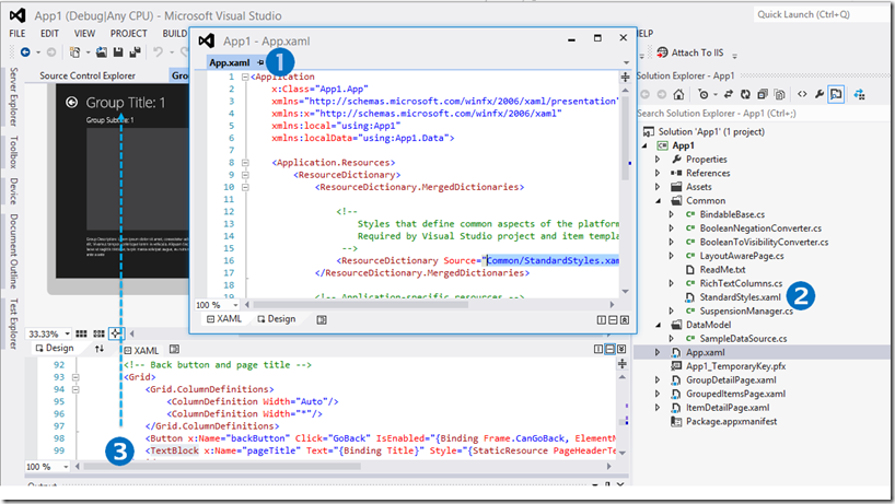
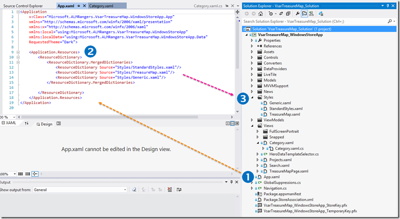
Style definitions are typically defined in Common/StandardStyles.xaml, or in separate resource files which are merged in App.xaml. Alternatively you could assign styling to each control implicitly, or include styling definitions in the separate view XAML file between the <Page.Resources/> tag … but, for the sake of maintainability we recommend that you minimise this scattered strategy.
Let’s take a quick peek at the default behaviour if we use the Windows Store App GridApp template in Visual Studio:
My first and probably greatest mentor once frowned and looked at me with a grim look when I asked whether I could as a stupid question. He eventually mumbled through is huge and grey beard … “Willy, there is only one stupid question … the one you never asked”. From that day I always questioned and we now have questions for both our UX and Dev Lead gurus ![]()
UX question time …
 |
Should we be fiddling with layout and styles in XAML or Blend? When is it the right time to use which tool? |
|
Anisha Pindoria, our UX specialist, replies … Blend allows both designers and developers to design styles and layout visually. The same result can be achieved writing XAML, however, all visual aspects would have to be written and this can be time consuming. When styling, it is usually done best in Blend, as the designer/developer can visually see what is being applied and can be achieved in a few clicks. Fiddling in XAML is usually done when small tweaks are needed, or if Blend cannot visually aid in this. For example, to create a simple rectangle with a style coloured red and centered in the middle of a grid… In Blend, you would draw a rectangle on the page, right-click on the new rectangle, create a new style and colour the rectangle red and finally change the horizontal and vertical alignments to Stretch. In XAML you would create the following… <Rectangle Height="394" Margin="0" Width="394" Style="{StaticResource RectangleStyle1}"/> … then in the file where the styles are kept, the following needs to be added… <Style x:Key="RectangleStyle1" TargetType="Rectangle"> <Setter Property="Fill" Value="Red"/> </Style> |
 |
Dev Lead question time …
 |
When we have a gazillion styles, how do we quickly and easily find the definition of the style and how do we avoid contention by a style being defined in multiple style files? |
|
Robert MacLean, our dev lead, replies … Finding the style is really a matter of tooling and thankfully a lot of work was done to merge Blend & VS 2012 together so it is a lot easier to right click on an item and navigate to the current set option as well as have options for listing the other potential choices. Contention is a real issue and something we make use of with the generic.xaml file which intentionally overrides some of the styles from standardsstyles.xaml to get the colouring right. At this point, it is still pretty manual to deal with bugs in this space. |
 |
Treasure Map Styling
Styles Files
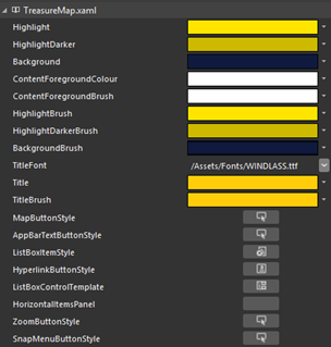
The ALM Readiness Treasure Map solution uses a strategy for referencing styles that is generally one of the better ways to share style definitions across your views and solution in general.
Dev Lead question time …
 |
Why are the StandardStyles and Generic styles not all in one ResourceDictionary? They appear to be MS defined and thus standard … in which case they could be combined? |
|
Robert MacLean, our dev lead, replies … StandardStyles.xaml - this is the one that comes with the project when you do a file -> new project. We do not fiddle here, or we try not to Generic.xaml - This is a generated file (generated using Hammer.Pants - https://github.com/Code52/HAMMER ) that takes the out of the box styles and applies our colours to it so we get a more consistent application of our colours. It doesn't cover all the styles just a subset. Could they be combined? Yes - but if Microsoft ever updates either (in the template or in generic.xaml in the SDK) having them separate will mean it is easier to update them. |
 |
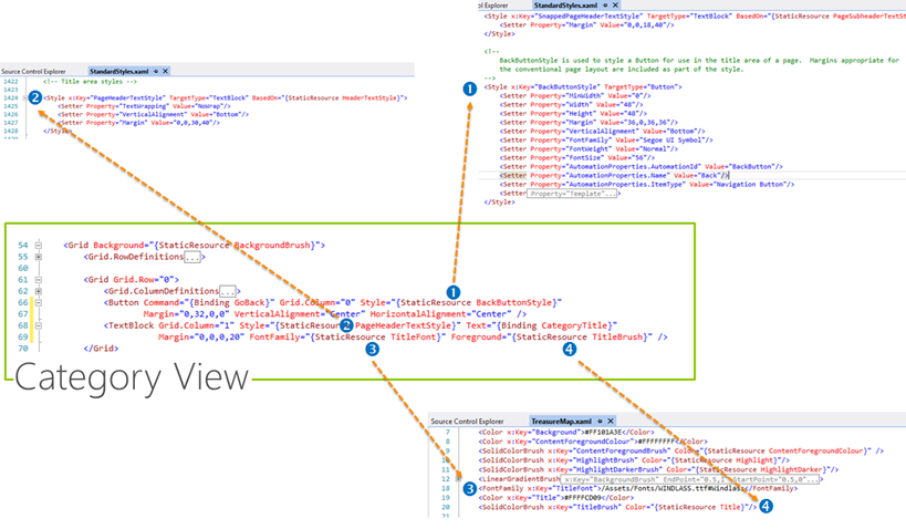
Styles Examples
We peek into the first row <Grid.Row=”0”/> of our Control View in this example, which contains a Button and a TextBlock action control.
Last question for our Dev Lead …
 |
Should we not add names x:Name="" to all controls for ease of Coded UI testing, when support is available for Windows Store Apps? For Coded UI support info see https://msdn.microsoft.com/en-us/library/dd380742.aspx. |
|
Robert MacLean, our dev lead, replies … First we should only add properties to things that actually need it, and many of our controls do not need to be exposed to any sort of automation. Since we have followed MVVM we have a pretty good way of testing the logic without automation, so really what we need UI automation for is a small subset. Secondly, for Coded UI or any UI automation really there is a much better option: AutomationProperties ( https://msdn.microsoft.com/en-us/library/windows/apps/br209081.aspx ) |
 |
Next?
We planned to cover data binding next, but check-in events have made me realise that changes to the layout may deserve a quick peek before we continue. In the next post we will “briefly” review the latest changes and ask the team to elaborate on the churn.
References


