What do you think of proposed User Experience (UX) ideas for ALM Readiness Treasure Map?
Anisha Pindoria has been hard at work to re-design the user experience for the ALM Readiness Treasure Map, based on feedback from the community, the team and her at times rebellious crew.
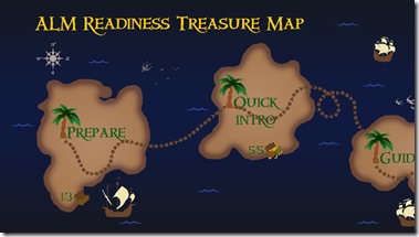
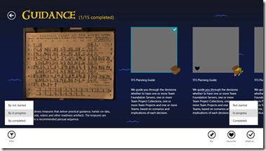
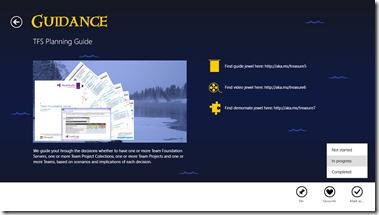
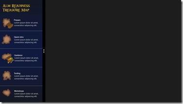
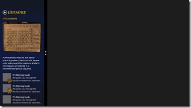
Here are the proposed changes, whereby the current v1 experience is shown on the left and the v2 proposed experience on the right:
Views
Views |
v1 UX |
v2 – Proposed UX |
| Main | 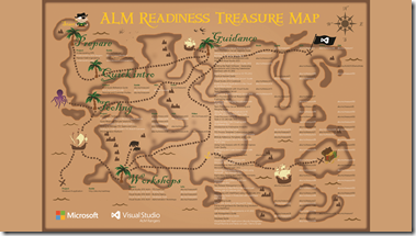 |
 |
| Group | 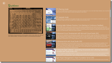 |
 |
| Detail | 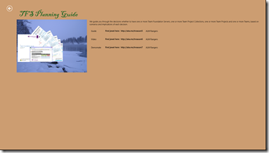 |
 |
| Semantic Zoom | 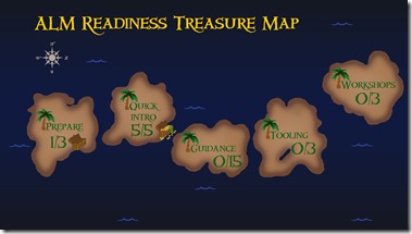 |
|
| Snapped |  |
 |
| Snapped II |  |
 |
| Favourites | 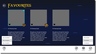 |
For those that have installed v1 from https://aka.ms/vsartmapapp you will remember the v1 “look and feel” as shown on the left. For the new v2 UX, Anisha tried to capture all the possible ways of interacting with one view, i.e. showing the app bar as well as the filter options etc., so that we have an idea what items could look like.
The little treasure chest that you notice on the list items on the Group view, indicates that this list item has been ‘completed’.
- Not started – symbolised by no treasure chest.
- In Progress – symbolised by an empty treasure chest.
- Completed – symbolised by an overflowing treasure chest
Live Tiles
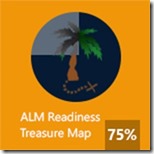
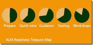
The tiles are still undergoing heavy redesign, but we are planning to show your progress on through the treasure map as a percentage on the small tile and pie charts representing categories on larger tile.
What do you think? We would appreciate your candid feedback and ideas on these proposed UX changes.
