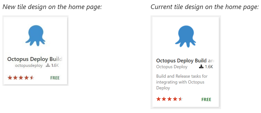
New look of the extension tiles on Marketplace
We aim to continuously improve the browsing experience on Marketplace and are introducing new designs for the extension tiles on our website.
- The tiles on the home page are now optimized for increased exploration and hence, do not include the extension description upfront. Instead, the extension description is now revealed when the user hovers their cursor over the tiles.
- The tiles on the Marketplace search and category pages have also undergone a face-lift with cosmetic improvements in the UI elements. The new look is more visually balanced as well as consistent with the layout of the new tiles on the home page.

We ran this design optimization by a set of test users comparing user responses with a control group. We calculated key metrics and analyzed the benefits of optimizing the tile design on the home page and how it helps our users discover more content from their page visit.
Expect more from us as we continue our progress in optimizing the user journey for discovering productivity tools and extensions that boost their everyday work.
The new tiles would be live on the website now. Do write to us at vsmarketplace@microsoft.com or tweet at us with the hashtag #VSMarketplace with any feedback.
FAQs
- Why do the home page and the category/ search pages not have the same tile design?
The home page tiles are intentionally concise helping the users notice more extensions upfront. While, the search and category tiles are designed to highlight the “queried” or “filtered” information. Therefore, the difference between the two tile designs.
- Will I still be able to access sufficient information about each extension?
Yes. On the homepage, hovering over the tiles would reveal the short description. While on the search and category pages, users would notice the information upfront as a part of the tiles.