Five more COOL features we noticed on Visual Studio Online today
We started highlighting cool features and their impact on our process and productivity in the post seven COOL features we noticed on Visual Studio Online today. The feature teams are doing a phenomenal job in terms of continuously updating Visual Studio Online and lighting up additional features on the planning boards, such as …
Swimlanes
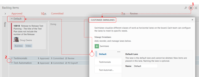
Swimlanes help us categorise and visualise information for features and releases on the board.
- Click on Configure the board icon, select Swimlanes and configure to suit you!
- When you collapse the Swimlanes, you get a handy heads-up overview.
We initially overused Swimlanes and noticed a side effect that they can break-up the order within a column (i.e. Committed) and flow across the board. If the order and flow within the swimlane is intentional, this a great visualization and productivity feature. However, Swimlanes are not a silver bullet or fit-for-all, and the side effect can be deceiving if used in an incorrect context.
When you see a flow within a Swimlane you likely have a healthy board:
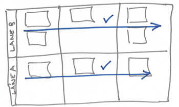
When your flow crosses Swimlanes you have a smell (potential anomaly or hint that something is amiss) on your board. Just like with swimming, crossing the lanes is frowned upon.
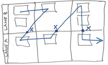
The Rangers, who used the portfolio board, will remember a distinct smell when we used a Swimlane to visualise blocked features. Instead of highlighting blocked, delayed and other impediments, they were often forgotten. We resolved the visualization of cards, i.e. blocked or delayed, using a much better feature which we noticed and will introduce next.
Colo[u]r coded cards
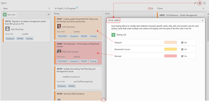
When you click on the Configure the board icon, you will notice the Card Styles feature. It allow us to create rules to visually draw attention towards specific cards. On our overall Epic (flights, projects) board we defined a rule to look for blocked, delayed and bandwidth crunch tags and colour the cards in red, orange and yellow respectively.
With the coloured cards we visually notice “smoke” from afar and were able to remove swimlanes, special queries and visualizations and thereby simplify our environment.
Maximize board real-estate
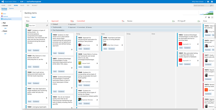
Visual boards are great, however, when projects and their backlogs become large, or (as in our case) we use one Team Project and one Backlog to rule them all, some of the boards can become very busy and the visualization value quickly deteriorates.
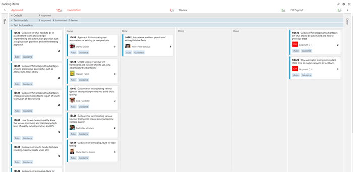
With 4 clicks, we can bring a lot of relief to busy boards and use the available real estate more effectively.
- Click … minimise the backlog explorer.
- Click … minimise the NEW column.
- Click … minimise the DONE column.
… and … - Click … and enter full screen mode.
We end up with a more focused and less-noisy visualization.
Filter board
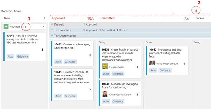
During scrum events we often stare at the board looking for a specific card or cards with special attributes. Welcome search!
- We can filter the NEW column to only show the cards we are interested in. For example all cards with 3 story points or a 3 in the data.
- More importantly, we can filter the rest of the board. Again we search for 3 andnotice that the noise vanishes.
Next time you are running the scrum event, try using the filter to focus the cards on the development team user giving feedback.
Hints
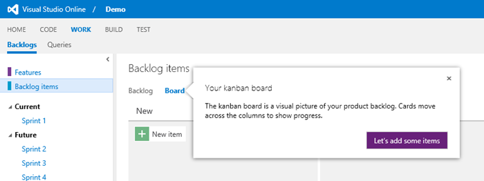
Last but not least we notice a lot more hints popping up and guiding the user. This is a great guide for new users to get started and the rest of us to be reminded of features we have forgotten or not yet discovered.
Feedback
What are your findings? What do you like, dislike and/or miss in terms of Agile planning?
Add a comment or contact us here.
Related Posts
- Seven COOL features we noticed on Visual Studio Online today
- Managing agile open-source software projects with Microsoft Visual Studio Online
For more information on these and other productivity features, please refer to Visual Studio Online, Get Started, and Visual Studio Online Updates.

