
Designing pixel perfect layouts in Visual Studio 2013 and Blend
It’s a familiar scenario. You’re developing your application and you’ve got a design in mind. It may have come from a professional designer or a sketch on the back of a cocktail napkin, but you need to move from a concept to a working, implemented design. This can be easier said than done.
When your design calls for the baseline of that text to be exactly 100px from the top, but that baseline is within a control template buried in a custom control, it’s a headache to figure out what value needs to be tweaked to get that precise position. In another case, you want the Image to be exactly 300px wide, but your asset is 260px wide and you plan to skew it horizontally until it’s the right width. You probably don’t want to use trigonometry to figure out the correct angle of skew. Blend has heard the pleas for an easier way to do it, and with Blend for Visual Studio 2013, we’ve implemented some new tools to help you take that design and turn it into a polished, ready to impress app. Let your designers go wild; now you’re ready.
A new Ruler/Guide system helps you get the pixel perfect accuracy you want. The advanced snapping engine gets everything lined up just the way you need, and the upgraded in-place editing engine helps you fix your control templates and styles without removing you from the environment where they’re being used.
The Measurement Bar
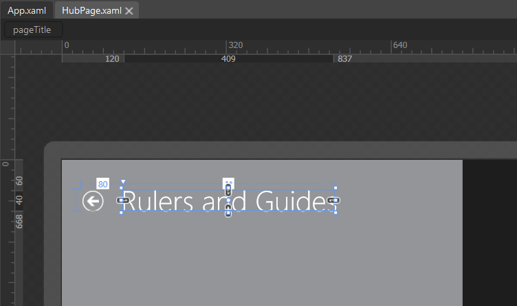
The first thing you’re going to see when you open up a Windows Store app in XAML or HTML are the new rulers. Drag a control out on the artboard, or just select some element. You’ll see that the rulers bring up the measurement bar, showing you some valuable information. It’s simple… how wide/tall is your element? How much distance is there between your element and the sides of the document? That may not seem like it’s the most valuable, but try this…
Create your Grid app and find out if your Title is exactly where it’s supposed to be. The Windows User Experience guidelines say that your baseline should be 100px from the top and 120px from the left. When you select the pageTitle, the values that you see on the measurement bar are the FINAL, rendered measurements. It takes into account the parent containers and render transforms to give you a set of measurements that represents where the control will be at runtime. This even works inside a control or data template. So, next time you’ve got a complex UI and you need to get that control to be exactly 120 pixels from the side of the application, you’ll see why the rulers and measurement bars are powerful tools.
Guides
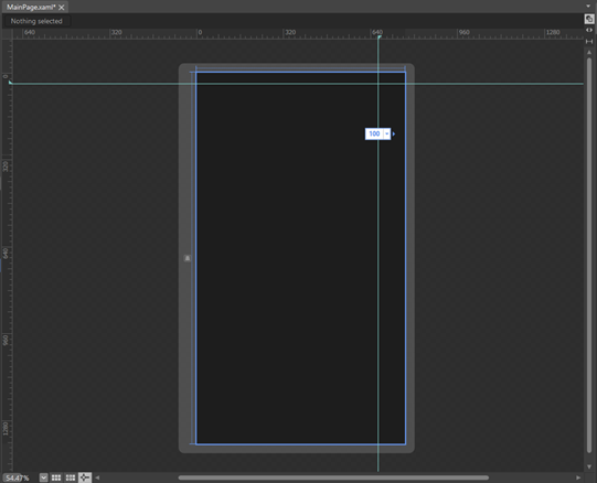
Of course, now you might be sitting there, asking yourself if there’s an EASIER way to get controls to a specific location. In your design, you’ve got a logo for your app, and you want that logo near the top right of your app, but with 40px of padding from the top and 100px of padding to the right. You could drag the Image to the general location and nudge it around until you get the desired values, but the guides system makes it MUCH easier.
Put your cursor on the top ruler, click the mouse and drag downward. As soon as you do, Blend will create a guide for you and show you the position relative to the top edge of your application. If you don’t want to try to drag to a specific offset, just click on the value and change it.

If you do the same thing with the guide on the left, you’re going to see the distance from the left edge of the design surface. In this example, that’s not what you want, so drop the guide somewhere, and click just to the right of the value. A context menu will come and allow you to specify that the guide should be “Right Aligned”. Now, Blend will show you the distance to the right edge. Click on that value, type 100, and you’ve now got a guide that’s showing your distance to the edge you want.
If you really want to see something cool, go to the Device panel and switch from Landscape to Portrait. As soon as you do, the vertical guide will readjust itself to be 100px from the new right edge. The guides will always make sure that their distances are correct, regardless of how you change the device resolution, snapped status or orientation.
The other really useful part is that you can snap to the guides, regardless of your scope. Draw a Button in the vicinity of the guides and edit the template on the Button. Within the Button, drag out a Rectangle, and you’ll see that you can snap that Rectangle to the guides, even though you’re inside the control template. This significantly improves the experience of trying to get your controls to line up, regardless of the layout patterns you decide to use.
Snapping
The snapping engine in Blend has also gotten a few improvements. If you tried to get your Windows Store elements to line up in older versions of Blend, you may have seen that some controls seem to be 3px off from everything else. You may have also tried to get the baseline of your TextBlock to line up with the baseline of the text in your Button, and found it somewhat challenging.
The default controls for Windows Store apps usually have a focus rectangle built into the control. For instance, when a keyboard user navigates to a Button, it gets a white rectangle placed outside the Button indicating focus. This focus rectangle is built into the layout boundaries of the Button, which is why the adorners for a Button on the design surface seem to be a few pixels away from the edges of the Button instead of directly on it. Having the focus rectangle inside the layout bounds helps prevent you from creating ugly layouts with overlapping rectangles, but it certainly makes it tricky to get that Button to look exactly right.
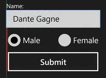
In the image above, all four controls have a left padding of 100. The guide is also positioned at 100 to show where you EXPECT all of the controls to be. But, the red rectangle shows how the RadioButton and Button are both offset by 3 pixels. These little discrepancies are the things that are, quite frankly, the types of things that will give your app an unpolished look.
The snapping engine in Blend is now able to ignore the invisible elements of most controls and snap to the visual bounds of the elements instead. To see this, drag a guide 100px from the left edge and move a Button toward the guide until it snaps. Now you’ll see that the element’s visuals snap to the guide instead of the layout boundary. This works when you’re snapping elements to guides or to other elements.
Another improvement in the snapping engine is with text baselines. Drag out a horizontal guide, a Button and a TextBlock. Now, drag the Button and the TextBlock to the horizontal guide and try to get the baselines of their text on the guide. You’ll see that Blend is now able to find text baselines for the common controls, and allows you to snap to them. So, when the Windows guidelines tell you that the baseline of a particular text element is supposed to be 140px from the top, you can create that guide and actually get your baseline exactly at 140px.
The rulers, guides, and snapping features have all been forged from your feedback. We’re always looking for ways to help users make better apps more easily, and if you’ve got more ideas, we’d love to hear them. Please let us know what’s on your mind. We read all the feedback, whether it comes from replies to this post, User Voice requests, Connect bugs or the Send-A-Smile system in Visual Studio.
 |
Dante Gagne is a Program Manager with Microsoft and has devoted the last 11 years of his life to XAML tools. He started as a tester, but eventually brought his passion to helping form the features of both Blend and Visual Studio. Today, his focus is on the design experience and productivity. |
 Light
Light Dark
Dark
0 comments