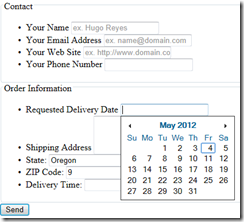
Getting Started on Line-of-Business HTML5 App – Part 8 Building a Better Form
 One of the cool features of HTML5 is the support offered in forms. You’ve probably worked with HTML form tag, which is how you collect customer responses and add interactivity to your website. HTML forms interact with scripts to collect data, record information, or simply involve your readers with your web page.
You’ve used input types like text, password, file, hidden, checkbox, radio, submit and button.
But with only those input types, you had to write you own controls for things like a data picker. Your date picker has been a combination of JavaScript and HTML for the user to select a date and insert it into a text.
The great news of HTML5 is that you get new attributes of input for use in your forms, including:
autocompleteautofocuslistplaceholdermaxminmultiplepatternrequiredstep
These new attributes can do things such as:
- enable native autocomplete.
- mimic elem.focus() at page load.
- do form field hinting,.
- do client-side validation.
And you get new input types. These types can enable native date-pickers, color-pickers, URL validation:.
searchThis a one-line plain-text edit control for entering one or more search terms. The search input will, in some browsers, change the styles to match the browser or operating system default search field format.telThis input type a one-line plain-text edit control for entering a telephone number. It helps devices such as the iPhone select a different input keyboard. There is no pattern-matching set by default so you would have to implement that yourself using the pattern attribute to accept only certain characters.urlThis input represents a control for editing an absolute URL given in the element’s value.emailIs a control for editing a list of e-mail addresses given in the element’s value. It is a string that matches the following regular expression:/^[a-zA-Z0-9.!#$%&’*+/=?^_`{|}~-]+@[a-zA-Z0-9-]+(?:\.[a-zA-Z0-9-]+)*$/You can define a pattern that requires the user to enter the protocol, such as https://datetimeThis control sets the element’s value to a string representing a global date and time (with time zone information). You get a datetime that looks like this:1996-12-19T16:39:57-08:00dateThis input control sets the element’s value to a string representing a date. It is a full-date with the additional qualification that the year component is four or more digits representing a number greater than 0, such as1996-12-19.monthThis is a control sets the element’s value to a string representing a month. You get the year and month that looks like this:1996-12weekThis is a control sets the element’s value to a string representing a week. You get back a string that looks like this:1996-W16timeThis is a control sets the element’s value to a string representing a time (with no timezone information). It is a valid partial-time that looks like this:17:39:57datetime-localThis control sets the element’s value to a string representing a local date and time (with no timezone information).numberThis is a a precise control sets the element’s value to a string representing a number.rangeThis is an imprecise control sets the element’s value to a string representing a number. You get a string.colorThe color input is meant to let you select a hex-code from a color wheel - or similar - but as yet doesn't appear to have been implemented in the wild.
And in HTML5 you get new tags to group and identify your user input: fieldset, legend and label.
How Modernizr Helps
But not all browser support a given type or attribute. You can use Modernizr to help you identify that a feature exists and then do the right thing. For browsers that do not support a particular input type, Modernizr will render your input as a text field. And Modernizr cannot detect that date inputs create a datepicker, the color input create a colorpicker, and so on. But Modernizr will detect that the input values are sanitized based on the spec.
In This Post
In this blog post, we’ll explore a couple important attributes and types.
I’ll show how required, placeholder, email, and pattern help you validate your user input. The input goes inside a label.
And I’ll what happens in various browsers because each one will be a bit different, and then show how to provide a consistent look using CSS.
And finally, I’ll group my input using fieldset, legend and label.
Validating Your Input in Markup
In the past, you have written JavaScript code to show that a field was required or to validate the input as a number or provide a calendar. Browsers that support the new tags and attributes will help you in letting the user know what to do next.
Required Input
With HTML5 forms you can add an attribute that shows a particular user input is required. For example,
<input type="text" id="name" required>
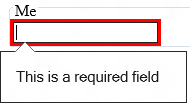
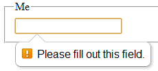
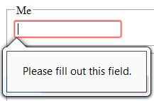
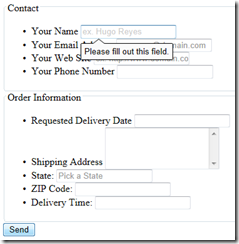
In browsers that support the new HTML5 forms, you will see the following when a user does not enter the required data.
IE 10 on Windows 8 |
On Chrome |
Firefox beta |
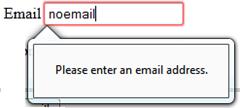
Internet Explorer 9 |
Note that IE 9 does not support the form input type. You will still need to validate your user input for IE9 and other browsers that do not support all of the new forms tags and attributes. Use Modernizr to help you detect whether the features exist and then take the appropriate action.
Placeholder
You can also add a placeholder, which displays some text that can be a hint to the user.
For example, an email placeholder code:
<input type="email" id="orderEmail" name="myEmail" placeholder="email@contoso.com" required />
Would show the following before the user entered her email address.
If the email is left blank, the required attribute cause the browser to prompt the user to fill in the field. And then when the address is not entered as expected, the browser will prompt the user to enter a valid email address.
Label
A label associates a caption in a user interface. The caption can be associated with a specific form control, known as the label element's labeled control, either using for attribute, or by putting the form control inside the label element itself.
Here’s an example:
<p><label>Telephone: <input type="tel"></label></p>
or
 <label for="price">Price</label>
<input id="price" type="text" title="0.00" pattern="\d+(\.\d{2})?" />
Pattern
The pattern attribute on input element specifies a regular expression against which the control's value, or, when the multiple attribute applies and is set, the control's values, are to be checked.
Here is a sample pattern:
 <label for="price">Price</label>
<input id="price" type="text" title="0.00" pattern="\d+(\.\d{2})?" />
Range
The range input type is used for the user to enter a value that should contain a value from a range of numbers. You can also set restrictions on what numbers are accepted.
<input type="range" name="anumberbetween1and10" min="1" max="10" />
You can use a value attribute to provide the user with a default value.
DataList
A datalist can be bound to an input to provide a list similar to a combo box. The difference being that the list can created and maintained using jQuery.
You define a datalist that represents the list that is used to predefine options for an input.
The input control can then use the datalist by declaring it as an attribute.
Here is an example:
 <input type= "text" list= "pacificstates" name= "State" id= "State" placeholder= "Pick a State" />
<datalist id= "pacificstates">
    <select>
        <option value= "California" />
        <option value= "Oregon" />
        <option value= "Washington" />
    </select>
</datalist>
Title
The title attribute specifies extra information about an element. The information is most often shown as a tooltip text when the mouse moves over the element.
For example:
 <label for= "zip">ZIP Code: </label><input type= "text" id= "zip" title="Five- or nine-digit zip code"
pattern="^(\d{5}-\d{4}|\d{5}|\d{9})$" />
Custom Invalid Entry
You can style an invalid input by using CSS. In the example, I will add a stop sign to style of the input.
 <style>
input:required:invalid, input:focus:invalid
{
    background-image: url(/images/invalid.png);
    background-position: right top;
    background-repeat: no-repeat;
}
</style>
The first set of styles can be used to mark an input box as 'invalid', by adding an icon, coloring the text or borders or similar. It will apply to inputs that are required but empty, or to inputs that have a required format which hasn't yet been met. I've added a red exclamation mark for my invalid icon.
Here’s the the input box after it has been formatted.
You can add -moz-box-shadow style is there just to prevent Firefox 4 Beta from adding it's default red border.
Identifying User Input with fieldset, legend, label Tags
Use a fieldset to group together a set of form controls. You can provide a visible name for the fieldset by defining a label.
Here’s an example where the name input is required:
     <form>
    <fieldset name="userinfo">
        <legend>User information</legend>
        <label for="name">Name</label>
        <input type="text" name="name" id="name" size="40" required>
        <br />
        <label for="address">Address</label>
        <input type="text" name="address" id="address" size="40">
        <br />
        <label for="phone">Phone</label>
        <input type="text" name="phone" id="phone" size="40">
    </fieldset>
    </form>
Use a label to put the name in front of the input element.
When you include the style sheet and a image icon that tells the user that the field is required, your users will see this:
Adding Modernizer
But the forms do not look like this in IE9. Modernizr and polyfills to the rescue.
Use Modernizr to test whether the forms functionality is supported by your browser, and if not, you can add some of the missing functionality using polyfills. (See my previous post ___);
To inspect what is supported for input tags, you can ask Modernizer whether the browser supports a particular input element or attribute.
For example, load Modernizr, then check to see if the placeholder attribute is supported, and then call a polyfill that can provide the functionality.
 <script src="Scripts/modernizr-2.5.3.min.js" type="text/javascript"></script>
<script>
    Modernizr.load({
        test: Modernizr.input.placeholder,
        nope: function () {
            Modernizr.load('Scripts/yourplaceholderpolyfill.js');
         }
     });
</script>
Choose your own polyfill from HTML5 Cross Browser Polyfills or write your own.
NOTE: Modernizr uses yepnope during load. And that will make sure your script is loaded only once, so you can do several checks and call the same polyfill.
NOTE: Polyfills are supported by their own authors and on public forums.
Webshims Lib
Webshims Lib is a modular capability-based polyfill-loading library, which focuses on accurate implementations of stable HTML5 features, so that developers can write modern, interoperable and robust code in all browsers. It is built on top of jQuery and Modernizr. You get it from GitHub.
In this case I’ll add it to the top of my page.
Here’s my page in IE9.
There is a lot more capability than I have demonstrated. You can minimize the JavaScript loaded and much more. You can customize your error messages and just use the parts of Webshims that you need. You can change the UI styles based on the validation.
If you want to achieve just the forms compatibility, all you need to do is include jQuery and then this:
 <script src="Scripts/js-webshim/minified/polyfiller.js"></script>
<script>$.webshims.polyfill('forms forms-ext');</script>
Check out the details on Webshims Lib on GitHub.
JQuery HTML5Form Plugin
In the GitHub source code you will also find example of how you can use jquery.html5form by Matias Mancini. It provides some of the functionality offered in Webshims but in a different way. JQuery HTML5 Form supports:
- Placeholder attribute
- Email attribute
- Textarea maxlength attribute
- Required attribute
- Url attribute
- Autocomplete attribute
The polyfill itself will determine what features my browser support. It does require jQuery, so you’ll need to load it first. So the code looks like this:
 <!-- jQuery (HTML5Forms requires jQuery 1.4 and higher) -->
<script src="Scripts/jquery-1.7.1.min.js"></script>

<!-- jQuery.html5form plugin -->
<script src="Scripts/jquery.html5form-1.5-min.js"></script>

<script>
    $(document).ready(function () {
        $('#myform').html5form();
    });
</script>
More Information
See:
- Brandon Satrom’s excellent article Better Web Forms with HTML5 Forms in MSDN Magazine.
- Creating Cross Browser HTML5 Forms Now, Using modernizr, webforms2 and html5Widgets
- Also Rachel Appel’s article , Build Mobile-Friendly HTML5 Forms with ASP.NET MVC 4 and jQuery Mobile and Detect HTML5 & CSS 3 features in your ASP.NET Web Forms, MVC, or Razor Pages with Modernizr.
Next Up
How to use jQuery to show and hide parts of the form (so the user does not have to see everything all at once).
Bruce D. KyleISV Developer Evangelist | Microsoft Corporation
