Getting Started on Line-of-Business HTML5 App – Part 3 Adding Some Style
 In Part 1, I just got some HTML code written as a skeleton to get me started. In Part 2, I wanted to build out my development environment so I got a trial copy of Visual Studio 11, and Expression.
First of all, I want to place place the text and stylize. I want to build out the blocks and place them on the screen. And I’ll add Modernizr and those features later.
The goal is not to teach you CSS, but to show off some of the possibilities of what you can do to get started.
Getting Ready for CSS
First, I want to set up a folder named Styles. It contains my style sheets.
In the head section of my HTML file, I want to add
 <!-- CSS -->
<link href="Styles/reset.css" rel="stylesheet" type="text/css" />
<link href="Styles/site.css" rel="stylesheet" type="text/css" />
Reset Stylesheet
The goal of a reset stylesheet is to reduce browser inconsistencies in things like default line heights, margins and font sizes of headings, and so on. All browsers have presentation defaults, but no browsers have the same defaults. For example, some browsers indent unordered and ordered lists with left margins, whereas others use left padding.
Your reset.css file is meant to be a document that you change for your particular needs. Fill in your preferred colors for the page, links, the default styles that you want to use on your Website.
The reset file is the first thing your browser sees. So it needs to be at the top of the <head> tag.
Eric Meyers has put together a reset stylesheet and placed it in the public domain as a starting point for you. See CSS Tools: Reset CSS.
You can use the one Eric proposes as a starting point for your own.
Save the file as reset.css into your Content folder.
You might use a more sophisticated HTML5 page template, you can reference HTML5 boilerplate.
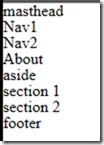
When I get done, I have text. Lots of text.
Setting up Text for CSS
Now I can begin styling my text.
I can do this by applying style sheets to the HTML5 itself.
I’ve added some background color so we can see where each item is placed.
 /* CSS layout */
body {
    margin: 0;
    padding: 0;
}

header {
}

nav
{
    background: coral;
}

nav ul {
    margin: 0;
}

nav ul li {
    display: inline;
    margin: 0 20px;
}


article {
    min-width: 600px;
}

aside {
    width: 200px;
    float: right;
    background: #009999;
}

section {
    margin-right: 200px;
    background: #FFACAA;
}

footer {
    clear: both;
    background: #BFF08E;
}
Save the CSS to a file named site.css and add a link in head of the HTML.
<link href="Content/site.css" rel="stylesheet" type="text/css" />
The CSS stylizes the nav bar so that each item on the same line.
The aside is positioned so that is appears to the right of the content. You can do quite a bit with positioning. There are three positioning schemes:
- Normal flow. In CSS 2.1, normal flow includes block formatting of block-level boxes, inline formatting of inline-level boxes, and relative positioning of block-level and inline-level boxes.
- Floats. In the float model, which is how we did the aside, a box is first laid out according to the normal flow, then taken out of the flow and shifted to the left or right as far as possible. Content may flow along the side of a float.
- Absolute positioning. In the absolute positioning model, a box is removed from the normal flow entirely (it has no impact on later siblings) and assigned a position with respect to a containing block.
And each of section appear in order as part of an article.
Supporting Small Screens Using Media Queries
What happens when I go to display this on a mobile device? To display the aside, the CSS makes the minimum width of the page 600 pixels, wider the most smartphones.
Remedy this, we can have CSS determine the width and call the right style sheet by doing a query into the media, then selecting the right sheet.
 <link media="screen and (min-width: 600px)" href="Content/site.css" rel="stylesheet" type="text/css" />
<link media="screen and (max-width: 600px)" href="Content/smallscr.css" rel="stylesheet" type="text/css" />
I can also inspect both min-width and max-width using something like this:
<link media="screen and (min-width: 300) and (max-width: 720px)" href="Content/some.css" rel="stylesheet" type="text/css" />
And you can test this in your browser by resizing the screen.
Custom Fonts
Font embedding enables fonts used in the creation of a document to travel with that document, which ensures that a user views the document exactly as the author intended. For browsers that font embedding, fonts can be temporarily installed on a user's computer so that a Web page is displayed exactly as the you intend.
Microsoft has been supporting font-embedding since IE4 in 1997. And the feature is getting special attention in CSS3.
Browsers that don't support font embedding ignore the code that links the font objects to the page. Those using browsers that support font embedding will see text displayed in the selected font if it's installed. Since Goudy Stout and Garamond come with Office, it's possible the fonts may be installed. If the first-choice font isn't available, the browser displays the text using the second- or third-choice fonts, if they are installed. Users of older browsers see all the text displayed using their default font.
In my case I want my h1 tag in my header to show off a custom font. My code takes this format.
@font-face {
font-family: yourFontName ;
src: url( /location/of/font/FontFileName.ttf ) format("truetype");
}
/* Then use it like you would any other font */
.yourFontName { font-family: yourFontName , verdana, helvetica, sans-serif;
}
Learn more at Embedded Font Technology.
Most fonts are licensed from their original publishers, who may place additional restrictions on their use and distribution. For information about licensing arrangements for a given font, contact the original publisher. You can use a font like Pfennig which is licensed under the SIL Open Font License, Version 1.1 https://scripts.sil.org/OFL
@font-face {
font-family: Pfennig;
src: url( /Content/Pfennig.ttf ) format("truetype");
}
/* Then use it like you would any other font */
.Pfennig{ font-family: Pfennig, verdana, helvetica, sans-serif; }
h1
{
font-size: x-large;
vertical-align: middle;
background: #C0C0C0;
font-family: Pfennig;
font-weight: 200;
color: #000080;
line-height: 100px;
height: 75px;
}
You can now embed fonts for IE6, IE7, IE8, FireFox 3.5+ (PC & Mac), Safari (PC & Mac) and Opera 10. More than 97.5 percent are now"cross-browser". Truetype fonts work in IE7 and up, including IE9. For more legacy IE browsers you might want to use OpenType font file (having an EOT extension).
The nuances and workarounds for various browsers are described in an Expand Your Font Palette Using CSS3.
Online Fonts
You can also use online fonts for applications that have access to the Internet. Your link would use a href that points to a font.
 <link rel="stylesheet" type="text/css" href="https://fonts.googleapis.com/css?family=Tangerine">
    <style>
      body {
        font-family: 'Tangerine', serif;
        font-size: 48px;
      }
    </style>
Fonts.com provides such a service for a monthly fee. Google provides fonts too as shown above.
Rounded Corners
Next, I already know you want to draw a box with rounded corners.
Internet Explorer 9 uses the property border-radius to define the rounded border. To support other browsers, also include
–moz-border-radius
–webkit-border-radius.
I’ve also added some positioning for the my navigation bar so that each of the items will appear in the same line.
aside
{
color: #009999;
-webkit-border-radius: 5px;
-moz-border-radius: 5px;
border-radius: 5px;
background: #FFE680;
}
More CSS Magic
I barely scratched the surface of what CSS3 provides.
As of November 2011, there are over fifty CSS modules published from the CSS Working Group. Three of them―Selectors Level 3, Namespaces and Color― became W3C Recommendations in 2011.
Some modules (including Backgrounds and Borders, Media Queries, and Multi-column Layout among others) have Candidate Recommendation (CR) status and are considered moderately stable. At CR stage, implementations are advised to drop vendor prefixes.
My Page
With all that fanciness, I can now display my page with my custom font, my corner text.
Next Up
But not all browsers support each feature. And even when they do, they support it in different ways.
Which bring us to our next topic on Modernizr.
For More Ideas
Check out:
- Beauty of the Web for more ideas.
- Cascading Style Sheets
See Getting Starting with HTML + CSS tutorial on the W3C site.
Bruce D. KyleISV Developer Evangelist | Microsoft Corporation


