The best help is NO HELP!!! (what is integrated assistance?)
This is Day 1 of 30 Days of Integrated Assistance.
The best Help that users can have... is none: It’s a better user experience if users never have to use Help. While that is ultimately impossible, the degree to which that is true can always be increased. Rather than sending users to find assistance in a maze of text-based topics or even a community full of helpful contributors, we can integrate some assistance directly into the product, reducing the requirement to open an additional interface for Help and to learn how to navigate and use that new interface.

Each time the user goes to a new interface (such as a Help file, TechNet Library, TechNet Forums, TechNet Wiki, or even this blog), they have to get used to the layout of the page. Where is the content? How do they navigate it? How do they find the answer to the question they have in mind? And every interface is different. Here are some examples...
Let's navigate the TechNet Library.
So I go to TechNet: https://technet.microsoft.com. I want to find information about how to use SQL Server Analysis Services...
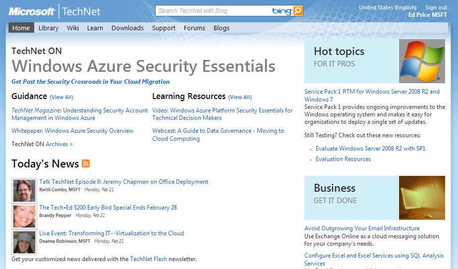
So do I look in the Library, Wiki, Learn, Support, or Blogs? Or do I ask in the Forums? Or do I just search on it and hope it takes me to the right place? Since we'll discuss search later, let's ignore that for now. Let's say I guess correctly and go to the Library. I end up clicking a few links (easy enough), and end up here, looking at Multidimensional Data: https://technet.microsoft.com/en-us/library/bb522607(SQL.100).aspx.
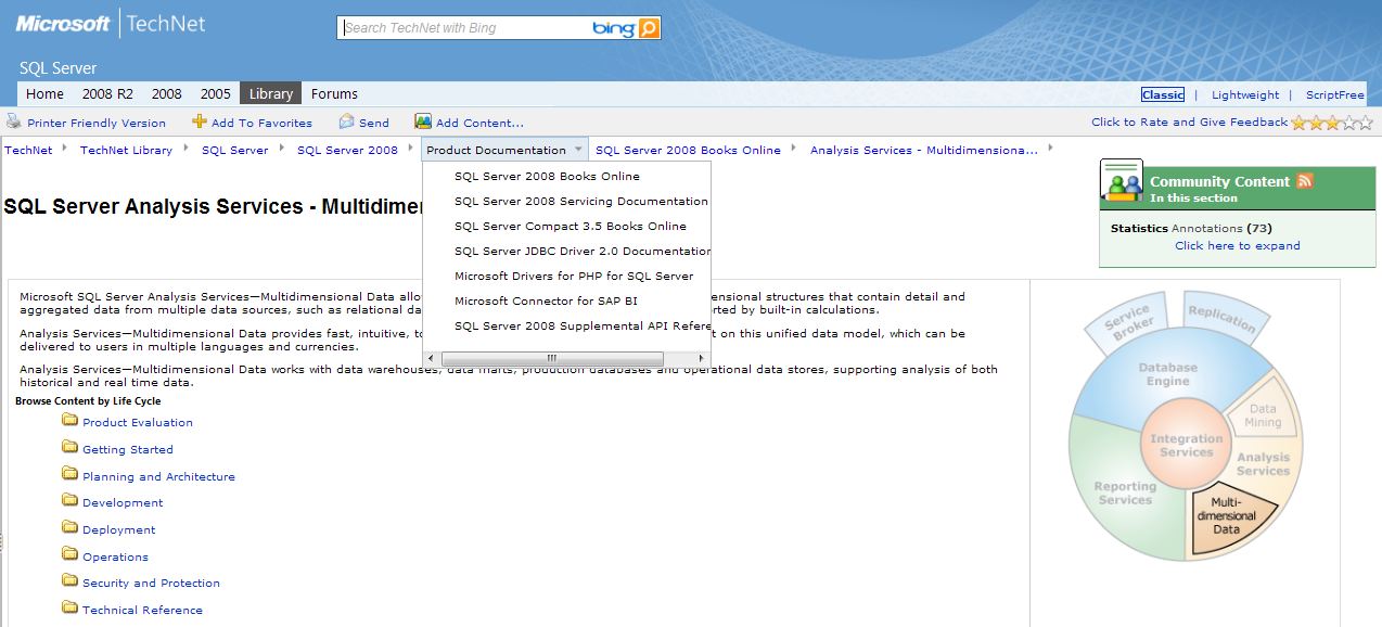
I end up looking at this unusual breadcrumb/dropdown paradigm that I need to figure out how to navigate. And there's this interesting thing called community content on each page that they want me to learn about. After a little while, I learn about what it is. Eventually this unusual interface will become more comfortable for me to use. I've never tried navigating from a breadcrumb/dropdown menu before. It's going to take me some time to get used to it. Now let's whisk away to a new interface.
Let's navigate the TechNet forums.
I end up here: https://social.technet.microsoft.com/Forums/en-us/categories/.
Do you see how long this page is? There's no way I could navigate this page without searching it. So now I NEED to use search to get to my proper forum. If I'm not used to using search in this capacity, I now have to learn it. I'm looking for the PowerPivot forum. So I search for PowerPivot in the page's search bar, and I get a list of threads and no PowerPivot forum: https://social.technet.microsoft.com/Search/en-US/?Refinement=112&query=powerpivot. In fact, the first result on the search results, which is titled "PowerPivot" and makes me think will take me to the forum, actually takes me to an Office thread that is titled "PowerPivot" and won't help me: https://social.technet.microsoft.com/Forums/en-US/office2010/thread/3fa2526d-823f-402d-9748-86959aa4e992.

There's a nice link on the right called "Need Help with Forums?" Uh oh. I came here to get help about PowerPivot! Now I need Help in order to navigate the forums in order to find out how to get Help in PowerPivot! Hmmm.
After a lengthy search and rescue mission, I finally find the PowerPivot forums... and they're only on MSDN (I had started out at the wrong Website and wasted all that time navigating). Here is the blog that I wanted to find 10 minutes earlier: https://social.msdn.microsoft.com/Forums/en-US/sqlkjpowerpivotforexcel/threads.
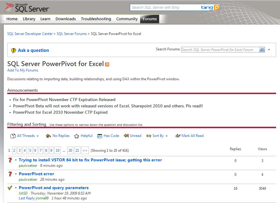
So I start to learn how to use the paging system, how to navigate through the topics, how to use the filtering tools, and how to use the search. It seems this list page feels very different from the search results page, which feels very different from the forum thread pages. So I feel like I'm learning how to use three different pages. After I use it for awhile, I'll become comfortable with it (I know it won't take too long, because I'm already comfortable with it), although the search results page is so different that it surprises me every time and requires me to quickly reorient myself.
I didn't find what I was looking for, and I dropped a question in the forum. I need an answer now though, so it's time to try something new...
Let's navigate Google and Bing.
So I get to those pages, and all I see is a search bar. Although I'm already comfortable with this (as most people have learned to be), I still have to reorient my thinking from navigating an interface in my application to a search-based system of typing in text. Both tools automatically give me options to choose from, which is nice.
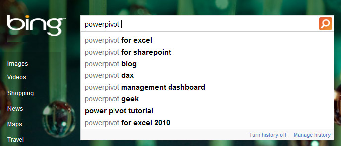
Google goes a step further and actively populates the search results page. It's slightly alarming to instantly change the page while I'm typing, but I appreciate being able to see my page options nonetheless. Despite the great features of them suggesting searches and showing the results, it might take me a minute to think of the right word combinations in order to get the results I'm after. I end up deciding to go to Wikipedia.
Let's navigate Wikipedia.
Wikipedia teaches me a different navigation system. I don't have bars of links on the tops or sides. Instead I have links on the specific terms that I read as I read my article. I also have a page table of contents (TOC) at the top of the longer pages, and there are lists and category indexes at the bottoms of the pages. I also don't have tags like I see on many blogs and news sites. After some time, I become comfortable navigating Wikipedia, even though it's different than all the other sites I've visited.
Do you see what I mean? Every time you go to a new interface, you're coming into a new paradigm that was designed by a new person or group of people. Often they will try to be nice to you and design something that is similar to what you've already seen (like hopefully this blog), but really there's no guarantee that's possible (or that the designer even wants that).
Our users don't want to have to go on a quest to find out how to use our software. They don't want to have to find the Help button.

So what's the alternative?
The alternative is Integrated Assistance (IA). We should seek to provide IA solutions, such as user interface (UI) text, animations, design, videos, and interactive content to coach our users through the interface (in an unobtrusive way, of course). In short, we should make our interfaces easier to use. That's not exactly a new concept. =^)
In fact, if you're a designer you might say that it's simply "usability design," and you've been doing it for 30 years (so it's nothing new, especially not worthy of a name).
What makes Integrated Assistance unique is:
(1) It integrates and implements the user education field into usability design rather than having the industry focus entirely on content to be found only in separate interfaces that the user has to get used to.
(2) It is a unified effort for us to band together and pursue the IA solutions together. Often times the most difficult part of IA isn't coming up with great ideas of how to inform our users; the greatest challenge is the day-to-day task of working with our Program Managers, Product Managers, Designers, and Developers in order to make the trade-offs and get the assistance solutions into the final products. The greatest challenge is implementing the IA solutions.
My goal on this blog is to get feedback and refine this material as I go. So, do you have any thoughts? (Please leave a comment below, or for anonymity click Email Blog Author on the right.) Or visit me on Twitta and send me a tweet (it's exactly like talking but completely different).
May you never look at an interface again without questioning the new interactions you have to learn in order to use that interface,
- User Ed
This is Day 1 of 30 Days of Integrated Assistance.