Solicited Content (remember Clippy? now forget him)
This is Day 3 of 30 Days of Integrated Assistance .
So now that we’ve established that no help is the best kind and that your elevator is a labyrinth of Integrated Assistance solutions (IAS), I’d like to divide the types of IAS and Help in half (I’ll use other divisions later).
The two groups are Solicited Content and Sought Content. Solicited Content is when you don’t know that you need or would want the content; someone offers you the content. Sought Content is when you are purposefully looking for the content. For more information about Sought Content, see my Day 4 post, Sought Content (RTFM - read the fascinating manual). Now let’s look at why Solicited Content might be useful.

The Kick Start
You need to have the kick start. You need to grab your customer's attention to tell them what they need to know and how to get to more content. You need to start the engine of the car before you can drive it. You need to roll the snowball on the top of the hill for it to be a snow boulder when it gets to the bottom. You need to have an ignition, a point where you speak to your customers, and then they listen. And you'll probably need to solicit that (hopefully in a way that isn't annoying).
I always wish the creators of an interface would tell me in the interface what is new and cool and how to use the thing. Very few interfaces do that.
Let’s look at YouTube.
YouTube has a “What’s New” list on the right of the home page (you have to scroll down a little) with a few new features, but I often wish they included more features or a link to a list of all the new features instead of a link that misleadingly goes to a blog about YouTube video activity (and not about features as it implies).
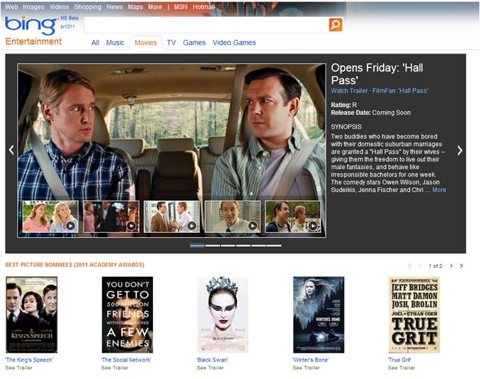
Let’s look at Bing.
Bing wants to put the content at the front, so everything you see on their first page goes to content. If you click a link on the left, you go to more content:
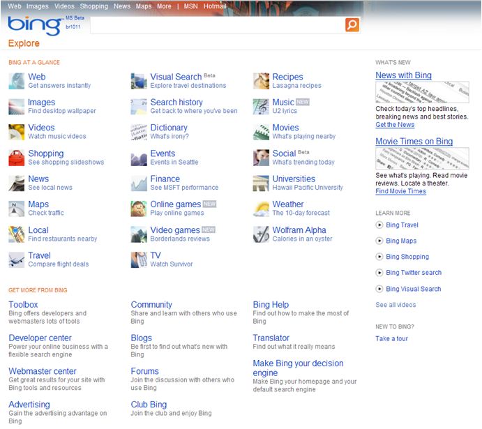
If you click More on the top, you go to a page called Bing Explore, which used to be called Bing Labs, which was derived from the Google Labs name (I think when Bing was doing research they found that users who were familiar with Google liked the Labs idea, and so they first ended up with their own Bing Labs until they decided that they really didn’t need that name). Here is Bing Explore:
But that’s it. There’s nowhere to go that tells me all the different features I can find in Bing Search. For example, in Bing I can do a lot from the Search bar. I can…
· Find movie times (type “movies” and click the link to go here).
· Find the weather (type “weather”).
· Check out the traffic (type “traffic”).
· Translate to your current language (type “translate” and then any word from any other language).
· Complete math calculations (such as 2 * pi * 24).
· Define words (type “define” and a keyword; “definition” and “what is” also do this).
· Spell check (if it’s spelled wrong, it links to a search with the correct spelling).
· Finance (type a stock symbol or the company name and “stock”).
· Track a package (type the name of the shipping company and the tracking number).
And I’d expect to find a page to tell me all that. But I just found it out on Wikipedia and by trial and error. I shouldn't have to go into another interface to find out what I can do.
Google on the other hand, has an “explore” page, a “lab” page with their new projects, and a page that lists out all their search tricks.
Why does this matter?
The point is that sometimes I want to know what I don’t know, but if I don’t know that there's information I want to know, who’s going to tell it to me? I wanted to know that I can just type “movies” in Bing and instantly get a list of all my local theaters. That’s cool and much faster and better than what I’ve had to do in the past. Plus I could just type “movies” or “weather” or “traffic” in the search bar in IE and I’d get what I want in less than a second. But I didn't know those features existed. How could I have known that?

The Expert Friend
Sometimes the best Help is when your expert friend is standing over your shoulder and saying, “Why don’t you just do this?” And then you’re like, “Where have you been for the last 5 years?”
I’ve had that person help me before, especially in telling me the tips and tricks in Excel. One friend of mine, Adam, taught me how to save an image that was pasted into a Word file (by saving the file as an HTML, it creates a folder with the images in it; thankfully Word added a feature where you can right-click any image and save it, so this workaround isn’t needed anymore). I’ve helped my friends by telling them how to take screen captures (thankfully Windows makes that easy now with the Snipping Tool; it even optimizes the image for you), or telling them how to optimize images in Photoshop (by reducing the image size and then selecting Save for Web).
Essentially, the software application can be that friend.
Remember Clippy?
So Clippy came on a little strong, and it was probably not a good idea to throw a cartoon character in the faces of millions of sarcastic office workers. This resulted in the “Can I help you write a suicide letter?” jokes and the brand new service pack feature to uninstall Clippy (what a great feature).
His name wasn’t even Clippy. It was Clippit, and the feature was called, “Office Assistant.” Plus he was the default assistant of several options: Dot (a bouncing ball), Hoverbot, Genius (a caricature of Albert Einstein), Office Logo, Mother Nature (a globe), Scribble (origami cat), Power Pup, Will (a caricature of William Shakespeare), F1 (another robot), Links (cat), Rocky (another dog), Bosgrove (butler), Genie, Peedy (parrot), Robby (another robot), Merlin, and Max (the Mac version). (Foreign versions also included a secretary, Monkey King, and a dolphin.) The concept originated from Microsoft Bob, which in itself was also annoying, and it should have been a hint to stop right there. I think it tested okay, but of course, they didn’t test it against millions of sarcastic and easily annoyed Internetters.
But what Clippy did right is he filled that role of soliciting content and helping you find what you didn’t know you needed (he just should have done that in a less annoying way). Clippy was too cute, he was an easy target for the Internetz, he wasn't easy to dismiss (at first, until the feature was released to dismiss him), and he interrrupted you waaaay too much. So unfortunately Clippy tainted the idea of soliciting content and made it an uphill battle.
Examples of Solicited Content
I’ll expand on examples like these in later posts, but here are a few examples of how to solicit content in a way that helps put users in control more than Clippy ever did (and hopefully doesn’t make them want to punch their computers).
For an example of context tips (an idea we’ve thrown about), a section of the UI or Help window can update with tips relating to what you’re currently doing. We’ve implemented this in videogames. Just look at that spot to see information about what you’re interacting with or click the tip to read about it and watch the video (and it would be nice to turn it off though).
For an example of content instructions, in the Windows 7 Touch Pack, we had conversation bubbles pop up around parts of the interface that users were interacting with. The context instructions tell users what to do next. Or the instructions could be audio instead of or in addition to text.
For an example of content topics, in Office, users can click a question mark button or link in a tool (or press F1), to open a Help window with information about the dialog box, wizard page, or UI part. Likewise, in Windows Vista tools I worked on, we added a feature for users to click or hover over a question mark icon to see a ScreenTip open with more detailed instructions.
For another example, users can overlay a shadow over the UI and place information boxes on top of the UI, mapping the information directly to the sections of the interface. Users click the Learn More button for an overlay to appear over the interface. Context-sensitive boxes appear over the interface to tell the users what each section of the interface is (with videos to show how to use it). The boxes also list tips to click and learn about and related tutorials to download. Users can pin a box if they want to keep it open when they exit the overlay mode. As an example of the overlay concept, click here, click Administration on the left, and then click Show Guide in the top right of the new window. This sample was found by Ron George (a UX designer I’ve worked with on two teams now).
Leave ye a comment on whether or not you think it's possible to achieve a non-annoying (non-Clippy) form of solicited content. And tweet me, cuz that's the social thing to do (or something).
May you forgive Clippy for wronging you and thus embrace Solicited Content that doesn’t make you want to punch your computer,
- User Ed
This is Day 3 of 30 Days of Integrated Assistance .