Virus attachments vs email classified as malware
This probably belongs in the “Well, no kidding” category but I thought I would post it anyhow.
Since near the beginning of this year, I have been tracking how much email our filters classify as malware. I then took those values, broke them down into a weekly chart and compared it to how many mails we received on a weekly basis that contained virus attachments. Is there any relationship between the two? If there is a new malware campaign, is that associated with an increase in spams with links to malware?
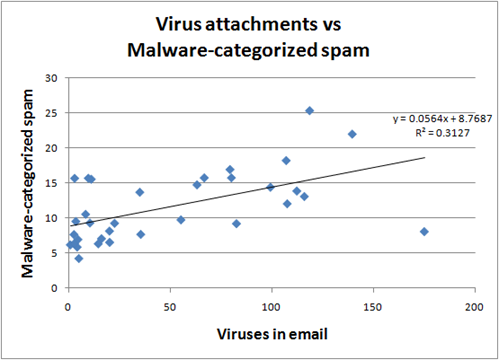
It’s hard to measure this because we block so much mail at the network edge (90%). So, all of the data that I have is for post-edge blocked mail. Below is a chart of the amount of mail we classify as malware vs how much mail has a virus attachment, on a weekly basis:
The result is pretty significant, 31% of the variance in the number of viruses in email is associated with the variance in the number of messages we classify as malware. In other words, there is a very strong malware spam/virus correlation (correlation = 0.55) since March of this year.
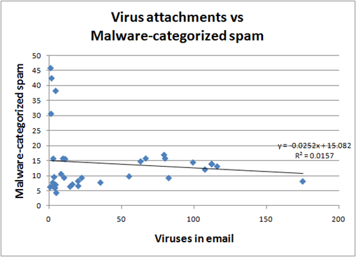
The problem is that I had to massage the data. There were 4 weeks of outliers that skewed the data set. If you include those, there is a weak relationship between the two of them, and it is negative (r = –0.12):
So on the one hand, I feel that removing the outliers results in an outcome that makes sense and fits the expectation. On the other hand, I feel bad about having to do some data-mining in order to return a result that I was expecting.

