Creating multi-series Bubble Charts in Excel
Bubble Charts are a great way to visualise data that has three numerical values for each point. Two of the values are plotted on the X and Y axis, while the other is represented via the diameter of the bubble.
Excel also supports Bubble Charts with more than one data series – this is useful if you want to label each bubble. However I’ve found that the Excel team’s collective brain operates in an entirely different way to mine, resulting in some very strange interpretations of my data.
For example, here’s a simple table with 4 data series, each containing 3 values:
| Risk | Probability | Impact | Exposure |
|---|---|---|---|
| Foo | 10 | 6 | 60 |
| Bar | 30 | 8 | 240 |
| Baz | 90 | 5 | 450 |
| Spong | 50 | 2 | 100 |
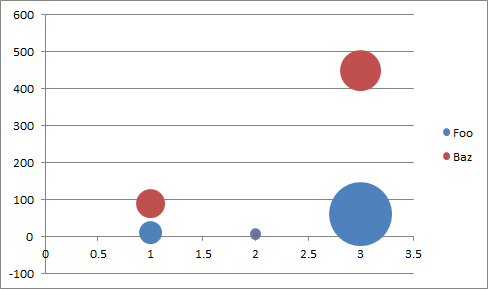
To me, this looks like a perfect range of data from which to create a Bubble Chart. However if you select the range and choose Insert > Charts > Other Charts > Bubble (Excel 2010 menus, may differ in other versions) you’ll get this monstrosity:

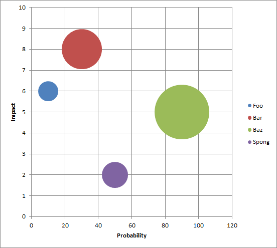
It’s possible to get more sensible results by adding each series one-by-one, but this is time consuming and useless if the number of series changes over time. There may be some way of structuring the source data to appease Excel, but I since I needed to create a bunch of charts and already had my data in this format I decided to brush off my VBA skills and teach Excel my way of doing things. The result from the same data is much more pleasing:

The VBA to achieve this is below. Note that the macro requires that you select a range with exactly 4 columns and at least 2 rows (a header row and at least one data row) before executing it. It’s a bit quick and dirty, and styles the graphs according to my personal requirements, but hopefully it will be of use to others too.
 Public Sub CreateMultiSeriesBubbleChart()
    If (selection.Columns.Count <> 4 Or selection.Rows.Count < 3) Then
        MsgBox "Selection must have 4 columns and at least 2 rows"
        Exit Sub
    End If

    Dim bubbleChart As ChartObject
    Set bubbleChart = ActiveSheet.ChartObjects.Add(Left:=selection.Left, Width:=600, Top:=selection.Top, Height:=400)
    bubbleChart.chart.ChartType = xlBubble
    Dim r As Integer
    For r = 2 To selection.Rows.Count
        With bubbleChart.chart.SeriesCollection.NewSeries
            .Name = "=" & selection.Cells(r, 1).Address(External:=True)
            .XValues = selection.Cells(r, 2).Address(External:=True)
            .Values = selection.Cells(r, 3).Address(External:=True)
            .BubbleSizes = selection.Cells(r, 4).Address(External:=True)
        End With

    Next

    bubbleChart.chart.SetElement (msoElementPrimaryCategoryAxisTitleAdjacentToAxis)
    bubbleChart.chart.Axes(xlCategory, xlPrimary).AxisTitle.Text = "=" & selection.Cells(1, 2).Address(External:=True)

    bubbleChart.chart.SetElement (msoElementPrimaryValueAxisTitleRotated)
    bubbleChart.chart.Axes(xlValue, xlPrimary).AxisTitle.Text = "=" & selection.Cells(1, 3).Address(External:=True)

    bubbleChart.chart.SetElement (msoElementPrimaryCategoryGridLinesMajor)
    bubbleChart.chart.Axes(xlCategory).MinimumScale = 0
End Sub