Archived: Adaptive Tile Templates - Schema and Documentation (10240)
Adaptive tile templates are a new feature in Windows 10, allowing you to easily specify content on your tile notifications without being limited to the preset templates we previously provided in the "tile template catalog". You can still use those legacy templates from the catalog, but adaptive tile templates allow you to design your own tile notification content using a simple and flexible markup language that adapts to different densities.
Once the official MSDN documentation is posted, I will update this article to simply link to MSDN. But in the meantime, this article will allow Windows 10 app developers to create awesome live tiles.
Install NotificationsExtensions
In order to generate notifications via C# instead of XML, install a NuGet package called NotificationsExtensions. Our C# samples seen on this page use NotificationsExtensions.
Install Notifications Visualizer
Notifications Visualizer helps you design an adaptive live tile with instant visual previews, similar to Visual Studio's XAML editor/design view. For more info and to download the app, read this blog post.
Quick Sample
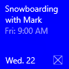
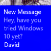
Here is an example that quickly shows the essence of Adaptive Tile Templates and the results they produce.
[Remote Snippet]
[Remote Snippet]
Schema
 <tile>

  <!-- Child elements -->
  visual

</tile>
 <visual
  version? = integer
  lang? = string
  baseUri? = anyURI
  branding? = "none" | "logo" | "name" | "nameAndLogo"
  addImageQuery? = boolean
  contentId? = string
  displayName? = string >

  <!-- Child elements -->
  binding+

</visual>
 <binding
  template = tileTemplateNameV3
  fallback? = tileTemplateNameV1
  lang? = string
  baseUri? = anyURI
  branding? = "none" | "logo" | "name" | "nameAndLogo"
  addImageQuery? = boolean
  contentId? = string
  displayName? = string
  hint-textStacking? = "top" | "center" | "bottom"
  hint-overlay? = [0-100]
  hint-presentation? = "photos" | "people" | "contact"
  hint-lockDetailedStatus1? = string
  hint-lockDetailedStatus2? = string
  hint-lockDetailedStatus3? = string >

  <!-- Child elements -->
  ( image
  | text
  | group
  )*

</binding>
 <image
  src = string
  placement? = "inline" | "background" | "peek"
  alt? = string
  addImageQuery? = boolean
  hint-crop? = "none" | "circle"
  hint-removeMargin? = boolean
  hint-align? = "stretch" | "left" | "center" | "right" />
 <text
  lang? = string
  hint-style? = textStyle
  hint-wrap? = boolean
  hint-maxLines? = integer
  hint-minLines? = integer
  hint-align? = "left" | "center" | "right" >

  <!-- text goes here -->

</text>


textStyle values...
  caption
  captionSubtle
  body
  bodySubtle
  base
  baseSubtle
  subtitle
  subtitleSubtle
  title
  titleSubtle
  titleNumeral
  subheader
  subheaderSubtle
  subheaderNumeral
  header
  headerSubtle
  headerNumeral
 <group>

  <!-- Child elements -->
  subgroup+

</group>
 <subgroup
  hint-weight? = [0-100]
  hint-textStacking? = "top" | "center" | "bottom" >

  <!-- Child elements -->
  ( text
  | image
  )*

</subgroup>
The Basics
Adaptive templates are semantic in nature, since they are meant to work across different form factors and different types of notifications. For example, elements like group and subgroup are used to semantically link content together – they do not imply a specific visual behavior on their own. The final appearance is up to the specific device – be it a phone/desktop/Xbox, HoloLens, or smartwatch, and the type of notification – tile or toast.
Hints are optional attributes that can be added to elements in order to achieve a specific visual behavior. Some hints might be device-specific or notification-specific, hence why they are optional.
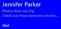
The Templates (Tile Sizes)
Content for each tile size is individually specified in separate <binding> elements within the XML payload. The size you are targeting is specified by setting the template attribute to one of the following values…
- TileSmall
- TileMedium
- TileWide
- TileLarge (desktop only)
In a single tile notification XML payload, you should provide <binding> elements for each tile size you choose to support, as shown by the example below.
[Remote Snippet]
[Remote Snippet]

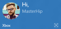
Branding
While a notification is being displayed, you can control the branding on the bottom of the live tile (display name and corner logo) via the branding attribute on the notification payload. You can choose to have “none” displayed, just the “name”, just the “logo”, or both “nameAndLogo”.
Note: Mobile does not support the corner logo. Thus, "logo" will display a blank branding bar, and "nameAndLogo" will simply become "name" on Mobile.
[Remote Snippet]
[Remote Snippet]
| none | name | logo (Desktop) | nameAndLogo (Desktop) |
|---|---|---|---|
 |
 |
 |
 |
Branding can be specified for specific tile sizes by applying the attribute on the <binding> element, or it can be specified for the entire notification payload by applying the attribute on the <visual> element. If a binding doesn’t have branding specified, it will use the branding provided on the visual element (if provided).
[Remote Snippet]
[Remote Snippet]
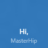
If your notification payload doesn’t specify branding, the branding will be determined from the base tile’s properties. If the display name is shown on the base tile, then the branding will default to “name”. Otherwise, if the display name isn’t shown, the branding will default to “none”.
Note: This is a change from Windows 8, where by default, branding was always “logo”.
| ShowName | Base Tile | Default Branding | |
|---|---|---|---|
| false |  |
after notification -> | 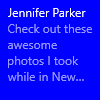 |
| true |  |
|
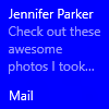
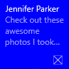
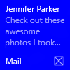
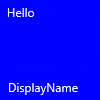
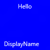
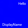
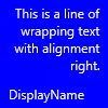
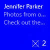
Display name
Additionally, notifications can override the display name while the notification is being shown. Use the displayName attribute to specify a string of your choice. Just like branding, this can be specified on the <visual> element, or for each individual tile size on the <binding> element.
[Remote Snippet]
[Remote Snippet]
| Base tile | Notification overriding display name |
|---|---|
 |
 |
Text
The text element is used to display text. Its usage is quite simple, but the appearance of the text can be modified in a number of different ways using hints.
[Remote Snippet]
[Remote Snippet]
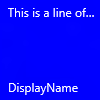
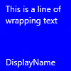
Text Wrapping
Use the hint-wrap attribute to set text wrapping on a text element. By default, text does not wrap and will continue off the edge of the tile. You can also control the minimum and maximum amount of lines with hint-minLines and hint-maxLines (which both accept positive integers).
[Remote Snippet]
[Remote Snippet]
Text Styles
Styles control the font size, color, and weight of text elements. There are a number of available styles, including a “Subtle” version of each style, which simply sets the opacity to 60% (usually resulting in a more gray color instead of white).
[Remote Snippet]
[Remote Snippet]
Note: if hint-style is not specified, the style defaults to caption.
Basic Text Styles
| <text hint-style="*" /> | Font Height | Weight |
|---|---|---|
| caption | 12 epx | Regular |
| body | 15 epx | Regular |
| base | 15 epx | SemiBold |
| subtitle | 20 epx | Regular |
| title | 24 epx | Semilight |
| subheader | 34 epx | Light |
| header | 46 epx | Light |
Numeral Text Style Variations
These variations reduce the line height so that content above and below come extremely close to the text.
| titleNumeral |
| subheaderNumeral |
| headerNumeral |
Subtle Text Style Variations
There is a subtle variation of every style previously mentioned, which simply makes the text 60% opaque, typically resulting in text that is more gray than white.
| captionSubtle |
| bodySubtle |
| baseSubtle |
| subtitleSubtle |
| titleSubtle |
| titleNumeralSubtle |
| subheaderSubtle |
| subheaderNumeralSubtle |
| headerSubtle |
| headerNumeralSubtle |
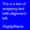
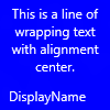
Text Alignment
Text can be horizontally aligned left, center, or right. In left-to-right languages like English, text defaults to left-aligned. In right-to-left languages like Arabic, text defaults to right-aligned. You can manually set alignment with the hint-align attribute on elements.
[Remote Snippet]
[Remote Snippet]
| left | center | right |
|---|---|---|
 |
 |
 |
 |
 |
 |
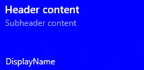
Groups and Subgroups
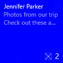
Groups allow you to semantically declare that the content inside the group is related and must be displayed in its entirety for the content to make sense. For example, you might have two text elements, a header and a subheader, and it would not make sense for only the header to be shown. By placing those elements inside a subgroup in a group, the elements will either all be displayed (if they can fit) or not displayed at all (since not all could fit).
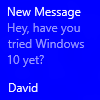
These groups allow your tile to adapt to larger screens, where each tile can fit more content. For example, say your tile displays new emails. On small-screen phones, the live tiles themselves are smaller, and therefore only one email can fit on the live tile. However, on large-screen phones, two emails can fit on the live tile. Thus, to provide the best experience, you should provide multiple groups.
Note: the only valid child of a group is a subgroup. Hence, you must place your content inside a subgroup in a group.
[Remote Snippet]
[Remote Snippet]
| Desktop | Tablet | High-Density Mobile |
|---|---|---|
 |
 |
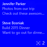 |
Subgroups (columns)
Subgroups also allow you to divide data into semantic sections within a group. For live tiles, this visually translates to columns.
The hint-weight attribute allows you to control the widths of columns. The value of hint-weight is expressed as a weighted proportion of available space. This is identical to GridUnitType.Star behavior. For equal width columns, simply assign each weight to 1.
| hint-weight | Percent of Width |
|---|---|
| 1 | 25% (1/4) |
| 1 | 25% (1/4) |
| 1 | 25% (1/4) |
| 1 | 25% (1/4) |
| Total Weight: 4 |
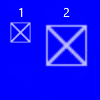
To get one column twice as large as another, assign one column a weight of 1, and the desired larger column a weight of 2.
| hint-weight | Percent of Width |
|---|---|
| 1 | 33.3% (1/3) |
| 2 | 66.7% (2/3) |
| Total Weight: 3 |
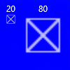
If you want your first column to take up 20% of the width, and your second column to take up 75% of the width, assign the first weight to be 25 and the second weight to be 75. As long as your weights sum to 100, they will essentially be percentages.
| hint-weight | Percent of Width |
|---|---|
| 20 | 20% (20/100) |
| 80 | 80% (80/100) |
| Total Weight: 100 |
Note: an 8 px margin is added between columns.
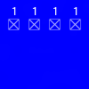
For subgroups of more than two, you typically should set hint-weight (which accepts positive integers). If the very first subgroup does not have hint-weight specified, it will be assigned a weight of 50. The next subgroup that does not have a hint-weight specified will be assigned a weight equal to 100 minus the sum of the preceding weights, or 1 if the result is zero. Remaining subgroups without hint-weight specified will be assigned a weight of 1.
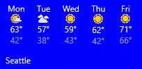
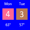
Here is a sample showing how you would achieve a tile with five columns of equal width, such as a weather tile displaying a five-day forecast.
[Remote Snippet]
[Remote Snippet]
Images
The <image> element is used to display images on the tile notification. Images can be placed inline within the tile content (default), as a background image behind your content, or as a peek image that animates in from the top of the notification.
Note: There are restrictions on the file size and dimensions of images.
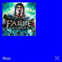
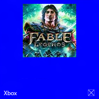
Without any extra behaviors specified, images will uniformly shrink/expand to fill the available width. The example below shows a tile using two columns and inline images. The inline images stretch to fill the width of the column.
[Remote Snippet]
[Remote Snippet]
Images placed in the <binding> root, or in the first group, will also stretch to fit available height.
Image Alignment
Images can be set to align left, center, or right, using the hint-align attribute. This will also cause images to display at their native resolution instead of stretching to fill width.
[Remote Snippet]
[Remote Snippet]
| left | center | right |
|---|---|---|
 |
 |
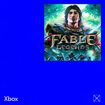 |
Image Margins
By default, inline images have an 8px margin between any content above or below the image. However, this margin can be removed by using the hint-removeMargin attribute on the image.
Note that inline images will always have the 8px margin from the edge of the tile, and subgroups (columns) will always have the 8px padding between columns.
[Remote Snippet]
[Remote Snippet]
| hint-removeMargin | |
|---|---|
| false | true |
 |
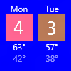 |
Image Cropping
Images can be cropped into a circle using the hint-crop attribute, which currently only supports the values “none” (default) or “circle”.
[Remote Snippet]
[Remote Snippet]

Background Image
To set a background image, place an image element in the root of the <binding> and set the placement attribute to “background”.
[Remote Snippet]
[Remote Snippet]

Additionally, you can set a black overlay on your background image with hint-overlay, which accepts integers from 0-100, with 0 being no overlay and 100 being full black overlay. The default is 20.
[Remote Snippet]
[Remote Snippet]
| hint-overlay | Result |
|---|---|
| 0 | 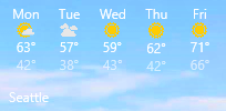 |
| 20 | 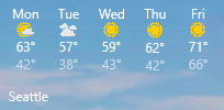 |
| 60 | 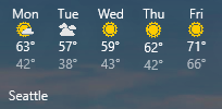 |
| 100 | 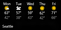 |
Peek Image
You can specify an image that “peeks” in from the top of the tile. The peek image uses an animation to slide down/up from the top of the tile, “peeking” into view, and then later sliding back out to reveal the main content on the tile.
To set a peek image, place an image element in the root of the <binding>, and set the placement attribute to “peek”.
[Remote Snippet]
[Remote Snippet]
| Animated | Peek shown | Peek sliding up | Content shown | Peek sliding down |
|---|---|---|---|---|
 |
 |
 |
 |
 |
Vertical Alignment (Text Stacking)
You can control the vertical alignment of content on your tile with the hint-textStacking attribute on both the <binding> element, and <subgroup> elements. By default, everything is vertically aligned to the top, but you can also align content to the bottom or center.
Text stacking on binding element
When applied at the <binding> level, text stacking sets the vertical alignment of the notification content as a whole, aligning in the available vertical space above the branding/badge area.
[Remote Snippet]
[Remote Snippet]
| hint-textStacking | top | center | bottom |
|---|---|---|---|
| With branding or badge |  |
 |
 |
| Without branding/badge | 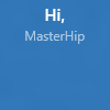 |
 |
 |
Text stacking on subgroup element
When applied at the <subgroup> level, text stacking sets the vertical alignment of the subgroup (column) content, aligning in the available vertical space within the entire group.
[Remote Snippet]
[Remote Snippet]
| top | center | bottom |
|---|---|---|
 |
 |
 |