Managing SharePoint Rendering on Mobile Browsers (iDevices)
Mobile browsers like Safari or Chrome render pages in a virtual "window" (the viewport), usually wider than the screen, so they don't need to squeeze every page layout into a tiny window (which would break many non-mobile-optimized sites). Users can pan and zoom to see different areas of the page.
Mobile Safari introduced the "viewport meta tag" to let web developers control the viewport's size and scale. Many other mobile browsers now support this tag, although it is not part of any web standard. Apple's documentation does a good job explaining how web developers can use this tag, however I had to do some detective work to figure out exactly how to implement it in a SharePoint site with a custom fixed screen resolution. (Width 1024).
Viewport basics
A typical mobile-optimized site contains something like the following:
<meta name="viewport" content="width=device-width, user-scalable=true;">
The width property controls the size of the viewport. It can be set to a specific number of pixels like width=600 or to the special value device-width value which is the width of the screen in CSS pixels at a scale of 100%. (There are corresponding height and device-height values, which may be useful for pages with elements that change size or position based on the viewport height.)
The initial-scale property controls the zoom level when the page is first loaded. The maximum-scale, minimum-scale, and user-scalable properties control how users are allowed to zoom the page in or out.
Need
In our SharePoint project we got the following very specific requirements with respect to mobility.
- Custom Branding with a of fixed screen width of 1024 pixels
- SharePoint Mobile View Turned Off.
- Mobility support to enable scroll and pinch & zoom.
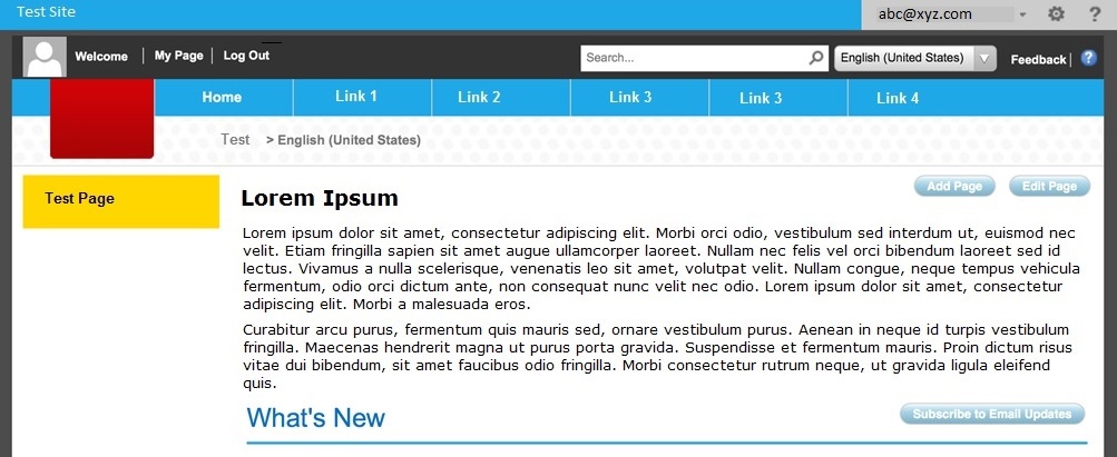
Per the given specs the actual page looks like the following with a fixed width of 1024 pixels.
Issues and Findings
Hence we tried with a recommended meta viewport setting of
<meta name="viewport" content="user-scalable=yes, width=device-width, initial-scale=1.0, maximum-scale=5.0, minimum-scale=0.25"/>
iPad Landscape Mode: The right side of the page is cut off and there is no scroll bar.
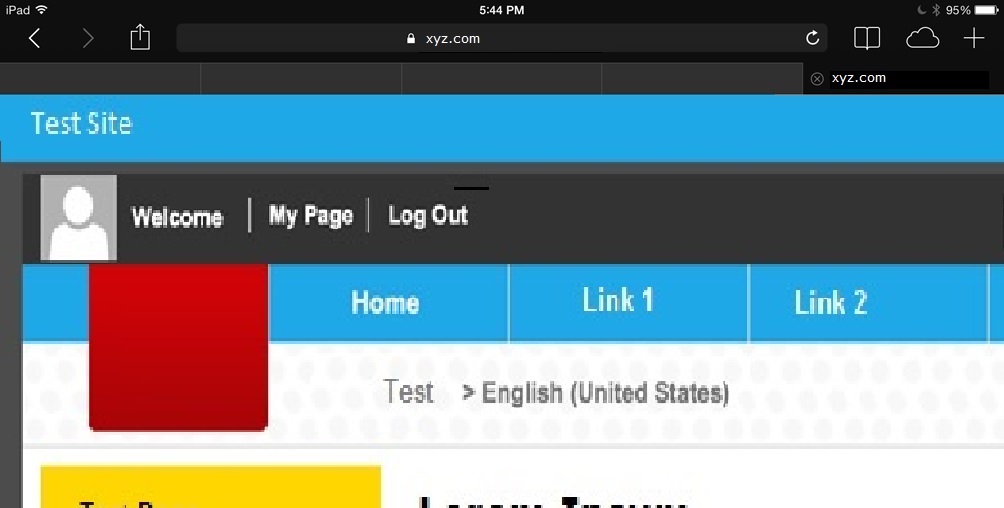
iPad Portrait Mode: The right side of the page is cut off and there is no scroll bar.
iPhone/iPod Landscape mode: The right side of the page is cut off and there is no scroll bar.
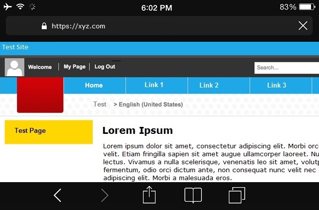
iPhone/iPod Portrait Mode: The right side of the page is cut off and there is no scroll bar.
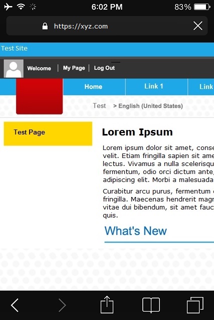
Despite setting the user-scalable=true the pinch and zoom was not functional either, due to the setting content="width=device-width"
Fix
After a bit of play around, identified that with the following setting the issues are getting resolved and the pages are rendering fine with scroll bar, pinch & Zoom options etc,.
<meta name="viewport" content="user-scalable=yes, width=1024, initial-scale=1.0, maximum-scale=5.0, minimum-scale=0.25"/>
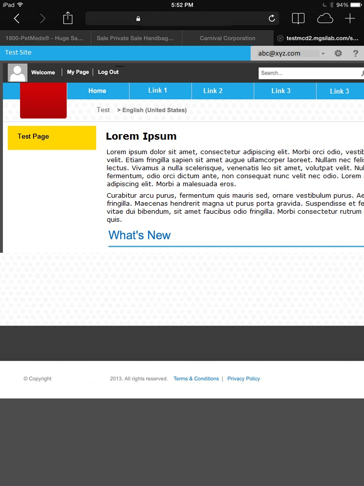
IPad Landscape Mode: Renders full page and allows Pinch & zoom
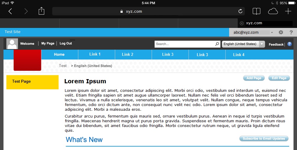
IPad Portrait Mode: Scrolls to the right and allows Pinch & zoom
Hence the recommendation is to use the Width attribute to control the rendering contents, specifically for the pages with custom branding and Mobile view turned off.
<meta name="viewport" content="user-scalable=yes, width=1024, initial-scale=1.0, maximum-scale=5.0, minimum-scale=0.25"/>