UX in the real world: Parking machine nightmare
Sometimes my inner UX geek just has to come out into the real world.
Below are two examples of parking machines. The proposition in both locations is the same: you park your car and before you leave you put a ticket in the machine and pay for it. That's about as complex as it gets and yet these retail owners have two very different approaches. One has gone for a simple design and interaction approach and the other...well the other has decided it's a good idea to bombard you with information that completely lacks any hierarchy.
Now I think most people are smart enough - and have most likely been conditioned over time to understand the process and the order in which they need to submit ticket, pay and leave - but it's interesting to see the likes of Westfield go with the information design we see below. And when I see interesting I mean perplexing. #over-engineering.
Exhibit A - Westfield, White City, London, UK
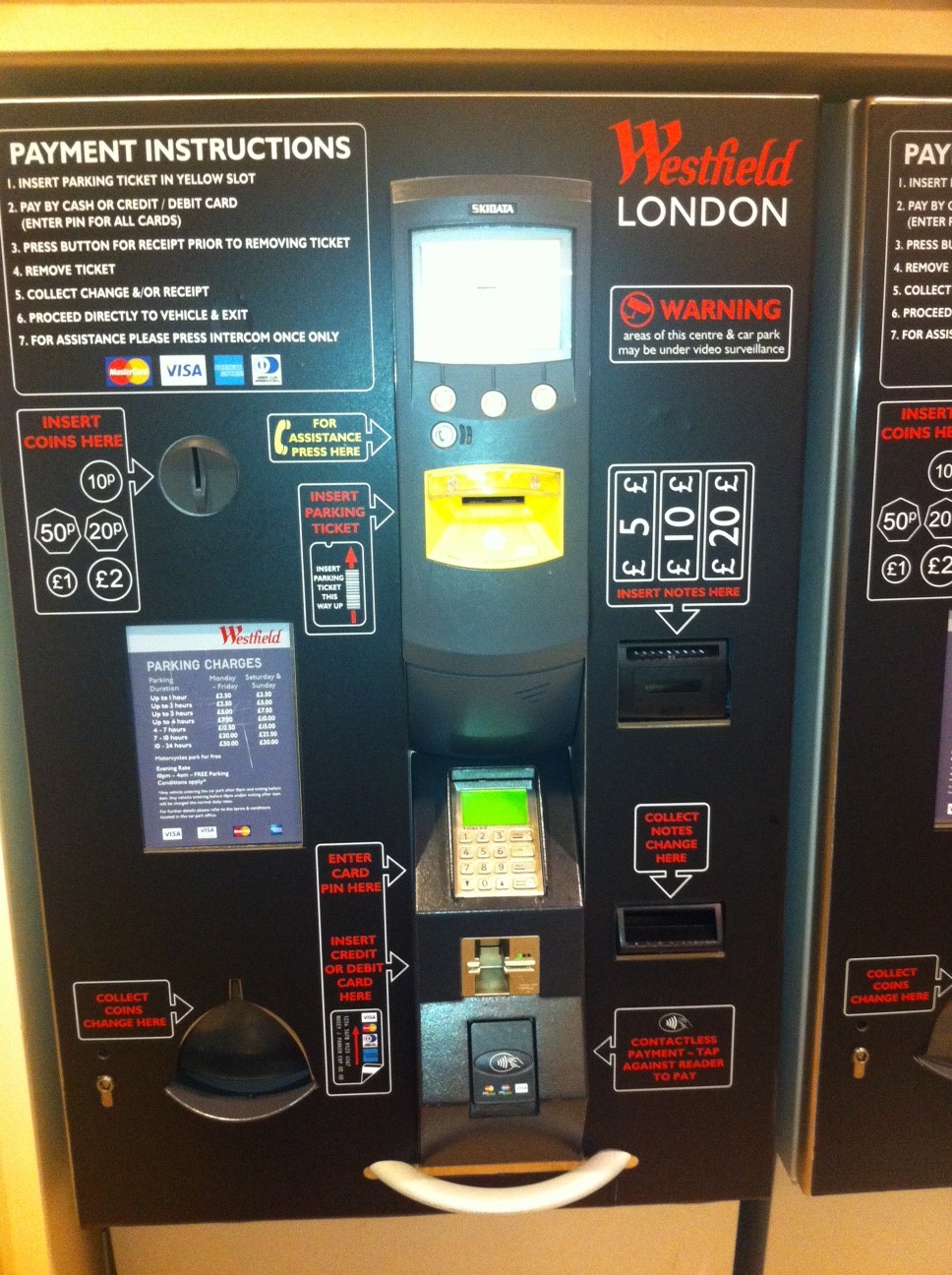
Exhibit B: Mall of the Emirates, Dubai, UAE
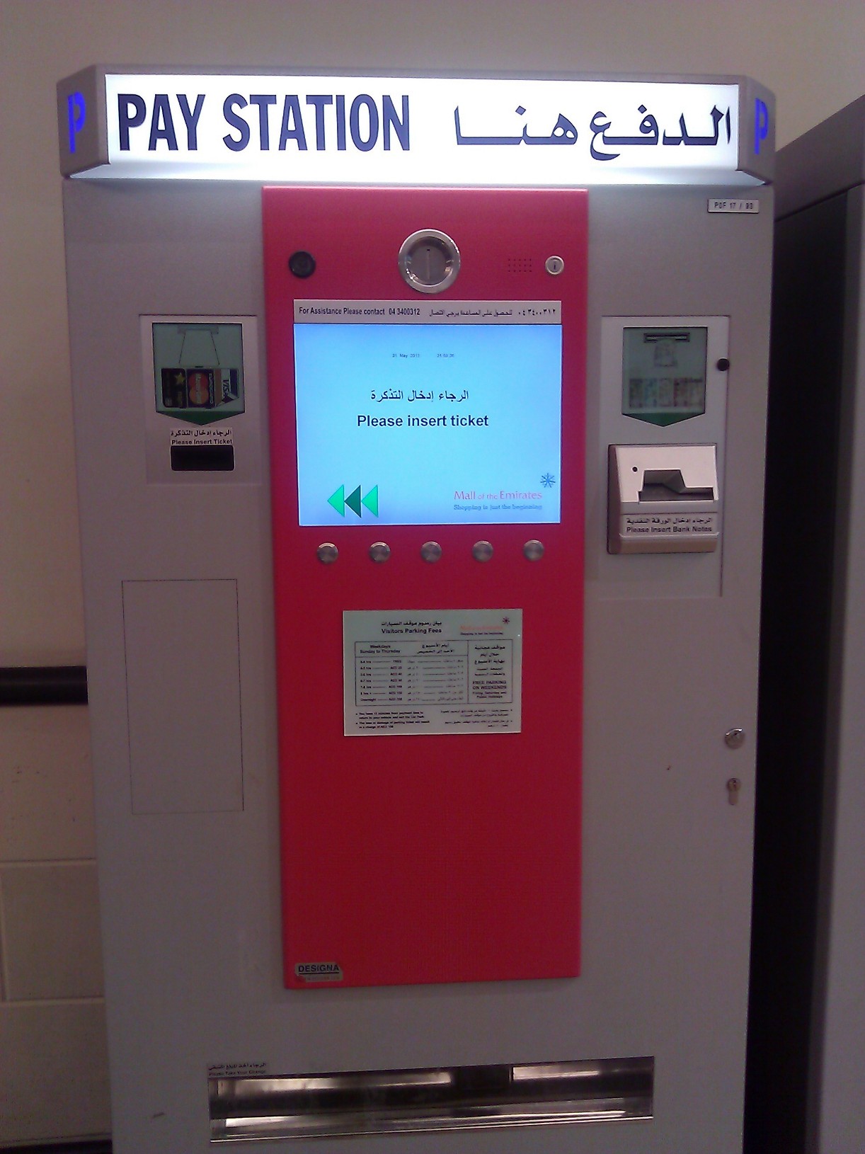
Now the Mall of the Emirates design lacks a certain finesse visually but hey, it does exactly what it is supposed to and when I am trying to drag my wife away from the shops at the mall, being able to pay and go as quickly as possible can only be valued as a good thing.