Ignore users at your peril!
It's a tough thing watching user research take place. Beyond that glass mirror sits The User, specially selected to review "your work". They look at the computer. They click through a prototype. And they verbalise feedback. Meanwhile, you, The Creator, furiously scribbles notes, recording the elements that are not resonating as well as you had hoped - and of course, the elements that just don't work at all.
It's tough but it's invaluable. The old addage of "you can't proofread your own work" rings true - you are not your audience and whilst you can try and get into their heads with personas and user journeys, user research is still needed and should form part of any project.
Now I am not saying that the following brands didn't do research - judging by some of the errors made it would be easy to assume that they bypassed it altogether - but we can assume that they either didn't incorporate the findings into development: or they chose to ignore the feedback completely. Either way, here are some examples that raised alarm bells in the user experience community.
Waitrose
A British supermarket chain, Waitrose is synonymous with a "pleasant" shopping experience. Its comfortable, reliable and a proprietor of quality.
It's a shame then that there recent site redesign turned out to be such a disaster, with endless articles written about it's ambiguous navigation terminology and overall poor experience. In fact it was so badly received - by both industry experts and users - that Waitrose had to publish an apology! Here are some of the highlights - or should I say lowlights:
Adoption of navigation terms like “Food”. Of course there is food on sale in Waitrose - it’s a SUPERMARKET so nebulously titled terms like this do nothing to aid navigation.
A lack of filtering options within the secondary navigation - what this means is that the onus is put on the user to meticulously review ALL results that come from selecting a broad category. This is
labour-intensive and frustrating.
Employing confusing metrics - for example, a user cannot simply select how many peppers they wanted: they would have to specify by kilograms. When you are shopping from home (without a pepper and a kg scale to hand) this is tricky/impossible.
The above are clearly issues that wouldn’t made it past the first round of user testing.
There is a statistic bandied around by user experience experts and it goes something like this. For every $1 you spend on research, you will save anything from $10 - $100 in development costs. It’s sometimes hard to visualise how that works in reality but Waitrose surely proves the point that a small investment upfront can save you massively in the longrun.
Also see Waitrose's redesign: where did it go wrong?
GAP
Ah good ole’ GAP. Over the decades we have come to recognise it’s presence like an old friend. We might not shop in there every month - or even every year - but nevertheless, it’s always there for us should we need it and there is a brand familiarity that we cannot deny.
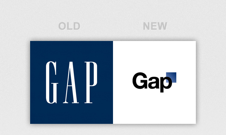
However, GAP themselves were clearly not so attached to said brand and last year decided to - some might say desperately - reinvent their image with a new logo.
Did they research audience perceptions of this logo? Who knows how assured they were prior to it’s launch, but after it was made public the negativity fell on them from all corners of media. Twitter, Facebook and blogs were alight in guffawed wonder at how GAP could possibly have thought this was a good idea. The most common quip was that it looked more like an accountancy firm logo than a fashion/clothing brand. Well that and the fact it could have been put togetherin Paint circa 1992.
The end result is that GAP withdrew the revised logo within one week - which no doubt cost them a fortune in development and design - and kept the old one. Publicity stunt and an alternative means of crowd-sourcing research or deeply embarrassing mistake? Either way it didn’t reflect particularly well on them. If only they had conducted some user research beforehand...
A final thought...
There are countless other examples and I think I might write another post soon outlining some memorable ones.
I think it’s important to learn from others in the market and remember that no matter how tight the deadlines and how well you think you might know how the audience will use your product, there is always value in conducting research, if only to shield your brand from intense embarrassment.

