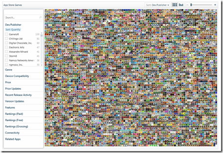
Visualising the Apple App Store
The amount of data we are subjected to every day is phenomenal. I’ve blogged about it before but have spent more time thinking about it following a recent conversation with Gary Flake. He pointed out to me the now fairly obvious fact that every time we do something, anything on the web or with technology it creates more data. You surf websites looking for data – that creates data, your virtual footfall. You send email, that creates data (who you sent it to, when, how many people etc). You post a tweet – that creates data such as where you posted it from, to whom, at what time and with what sentiment.
Sites like wefeelfine.org have done a beautiful job of showing what you can do with data in aggregate and there is so much more potential when you think about the amount of data around us. The canonical example for me is GPS in cars. Why can’t that data about your speed, your routes etc be used to build better navigation systems that are time based and take in to account real-time input from other vehicles on the road?
What the hell does this all have to do with navigating the App Store? Visualisation is the link….with so much data to handle we’re going to need far richer tools to navigate. Zoom Appy is a great example of this – you can navigate through the Apple App Store using a lot of different criteria such as price, connectivity type, what features of the phone the app takes advantage of etc etc. Your result are delivered back in a stunning visual layout which you can then further sort.
This is another one of those show vs. tell moment where it’s much easier for you to play with it to get the idea.
Oh and I’m pleased to see a version for Windows Marketplace is in the works too ![]() Nice work by zoomappy.com who are part of the Microsoft BizSpark program.
Nice work by zoomappy.com who are part of the Microsoft BizSpark program.
