10 most notable logos of 2009
Confession: I’m a bit of a logo geek. A friend of mine used to have this great party on Boxing Day and have a competition where they’d put a load of logos on paper around the house and there would be a competition to see who could correctly identify the most logos. I often won and pride myself on being able to spot a logo when it doesn’t have the name attached. The ABC’s of branding is a great example – I knew every one of them immediately (though the L had me flummoxed for a moment or two).
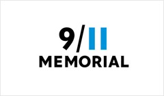
I enjoyed the 10 most notable logos of 2009 by David Airey and think the 9/11 Memorial logo is unquestionably the best. I love it when a logo includes within it’s design something of relevance to the thing it’s representing. Obviously the 11 here represents the twin towers in a simple and subtle way.
Be sure to check out David’s book too – available for pre-order. I’m looking forward to it.
