Ask Learn
Preview
Ask Learn is an AI assistant that can answer questions, clarify concepts, and define terms using trusted Microsoft documentation.
Please sign in to use Ask Learn.
Sign inThis browser is no longer supported.
Upgrade to Microsoft Edge to take advantage of the latest features, security updates, and technical support.
Note
Access to this page requires authorization. You can try signing in or changing directories.
Access to this page requires authorization. You can try changing directories.
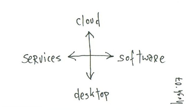
My pal Hugh drew this a couple of weeks back at the first Blue Monster coffee morning and the original now sits proudly on my desk at home. I've been meaning to publish for a while but couldn't track down a decent scanner.
What I love about the cartoon is Hugh's ability to make the complex simple - a rare talent. Software doesn't quite fit on it for me as the other 3 are derived from software *but* it does have a nice symmetry. Then when you read left to right and then up/down I think it works well.
When Hugh handed it to me he said
"you have to pick where you wanna be"....
I said Microsoft wants to be right there in the middle. The user gets to pick where they wanna be.
I wonder if I can get Ray Ozzie to use this :)
Technorati Tags: software + services , macleod
Anonymous
August 28, 2007
PingBack from http://www.engenharia.nelsonbiagiojr.com/?p=220
Anonymous
August 29, 2007
Interesting, (especially as I was over the other end of the table at that coffee morning )
For me the axes are too close to each other to be useful. There seems to be just too much overlap for Cloud & Services vs. Desktop & Software. Both axes seem to be 'location'...
but hold on, maybe Hugh was talking business model? what about changing services vs. software to Buy vs. Rent? It works better for me ... mmm
JB>
Anonymous
August 30, 2007
I think if you replace the "software" with "product", the drawing might make more logical sense to you ;-)
Anonymous
September 07, 2007
Thanks it's definitely an easier spectrum, but maybe less interesting ;o)
JB>
Anonymous
October 11, 2007
The comment has been removed
Ask Learn is an AI assistant that can answer questions, clarify concepts, and define terms using trusted Microsoft documentation.
Please sign in to use Ask Learn.
Sign in