Strategies for sharing XAML code in Universal Apps (1/2)
[Version FR disponible ici ]
Thanks to the universal apps, we can now share much more than PCLs between applications targeting different platforms.
In Visual Studio, a universal solution is composed of at least 3 projects : one for Windows Store, one for Windows Phone and another one for the shared components.
In the shared project, you don’t share binaries (like in PCLs) but files such as resources, images, xml, XAML, code, … which will then be used in each platform-specific project.
In this article, we will focus on sharing XAML code.
Regarding to this new exciting possibility, the aim will not be to share all of your XAML in your apps : we still need to adapt the UI to provide the best user experience according to the platform, device usage, form factor, ...
So instead, we will see common strategies to keep some UI platform specificities while having some of the XAML shared.
Don’t think I encourage you to share the maximum percentage of your XAML code : this can be very tricky and difficult to undestand what styles, datatemplates and usercontrols are shared or not, and how they relate to each other. This is an overview of the main technical possibilities, to help you do your own choices.
The article is divided in 2 parts:
- Part 1 : Starting a new Universal project and see what can be shared and how (this article)
- Part 2 : Going Platform specific : beyond the system controls and styles that can be shared and will behave differently on each platform, how to have custom behavior in the UI now that we have shared our XAML ?
You can download the source code here:
Let’s start a new Universal Projet
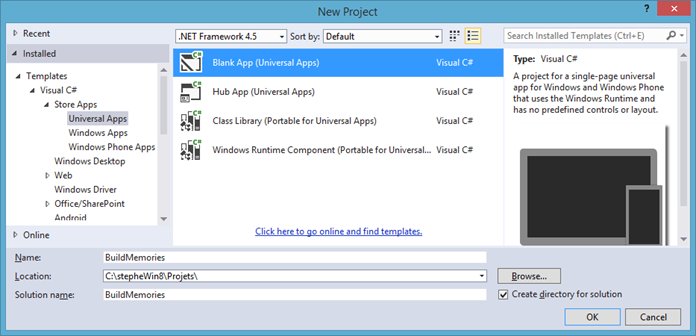
You can use the new templates provided in Visual Studio 2013 Update 2 to create a universal Hub app or empty app, or you can start with an existing Windows Store app and add a new Windows phone project (or the opposite).
Here we’ll use a blank project:
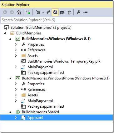
Here is what the solution looks like. You have one shared file : the app.xaml.
 <Application
    x:Class="BuildMemories.App"
    xmlns="https://schemas.microsoft.com/winfx/2006/xaml/presentation"
    xmlns:x="https://schemas.microsoft.com/winfx/2006/xaml"
    xmlns:local="using:BuildMemories">

</Application>
Sharing XAML
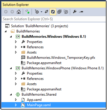
You can still share the MainPage.xaml : remove it from the specific projects to put it in the shared one : the compilation process will succeed.
Let’s add some controls to this common MainPage !
As Tim Heuer explained it in his Build session, the majority of the UI API are now common between Windows Store 8.1 Refresh and Windows Phone 8.1 (most of the differences are about Automation and picker controls specificities).
Classes |
Structs |
Interfaces |
|
Windows 8.1 SDK |
566 |
119 |
59 |
Windows Phone 8.1 SDK |
624 |
131 |
57 |
+58 |
+12 |
-2 |
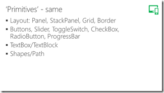
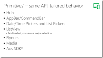
Common API doesn’t means same UI user experience and most controls will look and behave differently according to the Platform. Some of them are quite similar, some other are very different. Tim covers these différences in his slides:
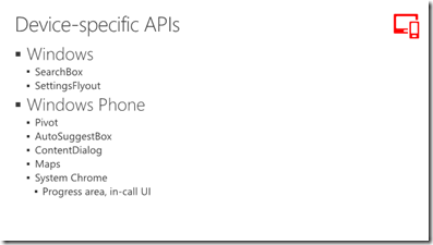
Some controls are still platform specific:
We won’t cover all of them here, we will just try to illustrate the sharing capabilities in a concrete basic example.
Let’s start by adding a few controls in MainPage.xaml:
 <Page
    x:Class="BuildMemories.MainPage"
    xmlns="https://schemas.microsoft.com/winfx/2006/xaml/presentation"
    xmlns:x="https://schemas.microsoft.com/winfx/2006/xaml"
    xmlns:local="using:BuildMemories"
    xmlns:d="https://schemas.microsoft.com/expression/blend/2008"
    xmlns:mc="https://schemas.openxmlformats.org/markup-compatibility/2006"
    mc:Ignorable="d">

    <Grid Background="{ThemeResource ApplicationPageBackgroundThemeBrush}">
        <StackPanel>
            <TextBlock TextWrapping="Wrap" Text="TextBlock" Margin="30" FontSize="28"/>
            <DatePicker Margin="30"/>
            <CheckBox Content="CheckBox" Margin="30"/>
            <Button Content="Button" Margin="30"/>
        </StackPanel>
    </Grid>
</Page>
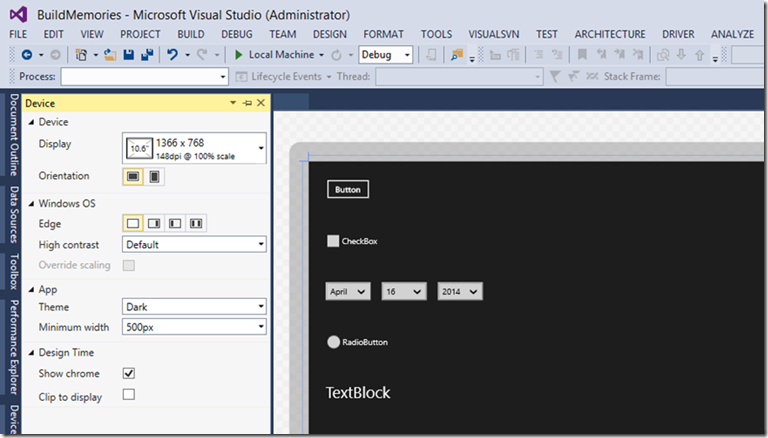
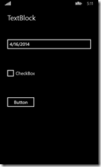
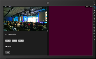
You can adapt the preview of the resulting UI, according to the form factor, resolution, orientation, contrast, theme, … This is a new feature of Visual Studio 2013 Update 2.
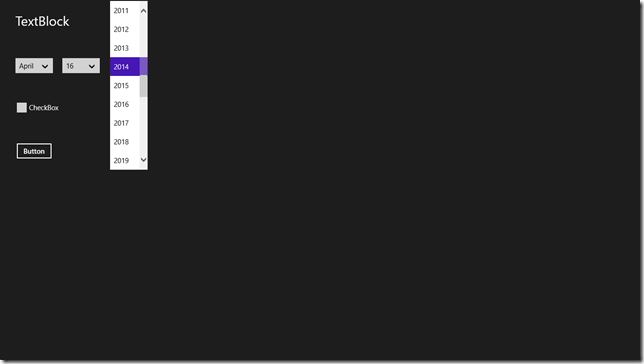
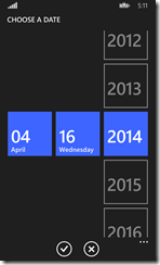
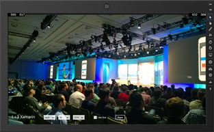
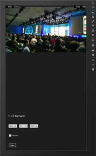
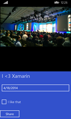
While having a shared XAML page, the controls included in it will look and behave differently on Windows 8.1 and Windows Phone 8.1, according to their specific implementation (the date picker is a great example) :
Let’s add a FlipView control to show some of the pictures I have taken at //Build:
     <Grid Background="{ThemeResource ApplicationPageBackgroundThemeBrush}">
        <FlipView Margin="0,9,0,-9" ItemsSource="{Binding Items}">
            <FlipView.ItemTemplate>
                <DataTemplate >
                    <Grid>
                        <Image Source="{Binding Path}" VerticalAlignment="Top" />
                        <StackPanel>
                            <TextBlock TextWrapping="Wrap" Text="{Binding Title}" Margin="30" FontSize="28"/>
                            <DatePicker Margin="30"/>
                            <CheckBox Content="I like that" Margin="30"/>
                            <Button Content="Share" Margin="30"/>
                        </StackPanel>
                    </Grid>
                </DataTemplate>
            </FlipView.ItemTemplate>
        </FlipView>
    </Grid>
I will also create a shared folder ViewModels with a MainViewModel and ItemViewModel to bind an image source to the items path.
Creating the basic ViewModel stuff
You may skip this step if you want to focus on XAML : it’s just plumbery stuff to bind my view to some data…
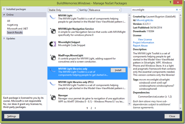
I didn’t implement all the two-way binding stuff because it’s not the subject of this article, but I encourage you to use the MVVMLight lib which will give you automatic INotifyPropertyChanged mechanism in a ViewModelBase class, RelayCommands, etc…
Laurent Bugnion wrote a short article to start with MVVMLight in universal apps.
MainPageVM.cs
 using System;
using System.Collections.Generic;
using System.Text;
using GalaSoft.MvvmLight;
 namespace BuildMemories.ViewModels
{
    // Making it partial can help sharing code too...
    public partial class MainPageVM : ViewModelBase
    {
        ItemVM[] _items = {
            new ItemVM() { Path = "Assets/WP_1.jpg", Title="SF From the bay"},
            new ItemVM() { Path = "Assets/WP_2.jpg", Title="I <3 Xamarin"},
            new ItemVM() { Path = "Assets/WP_3.jpg", Title="XBox session"},
            new ItemVM() { Path = "Assets/WP_4.jpg", Title="Which was that one ?"},
            new ItemVM() { Path = "Assets/WP_5.jpg", Title="Sunny, lucky me !"},
            };

        public MainPageVM()
        {
        }

        public ItemVM[] Items
        {
            get
            {
                return _items;
            }
        }
    }
}
ItemVM.cs
 using System;
using System.Collections.Generic;
using System.Text;using GalaSoft.MvvmLight;
namespace BuildMemories.ViewModels
{
// Using a partial class will help sharing VM accross shared and platform specific projects
public partial class ItemVM: ViewModelBase
{
public string Path { get; set; }
public string Title { get; set; }
}
In the xaml file, we instanciate the MainPageVM and bind it to the Datacontext:
 <Page
    x:Class="BuildMemories.MainPage"
    xmlns="https://schemas.microsoft.com/winfx/2006/xaml/presentation"
    xmlns:x="https://schemas.microsoft.com/winfx/2006/xaml"
    xmlns:local="using:BuildMemories"
    xmlns:d="https://schemas.microsoft.com/expression/blend/2008"
    xmlns:mc="https://schemas.openxmlformats.org/markup-compatibility/2006"
    xmlns:vm="using:BuildMemories.ViewModels"
    mc:Ignorable="d"
    >

    <Page.Resources>
        <vm:MainPageVM x:Key="dc"/>
    </Page.Resources>

    <Grid Background="{ThemeResource ApplicationPageBackgroundThemeBrush}"
          DataContext="{StaticResource dc}">
…
</Page>
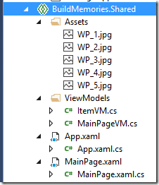
My shared project looks like that now:
To get all the detailed code, you can download the complete source code at the end of the article.
The app at this point
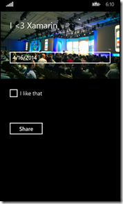
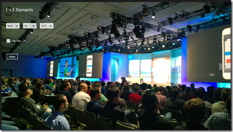
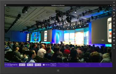
Now here is what the Windows Phone and Windows Store app look like.
The FlipView gets its nice specific behavior on each platform and is also working well with the mouse on Windows 8.1.
But maybe we should adapt the behavior and the position of what we could call the “banner command controls” in these two views. What I want is to bottom align my controls, but also have an horizontal alignment of the controls in the Stackpanel in the Windows app.
Tweak the view according to width/height ratio with the SizeChanged event
A first approach could be to keep that xaml code in the shared project and adapt the layout according to the portrait/lanscape mode, whether the app executes on Windows Phone or Windows 8. A simple way to do that would be to evaluate the width/height ratio and change the layout in the SizeChanged event.
Basic
In my case, I just change the orientation of my StackPanel.
 private void Page_SizeChanged(object sender, SizeChangedEventArgs e)
{
    if(e.NewSize.Width < e.NewSize.Height)
    {
        spActions.Orientation = Orientation.Vertical;
    }
    else
    {
        spActions.Orientation = Orientation.Horizontal;
    }
}
The interesting result is that the narrow view in Windows 8 will get benefit of that and behave the same when the width gets smaller than the window height.
With Visual States
You can also have more flexibility with a visual state for each just like it is suggested in the guidelines since Windows 8.1. Here is an example from the MSDN:
 /// If the page is resized to less than 500 pixels, use the layout for narrow widths.
/// If the page is resized so that the width is less than the height, use the tall (portrait) layout.
/// Otherwise, use the default layout.
void Page_SizeChanged(object sender, SizeChangedEventArgs e)
{
    if (e.NewSize.Width < 500)
    {
        VisualStateManager.GoToState(this, "MinimalLayout", true);
    }
    else if (e.NewSize.Width < e.NewSize.Height)
    {
        VisualStateManager.GoToState(this, "PortraitLayout", true);
    }
    else
    {
        VisualStateManager.GoToState(this, "DefaultLayout", true); }
}
Sharing the Accent Color resource
I can now use a common ThemeResource to use the accent color of each device with the SystemColorControlAccentBrush. To illustrate this, I will add a background set to the accent color, to my existing stackpanel:
 <StackPanel x:Name="spActions" VerticalAlignment="Bottom" Orientation="Horizontal"
            Background="{ThemeResource SystemColorControlAccentBrush}" Opacity="0.8">
And more…
You have yet more things to share such as animations and app bars, but here, I wanted to focus on how to add platform specific behavior while having some XAML shared. which is the second part of this article.
Next >> Strategies for sharing XAML code in Universal Apps (2/2)
