How to create a custom Delegate Control with VSeWSS 1.3
In this post you can see how we can develop and deploy a custom delegate control using VSeWSS 1.3. In this sample I am going to create a delegate control which will display an image at the place of site’s logo. So, if I want to show a different site logo in one of my sub sites then I can create another feature which will show a control to load a different image at that particular site.
This requirement includes the development of following objects.
a. A custom master page to show my custom delegate control
b. Two custom features to show different images embedded in web user controls.
c. Couple of web user controls and images
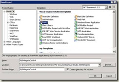
1. Create a new VSeWSS 1.3 “Empty” project in Microsoft Visual Studio 2008. Name that application as “MyDelegateControl” (or give your own name)
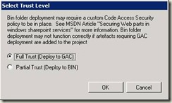
2. Once you click “Ok” then you can see a new window with the following option. Here I am selecting the GAC deployment which is the default option.
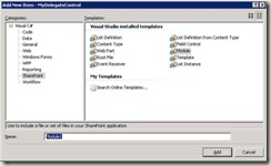
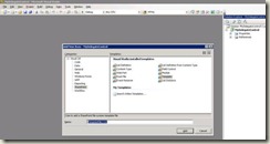
3. Right click on the project and select Add à new item, and then select “SharePoint” as the category. Then you can see several templates available on right hand side and there select “Module”.
4. Rename the “Module1” as MyModule and then you can see that it will add in to the solution explorer with a sampletext.txt file. Now do the following.
a. Rename the sampletext.txt file to MyMaster.master
b. Go to the following location, C:\Program Files\Common Files\Microsoft Shared\web server extensions\12\TEMPLATE\GLOBAL and then open the default.master page. Copy the html content and paste it in the MyMaster.master page inside MyModule folder in the solution explorer.
c. Open the MyMaster.master page and search for the SharePoint SiteLogoImage control and make that control as invisible by adding the following property Visible="false".
<SharePoint:SiteLogoImage id="onetidHeadbnnr0" Visible="false" LogoImageUrl="/_layouts/images/titlegraphic.gif" runat="server"/>
Once you do that then add a custom delegate control just below of the SiteLogoImage control.
<SharePoint:DelegateControl runat="server" ControlId= "MyDelegateControl" > </SharePoint:DelegateControl>
d. Open the Module.xml file and add the following.
<Module Name="Module1" Url="_catalogs/masterpage">
<File Path=" MyMaster.master" Url="MyMaster.master" Type="GhostableInLibrary" /> </Module>
5. Right click on the project and select Add à new item, and then select “SharePoint” as the category. Then you can see several templates available on right hand side and there select “Template”.
Template : In this project we are going to deploy a custom user control to the Control Templates folder and a custom feature to the Features Folder. Thus once you select this template, you can create the folder hierarchy similar in the low location and once you deploy the package all the custom files will be deployed to the corresponding locations automatically.
C:\Program Files\Common Files\Microsoft Shared\web server extensions\12\TEMPLATE
6. Once you complete the 5th step then you can see the Template Folder added to the project with a text file. The text file is just for a sample, you can remove it once you add the Template folder into the project.
7. Now, do the following steps.
a. Create a folder with name “IMAGES” inside the “Templates” folder and two images to this folder. (I am adding Red.gif and Green.gif images in this sample, I took those two images from the 12\Template\Images folder, images are kpipepperalarmlarge-2.gif and kpipepperalarmlarge-0.gif, you can take it to the visual studio project and rename it.)
b. Create a folder with name “CONTROLTEMPLATES” inside the “Templates” folder in the Visual Studio.
c. Give names as Red.ascx and Green.ascx for the user controls. Open both the user controls and add a <img > tag to show the Red & Green images.
Red.ascx
<%@ Control Language="C#"%>
<img border='0' src="/_layouts/images/Red.gif" >
Green.ascx
<%@ Control Language="C#"%>
<img border='0' src="/_layouts/images/Green.gif" >
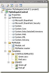
Now, the solution explorer view will be like below
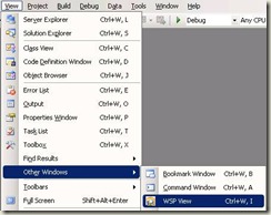
8. Our next step is to create two features for providing the controls to our custom delegate control. One feature is for providing the Green.ascx control and other feature is for providing Red.ascx control to Delegate control. We can create the feature by switching the view to WSP View; you can get this view by View à Other Windows à WSP View.
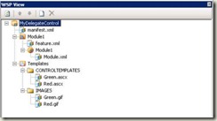
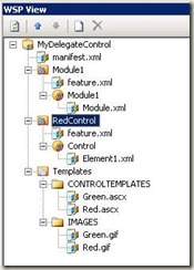
9. You can see the current WSP structure like below in the WSP view.
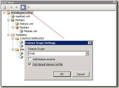
10. Now click on the “Create new feature” button then you can see a popup with Feature Scope Settings. Here I am selecting “Web” as my feature’s scope and adding a default element.xml file.
11. Once we get the feature in the WSP view then rename the Feature and Element folder names likes in below screen shot. (You can use function key F2 to rename the folders. You can’t rename the Element1.xml file in the WSP view, for that you have to switch to the solution explorer view and there we can see the element1.xml and rename the file as you want.)
12. If you try to add a new feature again then you may get a dialogue window says about the Feature1 already exists, ie because whenever you add the first feature with elements it is actually creating a Feature folder with name Feature1 in the solution explorer view. So, first you have to switch to the WSP view and rename the Feature1 folder. I have renamed the Feature1 folder as “RedControl” in this sample.
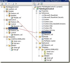
13. Once you are done with the above step then again switch to the WSP view add your second feature and then rename the Feature1 folder to “GreenControl”. The below screenshot is the final view of WSP and Solution explorer.
(Also, give your own titles to the Feature1.xml files. I am giving Red Control & Green Controls respectively for both the features)
14. Now double click on the Elements1.xml file of the RedControl in either WSP or Solution explorer view and do the following changes.
Add the below control tag to the Elements1.xml of RedControl:
<?xml version="1.0" encoding="utf-8"?>
<Elements Id="aac1a327-3a3d-4bd8-aa3b-6d8b3ba0ede2" xmlns="https://schemas.microsoft.com/sharepoint/" >
<Control
Id="MyDelegateControl"
Sequence="100"
ControlSrc="~/_controltemplates/Red.ascx">
</Control>
</Elements>
Add the below control tag to the Elements1.xml of GreenControl:
<?xml version="1.0" encoding="utf-8"?>
<Elements Id="2f573bc3-320e-4329-98f8-7f88c59f99e2" xmlns="https://schemas.microsoft.com/sharepoint/" >
<Control Id="MyDelegateControl" Sequence="99"
ControlSrc="~/_controltemplates/Green.ascx">
</Control>
</Elements>
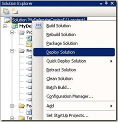
15. That’s all, we are done! Now you just right click on the project in the solution explorer and choose “Deploy Solution”.
16. After deploying the solution, browse to your SharePoint site in which you deployed the application and you can see your custom master (MyMaster.master) page in the master page gallery. (Site Actions à Site Settings à Galleries à Master Page)
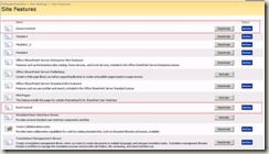
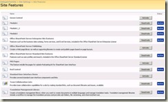
17. Now go to the site features, and then you can see that the features are get activated.
(Site Actions à Site Settings à Site Administration à Site Features)
18. Now change the default master page to MyMaster.page in the Master page settings. (Site Actions à Site Settings à Look and Feel à Master Page). You have to enable the publishing features in order to get this option. Otherwise you can directly access the page by hitting the URL like the following: https://sitename/_layouts/ChangeSiteMasterPage.aspx.
19. After that if you go to the home page and you can see that the Green Control rendered its image on top of the site. This is because, even if both the features are activated, the delegate control will render the control which has a lowest sequence number. In our case Green Control’s sequence number is 99 and the Red Control’s sequence number is 100. (see the Elements1.xml files)
20. If you want to see the delegate control in action, then go to the site feature and deactivate the Green Control feature. So, now your delegate control will render the Red Control because none of other controls are available less than its sequence number which is 100.
21. Go to the home page again to see the change.
You can apply the same functionality to your sub sites too, because the feature was installed as “Web” scope. So, if you apply the same master page to all the sub sites then you can toggle the images as per your requirement.
