Visualizing the Data Exhaust of the Internet of Your Things
I use a lot of devices (and smartphone apps) that collect data on the activities that I do; and one of them is Windsurfing. On my windsurfing session last weekend, I wore a Garmin 310XT to collect location and speed data. The GPS lets me export the data as KML. I used Power Query for Excel 2013 and imported this data into Excel, specifically, the time, speed and lat/long data. My session lasted from 10:40am to 3:40pm with an hour break between 1 & 2. This is what the data looked like in Power View for Excel:
In addition to the GPS data, I also wanted to correlate this data with wind speeds. I launched my sailboard at Magnuson Park in Seattle and the closest wind sensors that I know of are at the 520 Bridge. The 520 Bridge wind sensor data archives are available for download and I went to the download site to obtain the data for the date that I windsurfed on. The data download is in XML format and Power Query in Excel 2013 allows you to import XML data directly into Excel. This is what the data looked like for the entire day (April 13 2014):
In order to correlate my GPS data with the Windspeed data that I obtained from WSDOT, I used the Merge capability in Power Query for Excel to link the windspeed data for the specific time range that I was on the water. I ended up with a composite table that included my GPS data and the corresponding weather data (Windspeed, Wind direction, Temp …):
Using this composite table, I could easily build out a visualization that showed the correlation between wind speeds and my board speed.
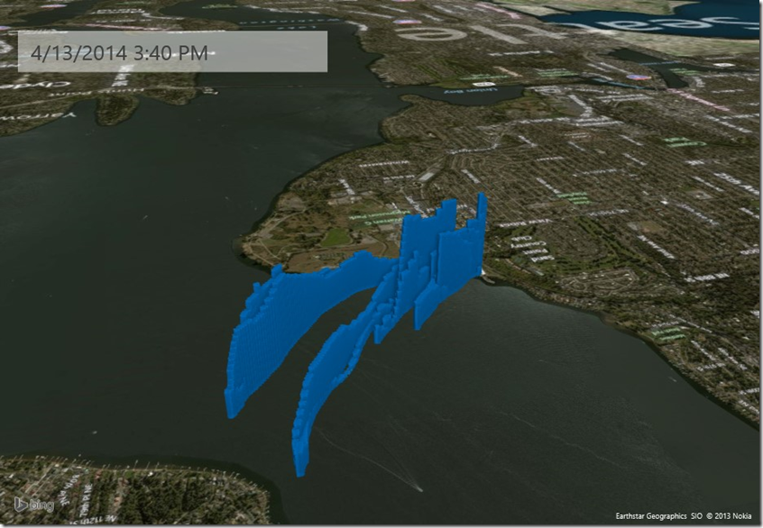
The next visualization that I built was to view these layers of information using the 3D Geospatial visualization capabilities in Excel using Power Map:
Here is a video that I put together that shows GPS data along with Wind Speed Data:
[View:https://www.youtube.com/watch?v=bSuXl_Ntp28&feature=youtu.be]


