Interactive Visualizations
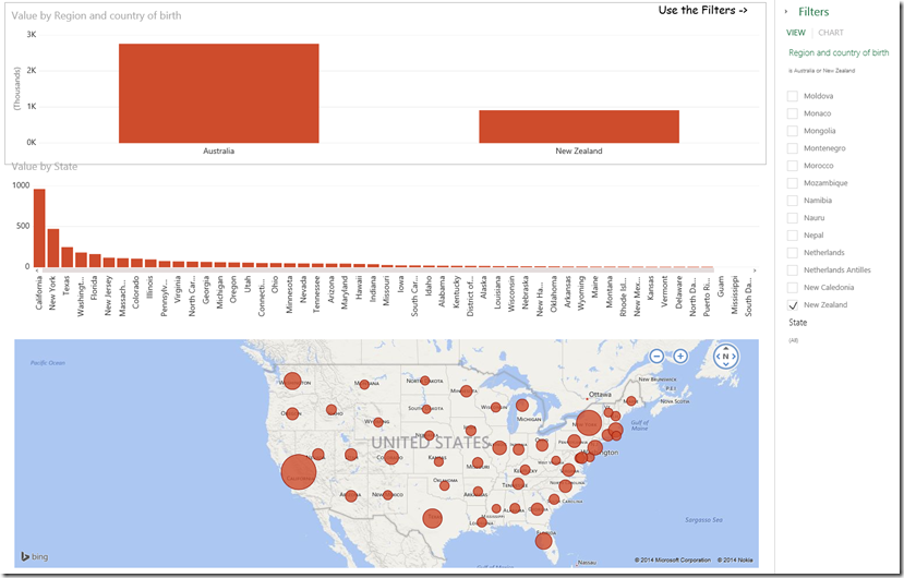
I was looking at a recent article which provided data visualizations that were rather difficult to understand and analyze. Here is the Washington Post article that I refer to: LINK. This set me thinking about how interactive visualizations empower the reader to engage with the visualization to better understand the data as well as make their own discoveries with it. I found the original data for the article at LINK and selected the Supplemental Table 1 for my experiment with Excel & Power BI.
I used Power Query for Excel for acquiring, cleansing and unpivoting the data. I then used Power View for Excel for creating the visualizations. These may not be the best visualizations (they were created in under 10mins) but the goal was to experiment with interactive vs static visualizations.
Here is a link to the interactive visualization: LINK
