Visualizing Seahawks vs Broncos with PowerBI
I’m not much into spectator sport but I do love stats and with all the buzz on the Superbowl around, decided to run some data visualizations to get a feel of the action. Since the Superbowl is one of the most watched annual events, chances are that Twitter is pretty busy with Super Bowl activity: I was right and the number of tweets were amazingly high: over a million tweets in the last few days. While my machine is pulling in those tweets for visualization, I decided I will share out the results of Bing Search & Google Trends instead.
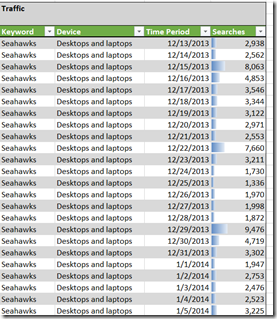
I used the Bing Ads Intelligence AddIn for Excel to get data of searches for December 2013 and January 2014.
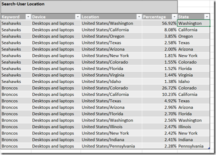
The data returned also showed a breakdown of the searches by State:
The final piece of information that I obtained using the Bing Ads Intelligence AddIn is the age and gender breakdown:
In order to make better sense of the data, I used Power View for Excel to visualize all this information. Power View is an interactive data exploration, visualization, and presentation experience that encourages intuitive ad-hoc reporting. Power View is a feature of Microsoft Excel 2013, and of Microsoft SharePoint Server 2010 and 2013 as part of the SQL Server 2012 Service Pack 1 Reporting Services Add-in for Microsoft SharePoint Server Enterprise Edition.
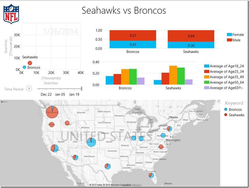
This is what the visualization looks like using Power View
Some of the interesting data points:
-
- The male/female ratio on the searches for both teams are pretty close but the Seahawks have a higher male ratio at 64% vs the Broncos at 57%.
- The biggest age group for the Seahawks is 35-49 whereas the Broncos are pretty close across 35-49 & 50-64. The Broncos do have a bigger base under 25.
- The map shows some obvious distributions of searches for both Seahawks and Broncos
- The animation of the search shows a larger volume of search for Seahawks with a massive jump happening after January 19 2014.
[View:https://www.youtube.com/watch?v=0Hdu0AfTuqk]
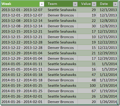
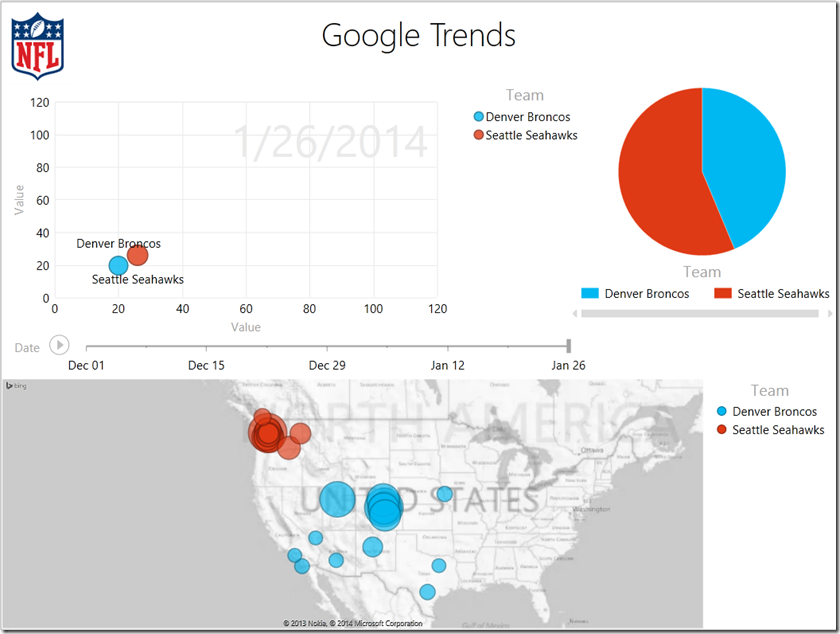
I did a similar comparison with Google Trends data and imported search traffic data for Dec 2013 and Jan 2014.
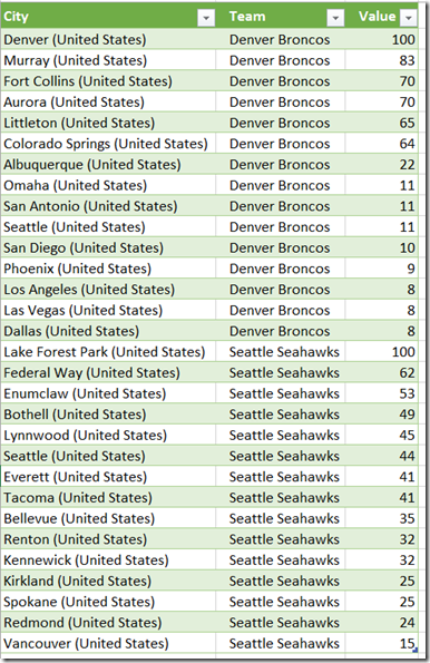
Google Trends also gave me the top cities in the US that were searching for the Seahawks and Broncos. After cleaning and transforming the data using Power Query, this is what I got:
Again, using Power View, I visualized this information to get a quick analysis:
The final visualization that I pulled together was to put these layers of data into a 3D data visualization with Power Map:
[View:https://www.youtube.com/watch?v=qMnDdHfrfTY]
This was a quick experiment with Super Bowl Search data and not necessarily the best analysis. With additional time, you could easily enhance this to include search data for specific players, twitter data and hashtags.
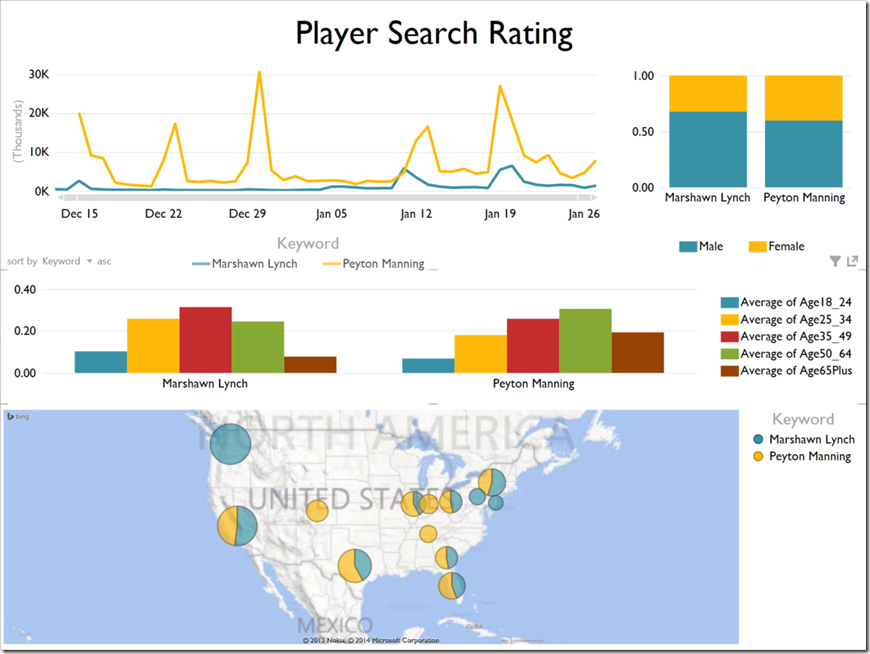
Here is what Bing data revealed of searches for Marshawn Lynch & Peyton Manning over December 2013 & January 2014 looked like:
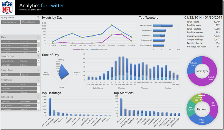
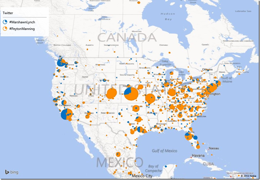
I did run the Twitter Analytics Addin for looking at mentions of hashtags for Marshawn Lynch & Peyton Manning. This would be a subset of all the superbowl tweets going on.
Here is a link to the Excel 2013 file if you want to download and experiment with it further: LINK
You may want to install:
