Download: Workflow Development Resources Interactive Map
(Cross-posted from my individual work blog.)
For the last several weeks, I’ve been experimenting with using mind maps, both as a way of brainstorming about developer content, and as a possible way of presenting content in a less-structured way than a typical (linear) table of contents. In regards to that last goal, I really liked how mind maps let you graphically lay out a content area, and draw non-linear relationships between various nodes. I could see how this could be a much more intuitive, discoverable way of presenting content, especially for a technology as complex and interrelated as Windows SharePoint Services. I was using an application called MindManager (from Mindjet) to create my mind maps, and was generally pretty happy with the results.
There was just one problem: in order to share a fully-functioning map with anyone else, they needed to have the same software (or at least a downloadable viewer) installed. Sure, Mind Manager let me save a given mind map as a image map or static PDF, but each of those formats ruled out one of the main selling points on the mind maps themselves: the ability to collapse/expand various nodes on the map, and thereby control the level of information you were looking at. Without that interactive ability, it really seemed like the value of using mind maps as content/resource maps was fairly restricted.
Perhaps MindJet thought the same thing, because the new version of MindManager now lets you save your mind maps as interactive PDF files. Now anyone who can view PDFs can also interact with your maps, and customize the view by collapsing/expanding the nodes of their choice.
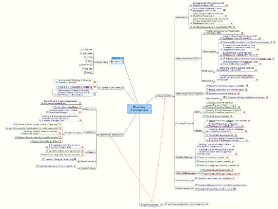
So I’ve created an interactive mind map as another way of presenting some of the information we currently have on MSDN, and I’ve love to know what people think of it. Basically, I’ve taken some of the content links present on the Workflow Resource Center and restructured them as a mind map. Rather than present the content based on content type or source, as the Resource Center does, I’ve tried to present the content grouped to present a workflow development overview, as well as by developer tool. Icons next to each link display what type of content I’m linking to (SDK topic, blog, multimedia, etc.); the text color denotes whether the link applies just to Windows SharePoint Services (green text) or Office SharePoint Server as well (blue text).
I’m hoping you’ll take a few minutes and download the map, play with it, and let me know what you think, even if you don’t have any interest in workflow development. More than just does this specific map meet your needs, I’ve love to hear whether you think using such maps in general is a useful/worthwhile way to present developer documentation. Leave a comment after the post or ping me directly through the blog; I’d love to hear from you.
(One minor drawback I can see is how much saving as an interactive PDF bloats the size of the file: this download, of a fairly small map, is 1.5M.)
Now if we could just get them to add a ‘Save as Silverlight’ feature…