CSS Style Bar Graphs using Data Views
 Hi everyone, Jon here again with a quick how-to on creating a simple bar graph of your data by using CSS and the Data View features of SharePoint Designer 2007. Among other things, this can give you a great KPI style view of your data without too much effort. For this example I created a basic list which had a column of number values formatted as percentages. First, I will go through the actual instructions and then I will describe what is happening.
Creating the bar graph:
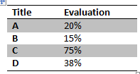
1. Insert a view of your list onto a page, making sure to include the columns you want (in my case “Title” and “Evaluation”).
![clip_image002[13]](https://msdntnarchive.blob.core.windows.net/media/TNBlogsFS/BlogFileStorage/blogs_msdn/sharepointdesigner/WindowsLiveWriter/CSSStyleBarGraphsusingDataViews_F8AD/clip_image002%5B13%5D.jpg)
2. Select an item in the column of numbers you want to graph (0.20), then click the “<”. In the Common xsl:value-of Tasks popup select Number formatting options… . Then, change the Format to “Percentage (%)”. Finally, click OK.
3. Place your IP after the number (20%), then click Insert -> HTML -> <span> .
4. With the span tag selected, open the Tag Properties task pane. For the “style” attribute type in “width: {format-number(@Evaluation, '##.#%')}; background-color: blue;”. (Note: change “@Evaluation” to match your field’s name).
5. You should now have something like this:
![clip_image004[6]](https://msdntnarchive.blob.core.windows.net/media/TNBlogsFS/BlogFileStorage/blogs_msdn/sharepointdesigner/WindowsLiveWriter/CSSStyleBarGraphsusingDataViews_F8AD/clip_image004%5B6%5D.jpg)
How it works
![clip_image006[6]](https://msdntnarchive.blob.core.windows.net/media/TNBlogsFS/BlogFileStorage/blogs_msdn/sharepointdesigner/WindowsLiveWriter/CSSStyleBarGraphsusingDataViews_F8AD/clip_image006%5B6%5D.jpg)
The graph works by taking the table cell and inserting a span tag within it. The table cell’s width becomes the “100%” width for the bar graph, and we adjust the size of the span tag to be the desired width given the percentage value. By coloring the background of the span tag, we get the familiar bar graph look. With a little creativity you can get very impressive looking graphs like those displayed on the CSS For Bar Graphs entry of the Apples to Oranges Blog. You can even combine this with the ability of the Data View to output JavaScript to create JavaScript based graphs. It’s a really great way to jazz up an otherwise boring view of a list.
Enjoy!
-Jon