Lo-Fi or Hi-Fi mockups? Blend Resource Dictionaries mean not having to choose
I was taught to avoid high-fidelity mockups for as long as possible. But there is an important role for high-fidelity mockups as well. If only we could have both...
I've just finished reading "Design Vision" by Luke Wroblewski, Dirk Knemeyer, Bob Baxley, and Jim Leftwich. (I make it a policy never to be more than two years behind in my work reading.)
Quite a few points got my attention, including a discussion of the important role of high-fidelity (even pixel-perfect) mockups in the design phase. But I was taught to keep my mockups lo-fi as long as possible.
Low-fidelity mockups elicit different user feedback to high-fidelity ones
Coming from a user-centred design background, I was taught that incorporating visual treatment too early in the design process can distract from the underlying information architecture and interaction model, which are still under development. I saw this myself usability testing an application to be used by university students. For some reason on this project we tested low-fidelity mockups (hand-drawn paper prototypes) and high-fidelity mockups (visually treated on-screen prototypes) at the same time. Just as I had been taught, we received very different feedback from the two conditions. Users who evaluated the high-fidelity mockups tended to critique the aesthetics (colours, layout, possibly labels), whereas users evaluating the low-fidelity mockup gave feedback about navigation, and general intuitiveness of the application - feedback which was much more useful at that stage of the project.
The conventional wisdom is that low-fidelity prototypes (like wireframes and paper prototypes):
- Don't distract users with visuals
- Signal to users that the design is still a work-in-progress and therefore feedback is welcome
- Allow designers to more easily explore different information and interaction options, because the visual treatment does not need to be constantly re-jigged.
But wireframes are sooooo boring!
The problem with low-fidelity mockups is that they aren't very exciting when presented to internal stakeholders. At the end of the day, we are required to drive a design vision for a new product or service, not just deliver a usable UI, and this is a main discussion point of the Design Vision paper.
(ironlically, sometimes in my consulting days we would try and dress-up our paper prototypes to make them more compelling by putting them on mounting boards with coloured borders and stuff - but this is missing the point.)
I guess I always trusted that my stakeholders would see past the grey caterpillar of the early protoypes and see the beautiful butterfly inside. Of course, this was a mistake. It is not the stakeholders' job to see that potential, it is my job to show it to them.
Luke Wroblewski puts it this way:
"Don't confuse the working prototype used for testing and getting kinks out of a mature product design with the one used to sell a design vision."
Efficiency vs fidelity
At SXSW last week, Michael Lopp described how Apple create pixel-perfect mockups of their designs. He acknowledges that this creates more work, but means there is no ambiguity. It also means that the design vision has the fullest opportunity to impress itself not just on stakeholders, but on the entire product team. When I think back over a lot of my UX specifications over the years, I can see how they were complete, and thorough, but really failed to invoke the vision.
That reminds me, by the way, of one of my favourite stories about the design of the Sydney Opera House. Jorn Utzon's submission for the design competition was decidedly lacking in pictures - making it hard for the judges to see the intrinsic value of the concept. Ironically, it was one of the judges, Eero Saarinen, who competed a number of paintings of the proposed building which swayed the rest of the judges.
Can Microsoft help? Sure!
So ideally we want to have both types of mockups to hand - low fidelity ones for facilitating design exploration and for usability testing, and high-fidelity ones to inspire and assure project team members and stakeholders.
When you think about it, it is actually possible to have the best of both worlds. When we are working on HTML web sites, we can swap in alternative CSS files to switch from 'wireframe' view to 'treated' view. Now I have never tried this, but I'm sure plenty of people have. I'd be interested to hear your experiences.
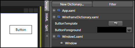
Using Expression Blend to design Silverlight and WPF user interfaces, we can also do a similar thing using Resource Dictionaries. Resource dictionaries are separate files in your project that store styles, among other things, for the whole project. By defining the look-and-feel of elements in a resource dictionary, it is possible to swap in different dictionaries for different purposes. For example, you could have a wireframing resource dictionary and a visually treated resource dictionary. That way, when you need to switch from wireframe to visual treatment, you can simply swap resource dictionaries (the secret here is that styles in the two dictionaries have the same names). In fact, if you have created your own wireframing controls (black an white buttons, checkboxes and nav-bars etc.) you can place them in their own resource dictionary, with their default styles already pointing to your wireframing resource dictionary.
With "WireframeDictionary" loaded, this button has a wireframe style and label:
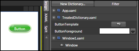
But with "TreatedDictionary" loaded buttons have a different style and foreground:
Layout
One thing to note: simply changing styles won't change layout per-se. However you could handle this to with appropriate use of layout controls in WPF and Silverlight 2 that adjust the layout as required.