Cruel to be kind - When it's good to be Modal
Here at Microsoft it is online training season. As a UI designer, I always look forward to the latest online training offerings because you never know quite what you're going to get in terms of usability.
This season, however, I was pleasantly surprised to find there was a great deal of consistency between the user interfaces for the various training packages - most of them seem to have been built using the same framework. Despite what your English teacher may have told you, consistency is good in user interfaces - it allows users to re-apply their previous learning about how to use a system to a new situation.
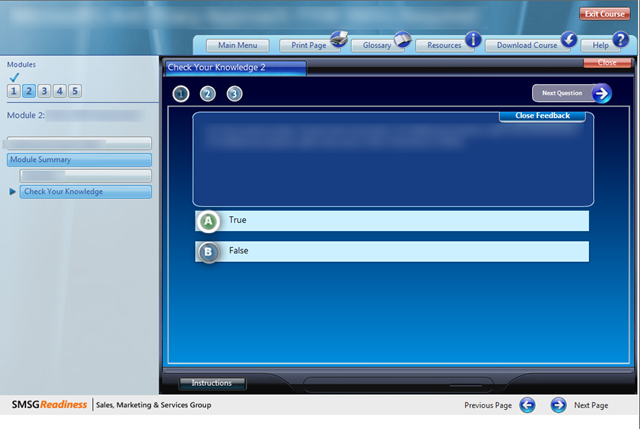
However, in this case the consistency brought with it one consistent problem. At the end of each training module was a 'Check Your Knowledge' section that asked me questions to see if I was paying attention. This function appeared in the right-hand side of the page, replacing the training material:
The problem
To navigate through the training material I had been using the "Next Page" button in the bottom-right. However, to navigate to the next question in the Check Your Knowledge module, I needed to use the "Next Question" button in the top-right.
So even before I tell you what happens when I press "Next Page", we can see an unfortunate collusion of interaction design principles:
- Habituation makes me inclined to click "Next Page" when I have finished a question, because that is what I do when I have finished the other training modules.
- Reading order reinforces that inclination - as a westerner I am likely to continuing reading down the page once I have finished a question.
- On top of that, the right-arrow and "Next Page" label quite reasonably mapto my "Next question" goal.
Notice that the designers have tried to compensate for this problem by applying extra "visual weight" (emphasis) to the "Next Question" button.
So I press "Next Page"
So, like a hapless user I press "Next Page".
The system informs me that this was the wrong thing to do, and basically I am a stupid-head:
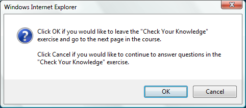
OK, so I am being a bit harsh. Pressing "Next Page" was a perfectly valid choice - if my intention was to stop answering questions and move on to the next section of the training.
At this point we must consider user motivation. While it is possible that I do want to move on without finishing the questions, the fact is that unless I finish the questions I will not be given credit for the training and Anna will get mad. Therefore it is most likely that I don't want to move on at all.
This is a common problem we see in user interface design. We want to let the user have the freedom to do what they want when they want. In the olden days of GUI design, this principles was captured in the idea of non-modality. Basically, don't make users switch between 'modes' when they want to do something different.
More recently, modality (making the user stick to one activity at a time) has made a comeback. This is for a couple of reasons:
- We are designing for the web these days, which, with it's simplified underlying model, just isn't as capable of supporting users performing all sorts of unstructured actions, and
- Applications of all sorts are much more complex these days.
Cruel to be Kind
These days we are more likely to deliberately design modality into our user interfaces - this allows the user to concentrate on the task at hand, thus reducing their cognitive load.
In the case of our training system, the user interface designers might have considered restricting my choices to "Next Question" and an explicit "Exit 'Test Your Knowledge'" (and emphasising the former). All other choices would be disabled or obscured. This would mean more clicks if I genuinely wanted to skip the questions, but it would create less confusion (and decision making) overall.
Lessons Learnt
- Consistency is good, but in situations where it is better to be inconsistent, flag that inconsistency clearly.
- Sometimes you have to be cruel to be kind. Restrict user options (go modal) where it will help them to focus on the task at hand (but always provide clearly marked exits).
Usual Disclaimer
As usual I don't know anything about the actual internal processes or constraints (technical or otherwise) that led to this UI. Despite my observations above, this UI is certainly a huge improvement one some of the other online training systems I used before.
I write these little critiques not to criticise the people who worked on any particular project, but so that we can all learn by observation - a good skill for any designer to have.