User Feedback and the Halo Silverlight site
If you've got nothing nice to say...
One of the problems with having joined Microsoft is that it's harder to criticise. Anyone who has attended my courses (coming up at OzChi, by the way) knows how I rely on sympathetic critique to build interaction design skills. However, since joining Microsoft if is harder to criticise others - coz they are possibly competitors, or else don't have the same resources as Microsoft. On top of that it's harder to criticise Microsoft, too, since I am effectively criticising my colleagues.
Having said that...
On the new Halo 3 Silverlight site I found this page, which has a simple problem of feedback (and 'Visibility of system state').
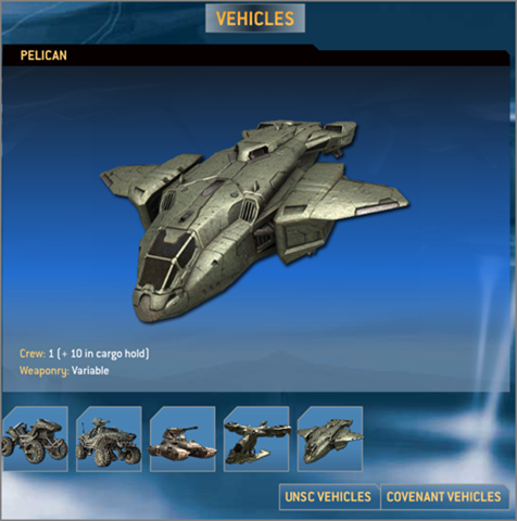
When I click 'Vehicles' I got this:

Cool. Then I clicked "UNSC Vehicles" and I got this:
So I clicked "Covenant Vehicles" and I got this:
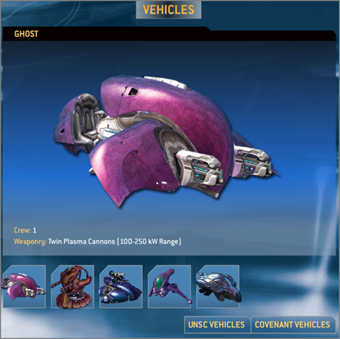
So it looks like "UNSC Vehicles" must have been selected when I first arrived - but there was no way to know that (unless I had prior knowledge that UNSC vehicles only come in monochrome).
So what's the problem?
It's a simple problem of Feedback. At the very least, the selected option should be highlighted (the buttons do have a rollover highlight).
If I was to go further, there is also a problem of Hierarchy of Control. The buttons at the bottom-right drive the content of the rest of the page, but the Visual Hierarchy does not suggest that. Simple solution? Consider moving the buttons to the top-left. That would more naturally indicate the relationship between the elements on the page - especially for users who are used to reading in a left-right, top-bottom way.
Does this mean I have to give my Halo jumper back?