Maps: You’re Missing the Point(s)!
While the map in SSRS 2008 R2 supports different data sources for spatial data (ESRI shape files, SQL Server spatial, and included maps in the Map Gallery), sometimes that may not be enough for your needs. Another way you can get spatial data into the map is to add it to the map directly in the report authoring environment (both BIDS and Report Builder 3.0).
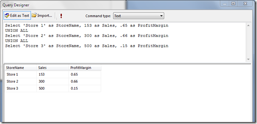
In this scenario, we’ll look at an example where you might have a list of stores with just a store name field and you’d like to show their sales and profitability. The dataset looks like this.
Once you have the dataset, simply add a map to the report by right-clicking –> Insert Map. This will place a blank map on the report.
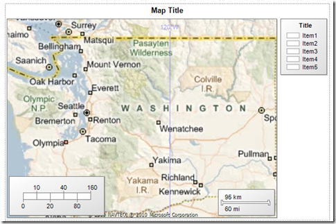
Next, select a map and add a tile layer. This will place a Bing! maps tile layer background on the map. In our case, we are going to assume that our stores are all in the state of Washington so we need to zoom the map into the Washington state area and we can do that by just panning and zooming the map in the designer. After zooming and panning the map will look something like this.
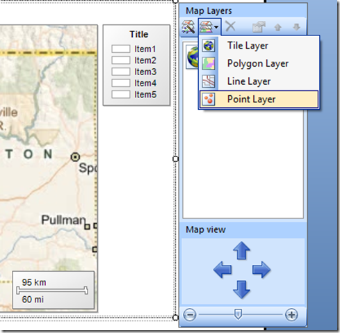
Now that we have the state, we can add embedded points into the map. For our case, we are going to assume that our three stores are in Seattle, Tacoma, and Olympia. To add the points, first add a point layer to the map using the fly-out.
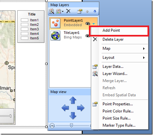
Now there is a point layer on the map. Next, select the drop-down on the point layer and choose the option to “Add Point” as shown below. Add the point over the Seattle city area.
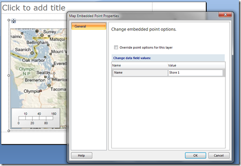
Once the point is on the map, you can select it and bring up its property page. Give the point a name, and you can optionally choose to open up a lot of other properties for the point using the checkbox override. For now, we’ll leave this box in its unchecked state.
Repeat this procedure to add Store 2 and Store 3 in Tacoma and Olympia.
Once the map has all three points added, select the Point Layer in the fly-out and choose the option to bring up the layer wizard. This will bring up the layer wizard for the point layer.
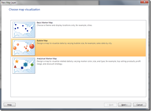
Select the Bubble Map option and hit “Next”. On the next page where the wizard asks you to select an analytical dataset, select the dataset you created based on the query at the beginning of this post, and then select “Next”.
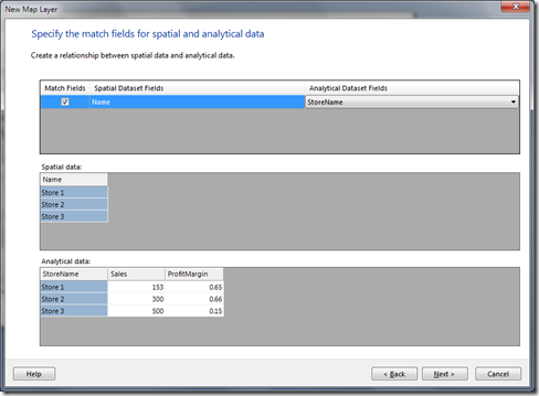
On the next page you will be asked to bind the analytical data to the name property we created on the embedded points. Here’s a screenshot of what that should look like.
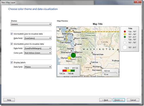
On the next page of the wizard, we’ll choose the options for setting the bubble size and bubble color. In our case, we want to make the bubble sizes dependent on sales and the bubble color to be dependent on profit margin. Below is what the wizard should look like once it’s filled in.
Click “Finish” to leave the wizard and return to the report design surface.
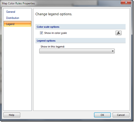
Before we run the report, there’s one last bit of cleanup we need to do. Select the Point Layer and bring up the Point Color rule property page. We want to remove the point colors showing up in the legend on the right. Select the Legend tab and from the “Show in Legend” drop-down, de-select Legend1 as shown below.
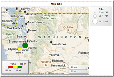
Exit the property page and then return to the report. Go ahead and run it now and you should see the following:
That’s it. Of course, you could go in and add a Legend Title, or even change the Point color rule properties to create as many color buckets as you like to customize the report further.
del.icio.us Tags: SSRS,maps,R2,SQL Server Reporting Services 2008 R2
