Silverlight 2 DataGrid is Released
As you might have heard, we just released Silverlight 2, and with it the first version of the Silverlight DataGrid! We have been building this for a while, giving the first glimpse of it last March in Silverlight 2 Beta 1, and tweaking it ever since based on your feedback. We were able to pack a lot of great features into it, and I look forward to hearing from you what features you want next!
In celebration of its release, all of the previous walkthroughs have been updated to work with the RTW bits, and new walkthroughs are on their way.
Also, if you have never used the Silverlight DataGrid before, here is a good place to start.
What's New?
You might be wondering what has changed since Beta 2:
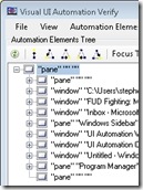 |
Accessibility:One of the biggest features that we have added since Beta 2 is the addition of an automation peer framework which allows the DataGrid to work well with screen readers. |
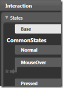 |
Support for the VSM:The Visual State Manager (VSM) is a tool that allows designers to customize how a control looks in various states, and the animations used to switch between these states. |
 |
Performance, Performance, Performance:We have done a lot in this area to try to get the DataGrid running as fast as possible. If the last time you used it was in Beta 1 or even Beta 2, you should definitely take another look. |
 |
API Improvements:Based on your feedback, we took another pass through the API in an effort to simplify it more and give you more control over the DataGrid. |
 |
Great New Look:The entire framework got a visual upgrade since Beta 2, and the DataGrid is no exception. |
What's Else Can It Do?
For those of you new to the Silverlight DataGrid, here is a quick rundown of what it could already do:
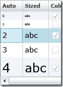 |
Auto-sizing:Everything in the DataGrid can be auto-sized. That includes the DataGrid itself, Columns, Rows, Headers, and Row Details meaning that you do not have to worry about the size of what you are putting into the DataGrid, it will grow to accommodate it. |
|
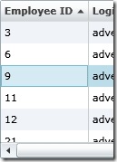
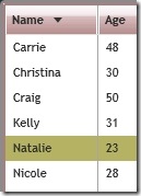
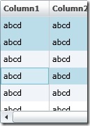
Sorting:Any time you bind the DataGrid to a collection that implements IList such as a List<T> you now get sorting for free. Even better, sorting isn't limited to a single column, but end users can sort by multiple columns by holding Shift and clicking on additional column headers. As an RTM improvement, you can also choose which columns you want to support sorting. |
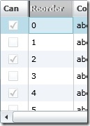 |
Column Reordering:End users can reorder columns at runtime just by dragging a column's header, and developers can control not only the order, but the appearance of the reordering UI as well as the behavior. |
 |
Column Resizing:Just like reordering, and sorting, end users can control the size of columns at runtime. |
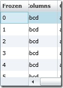 |
Frozen Columns:This is a semi-advanced feature, but once you know about it you'll be surprised at how useful it can be. A frozen column does not scroll horizontally but rather is "frozen" in place. This is the same as the Freeze Column feature in Excel. |
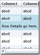 |
Row Details:This feature is one that we are very excited about. In short, it is an area in each row that allows you to put any UI you want that spans all columns. This could be anything from form-based entry to the contents of a column that would do better if given more space. |
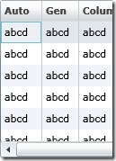 |
Auto-Generation of Columns:A great feature to help get an application up and running quickly, auto-generation of columns creates a column for every property on the item that it is bound to. |
 |
Highly Customizable Visuals:The look of the Silverlight 2 DataGrid has been improved, but it doesn't mean that you can't change it. Every aspect of the DataGrid's appearance can be retemplated to create a drastically different looking DataGrid that maintains all of the great features listed here. |
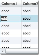 |
Editable:The DataGrid control allows your users to edit the data that it is bound to. One benefit of the Silverlight DataGrid is that it gives you control over what control is used to display the data for each cell, and what control is used to edit the data for each cell even if they are different. The customization is easy, and it handles switching between the two when the user wants to go into edit mode. |
 |
Scrollable:Another benefit that the DataGrid provides is the ability to scroll through long lists of data. The DataGrid does a lot behind the scenes to make this experience as smooth as possible for your users even when you have a large number of rows. You can also scroll columns and items into view to make sure that an item you want to highlight to your user is visible on screen. |
 |
Multi-Selection:The DataGrid provides both single as well as extended selection modes, allowing you to choose if you want users to be able to select more than one row at a time |
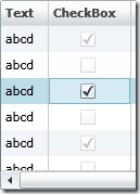 |
Built-in Column Types:Out of the box you can use both Text columns as well as CheckBox columns, and creating your own column types is easy. Read more about using the Built-in Column Types: |
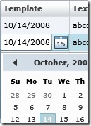 |
Template Column:In addition to the built-in column types, the template column gives you complete control of what to show during display and edit modes. Read more about using the Template Column: |