Using Images as Buttons on Windows Phone 7
Within the Windows Phone 7 marketplace there are more than 12,000 applications and one such application is the Stopwatch that I published sometime ago, the free version is one of the most popular health and fitness applications.
Initially the user interface used buttons within the ApplicationBar to start, pause, stop, and reset the stopwatch; unfortunately these buttons were quite small and more than a few reviews of the application commented that the application needed larger buttons.
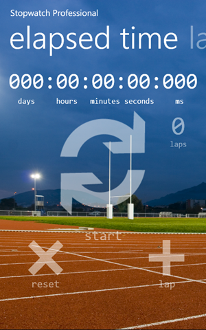
It is arguable that the most popular applications on Windows Phone 7 use the Pivot and Panorama controls, therefore the Stopwatch user interface was redesigned to use the Pivot control. Using the Pivot control would then allow the laps to move to a second pivot item (see the PivotItem class) which would allow larger buttons to be used although, instead of using buttons that look like buttons, I decided to resize the ApplicationBar icons.
Stopwatch Professional 4.2
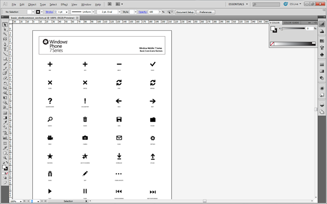
ApplicationBar icons are installed along with the Windows Phone SDK in light, dark, and vector formats; the light and dark icons are in the PNG graphics format while the vector icons are provided in Adobe Illustrator format.
After opening the basic_shellcommon_vectors.ai document in Adobe Illustrator CS5 the required icons were resized and the opacity was set to 50% and the icons were now ready to be used in the Stopwatch Pivot control.
Adobe Illustrator CS5 - basic_shellcommon_vectors.ai (from the Windows Phone SDK)
You can find the basic_shellcommon_vectors.ai file within the Windows Phone 7 SDK installed here:
C:\Program Files (x86)\Microsoft SDKs\Windows Phone\v7.0\Icons\vector
It is possible to use an Image as the content for a Button as in the following example:
<Button x:Name="StartButton">
<Grid>
<Image x:Name="StartButtonImage" Source="Stopwatch;component/Images/Start.png"/>
</Grid>
</Button>
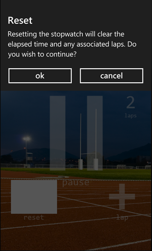
Unfortunately when the user clicks the Button in this example the button will turn white as in the following example where the Stopwatch reset button has clicked. In this example the issue is all the more apparent to the user because the button will remain white until the user clicks either the ok or cancel buttons.
Reset Button Version 1 – Button Becomes White When Clicked
Instead of defining the Button with the Image, as in the above example, we instead define a Style that can be applied to one or more other elements, specifically the Button type as per the specified TargetType. Expression Blend make it easy to define the Style so don’t worry necessarily about having to write all the following XAML each time you need to define another Style, we’ll look at how to do this in just a moment.
<phone:PhoneApplicationPage
x:Class="Stopwatch.MainPage">
<phone:PhoneApplicationPage.Resources>
<Style x:Key="StartButtonStyle" TargetType="Button">
<Setter Property="Template">
<Setter.Value>
<ControlTemplate TargetType="Button">
<Grid>
<Image x:Name="StartButtonImage" Source="Stopwatch;component/Images/Start.png"/>
<ContentPresenter HorizontalAlignment="{TemplateBinding HorizontalContentAlignment}"
VerticalAlignment="{TemplateBinding VerticalContentAlignment}"
Content=""/>
</Grid>
</ControlTemplate>
</Setter.Value>
</Setter>
</Style>
</phone:PhoneApplicationPage.Resources>
</phone:PhoneApplicationPage>
With the Style defined the Button can now be defined using that Style as in the following XAML definition:
<Button x:Name="StartButton" Style="{StaticResource StartButtonStyle}"/>
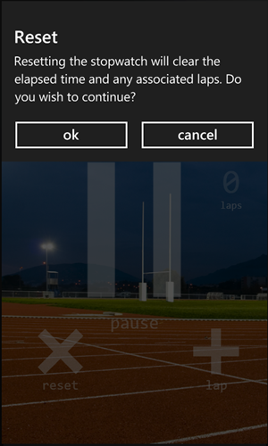
Using the Style the Image within the Button remains visible when the Button is clicked.
Reset Button Version 2 – Button Image Remains When Clicked
Expression Blend provides the easiest way to create the Style from any Button. Within the Visual Studio Solution Explorer simply right click on the page containing the Button definition and select Open in Expression Blend.
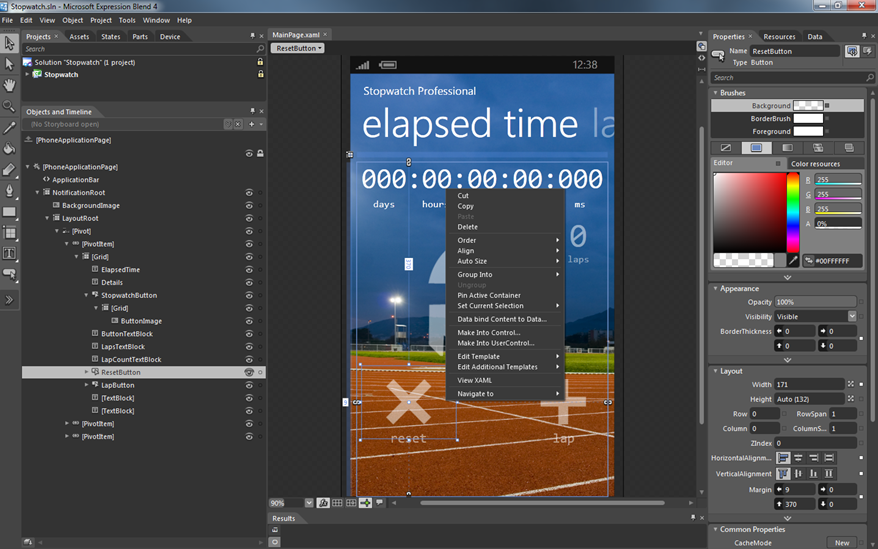
With the page opened within Expression Blend simply select the Button within the designer or the Objects and Timeline, the ResetButton is highlighted within the Objects and Timeline below, and right click and select Make Into Control.
Expression Blend – Selecting Make Into Control
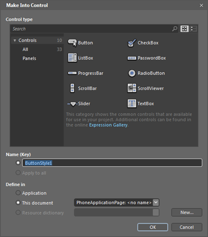
After selecting Make Into Control… within Expression Blend the Make Into Control dialog appears allowing you to name the Style and determine where the Style should reside. Select This document unless the Style should be available application wide.
Expression Blend – Make Into Control Dialog
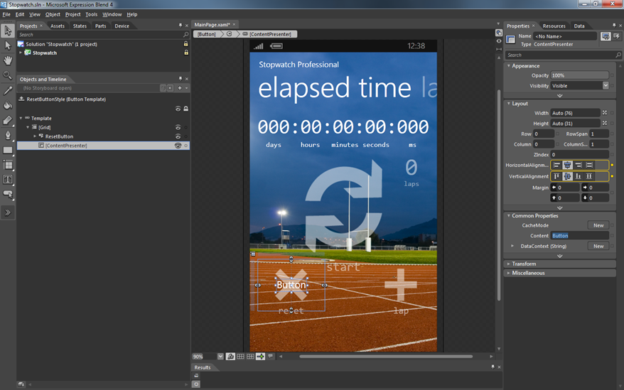
With the Style created Expression Blend the Button has been updated to be based upon that Style however the Content of the Button now contains the string “Button” which need to be removed. Simply select the Content of the Button and remove the string “Button” within the Common Properties.
Expression Blend – Removing Button Content String “Button”
Using Expression Blend and Visual Studio together in this way can be immensely productive and if you’re using Visual Studio Team Foundation Server you’ll be able to perform source control operations in both Visual Studio and Expression Blend. You’ll also be more productive using multiple displays on your PC too!
If your phone is a Windows Phone 7 device then also download either the free Stopwatch from the marketplace or Stopwatch Professional which adds the ability to send the elapsed time and laps by either email or text message, let me know what you think of the application and of course this blog post.
