Visibility + Supportability + Consistency == Great UX?
In my last couple of posts I explored the concepts of Visibility and Supportability as properties of an architecture. These are principles that architects must keep in mind when designing user centered architectures, systems that as Frank Lloyd Wright would say, put people first. We must never forget that we humans are in charge. We are the masters, the machines exist to serve us. That is of course until Skynet becomes self aware and judgement day ensues moments later, but I digress...
A number of you responded to my previous posts pointing out that Office Communicator is but one of several applications released by Microsoft in recent times that have made something as simple as finding the menu quite difficult. A couple of quick examples...
Windows Media Player 11
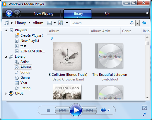
You have probably seen this UI before. Now just imagine that it is your job to instruct your grandmother on how to open an mp3 file to play it using Windows Media Player 11. Simple, just select File/Open from the menu right? Oh wait... there is no menu... or is there? Actually if you press Alt-F a file menu will magically appear. However if you are not among the Alt+key aficionados you won't know this.
The solution? Right click on the black bar across the top of the window.
No... not the Window Title bar area (which might look black depending upon the thing that is behind the window if you have the Aero shell enabled otherwise it will be the Window Title bar color selected by the color scheme which... uh... could be black.)
No... it is the bar that says "Now Playing"... yes that one.
What? You say when you click on that you get a menu but it doesn't have "File" on it?
Oh... uh... you have to find a spot on the black bar that isn't otherwise occupied by a word or phrase like "Now Playing" or "Library". If you right click on those you get a special menu that applies only to that word. Which by the way is the same menu you get if you happen to left click (for those who are confused about what right and left is).
So where do I need to right click to actually see the menu?
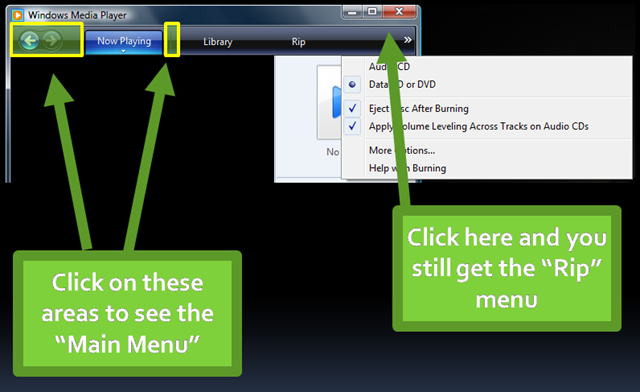
Since there are no obvious visual cues I have shaded the only areas I could find that will result in the menu being displayed when you right click there. You will notice that the area that will result in a success (menu displays) are actually much smaller than the areas that will result in failure. Even if you right click way over to the right side off the black bar you still get the "Rip" menu.
How did we let this happen?
I'm afraid that in our desire to have a "Cool" and "Clean" design we have forgotten the old maxim "Form follows function". If WM11 was the first application you would be free to do whatever you want (as long as it made sense) but it is not the first application. It exists in a world where applications have come and gone for nearly 20 years on the Windows platform. In the early days of Windows 3.0 there was a great deal of chaos about things like this. Menus, toolbars and other UI widgets were unpredictable and there was no unified conceptual model about how a Windows app should look or function.
Reinforcing the Conceptual Model
Somewhere in the mid nineties (I can't remember exactly when it was) a style guide for Windows applications emerged. The style was modified and updated for successive Widows releases each having minor modifications. The style guide specified how a "Window" should work. It specified how menus should be structured and we trained the world on this conceptual model.
"Mental models, our conceptual models of the way objects work, events take place, or people behave, result from our tendency to form explanations of things. These models are essential in helping us understand our experiences, predict the outcomes of our actions, and handle unexpected occurrences. We base our models on whatever knowledge we have, real or imaginary, naive or sophisticated."
"The Design of Everyday Things" page 38 - Donald A. Norman
From the first day you click a mouse on a Windows application you began to form a conceptual model about how these things work. You learned that if you wanted to open a document, a media file or whatever that you clicked on the "File" menu. It may not have been the best model but is was familiar and when the next application or new version came along you didn't have to alter your conceptual model because it was essentially the same. It made the world predictable which left you with a comfortable feeling.
But now for the sake of gleaming eye-candy we have broken the model we so carefully built and reinforced for so long.
Who cares how "cool" your design is if human beings cannot successfully predict the steps it will take to use it!
I know, some of you are saying... What is so hard about that? I can figure it out. Yes, but you are a software professional. Your geeky inquisitive nature will cause you to keep working at understanding this thing until you get it. Most people on the other hand have little patience for this type of thing and will quickly tire of guessing how it works. They might use it because they have no other media player but then some bright guy comes along and steals your market share because they understood what it means to make a device or UI that people actually love to use.
I'm sure that the engineering of WM11 is phenomenal. I bet that the way it handles media files and does cool audio things are fantastic. What a shame if all that were lost to a few bad decisions about something as simple as a menu...
Stop Yer Whining...
Ok... enough whining already. The question is, how do we avoid making this kind of mistake?
The answer lies in changing we way we think about the problem. We have to develop a user oriented, task focused way of thinking. What I recommend that you do is to develop a list of tasks that you will focus on. I'm sure your app could allow a person do do hundreds of things but we don't have enough time, resources or focus to think about all of them. What you need to do is to identify the top five or ten tasks that the app does and then work the problem.
What does Windows Media Player do?
- Play media streams (audio/video) from files or network connections
- Manages a media library
- Shares a media library
- etc.
You need a prioritized list of things that the app must do. Once you have this you have focus. Now starting with the most important tasks, break down the steps it will take for a user to be successful in accomplishing that task in a given scenario. For example, to play a music file there are many different ways you could do it. From the library, Shell integration, navigating to a streaming URL etc. In this case, think about what it would take to use the menu from within the media player.
Scenario: User opens media file from "My Music" folder from WMP11
- User opens the menu by right clicking on a menu hotspot somewhere in the currently selected skin
- User selects File / Open to access a common dialog for opening a file.
Hold on a minute...
- Does step 1 alarm you?
- What are the odds that users will be successful in accomplishing this?
- What visual cues indicate where these mysterious "hot-spots" are?
How can you evaluate the proposed design? Simple, try some lightweight usability testing.
I learned about paper prototyping from Mia Northrop of seek.com.au who told me what they do.
What if you printed a screen shot of the proposed UI on a piece of paper and asked 10 different people to use a pencil to indicate what they would do with a mouse to display the menu. Don't even tell them that they have to right click or left click. Just ask them to point to a spot with the pencil and then say "right click", "left click" or "double click".
What percentage of people would be successful with this test? My guess is that if you gave the UI a letter grade it would get an "F" based on this one case alone. I would not proceed with a UI design that got less than a 70% success rate from people on the top 5 tasks.
UI for Dummies
Oh I know... it's those stupid users. Sure there is a learning curve, but they'll get over it right? Wrong! They will tolerate your product until they can't stand it any more or find a better alternative. In the mean time instead of loving your product and telling everyone how cool it is they will silently hate your product because it makes them feel stupid.
How can you know what people will think about your proposed UI? Try testing it on them. We have got to do better before its too late to fix this.