Holistic approaches to performance analysis
About 6 weeks ago I prepared a talk on some of my experiences addressing performance problems in the context of Microsoft Edge. I ended up not actually giving that talk but I thought it would make an interesting article so I've fleshed it out a little and turned it into this.
The kind of problems you encounter in this context are pretty much typical ones:
- There is a large codebase always under churn
- There are many new features going in at any given moment
- It's therefore easy to make things worse, even with no bugs
- And bugs don’t help the situation...
We attack the problem in these two ways:
Defense
- Making sure things aren’t getting accidently worse
Offense
- Finding opportunities for improvement and attacking them
Maybe those aren't especially clear but let me give you an example of what I'm talking about, and what I mean by holistic analysis.
This chart represents a recent day in the life of Microsoft Edge (well it was recent when I first wrote this)
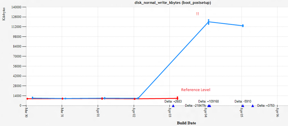
Now with a problem like this one, you have a pretty clear metric to go after. Bytes written to disk. You can use a tool like WPA to show pretty much any metric with resounding clarity.
But even knowing what was written doesn't necessarily tell you anything about what you should do about it. This particular bug would have been hard to observe
- It manifests as a lot of retried disk writes
- You get slightly worse Cortana quality because of the failing writes
- And as it turns out we actually wrote less bytes to the disk, it's failed writes that are going on here
What's the cost?
- Burning battery and disk lifetime with redundant writes
- Burning battery with redundant computation
This bug was caught before the bits ever went anywhere, that's what good defense looks like:
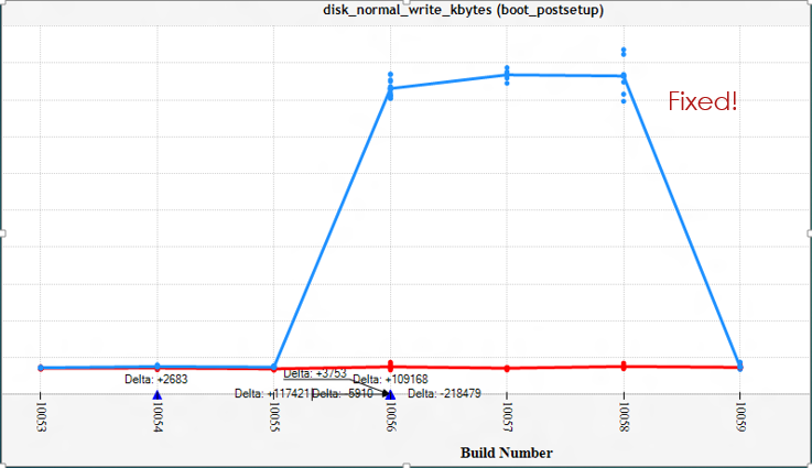
Defense pays for itself, but you need take a page from Madeye Moody: "Constant Vigilance!"
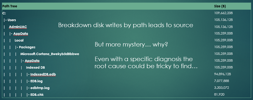
In this case the file names easily led us to the cause of the problem but in other cases it can be more complicated. Consider this picture:
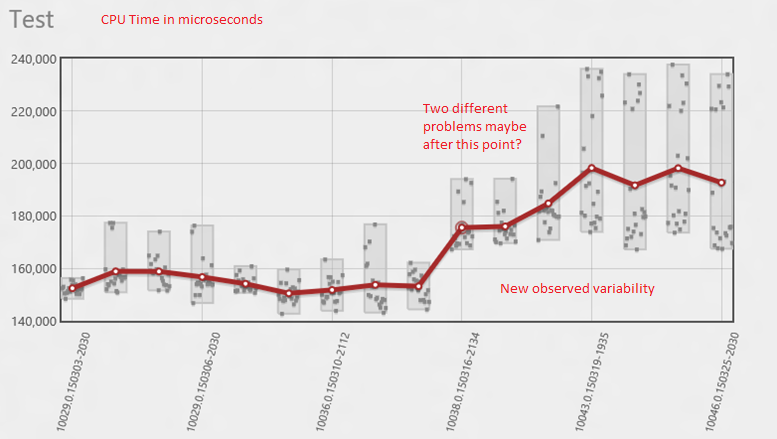
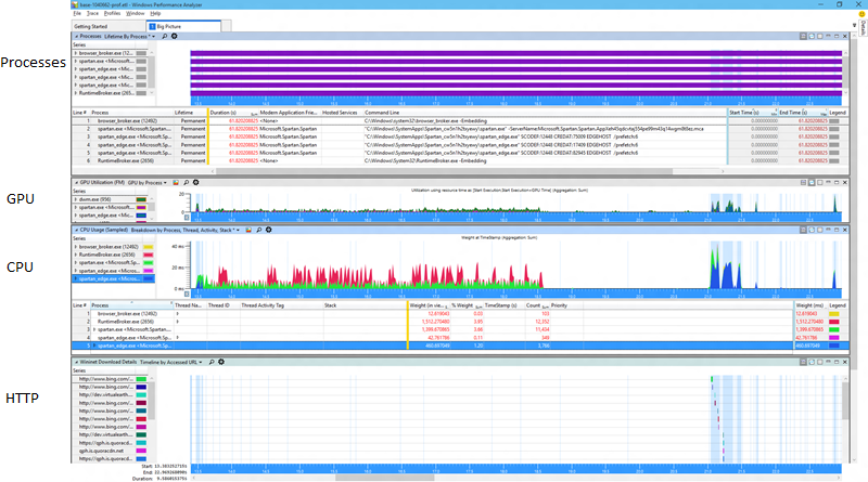
So what is going on here? There was always some variability in the results but there is a clear shift and also a significant increase in variability. Is that the same thing? Is that two things? Well I like to start by taking a look at the whole picture whenever I can. A wide view is often very helpful. Here's a typical WPA profile that I use, I'll show this test case before and after the problem on 3/16.
Here's before:
And here's after:
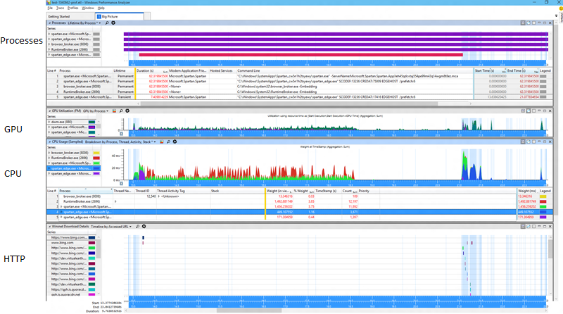
Now fair enough at that resolution those are a bit of an eye chart so you might not be able to spot the difference right away, but I can assure you that at normal resolution it's quite visible to the unaided eye with no need for symbols, stacks, or anything else challenging. One thing you can see looking at the process view is that one of the helper processes is now temporary. That's a great improvement because all it's memory goes from being permanent to transitional. And let me zoom in just a bit to show you another relevant bit.
OK so looking closer there's that little extra purple there, that's the cost of shutting down the process whence became transient. That's all good. But what about all that extra green? That's looking like it's all new and unrelated to the process exit.
Now to find it we could start doing some complicated stack differencing to locate the extra CPU.... or we could just select the time range where the extra green is and see what's happening there. Your call. :)
This little problem is a great example of why its important to know not just what is going on, but when it's happening. Many profiling techniques lose all sense of "when" in the course of the investigation. Typical reports like inclusive/exclusive CPU time for instance classically lose sight of when the cost was paid and it is essential for spotting and diagnosing differences efficiently.
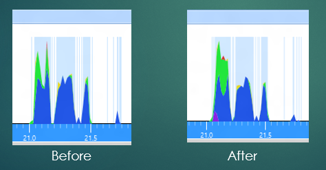
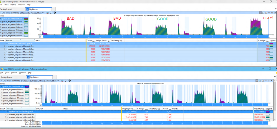
To understand the variance, we look more closely at the extra bits of work that are happening. Here I'm looking at 5 runs of a similar test, unfortunately I changed the colors so it's less clear, the extra work is now shown in purple with the normal work in green.
It doesn't take much to understand the source of the variability -- looking at these five runs we can see that we sometimes get "bad" results with extra CPU, sometimes get "good" results which are essentially unchanged from the baseline (the bottom 5 runs), and sometimes get "ugly" results where the extra cost is extraordinary. These execution modes are resulting in a changed distribution of cost. And of course to see the cost you can simply select the extra purple bit and look at the stacks. This kind of eyeball analysis is actually remarkably effective.
Now what's interesting is that this problem is actually not directly observable by your average user, the page isn't actually loading any more slowly at all! If you were to see it, without tools that is, you would perhaps see it as unusual drain on your battery, or maybe increased load on a server system of some kind. Looking at a variety of metrics can help you understand "stealth" problems like power much earlier and more directly. Joules are notoriously difficult to measure directly, but key drivers of power like CPU, Disk, Memory, GPU, and Network are directly measurable. Those considerations plus metrics that help you understand the application workload can be invaluable in defending and improving power performance.
Contextualizing your consumption is critical, without context you can't even tell an improvement from a problem. For instance in the next example the lab reports that a particular scenario is taking longer and there is additional CPU usage, that must be bad right? Well, let's look at some pictures of what was going on (keeping in mind I'm not making these up, this are real traces that were reported to me) and I won't have to bore you with symbols and wait analysis -- the pictures tell the tale.
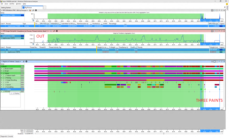
The first picture shows the "before" situation. The green marked region is the measurement interval, anything outside of that did not count towards any reported metrics. Tellingly I've marked some of the run as "OUT" in red. I've also selected in blue the painting periods, and we can see three blue bars, showing that we had three paints in the before trace but only one of those paints is in the measurement interval. The first strip is showing GPU usage, the second CPU usage, and the third is showing begin/end markers for various activities like layout, painting, and so forth. These are all standard WPA views.
Now let's have a look at the supposedly worse "after" picture:
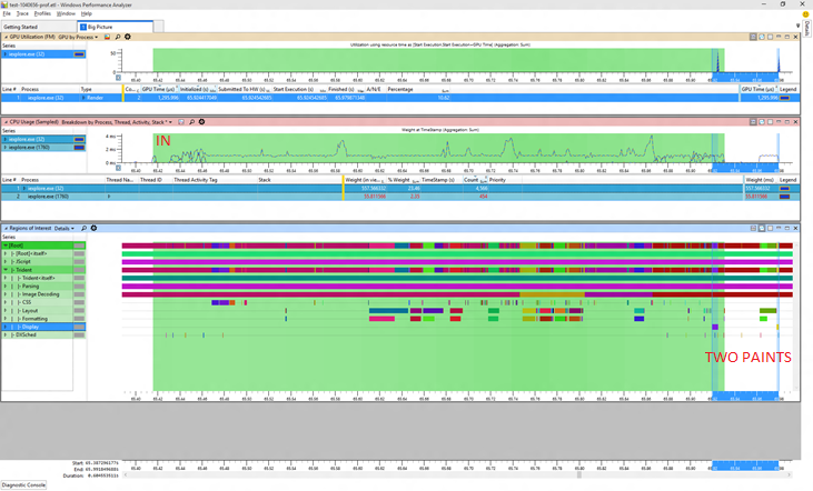
In this trace the little setup period at the start of the trace is in the measurement interval. That inconsistency makes it seem like the "after" trace took longer but actually it didn't at all. Comparable work happened in the same amount of time. The additional CPU time comes from the fact that there is extra work done in those few leading milliseconds (and we're sensitive enough to notice even that small percentage!). Again the blue selection shows the painting activities and we can see that there are now only 2 paints in the overall scenario, and only one paint was counted (a common pattern is that the clock stops after the first paint once the browser is back to processing input).
And there's more, you can't see it clearly because the pictures are smallish but allow me to zoom in on the GPU usage for you.
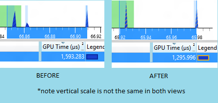
Now unfortunately the scaling wasn't the same in both views but even without that we can see that the 3 impulses of GPU work clearly became 2 and the total GPU cost went down from about 1600 to about 1300. That's a nice savings!
So what began looking like a problem is actually an improvement (and some work to figure out why we are not always starting the clock at the same moment)
There are many ways to be led down the wrong path, so it pays to stay alert. This one looks clear enough right? The Y axis is showing memory usage in bytes. Obviously something went wrong right about 3/13?
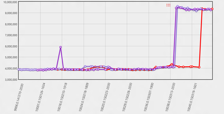
Well maybe, but we do have a lot of other data... what else can we see in that time period? Well in this next view the Y axis has number of paints in the scenario. Now we can see that actually much sooner we started having some cases where there was an extra paint. It wasn't until the extra paint became the norm that the average memory usage went up enough to report it. The real problem happened much sooner!
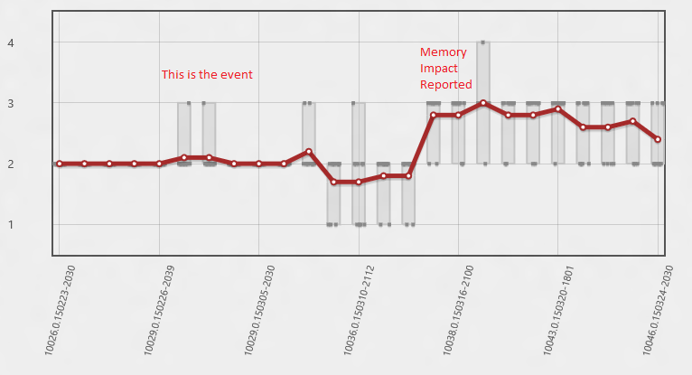
In this case the memory usage implicated drawing, the drawing lead to an investigation of paint patterns, the paint patterns gave us the time period the bug was introduced, and from there we are able to find the bug. If we had done an intensive analysis of the memory usage stacks in the initial time period they wouldn't have told us anything interesting. Display memory is always allocated by essentially the same stack, we needed to know when this happened so we could see what was driving the extra paints. The correct time period was essential.
Working on "offense" (i.e. looking for new opportunities) can benefit from exactly the same approach. Here's an old trace of Internet Explorer I had lying around from a couple years ago.
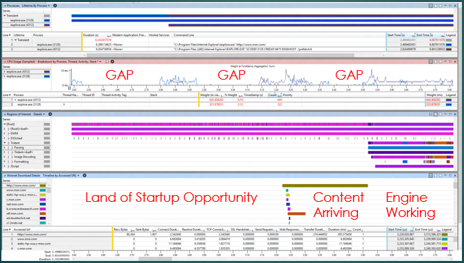
The same kind of "big picture" views are doing their job again, this time we see "gaps" in CPU usage, indicating some kind of synchronous delay, well before we start asking for content. That's a no-no. The actual engine activity is maybe 20% of the trace. There's a huge expanse of opportunities for improvement early on where there is a lot of what I call "get ready, get set... and not so much go" going on. Each one of those gaps easily leads to a useful wait analysis -- you can select the exact context switch that woke up the CPU and see the stack! And then fix it!
So, summarizing all of this:
- The most important thing I learned doing this for three years is to not rush into detailed analysis but rather keep the big picture in mind
- The same tools I use for finding potential regressions translate well to finding new opportunities
- Familiarity with many metrics and good history is essential
- Consumption metrics translate into consumer experience and are often your best proxy to what the customer will see on many devices
Happy Profiling!