Emulating HVGA screens with Mix CTP
One of the (many) differences between Windows Phone 7 Series and the older Windows Mobile platform is that there is now a single hardware and software platform for developers to code against. Every device will have a fast CPU and GPU, GPS, 4-point multi-touch, and so on. The only attribute of the phone that can vary is the screen resolution, which must be either WVGA (480 x 800, available at launch) and HVGA (320 x 480, available sometime thereafter).
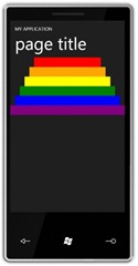
We don’t have tooling to support the HVGA screen size yet, but rest assured it will be provided before devices hit the market! In the mean time, if you want to experiment with HVGA there is a pretty easy way to do it – just re-template the frame! First of all, let’s take a look at a simple page running in the normal resolution:
Now let’s see what the same page looks like cropped to HVGA. In your application, open up App.xaml and replace the current RootVisual definition with the following:
<Application.RootVisual>
<phoneNavigation:PhoneApplicationFrame x:Name="RootFrame" Source="/MainPage.xaml"
OrientationChanged="RootFrame_OrientationChanged">
<phoneNavigation:PhoneApplicationFrame.Template>
<ControlTemplate>
<Grid x:Name="ClientArea" Background="{StaticResource PhoneBackgroundBrush}">
<ContentPresenter x:Name="hvgaContent" Width="320" Height="480" />
</Grid>
</ControlTemplate>
</phoneNavigation:PhoneApplicationFrame.Template>
</phoneNavigation:PhoneApplicationFrame>
</Application.RootVisual>
And then go into the App.xaml.cs file and add this event-handler (which will ensure orientation changes work correctly). If you want to support on-the-fly switching from HVGA and WVGA then that’s left as an exercise for the reader (shouldn’t be too hard!):
private void RootFrame_OrientationChanged(object sender, Microsoft.Phone.Controls.OrientationChangedEventArgs e)
{
FrameworkElement templateRoot = VisualTreeHelper.GetChild(RootVisual, 0) as FrameworkElement;
FrameworkElement hvgaContent = templateRoot.FindName("hvgaContent") as FrameworkElement;
if (hvgaContent == null)
return;
if ((e.Orientation & Microsoft.Phone.Controls.PageOrientation.Portrait) != 0)
{
hvgaContent.Width = 320;
hvgaContent.Height = 480;
}
else
{
hvgaContent.Width = 480;
hvgaContent.Height = 320;
}
}
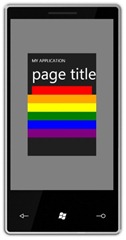
Now the page looks like this:
Note all but the first two bars have been cropped because they are larger than the new screen size.
Another approach you could take (instead of hard-coding the ContentPresenter size) is to simply scale each page down, using XAML such as this:
<Application.RootVisual>
<phoneNavigation:PhoneApplicationFrame x:Name="RootFrame" Source="/MainPage.xaml"
OrientationChanged="RootFrame_OrientationChanged">
<phoneNavigation:PhoneApplicationFrame.Template>
<ControlTemplate>
<Grid x:Name="ClientArea" Background="{StaticResource PhoneDisabledBrush}">
<ContentPresenter RenderTransformOrigin="0.5,0.5">
<ContentPresenter.RenderTransform>
<ScaleTransform ScaleX=".6" ScaleY=".6" />
</ContentPresenter.RenderTransform>
</ContentPresenter>
</Grid>
</ControlTemplate>
</phoneNavigation:PhoneApplicationFrame.Template>
</phoneNavigation:PhoneApplicationFrame>
</Application.RootVisual>
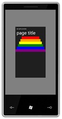
Now the page looks like this – nothing is cropped, but everything is smaller (watch out for hit-targets getting too small!).
Note that both these approaches are just a rough approximation to let you see how various layouts might work inside the smaller screen. We might change the default font sizes, control sizes, etc. to accommodate the new screen size, but we don’t have any of that detail yet so please don’t take any hard dependencies on this “emulation” and you certainly should not assume that your work is done if your app renders in this fashion. It’s just something to get you started.


